Elegant Brand Strategist Landing Page Template
Distill is a single-page masonry landing page built for independent brand strategists. It combines a full-bleed desk photography header, a staggered card grid of case studies and essays, and a lead-capture form for a naming toolkit. The design uses deep obsidian black, warm parchment, and tarnished gold to project quiet authority and intellectual depth.
by Rocket studio
Quick summary
Distill is a minimalist brand strategist landing page with a masonry card layout, full-bleed header photography, and a dual conversion path. It moves visitors through client work, essays, and frameworks before presenting a soft, trust-earned call to action. The palette of obsidian, parchment, and tarnished gold creates the feel of a luxury atelier rather than a typical portfolio site.
Who this template is for
This template is built for independent brand strategists who work with serious clients and lead with thinking. It suits practitioners whose best work is conceptual and whose portfolio lives in positioning decks, naming systems, and voice guides as much as in visual output.
- Independent brand strategists running a single-person or small-team practice
- Creative consultants who serve Series A founders, direct-to-consumer brand teams, or family-business owners rewriting their brand story
- Strategists who want to attract clients through visible intellectual rigor rather than a traditional gallery of deliverables
What problem this template solves
Most portfolio templates are built for designers, not strategists. They prioritize images over ideas and push visitors toward a contact form before any trust has been built. A brand strategist's actual value lives in narrative, tension, and the questions that crack a brief open.
- Generic portfolio layouts flatten strategic work into a visual grid that looks identical to every other creative's site
- Visitors leave without understanding the depth of thinking behind the work, making it hard to justify premium fees
- Standard contact forms ask for company name and job title, signaling qualification rather than conversation
What you get with this template
You get a complete, fully structured single-page layout ready to be filled with your work and thinking. Every section is deliberate and serves the conversion flow described in the brief.
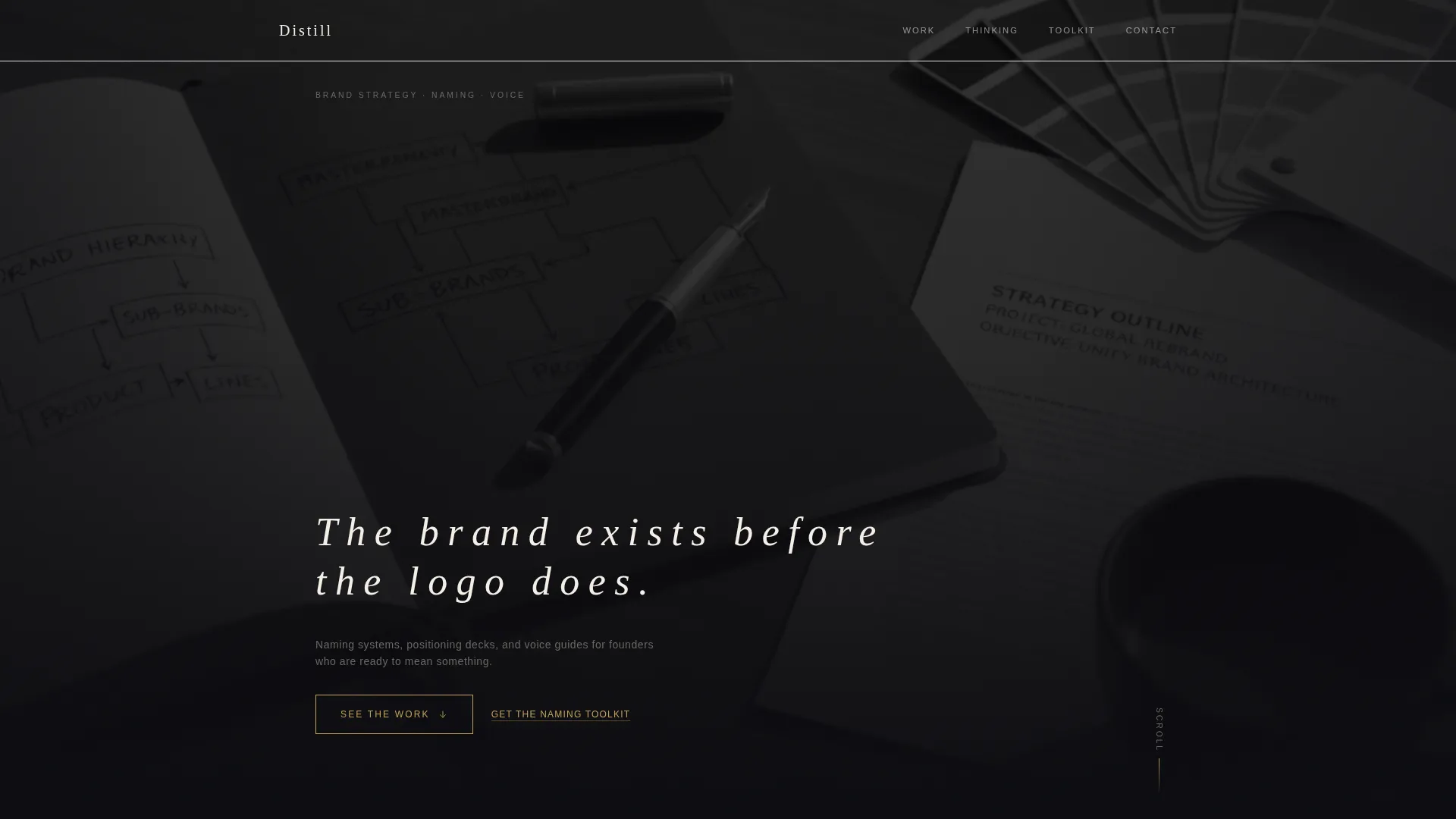
- A full-bleed header with a desaturated desk photography concept, a tracked-out headline, and a fade-in entrance
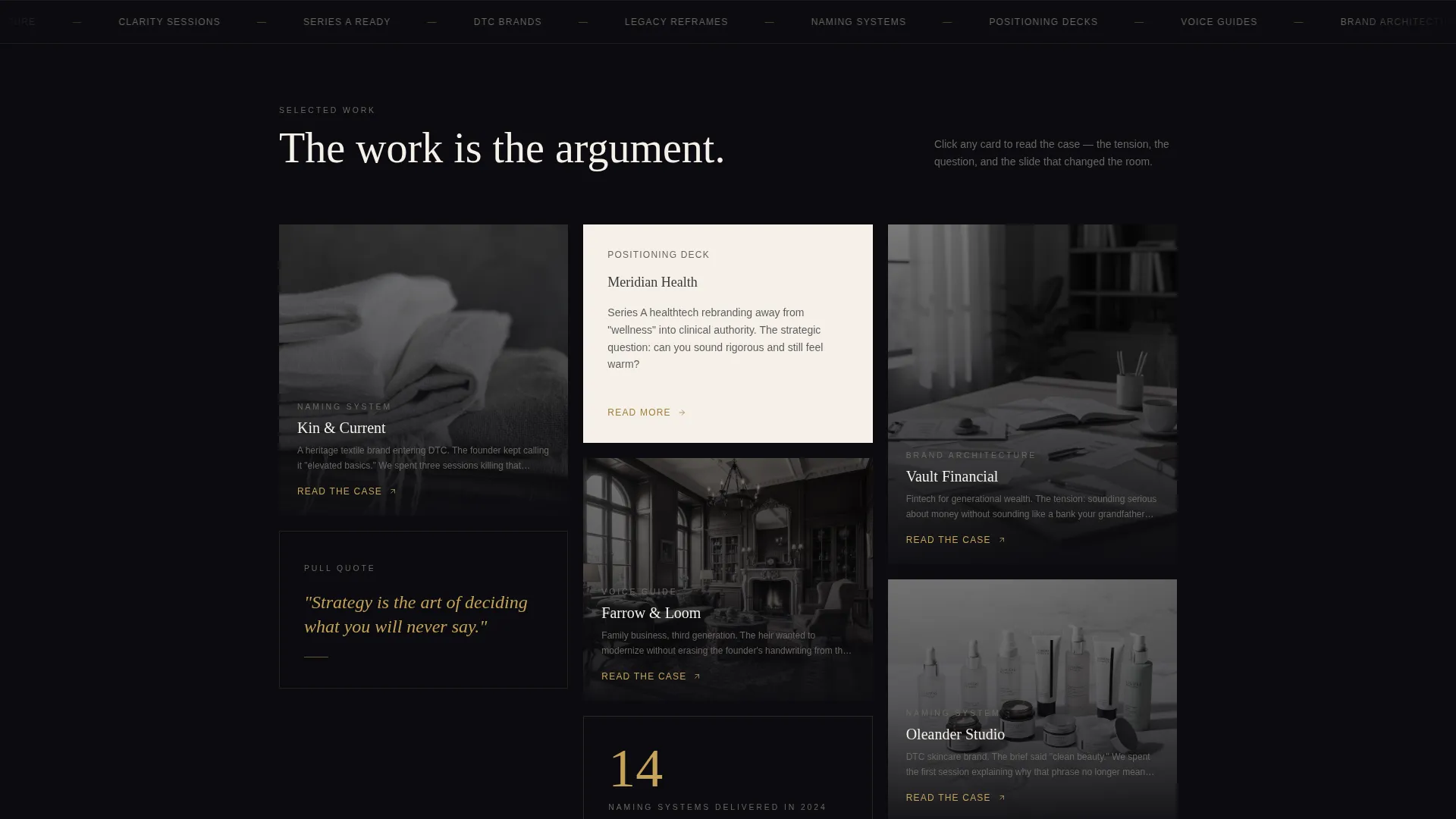
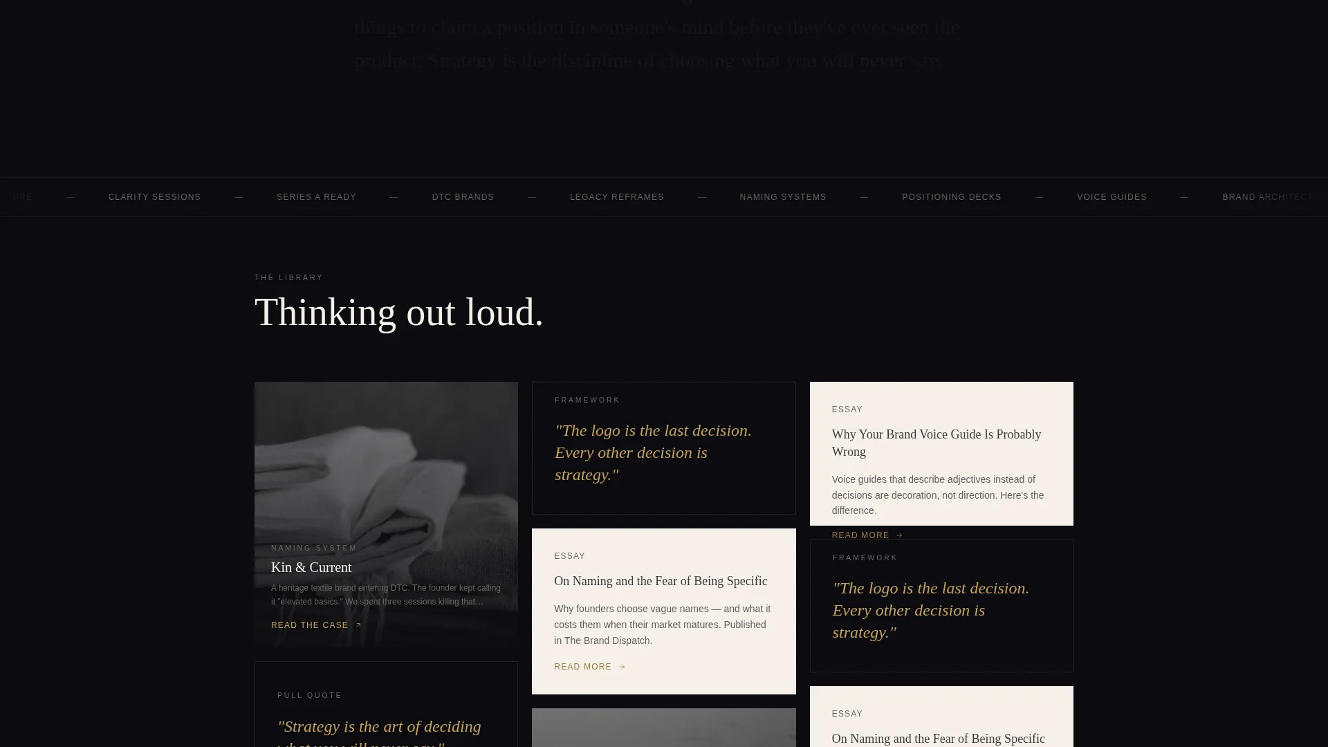
- A staggered masonry card grid that mixes case study images, text-only narrative cards, essays, and recorded talks
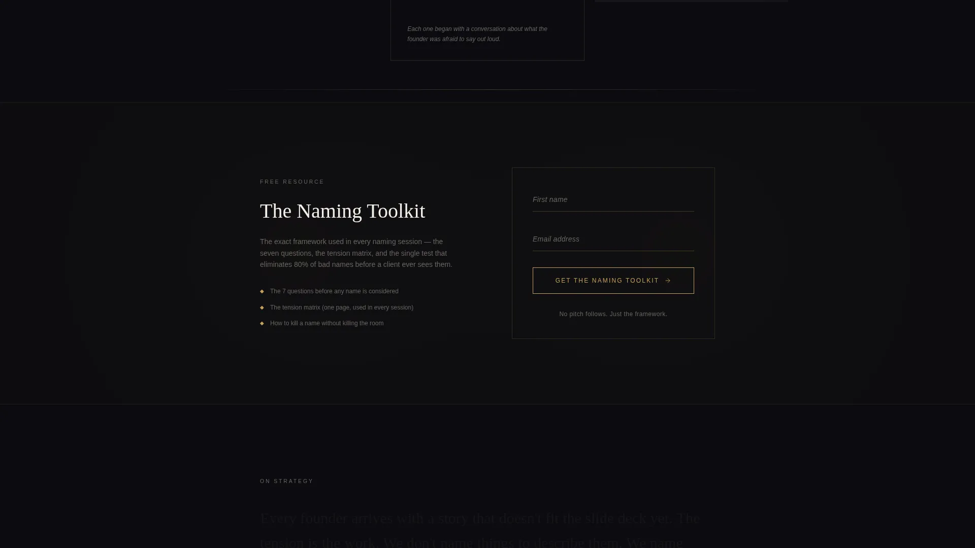
- A mid-page lead capture form for a naming toolkit, plus a footer Calendly embed for direct booking
Feature list
This template delivers a set of focused, prompt-backed features. Each one is designed to support the strategist's specific conversion goal and brand presentation.
Full-Bleed Header Section
The header uses a top-down desk photography concept, desaturated except for gold and paper warmth. A single tracked-out headline fades in on load, setting a deliberate, gallery-like tone from the first second.
Staggered Masonry Card Grid
Cards are set at varied heights in an intentionally uneven rhythm. Some cards carry a full case study image; others display a single sentence in gold italic on obsidian. The layout feels like a sketchbook, not a portfolio grid.
Narrative Case Study Cards
Clicking a card opens a short written narrative rather than a deliverables gallery. Each story covers the tension the client brought in, the strategic question that cracked it, and the single slide that changed the room.
Content-to-Library Scroll Flow
As the visitor scrolls deeper, the card content shifts from client work to essays, frameworks, and recorded talks. The transition happens without announcement, letting the portfolio dissolve naturally into a library.
Mid-Page Lead Capture Form
Placed after the third row of masonry cards, the form captures first name and email only. The tarnished gold call-to-action button reads "Get the Naming Toolkit" and feels like continuing a conversation rather than filling out a form.
Footer Booking Embed
A secondary conversion path sits in the footer as a single Calendly embed. The call to action reads "Book a Clarity Call" and is intended for visitors who arrive already ready to engage.
Page sections overview
| Section | Purpose |
|---|---|
| Full-Bleed Header | Sets tone, introduces headline |
| Masonry Card Grid | Showcases client work narratives |
| Text-Only Cards | Adds essay and framework depth |
| Naming Toolkit call to action | Primary lead capture form |
| Essays and Talks | Extends portfolio into library |
| Footer Booking Embed | Secondary direct-booking path |
Design & branding system
The visual identity follows an Atelier Studio theme built on restraint and precision. Every color choice and spacing decision is made to feel like a luxury jeweler's tray: dark velvet underneath, gold visible only when the light catches it.
- Color palette: deep obsidian black (#0B0B0F) as the primary ground, warm parchment (#F5F0E8) for card surfaces, tarnished gold (#C5A258) on hover states and pull-quotes, and graphite (#3A3A3C) for body text
- Typography uses tracked-out sans-serif for display headlines, with italic gold treatment reserved for pull-quotes and card-level statements
- White space is an active design element; layout breathing room carries as much weight as the content itself
Mobile & speed optimization
The layout is structured to remain clean and legible across screen sizes. The masonry grid adapts to narrower viewports without losing the staggered rhythm that defines the desktop experience.
- Card heights and image proportions are set to reflow gracefully on mobile screens
- The single-column form and footer embed remain functional and uncluttered on smaller displays
- Heavy visual elements like the full-bleed header are treated with restraint in the design to keep the page feeling fast and intentional
How this template helps you convert
The page earns trust before it asks for anything. By the time a visitor reaches the call to action, the intellectual case for the strategist has already been made through the work itself.
- The masonry scroll builds progressive trust by moving from client case studies to essays and talks, showing range and depth before any offer appears
- The mid-page naming toolkit form arrives after three rows of visible thinking, so downloading feels like the natural next step in a conversation already in progress
- The footer Calendly path catches visitors who bypassed the toolkit and are ready for a direct engagement, ensuring neither type of buyer leaves without a clear next step
Other information about this template
This template is designed as a standalone single-page layout optimized for a content and resource delivery conversion model. It is built within the Masonry and Pinterest-style grid format category of portfolio and agency templates.
- The template sits within the Brand Strategist Portfolio subcategory and is specifically scoped for the brand strategist minimalist portfolio niche
- The dual-path conversion structure (toolkit download plus direct booking) is intentional and drawn directly from the brief, supporting both early-stage and decision-ready visitors
- The Atelier Studio theme, Obsidian and Gold color system, and Creator Spotlight creative direction are all matched intersection context fields that define the template's visual and structural identity
Theme
Atelier Studio
Creative direction
Creator Spotlight
Color system
Obsidian & Gold
Style
Masonry/Pinterest
Direction
Content/Resource
Page Sections
Full-bleed Desk Photography Header
Staggered Masonry Card Grid
Narrative Case Study Format
Content-to-library Scroll Transition
Mid-page Lead Capture Form
Footer Calendly Booking Embed
Related questions
Can I use this template without professional desk photography?
Does the masonry grid adapt to mobile screens?
Can I change the lead offer on the mid-page form?
Is this template suitable for a strategist who also produces visual deliverables?



