Tarot Subscription Box Landing Page Template
Divination is a bento grid landing page built for tarot and oracle deck subscription boxes. It pairs a live countdown timer with a sensory unboxing reveal, past-box scarcity grid, tiered subscription cells, and a sticky checkout bar. Every section is crafted to move curious visitors toward one action: claiming this month's limited-edition box before it closes.
by Rocket studio
Quick summary
Divination is a single-page, click-through landing page designed for a lunar-cycle subscription box carrying tarot or oracle decks, crystals, guidebooks, and ritual tools. A full-width countdown timer opens the page, a bento grid builds desire through scarcity and sensory reveal, and a sticky bottom bar keeps the primary call to action within reach at all times.
Who this template is for
This template is built for anyone selling a curated, time-limited subscription product in the spiritual or wellness retail space. If your offer has a closing date and a story worth telling, this layout is designed around you.
- Tarot and oracle deck shop owners launching a monthly subscription box
- Independent spiritual retailers who want to turn a limited-edition drop into an event
- Gift-box sellers targeting curious beginners and thoughtful gift-givers who need guided purchasing
What problem this template solves
Most subscription box pages present a product. This template presents a moment. Generic e-commerce layouts cannot carry the weight of urgency, ritual, and scarcity at the same time. Divination is built to hold all three without feeling cluttered.
- Visitors land without a clear signal that the window is closing, killing conversion momentum
- Flat product grids fail to communicate curation quality or the sensory experience of receiving the box
- Gift-givers and beginners need a secondary path that does not compete with the main checkout flow
What you get with this template
You get a fully structured bento grid landing page with every section pre-built and visually sequenced to guide a visitor from first impression to checkout click. The layout does the heavy persuasion work before a visitor reaches the buy button.
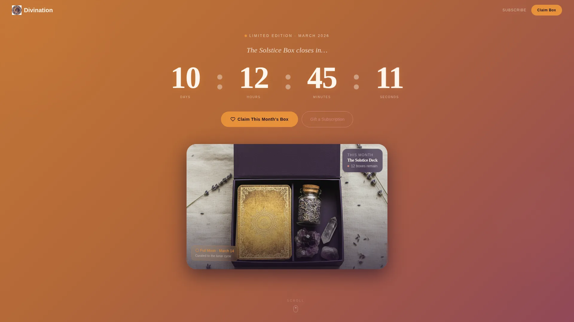
- Full-width countdown timer header with animated gradient, oversized serif numerals, and a hero product photograph
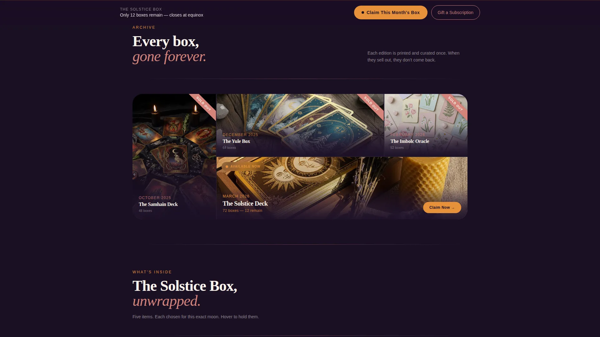
- Bento grid of past box cells with flat-lay photography slots, edition size labels, and "Sold Out" ribbon overlays
- Three-tier subscription pricing cells, sticky bottom bar with primary call to action, and a secondary rose-gold gift path
Feature list
This section walks through the core built-in components that make the Divination landing page work as a complete, conversion-ready layout.
Live Countdown Timer Header
The header spans the full page width and displays a real-time countdown in days, hours, minutes, and seconds. Oversized serif numerals sit above the closing-date label "The Solstice Box closes in...", anchoring urgency from the first scroll position.
Scarcity-First Bento Grid
Past boxes are displayed as individual grid cells, each holding a flat-lay photograph, the deck name, the edition size, and a "Sold Out" ribbon. The visual pattern registers scarcity before a visitor consciously processes the copy.
Sensory Box Reveal Section
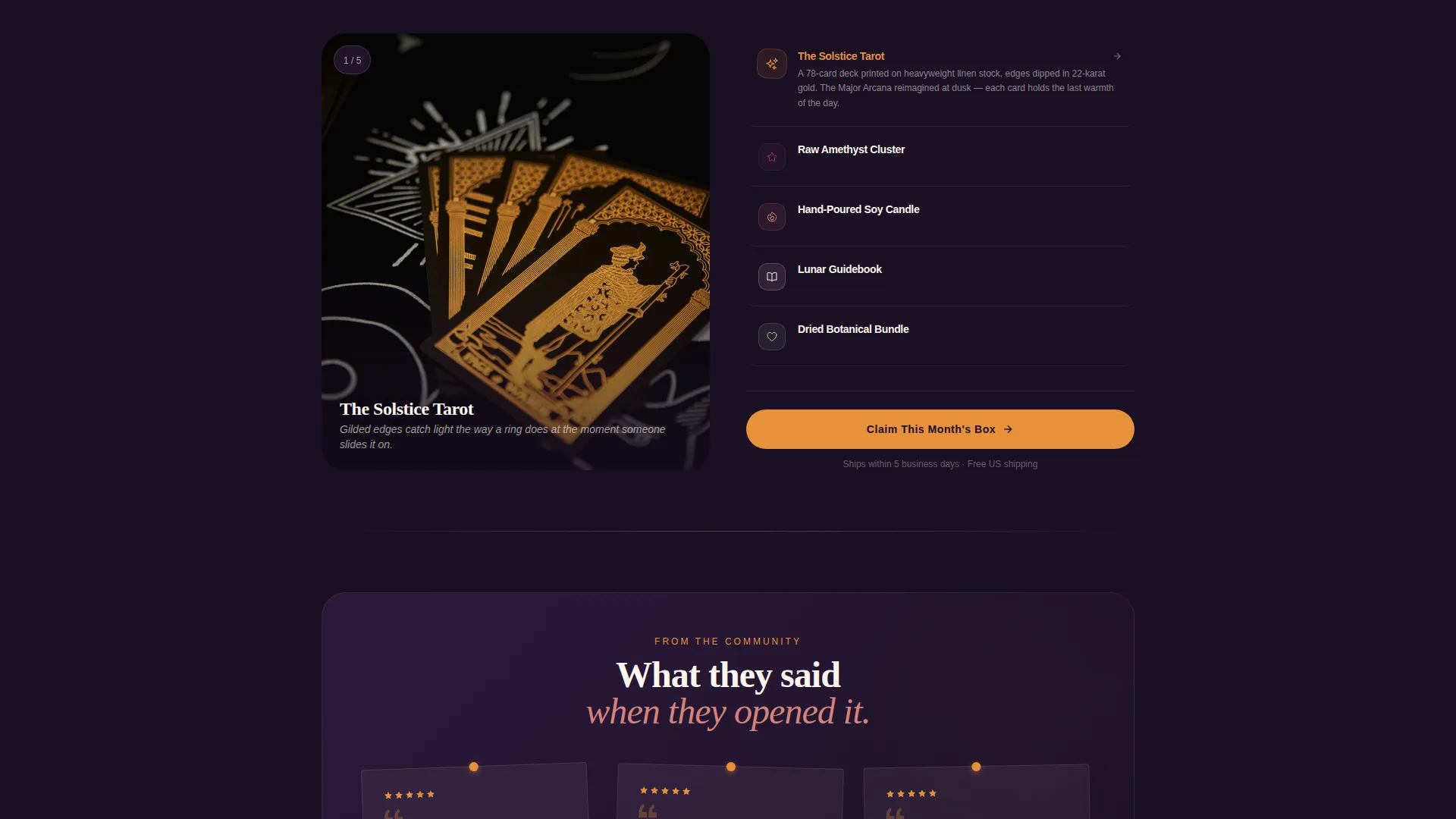
One oversized bento cell breaks the grid rhythm to reveal this month's box one item at a time. Each item entry pairs a product photograph with a short, sensory description line, building desire through specificity rather than marketing language.
Corkboard Testimonial Row
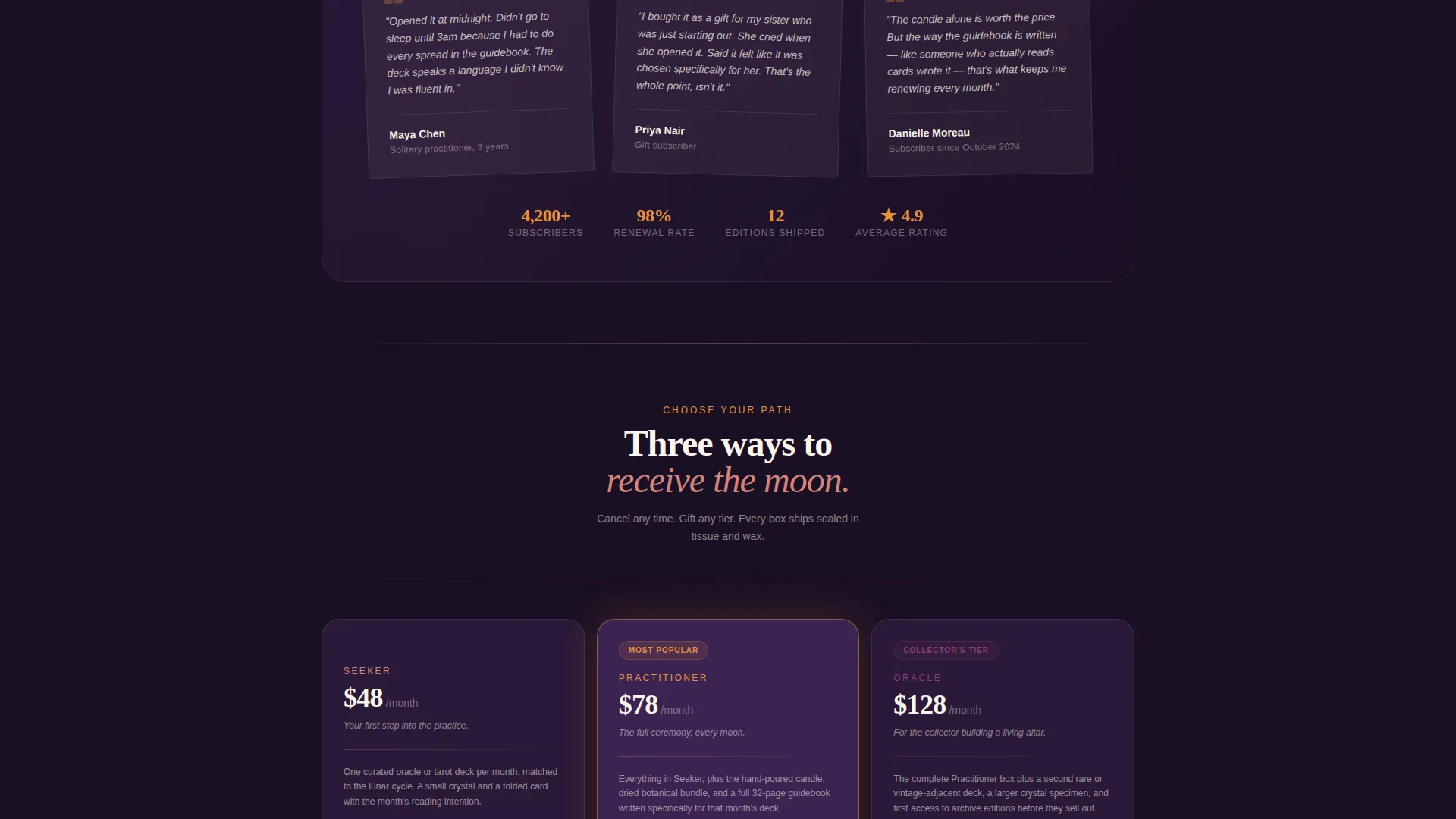
Customer reviews are styled as handwritten cards pinned to a corkboard layout. This presentation keeps social proof feeling personal and hand-selected rather than templated, which fits the curated identity of the subscription.
Three-Tier Subscription Cells
Three subscription options sit side by side in amber-glowing hover cells. The layout makes plan comparison immediate without requiring a separate pricing page or modal popup.
Sticky Checkout Bottom Bar
A bottom bar slides up once the visitor scrolls past the fold and stays anchored throughout the rest of the page. It holds the primary call-to-action button and removes friction from re-initiating the checkout click at any scroll depth.
Page sections overview
| Section | Purpose |
|---|---|
| Countdown timer header | Opens with urgency and hero product image |
| Past boxes grid | Shows sold-out history to signal scarcity |
| Monthly box reveal | Builds desire through item-by-item sensory reveal |
| Testimonial corkboard | Adds social proof in a personal, curated style |
| Subscription tier cells | Presents three plan options for quick comparison |
| Sticky bottom bar | Keeps primary call to action always reachable |
Design & branding system
The visual identity uses a Sunset Gradient palette built around four tones that evoke the sky in the ten minutes after sunset. Every color has a functional role, so the design communicates meaning without extra copy.
- Deep plum (#2D1B3D) anchors background areas and card containers; molten amber (#E8913A) activates countdown elements and call-to-action buttons; rose-gold (#D4837A) washes hover states and divider lines
- Pale celestial cream (#FDF6EC) provides breathing room between bento cells, preventing the dense grid from feeling heavy or overwhelming
- Typography uses a serif typeface with a hand-pressed quality for headings; the overall theme follows a Marketplace Grid structure with bento cell proportions and flat-lay photography as the primary image style
Mobile & speed optimization
The bento grid layout is structured to reflow naturally across smaller screen sizes without losing the scarcity-first visual logic. Urgency elements remain prominent and the call-to-action path stays clear on every viewport.
- Countdown timer numerals and the sticky bottom bar are sized to remain legible and tappable on mobile screens
- Bento cells stack vertically on narrow viewports while preserving the flat-lay photograph and label hierarchy within each cell
How this template helps you convert
Every design decision in this landing page points toward a single action: clicking through to the checkout for the current box. The page removes hesitation rather than adding information.
- The countdown timer opens the page with a time constraint that makes scrolling feel purposeful, not passive, turning visitor curiosity into a reason to act now
- The scarcity grid of past sold-out boxes proves demand before the visitor reaches the current offer, so the primary call-to-action button lands in already-warmed attention
- The sticky bottom bar and the three inline placements of the "Claim This Month's Box" button mean a visitor never needs to scroll backward to complete the action
Other information about this template
This template is matched to the Retail and E-Commerce category, specifically built around the tarot cards and oracle decks subscription niche. It is designed to support an upsell and upgrade landing page direction where a tiered subscription model is central to the offer.
- The secondary "Gift a Subscription" button uses a quieter rose-gold style so gift-givers find their path without pulling focus from the primary checkout flow
- No on-page form is included by design; every call-to-action click carries the visitor directly to a pre-selected checkout with the current box already in cart
- The creative direction is explicitly Limited Time, meaning the page architecture assumes a closing date and a rotating monthly product, not a permanent evergreen catalog listing
Theme
Marketplace Grid
Creative direction
Limited Time
Color system
Cloud Canvas
Style
Masonry/Pinterest
Direction
Upsell/Upgrade
Page Sections
Live Countdown Timer Header
Scarcity Bento Grid for Past Boxes
Item-by-item Box Reveal Cell
Corkboard-style Testimonial Row
Three-tier Subscription Pricing Cells
Sticky Checkout Bottom Bar
Related questions
Who is this landing page template designed for?
Does the page include a form or email capture?
Can I update the countdown timer for each monthly drop?
How does the template handle gift-givers without confusing the main buyer path?
How many subscription tiers does the template support?



