Diwali Business Booking Website Template
Diya is a cinematic Diwali landing page template built for photography and videography teams. It uses a masonry card grid, a comparison journey layout, and a tiered upsell flow to turn casual visitors into booked clients. The Obsidian and Gold visual identity and warm UGC photo wall make the page feel as alive as the celebration it documents.
by Rocket studio
Quick summary
Diya is a single-page Diwali photo and video service landing page. It opens with a cascading UGC photo wall, walks visitors through a side-by-side comparison journey, and closes with a tiered package selector. Every section is built to show prospective clients the difference between what a phone captures and what a trained creative team sees.
Who this template is for
This template is made for creative professionals who document Diwali celebrations for paying clients. It fits teams that offer layered service tiers and want a page that sells the upgrade without a hard pitch.
- Diwali photographers and videographers offering tiered coverage packages
- NRI families and joint households looking to book a cinematic celebration shoot
- Event planners running corporate Diwali galas who need fast turnaround on highlight reels
What problem this template solves
Most creative service pages show a portfolio and a contact form. They do not explain why a client should spend more. Visitors leave without understanding what better coverage actually looks like.
- There is no side-by-side proof that shows the gap between a phone snapshot and a professional shot
- Service tiers feel abstract without a visual demonstration of what each level delivers
- The booking form often feels transactional rather than conversational, reducing inquiry quality
What you get with this template
You get a fully structured landing page designed around the upsell journey from first scroll to inquiry. Every component is laid out in a modular card grid, making it straightforward to swap in your own photos and copy.
- A staggered masonry photo wall header that loads client images in a Polaroid-scatter effect
- Paired comparison card modules that show phone-camera versus professional output at each service tier
- A floating "Upgrade Your Diwali" call-to-action button and a tiered package selector with three named tiers
- A lightbox gallery for past reels and a conversational inquiry form that collects celebration details
Feature list
This section covers the core built-in components that define the template's structure and conversion logic.
Staggered UGC Photo Wall Header
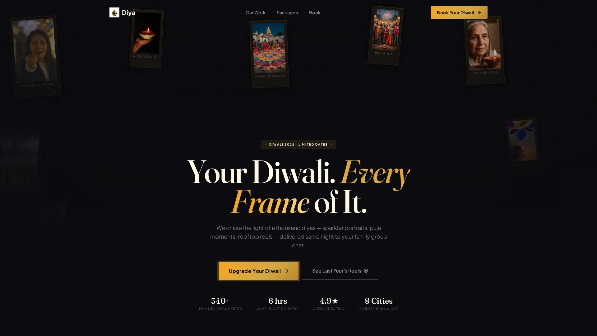
The header is a masonry grid of real client photos that loads in a cascading stagger. Each card sits at a slight rotation, mimicking Polaroids scattered on a table. A translucent obsidian overlay rises from the bottom, carrying the headline "Your Diwali. Every Frame of It." The warmth comes from authentic, imperfect imagery rather than studio compositing.
Side-by-Side Comparison Card Modules
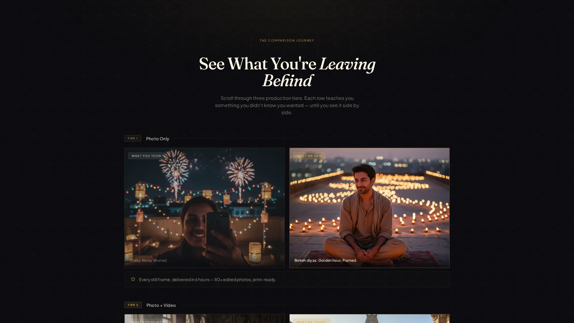
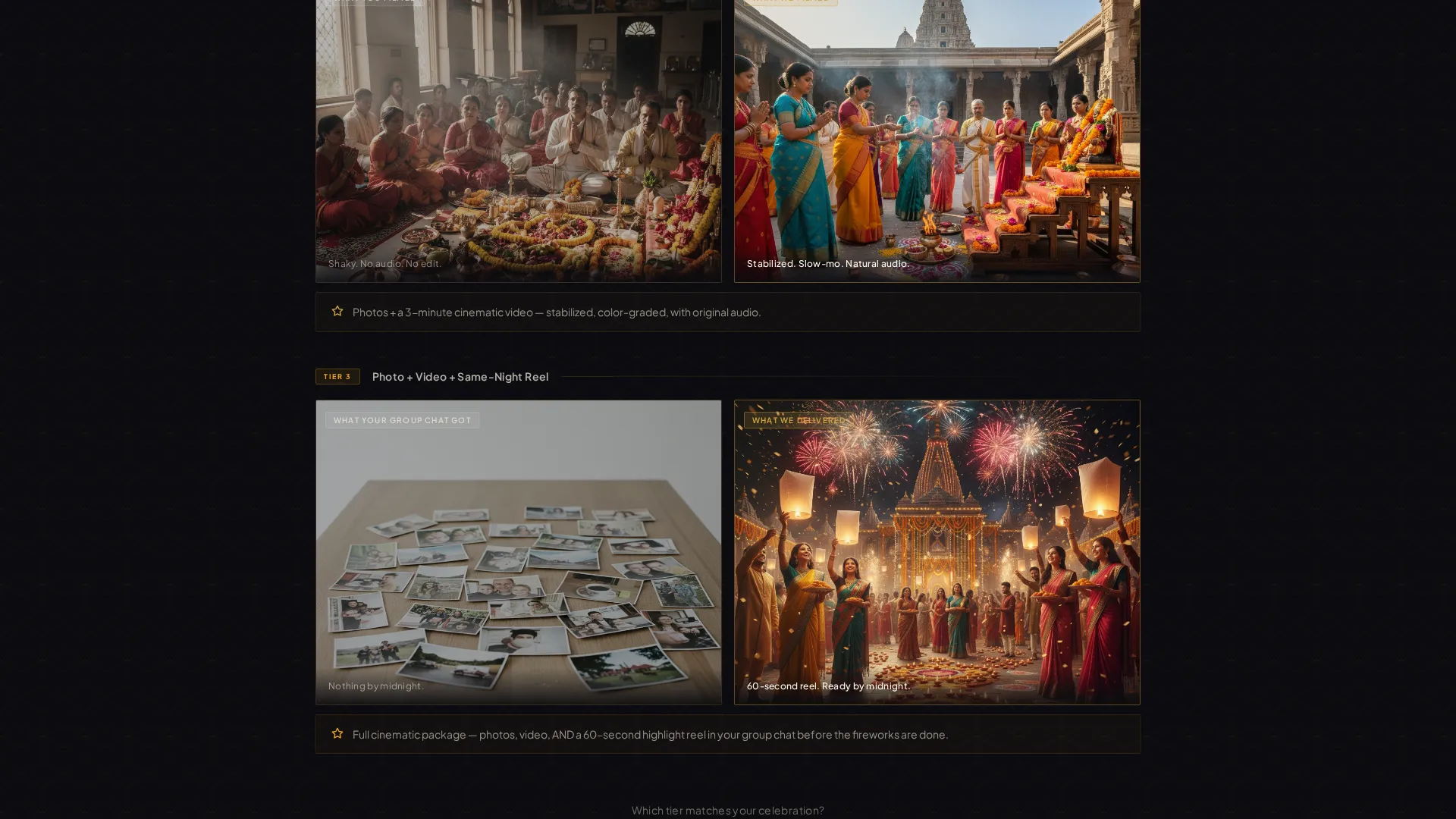
Paired card rows show "What you took" on the left and "What we saw" on the right. Each row escalates in scope, moving from Photo Only through Photo and Video to the full cinematic package with a same-night highlight reel. The comparison teaches the visitor to want more before they reach the pricing section.
Tiered Package Selector
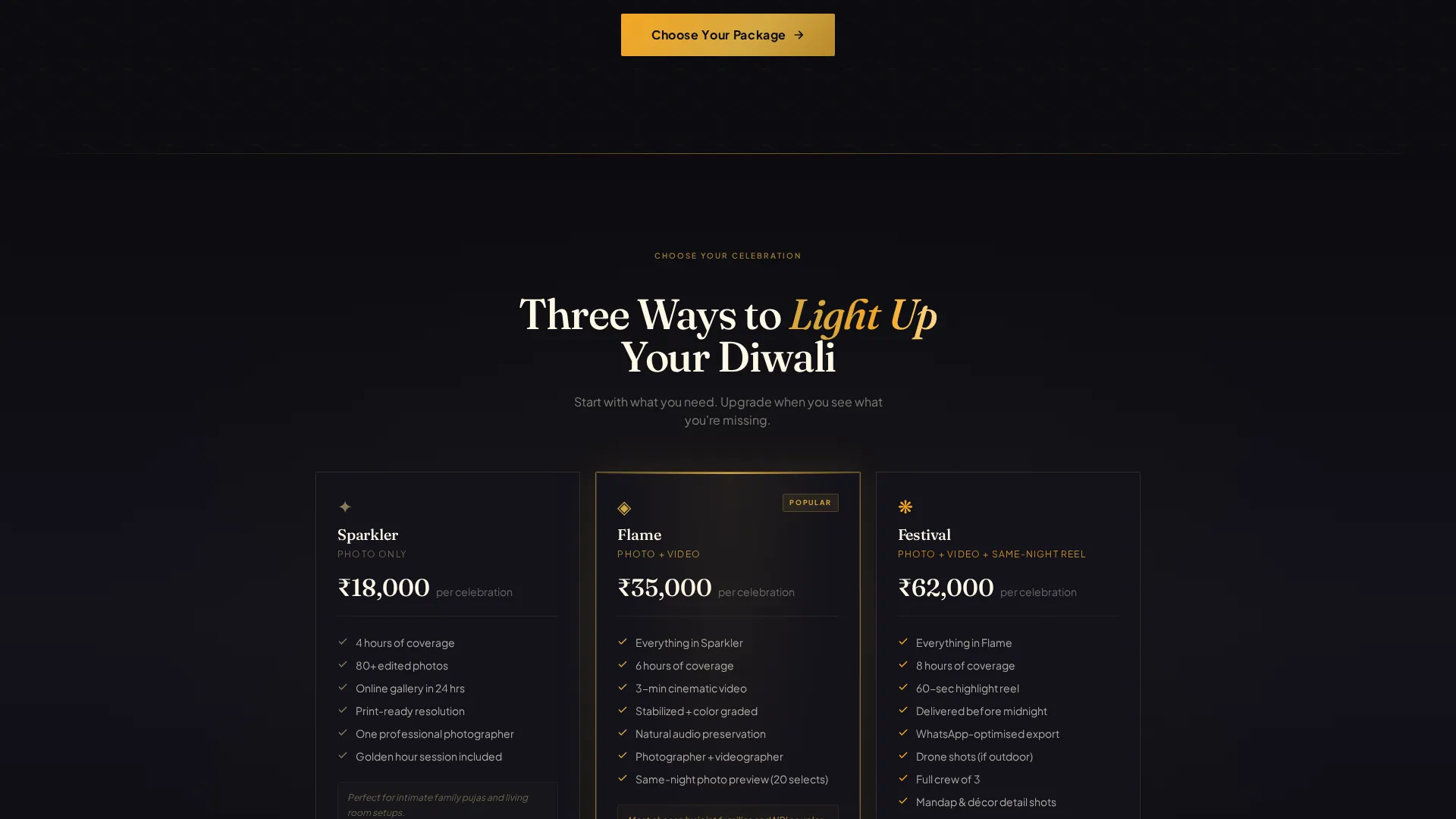
Clicking the primary call-to-action opens a three-tier package selector. The tiers are named Sparkler, Flame, and Festival. Each tier reveals an additional comparison card showing exactly what that coverage level captures, so the decision feels informed rather than pressured.
Floating Upgrade Call-to-Action
A marigold-on-obsidian button labeled "Upgrade Your Diwali" pins to the screen after the second comparison row. It stays visible as the visitor scrolls, reducing the distance between intent and action at every point on the page.
Lightbox Social Proof Gallery
A secondary call-to-action labeled "See Last Year's Reels" opens a lightbox gallery. It functions as in-page social proof, letting visitors watch past work without leaving the page or opening a new tab.
Conversational Inquiry Form
The inquiry form is framed as "Tell us about your Diwali" rather than a standard checkout. It collects celebration date, location, guest count, and preferred tier. This framing keeps the tone warm and positions the follow-up conversation over WhatsApp as a natural next step.
Page sections overview
| Section | Purpose |
|---|---|
| UGC Photo Wall | Opens with cascading real client photos and the primary headline |
| Comparison Row One | Shows photo-only tier contrast between phone and professional output |
| Comparison Row Two | Adds video coverage to the side-by-side comparison escalation |
| Comparison Row Three | Presents the full cinematic package with same-night reel contrast |
| Floating call to action Button | Pins upgrade prompt after second comparison row for persistent visibility |
| Package Selector | Reveals three named tiers with individual comparison cards per tier |
| Lightbox Reel Gallery | Displays past work as social proof inside an in-page lightbox |
| Inquiry Form | Collects celebration details in a conversational, low-friction format |
Design & branding system
The visual identity follows a Playful Geometric theme built on an Obsidian and Gold color system. The palette is designed to feel like a brass thali catching candlelight: deep where the flame has not yet reached, radiant where it has, with every edge catching the light.
- Deep obsidian black (#0B0B0F) forms the primary background, brushed temple gold (#D4A843) carries headlines and dividers, bright marigold (#F5A623) activates on hover states and call-to-action pulses, and warm ivory (#FFF8E7) surfaces card backgrounds and body text
- Geometric motifs including hexagonal rangoli patterns, diamond dividers, and concentric diya silhouettes tile across section breaks at low opacity, giving the grid an architectural rhythm inspired by kolam and jaali screens
- The modular card grid uses a masonry and Pinterest-style layout so image-heavy sections feel curated rather than crowded
Mobile & speed optimization
The card grid layout is modular, meaning each section adapts to the available screen width without breaking the comparison structure. The staggered load animation and card rotation effects are defined at the layout level.
- Comparison card rows restack vertically on smaller screens so the left-right pairing reads as top-bottom without losing context
- The floating call-to-action button remains pinned and accessible regardless of scroll depth or screen size
- The lightbox gallery opens in-page, avoiding full navigation away from the conversion flow on any device
How this template helps you convert
The page is architected around a single goal: moving a visitor from "I need basic photos" to "I want the full cinematic package." Every scroll step adds evidence before it asks for a decision.
- The comparison journey runs before pricing appears, so visitors arrive at the package selector already convinced of the quality gap between tiers rather than comparing numbers in isolation.
- The floating call-to-action button removes the need to scroll back to a form, capturing intent the moment it forms at any point in the page.
- The conversational inquiry form lowers the commitment threshold by framing the first step as sharing celebration details rather than completing a purchase, keeping the sales conversation warm and continuing over WhatsApp.
Other information about this template
This template was designed specifically for the Diwali photography and videography services market. It suits any creative team that documents South Asian celebrations and needs a page that explains its value visually rather than through text alone.
- The template style follows a masonry and Pinterest-inspired grid, making it a strong fit for image-forward service businesses in the Diwali celebrations space
- The Playful Geometric theme and Obsidian and Gold color system are defined at the component level, so updating brand colors requires changes in one place rather than across individual elements
- The comparison journey layout and upsell structure make this template reusable beyond Diwali for other celebration photography niches with minor copy changes
Theme
Playful Geometric
Creative direction
Comparison Journey
Color system
Dopamine Pop
Style
Masonry/Pinterest
Direction
Upsell/Upgrade
Page Sections
Staggered UGC Photo Wall Header
Side-by-side Comparison Card Modules
Three-tier Package Selector
Floating Upgrade Call-to-action Button
Lightbox Social Proof Gallery
Conversational Inquiry Form
Related questions
Who is the primary audience for this landing page template?
Can I swap in my own client photos and videos?
How does the three-tier package selector work?
Does the inquiry form connect to a booking or payment system?
Can this template work for other celebration photography services beyond Diwali?



