Diwali Stationery Landing Page Template for Card Studios
Diya is a bento grid landing page template built for a letterpress-and-foil Diwali stationery workshop. It features an interactive five-question card quiz, side-by-side comparison cells, and a warm Ink and Paper color palette. The layout guides shoppers from first impression to a curated card recommendation, with a secondary email capture path for browsers still deciding.
by Rocket studio
Quick summary
Diya is a single-page bento grid landing page template for a Diwali greeting card and stationery brand. It blends a tactile, letterpress-inspired visual identity with an interactive quiz flow that recommends the right card to each visitor. The page moves shoppers from curiosity to a confident "Customize and Order" action in one continuous scroll.
Who this template is for
This template is designed for makers, studio owners, and gifting professionals who sell premium physical stationery. It works especially well for anyone who needs to communicate craft and quality before a visitor ever touches the product.
- Letterpress and foil workshop owners selling Diwali greeting cards online
- Corporate gifting managers at South Asian-owned firms looking to move beyond generic holiday card options
- Independent stationery designers targeting first-generation professionals and NRI (Non-Resident Indian) families
What problem this template solves
Generic product pages fail handcrafted goods. When a card is made from thick cotton stock, embossed with rangoli geometries, and lined in marigold tissue, a plain grid of product photos does not tell that story. Visitors leave before they feel the difference.
- Flat layouts cannot convey material quality, so buyers default to cheaper, mass-printed alternatives
- Too many stationery options overwhelm shoppers who do not know where to start
- Email capture is often an afterthought, leaving browsing visitors with no follow-up path
What you get with this template
You get a fully structured bento grid landing page that carries visitors through discovery, comparison, and decision in a single scroll. Every section has a clear job, from the device mockup header to the quiz results screen.
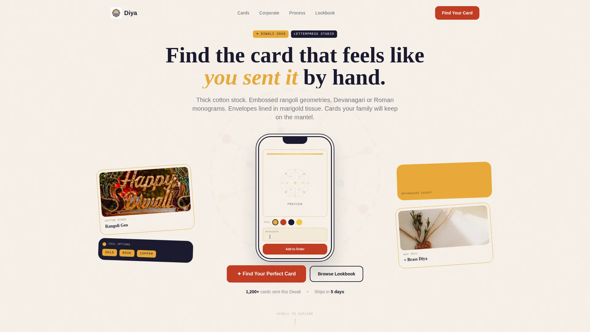
- A hero section with an App Store Preview-style phone frame showing the card customization interface mid-use
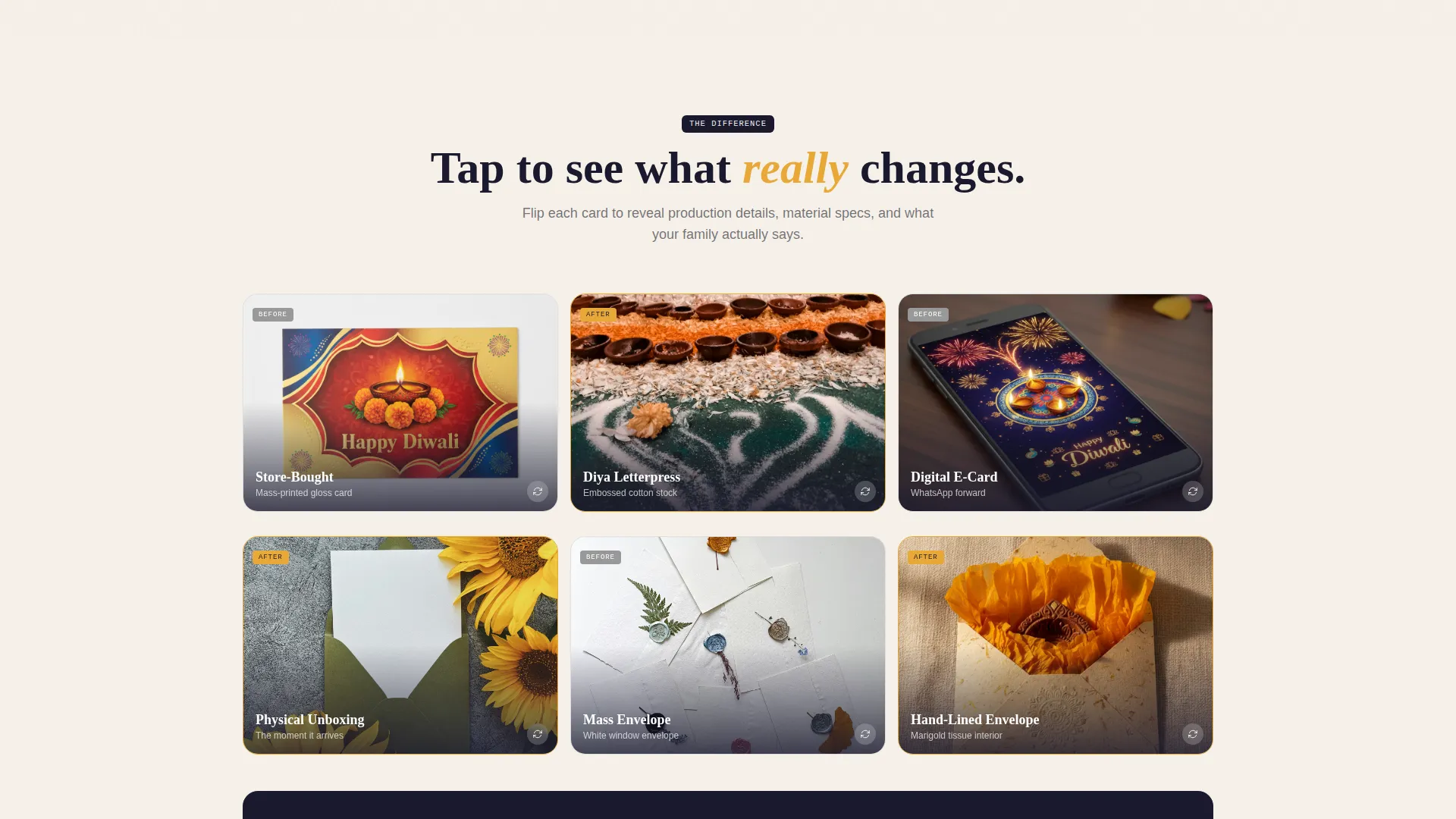
- An interactive Comparison Journey with flip-cell bento grids contrasting store-bought cards against letterpress versions
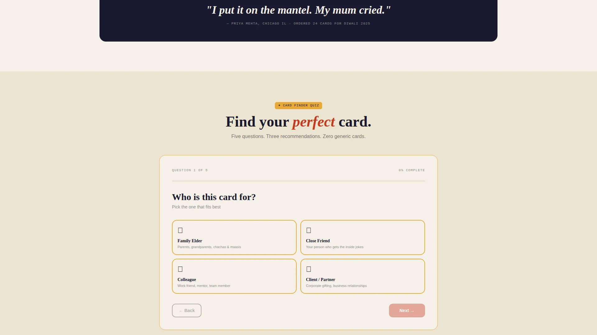
- A five-question visual quiz that delivers three curated card recommendations plus a secondary email capture option
Feature list
This template is built around a set of purposeful, prompt-backed components that work together to move a craft-stationery shopper from curiosity to order.
Bento Grid Page Layout
The entire page is structured as a responsive bento grid. Cells resize and reorder as the visitor scrolls deeper, growing denser and more colorful to mirror the visual abundance of a Diwali celebration.
App Store Preview Hero Header
The header centers a phone-shaped frame showing the card customization interface mid-use. A half-finished rangoli motif, a floating foil color picker, and a Devanagari name being typed into the monogram field are all visible. Flat-lay photographs of finished cards, wax seals, and brass diya props are scattered at playful angles around the device.
Interactive Comparison Cells
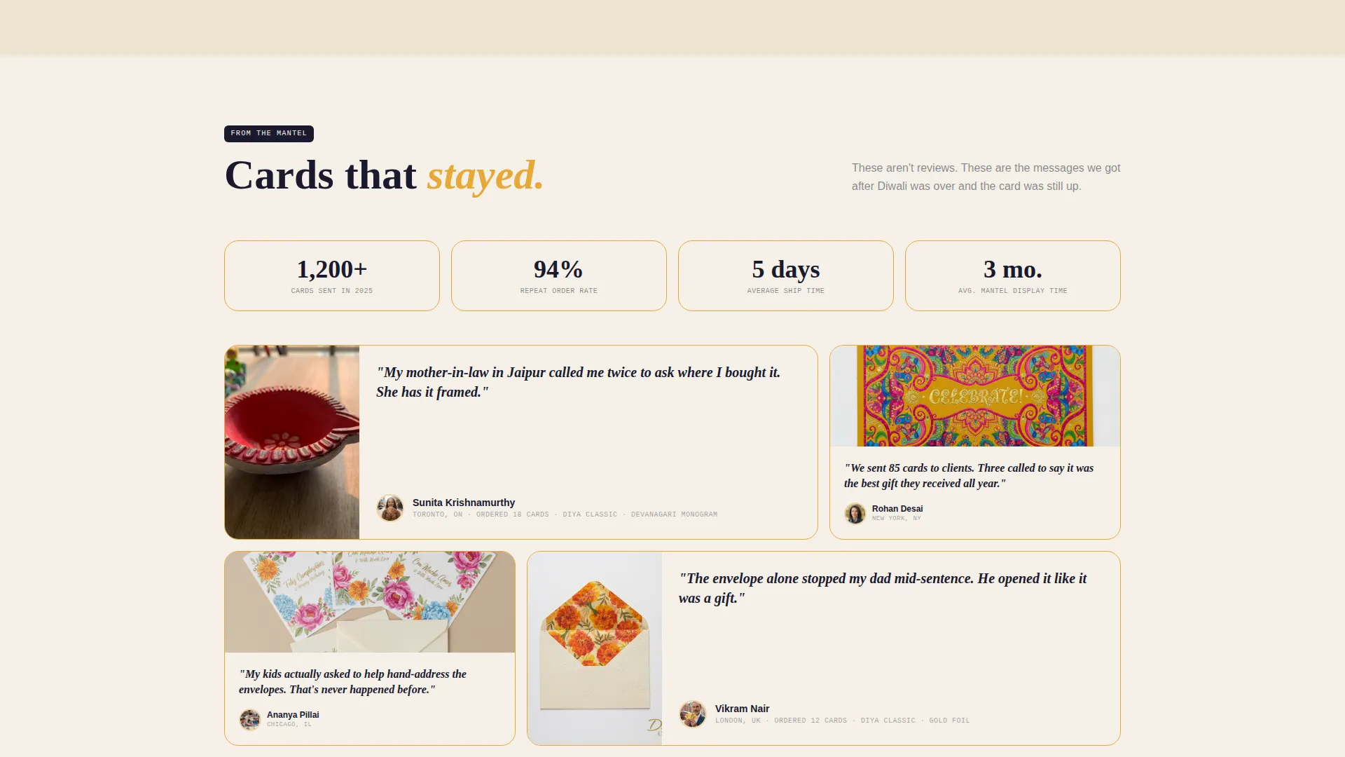
Side-by-side bento cells place generic store-bought Diwali cards against the studio's letterpress versions. Tapping either side flips the cell to reveal production details, material close-ups, or a customer photo of the card on a mantel. The grid reshuffles at each scroll checkpoint.
Five-Question Visual Card Quiz
The primary conversion driver is a five-question quiz launched by the "Find Your Perfect Card" call to action. Each question uses tappable illustrated bento tiles instead of plain text answers. Questions cover recipient type, visual vibe, foil preference, script choice, and order quantity.
Curated Quiz Results Screen
Quiz results surface three card recommendations tailored to the visitor's answers. Each recommendation card carries a "Customize and Order" button. A secondary prompt invites visitors who are still browsing to download a free Diwali Stationery Lookbook in exchange for their email address.
Typewriter Headline Animation
The hero headline types in progressively, mimicking a handwritten inscription being placed on a card. The effect reinforces the handmade, personal tone of the brand before a visitor reads a single product description.
Page sections overview
| Section | Purpose |
|---|---|
| Hero header | Showcases card customization interface inside a phone-shaped device frame |
| Scattered flat-lays | Surrounds the device with finished card photography and prop styling |
| Typewriter headline | Delivers the brand's core promise in an animated, inscription-style format |
| Comparison grid intro | Introduces the side-by-side contrast between generic and letterpress cards |
| Flip comparison cells | Lets visitors tap to reveal production details, materials, and customer photos |
| Quiz launch section | Presents the "Find Your Perfect Card" primary call-to-action button |
| Visual quiz flow | Guides visitors through five illustrated, tappable question tiles |
| Quiz results screen | Displays three curated card picks with individual order buttons |
| Lookbook capture | Offers a free Diwali Stationery Lookbook download in exchange for an email |
Design & branding system
The visual identity follows a Playful Geometric theme built on an Ink and Paper color system. Every color choice is grounded in the sensory world of a calligrapher's desk: warm handmade sheets, ink-stained brass nibs, and festival pigment pressed into parchment grain.
- Core palette: unbleached cotton white (#F5F0E8) for backgrounds, fresh fountain-pen ink navy (#1A1A2E) for body text and structural lines, turmeric gold (#E8A838) for bento cell borders and hover states, and deep kumkum vermillion (#C23B22) reserved exclusively for call-to-action buttons and active quiz selections
- Rangoli-inspired geometric motifs appear on card faces and as decorative elements within bento cells, reinforcing the workshop's embossing and letterpress craft
- Flat-lay photography of cotton stock cards, marigold tissue-lined envelopes, wax seals, and brass diya props provides tactile visual context across the grid
Mobile & speed optimization
The bento grid layout is designed to reflow cleanly across screen sizes. Quiz tiles are built as large tappable targets, which suits thumb-driven navigation on a mobile device.
- The phone-shaped hero frame is a native mobile metaphor, making the header feel immediately at home on a smartphone screen
- Each quiz question renders as a full-width illustrated tile on small screens, keeping choices readable without zooming
- Comparison cells stack vertically on mobile so the flip interaction remains accessible on touch screens
How this template helps you convert
The page is structured so that every scroll step reduces hesitation and moves the visitor closer to a decision. Passive browsers have a low-commitment exit ramp through the Lookbook email capture, while ready buyers are funneled directly to a curated order screen.
- The visual quiz replaces decision paralysis with a guided, playful experience that ends in a personalized recommendation rather than a full catalog browse
- Comparison cells do the persuasion work by showing the material and emotional gap between a generic card and a handcrafted letterpress piece, turning a vague "maybe" into a clear preference
- The secondary Lookbook capture ensures that visitors who leave without ordering are not lost entirely, giving the brand a warm email contact for follow-up
Other information about this template
This template sits within the Retail and E-Commerce category, specifically aligned with Diwali Business use cases. It is suited to any premium, occasion-driven stationery brand that needs to communicate craft quality and cultural specificity on a single landing page.
- The template supports custom monogram fields for both Devanagari and Roman script, reflecting the bilingual needs of the target audience
- Corporate gifting use cases are addressed through the quiz's "How many do you need?" question, making bulk order intent visible early
- The Playful Geometric theme and Masonry-style bento grid structure give the page a high visual density that suits festive, occasion-led product launches
- The template style is classified as a Masonry and Pinterest-inspired bento grid, which scales well for product-heavy stationery ranges beyond the Diwali season
Theme
Playful Geometric
Creative direction
Comparison Journey
Color system
Dopamine Pop
Style
Masonry/Pinterest
Direction
Upsell/Upgrade
Page Sections
Bento Grid Page Layout
App Store Preview Hero Header
Interactive Comparison Flip Cells
Five-question Visual Card Quiz
Curated Quiz Results with Email Capture
Typewriter Headline Animation
Related questions
Can I use this template for festive stationery occasions beyond Diwali?
Does the visual quiz connect to a live product database automatically?
How does the Lookbook email capture section work?
Are the comparison flip cells touch-friendly on mobile devices?
Can I edit the quiz questions to match my own card collection?



