Visa Tracking | Free Website Template | Rocket
Docket is a visa tracking landing page template built for immigration paralegals, HR mobility managers, and solo applicants. It uses a zigzag Problem→Solution layout, a departure-board color system, and a freemium conversion flow to turn scattered case chaos into a clear, living timeline that readers understand in seconds.
by Rocket studio
Quick summary
Docket is a single-page landing page template for visa tracking software. It pairs a giant centered headline with a zigzagging Problem→Solution scroll, guiding visitors from inbox overload and missed deadlines to a unified, color-coded case dashboard. The design feels calm and authoritative, engineered to earn a free trial signup before asking for a single extra detail.
Who this template is for
This template is built for teams and individuals who manage visa applications at any scale. If your work involves tracking cases, chasing deadlines, or explaining immigration status to stakeholders, this layout speaks directly to you.
- Immigration paralegals handling forty or more active cases at once
- HR mobility managers relocating employees across multiple countries
- Solo applicants navigating their first visa process with no prior experience
What problem this template solves
Visa tracking is notoriously fragmented. Status updates live in email threads, deadlines hide in spreadsheets, and embassy portals offer no clear picture of where a case actually stands. This template addresses that chaos head-on.
- Scattered PDFs and documents with no single source of truth
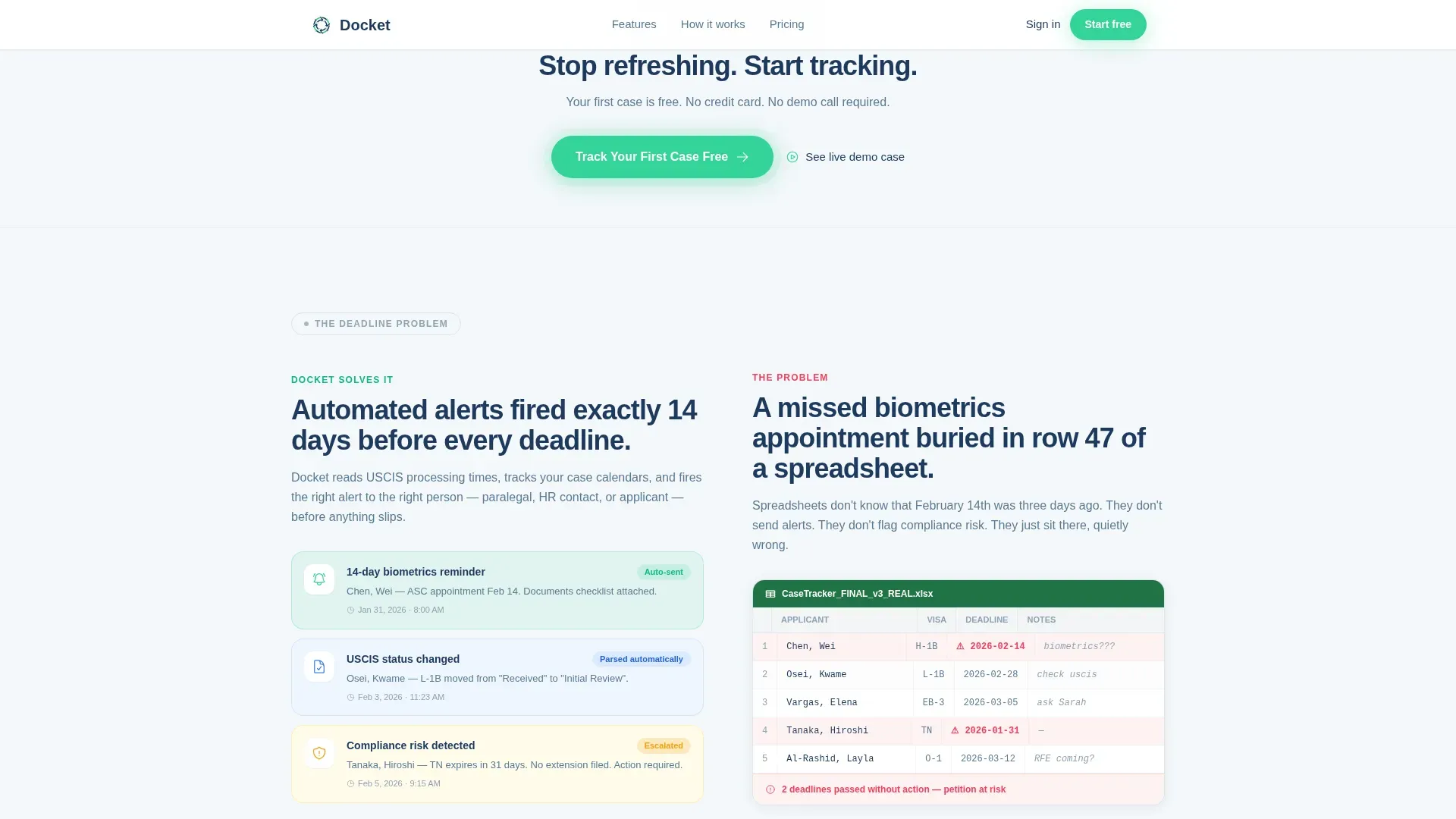
- Missed biometrics or expiry deadlines buried across multiple tools
- Compliance risk growing as caseloads scale beyond manual tracking capacity
What you get with this template
You get a fully structured landing page template that walks visitors through real pain points and then resolves each one with a product answer. Every section is ready to populate with your copy, colors, and case data.
- A hero section with a giant centered headline and a pulsing clearance-green call-to-action button
- Three zigzag Problem→Solution pairs covering inbox chaos, missed deadlines, and compliance risk
- A progressive signup modal flow and a live demo sandbox link for trust-first conversion
Feature list
This template is built around six core design and functional capabilities drawn directly from the project brief.
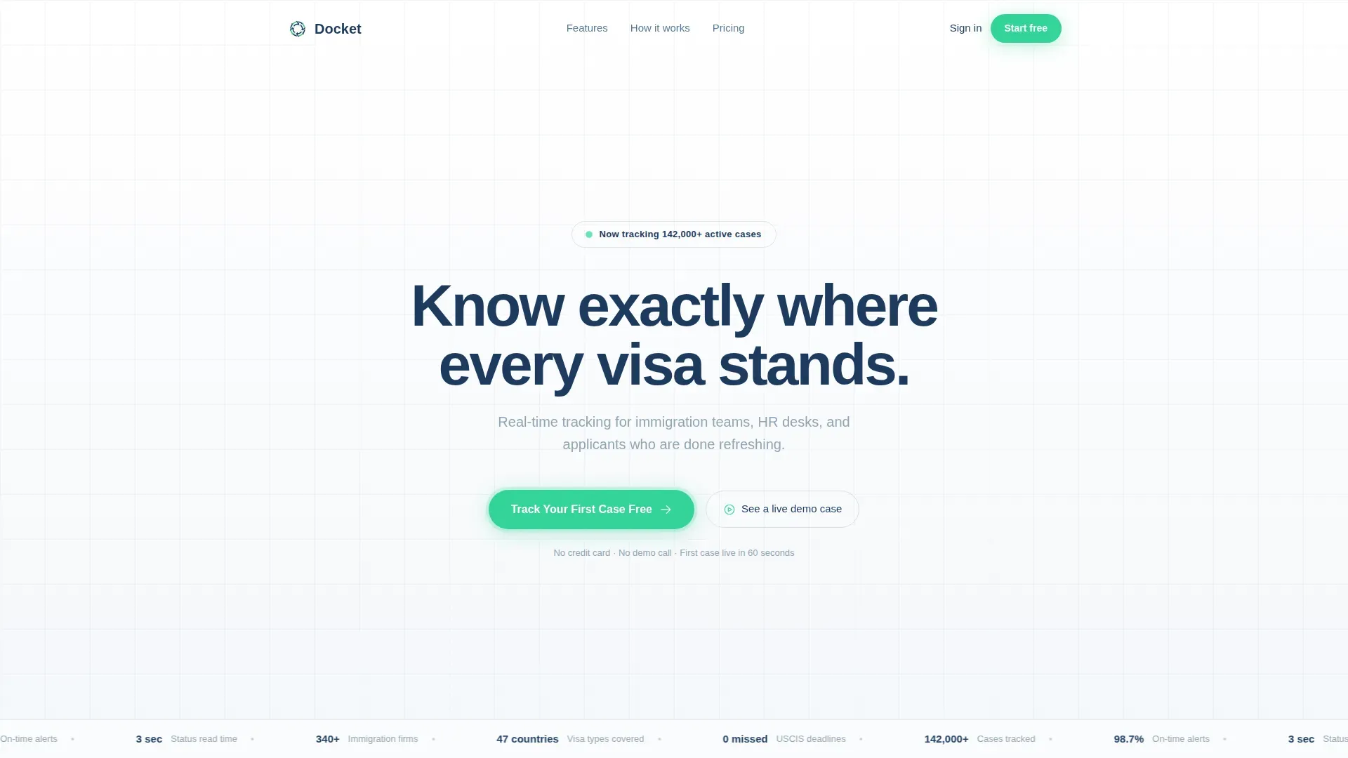
Giant Centered Hero Headline
The hero opens with edge-to-edge white space and a single stratosphere-blue headline at 80px or larger. No hero image competes for attention. The emptiness itself communicates the clarity the product delivers, and a pulsing clearance-green button sits directly beneath.
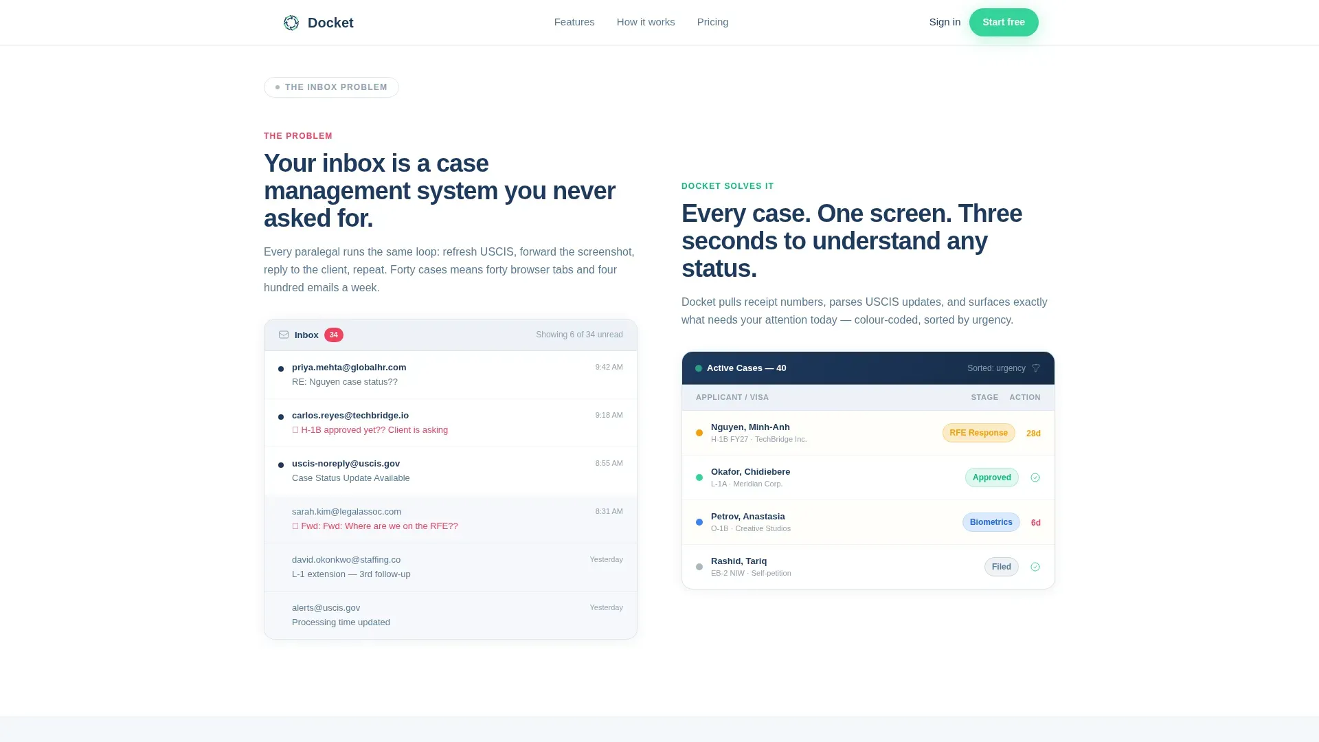
Zigzag Problem→Solution Layout
Three alternating content pairs escalate the stakes from inconvenience to compliance risk. Each left block presents a real user pain point. Each right block answers with a specific product capability. The scroll feels like watching a tangled process resolve into one clean thread.
Progressive Freemium Signup Flow
The primary call-to-action asks only for an email on first click. A follow-up modal then collects first name, team size, and primary visa type tracked. This staged approach reduces friction and increases the likelihood that a visitor completes signup.
Live Demo Sandbox Link
A secondary conversion path labeled "See a live demo case" opens an interactive sandbox with a sample H-1B timeline. No signup is required to access it. This lets skeptical visitors experience the product before committing any personal information.
Color-Coded Status Indicators
Clearance green is used on status badges, indicators, and call-to-action buttons throughout the page. The color system mirrors a departure board: calm, readable, and engineered so the eye finds critical status information without scanning twice.
Scroll-Triggered Animation System
Staggered scroll reveals and zigzag entrance animations bring each section in progressively as the visitor moves down the page. The pulsing call-to-action button reinforces urgency without interrupting the reading flow.
Page sections overview
| Section | Purpose |
|---|---|
| Hero Headline | Establish clarity and launch primary call-to-action |
| Zigzag Pair 1 | Contrast inbox chaos with unified case dashboard |
| Call-to-Action Strip | Repeat "Track Your First Case Free" prompt |
| Zigzag Pair 2 | Contrast missed deadlines with automated alerts |
| Zigzag Pair 3 | Contrast compliance risk with integrations and analytics |
| Footer | Single-row linear links and brand close |
Design & branding system
The visual identity follows a Directory & Discovery theme using the Cloud Canvas color system. Every color choice serves a functional purpose, making the page feel like a perfectly clear international departure board.
- Cloud white (#F4F7FA) as the primary background, stratosphere blue (#1E3A5F) for headlines and body text, and contrail silver (#C9D6DF) for dividers and secondary surfaces
- Clearance green (#34D399) reserved exclusively for status indicators and call-to-action buttons to direct the eye without noise
- DM Sans for headlines and Manrope for body text, delivering a clean, authoritative typographic pairing
Mobile & speed optimization
The template is desktop-first by design, reflecting the primary audience of paralegals and HR professionals working at workstations. It is built to be fully responsive so mobile visitors still receive a clean, readable experience.
- Server Components handle static hero and zigzag sections to keep initial load lean
- Client-side components are scoped only to the modal, sandbox link, and scroll animations
- The progressive modal collects minimal data on first interaction, keeping the mobile form experience light and fast
How this template helps you convert
The entire page is structured to earn trust before asking for commitment. Every design and layout decision serves the freemium conversion goal.
- The hero call to action appears immediately beneath the headline, then repeats after every second zigzag pair, keeping the offer visible without overwhelming the visitor.
- The live demo sandbox removes the biggest barrier to signup: uncertainty about whether the product actually works for the visitor's use case.
- The progressive modal reduces perceived form length, collecting just an email first and expanding only after the visitor has already committed to that first step.
Other information about this template
This template is categorized under HR & Hiring, specifically within the Immigration & Global Mobility subcategory. It is designed for visa tracking software products operating on a freemium or free-trial acquisition model.
- The template style is Zigzag/Alternating with a Problem→Solution Arc creative direction
- Inline social proof metrics covering cases tracked, time saved, and firms using the product are included as placeholder content blocks
- The footer follows a Pattern 1 Linear Single-Row layout for a clean, uncluttered close
- Localization defaults are set to English, US date format, and USD currency references
Theme
Directory & Discovery
Creative direction
Problem→Solution Arc
Color system
Cloud Canvas
Style
Zigzag/Alternating
Direction
Freemium/Trial
Page Sections
Giant Centered Hero Headline
Zigzag Problem→solution Pairs
Progressive Freemium Signup Modal
No-signup Live Demo Sandbox
Clearance-green Status Indicators
Scroll-triggered Animation System
Related questions
Who is this landing page template designed for?
Do I need design experience to customize this template?
What conversion strategy does this template use?
Can this template support different visa types or team sizes?
What animations and interactive elements are included?


