Martial Arts School Marketing Complete Booking Website Template
Dojo is a split-screen martial arts landing page built for neighborhood schools that need to convert late-night local searches into booked first classes. It pairs a magazine-quiet editorial aesthetic with a community-driven testimonial mosaic and a three-step inline booking form, turning real student voices into the school's most persuasive argument.
by Rocket studio
Quick summary
Dojo is a single-page, split-screen landing page template built for martial arts schools competing in local search. It combines an editorial serif manifesto header, a scrolling testimonial mosaic, and a frictionless three-step booking form. The design is calm, authoritative, and community-voiced, built to earn trust before asking for a commitment.
Who this template is for
This template is built for martial arts school owners and operators who want a professional local presence without a generic gym-website feel. It suits anyone running a neighborhood dojo that teaches children, teenagers, or adults.
- Martial arts school owners targeting parents searching for kids' programs nearby
- Adult programs and teen classes looking to attract non-traditional fitness seekers
- Local dojos that rely on community trust and word-of-mouth to fill class schedules
What problem this template solves
Most martial arts school pages either look like outdated sports directories or generic fitness sites. Neither earns trust from a parent making a late-night decision about their child's safety. This template solves the credibility gap through design restraint and community-sourced social proof.
- Visitors arrive skeptical; real neighbor testimonials replace hollow marketing claims
- Parents need to act quickly; a clear booking flow removes every point of hesitation
- Local search traffic needs local signals; neighborhood tags on every testimonial feed that intent naturally
What you get with this template
You get a fully structured, single-page landing page with every section laid out and ready to customize. The layout handles the editorial tone, the social proof architecture, and the booking flow, all in one contained page.
- A split-screen quote-and-photograph header that commands attention immediately
- A scrolling testimonial mosaic with neighborhood tags, photo fragments, and pull-quote styling
- A three-step inline booking form with program selection, a visual weekly calendar, and a secondary SMS contact path
Feature list
A paragraph introduces each feature below, describing how it contributes to the page's purpose.
Split-Screen Quote and Manifesto Header
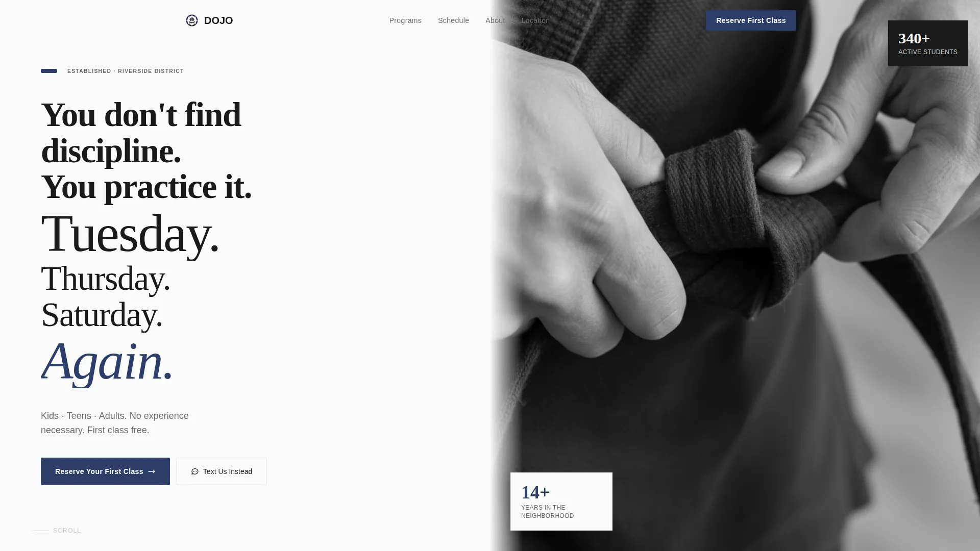
The header divides the viewport evenly. The left side holds a stacked editorial serif manifesto, short, rhythmic lines that feel more like a poem than a headline. The right side displays a high-contrast black-and-white photograph cropped tightly on two hands tying a belt knot. No face, no logo, just the gesture. The composition creates instant emotional authority.
Testimonial Mosaic Layout
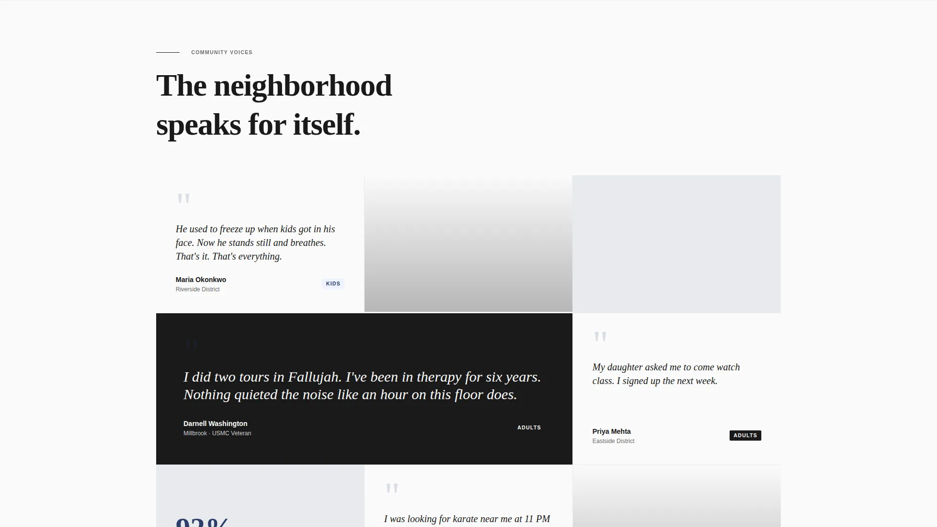
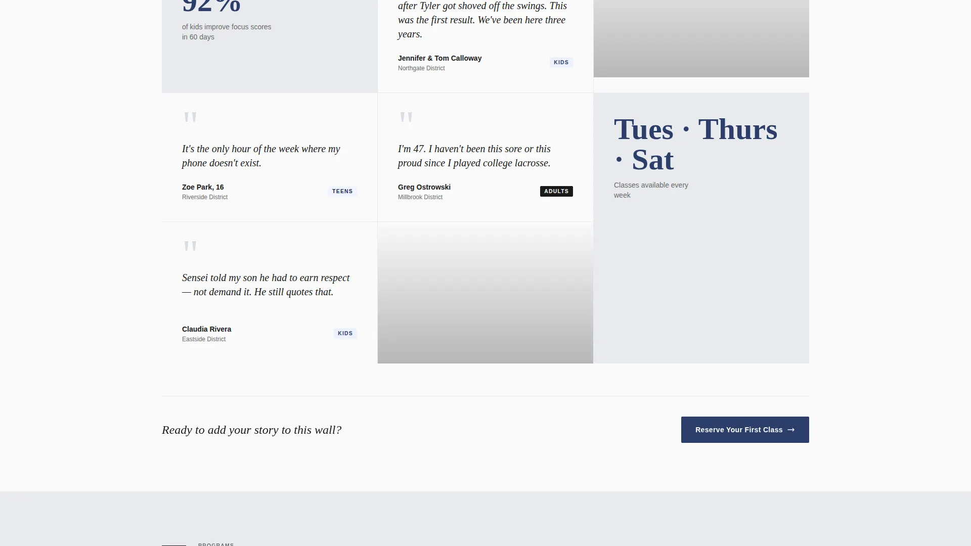
Testimonials are arranged in a scrolling editorial grid rather than a flat carousel. A mother's three-line review sits beside a cropped image of small feet in a fighting stance. A retired Marine's paragraph anchors a full-width band. A teenager's one-sentence quote floats next to a class schedule card. Each testimonial is tagged with a neighborhood name and program type, building local relevance and social proof together.
Three-Step Inline Booking Form
The primary booking flow is embedded directly on the page. Step one lets the visitor select a program: Kids, Teens, or Adults. Step two shows a visual weekly calendar with real open slots. Step three collects name, phone number, and child's age when applicable. The form never requires a page reload or a separate booking portal.
Persistent Mobile Booking Bar
On mobile devices, a slim bottom bar stays fixed as the visitor scrolls. The "Reserve Your First Class" call-to-action button in deep indigo remains visible at all times. This removes the need to hunt for a contact option and reduces the drop-off that happens when mobile visitors lose their place.
SMS Secondary Contact Path
Below the primary form, a "Text Us Instead" link drops a pre-filled SMS message to the school's number. This option is designed for parents who prefer messaging over filling out forms. It keeps the path to contact open for visitors who abandon the form before completing it.
Repeating call to action Placement Strategy
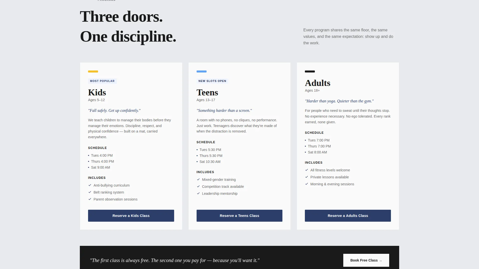
The "Reserve Your First Class" call-to-action button appears after every third testimonial cluster throughout the page. This rhythm keeps the conversion opportunity present without interrupting the mosaic's storytelling flow. Visitors who are ready to book at any point find the prompt right in front of them.
Page sections overview
| Section | Purpose |
|---|---|
| Split-Screen Header | Opens with manifesto quote and belt-tying photograph |
| Testimonial Mosaic Grid | Layers community voices with neighborhood and program tags |
| Full-Width Marine Band | Anchors credibility with a standout long-form testimonial |
| Class Schedule Card | Shows program options inline within the testimonial mosaic |
| Inline Booking Form | Guides visitors through a three-step reservation flow |
| SMS Contact Path | Offers a pre-filled text option as a secondary contact route |
| Fixed Mobile Bar | Keeps the primary call-to-action pinned during mobile scrolling |
Design & branding system
The visual language follows an Editorial Magazine theme built on an Arctic White color system. Every design decision prioritizes restraint over decoration, letting the content carry the weight.
- Color palette: vast negative white (#FAFAFA) for backgrounds, ink-black (#1A1A1A) for typography, pale frost gray (#E8EAED) for card backgrounds and section dividers, and deep indigo (#2C3E6B) reserved for buttons, pull-quotes, and belt-rank iconography
- Typography: oversized editorial serif used for the manifesto header and pull-quotes; body copy remains clean and unhurried to match the broadsheet aesthetic
- Photography style: high-contrast black-and-white imagery, tightly cropped on gestures and details rather than faces or staged group shots
Mobile & speed optimization
The template is structured with mobile visitors in mind. Parents searching "karate near me" at night are most often on a phone, and every layout decision accounts for that context.
- The fixed slim bottom bar keeps the booking call-to-action accessible during the entire mobile scroll session
- The three-step booking form is designed to progress cleanly on small screens without requiring a separate page or modal overlay
- The SMS contact path provides an immediate fallback for mobile visitors who prefer tapping a text link over completing a form
How this template helps you convert
The page is structured so that trust builds before any ask is made. By the time a visitor reaches the booking form, the community has already done the persuading.
- The manifesto header establishes calm authority in the first seconds, creating an emotional tone that makes the school feel serious and intentional rather than promotional
- The testimonial mosaic builds layered social proof from real voices tagged by neighborhood and program, so local visitors see people like themselves before they see a form
- The repeating call-to-action placement and the fixed mobile bar ensure the booking prompt appears at every natural decision point, reducing the distance between intent and action
Other information about this template
This template is part of a category of professional services landing pages designed for local businesses that depend on community trust and neighborhood reputation rather than broad brand advertising.
- The template is well-suited for martial arts styles including karate, judo, taekwondo, Brazilian jiu-jitsu, and mixed disciplines operating from a single neighborhood location
- The neighborhood tagging system on testimonials is specifically designed to support local search intent by associating real student voices with recognizable local areas
- The page style fits a single-location dojo equally well as a small multi-program school operating under one roof
- The overall editorial aesthetic keeps the page evergreen; it does not rely on trends or seasonal visuals that would require frequent redesign
Theme
Editorial Magazine
Creative direction
Testimonial Mosaic
Color system
Arctic White
Style
Split Screen (50/50)
Direction
Booking/Scheduling
Page Sections
Split-screen Manifesto Header
Scrolling Testimonial Mosaic
Three-step Inline Booking Form
Persistent Mobile Booking Bar
SMS Secondary Contact Path
Rhythmic Call to Action Placement
Related questions
Can I customize the testimonials and neighborhood tags for my own school?
Does the booking form connect to a scheduling system automatically?
Can this page work for a school that teaches more than one martial arts style?
Is the SMS contact path easy to update with my school's number?
Do I need to build a separate mobile version of this landing page?



