Student Housing Design Studio Landing Page Template
Dorm is a landing page template built for student housing design studios. It features an animated axonometric room assembly header, a horizontal scroll blueprint explorer with furniture hotspots, and a click-through conversion flow. The template targets university housing directors, co-op boards, and private developers who need to present modular student room solutions with confidence and visual clarity.
by Rocket studio
Quick summary
Dorm is a bold, horizontal scroll landing page template for student housing design studios. It opens with a self-assembling illustrated room, guides visitors through an interactive floorplan, and closes with a real installation photo and a clear call to action. Every section is built to make compact spaces look compelling and earn the consultation click.
Who this template is for
This template is designed for professionals in the student housing and education facility design space. It speaks directly to decision-makers who manage or develop residential spaces for students and need to communicate quality, efficiency, and design intelligence at a glance.
- University housing directors replacing outdated furniture packages
- Student co-operative boards planning communal space makeovers
- Private developers building purpose-built student accommodation
What problem this template solves
Selling modular student room design is hard when your audience cannot picture the transformation. Static brochures fail to show how a folding desk and a lofted bed coexist in 120 square feet. This template solves that visual storytelling gap with interaction and motion.
- Visitors cannot touch or feel the furniture, so the hotspot explorer lets them explore every piece virtually
- Decision-makers need social proof fast, and the impact stats viewport delivers it in one line
- Generic portfolio pages lose clients who need to see real before-and-after results
What you get with this template
You get a fully structured, single-page horizontal scroll experience designed for desktop-first use with a mobile fallback. Every section is purposeful and pre-built, so you can drop in your content and present your studio professionally from day one.
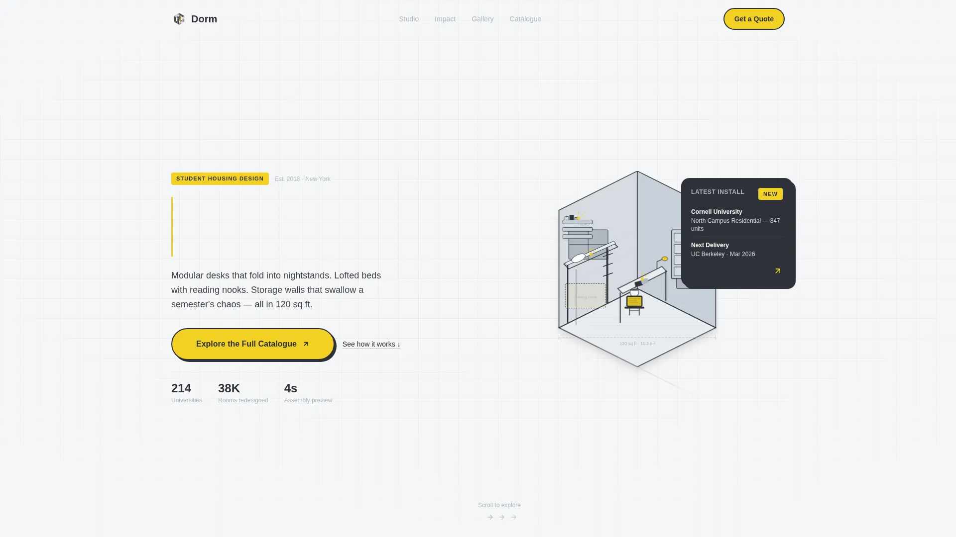
- An animated SVG hero that assembles a student room piece by piece over four seconds
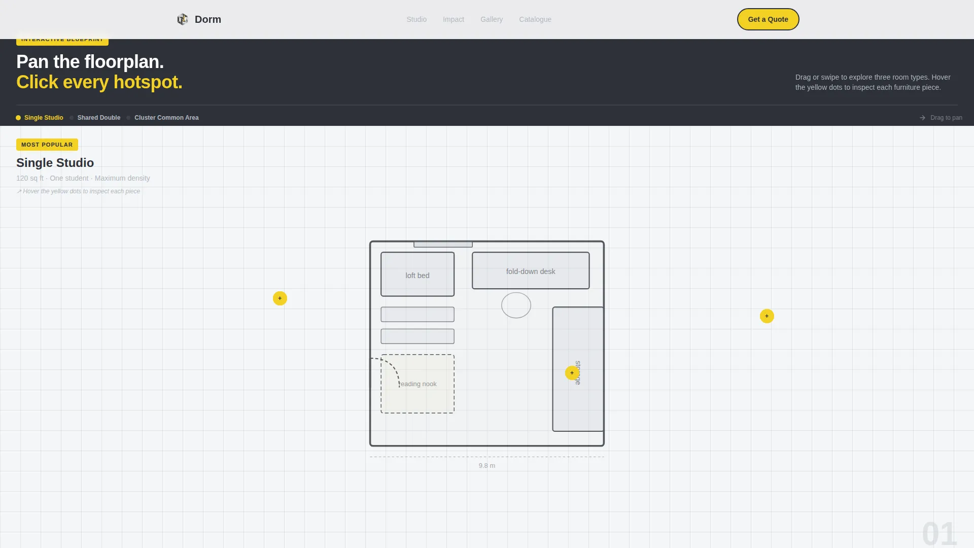
- A scroll-linked blueprint explorer with furniture hotspot pop-out cards showing dimensions, materials, and before/after photos
- A conversion-focused final viewport with a pill-shaped call-to-action button and a secondary consultation link
Feature list
This template combines high interactivity with a tight, structured visual identity. Each feature below is built into the template as described in the source brief.
Animated Room Assembly Header
The hero section opens with a cutaway axonometric drawing that builds itself as the page loads. Walls slide up, the lofted bed drops in, shelves snap into place, and a tiny illustrated student sits down at an unfolding desk. Each furniture piece flashes signal yellow the moment it locks into position. A typewriter headline finishes the sequence: "Every square foot, earning its keep."
Horizontal Scroll Blueprint Explorer
Swiping right moves visitors through a continuous illustrated floorplan that stretches like an unrolled blueprint. Each room type occupies one full viewport width. The experience feels like panning across an architect's desk, with signal yellow hotspots acting as visual breadcrumbs throughout the journey.
Furniture Hotspot Pop-Out Cards
Hovering over any piece of furniture in the blueprint explorer triggers a geometric pop-out card. Each card displays dimensions, material information, and a before/after photo. This gives buyers and housing directors the product detail they need without leaving the page flow.
Impact Stats Viewport
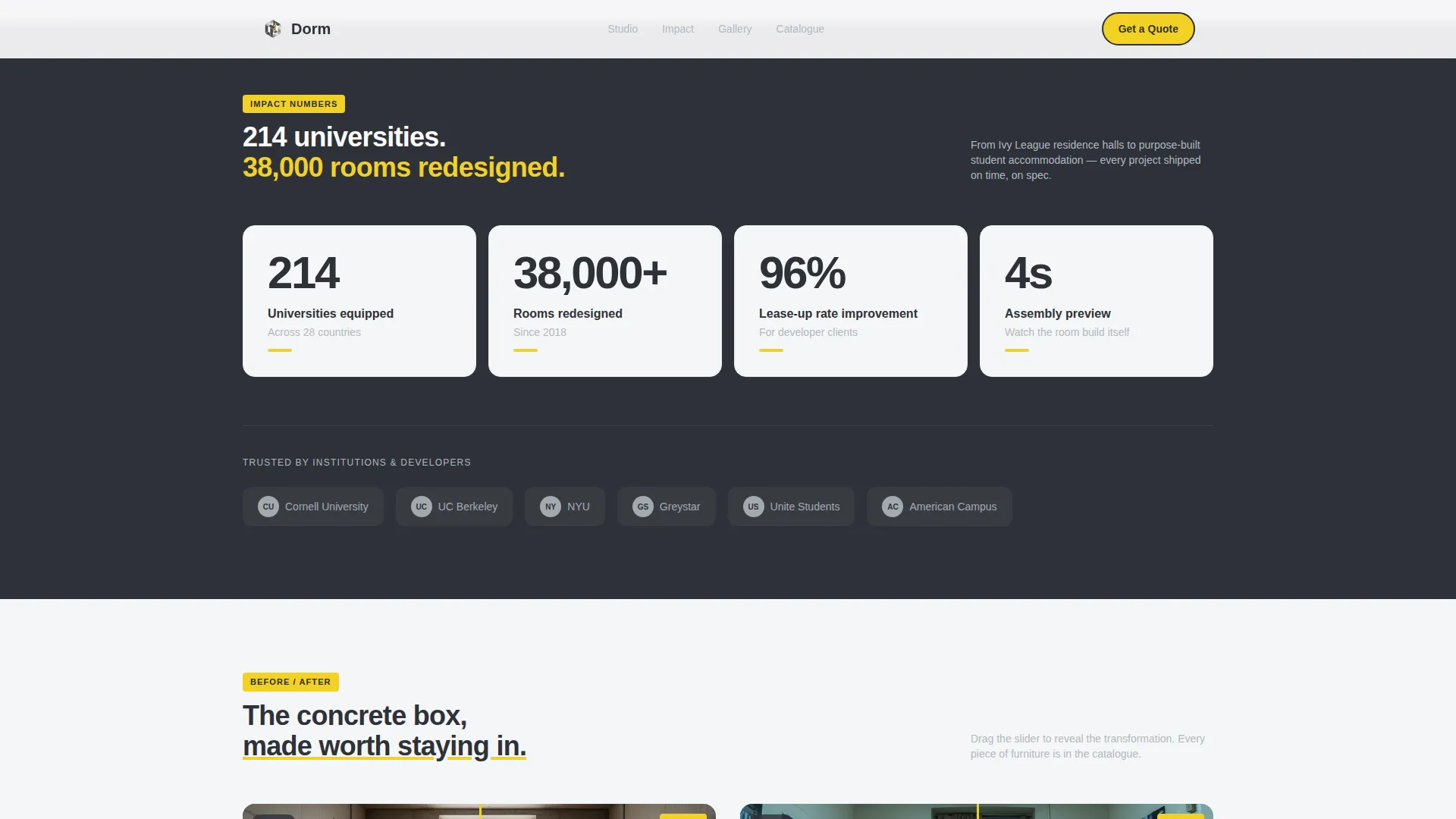
A dedicated section presents the studio's credibility in one punchy statement: 214 universities and 38,000 rooms redesigned. Client type badges sit alongside the stat, giving institutional buyers immediate confidence in the studio's scale and track record.
Transformation Gallery with Before/After Slider
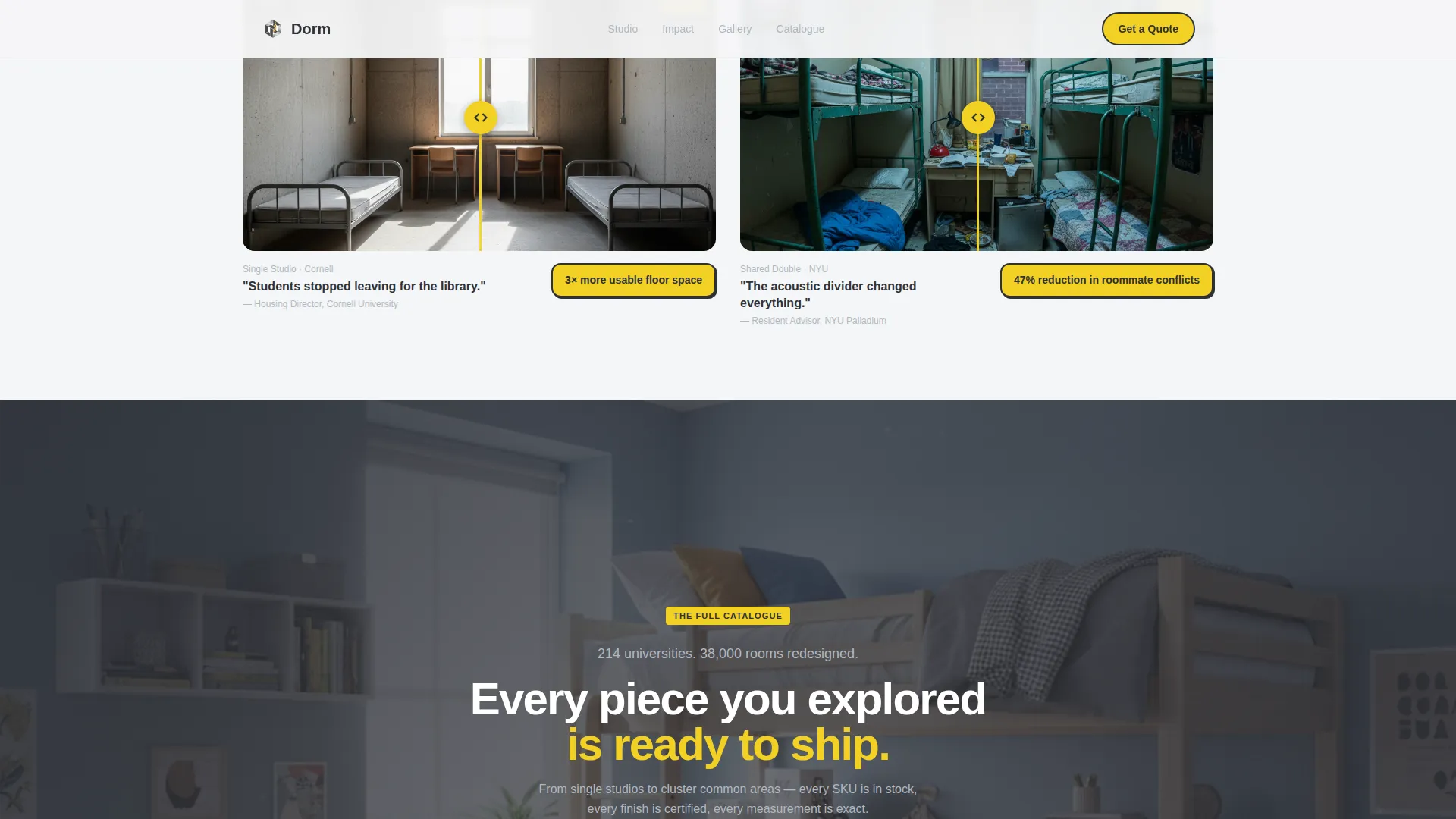
The template includes a before/after photography section that shows real completed installations. Visitors can compare the original room state against the redesigned result, making the value of the modular system immediately visible.
Click-Through Conversion Viewport
The final viewport rotates the illustrated floorplan into a real installation photograph, then presents two calls to action. The primary button reads "Explore the Full Catalogue" in charcoal on a signal yellow pill shape. A secondary text link reads "Request a Campus Consultation" for housing directors ready to discuss scope.
Page sections overview
| Section | Purpose |
|---|---|
| Hero Animation Viewport | Assembles an illustrated student room with SVG animation and a typewriter headline |
| Blueprint Explorer Scroll | Guides visitors through a horizontal illustrated floorplan with room type views |
| Furniture Hotspot Cards | Lets visitors explore dimensions, materials, and before/after photos per furniture piece |
| Impact Stats Bar | Displays social proof stats and client type badges in one focused viewport |
| Transformation Gallery | Shows before/after installation photography with a comparison slider |
| call to action Conversion Viewport | Closes the journey with a catalogue button and a consultation text link |
| Footer Linear Row | Single-row footer with essential studio links and contact information |
Design & branding system
The visual identity follows a Playful Geometric theme built on a Monochrome Steel color palette. The system feels industrial and precise, with one deliberate pop of warmth that keeps the experience from feeling cold.
- Colors: charcoal graphite (#2E3138), brushed aluminum (#B0B8C1), bright rivet silver (#D6DCE1), and signal yellow (#F2D024) reserved strictly for interactive hotspots and hover states
- Typography: Manrope for headers, DM Sans for body copy, both chosen for geometric clarity and legibility at small sizes
- Illustration style: thin, precise steel-gray line art against white, axonometric and blueprint-inspired throughout
Mobile & speed optimization
The template is built desktop-first, with the horizontal scroll experience designed for wide-screen use. A mobile fallback converts the horizontal layout into a vertical flow so the content remains accessible on smaller screens.
- GPU-accelerated transforms power the SVG assembly animation and scroll-linked horizontal pan
- Intersection Observer handles animation triggers, keeping the page responsive as users scroll
- The desktop experience prioritizes the full interactive journey; the mobile layout preserves all content in a readable vertical format
How this template helps you convert
The template is structured as a guided journey, not a static page. Every section builds intent before the call to action appears, so the click feels earned rather than forced.
- The animated hero creates immediate curiosity and sets the quality bar for the studio's design thinking, pulling visitors deeper into the page from the first second.
- The hotspot explorer turns passive browsing into active product interaction, so visitors arrive at the final viewport already familiar with the furniture system.
- The conversion viewport pairs verified social proof (214 universities, 38,000 rooms) with two calls to action that serve different buyer stages, capturing both ready-to-act visitors and those still in scope discussions.
Other information about this template
This template sits within the Architecture and Design category, specifically scoped to the Education Facility Design subcategory and the Student Housing Design niche. It is built as a single landing page with a clear horizontal scroll structure, desktop-first device priority, and English (United States) localization.
- Localization defaults: English (US), USD currency formatting, MM/DD/YYYY date format
- Animation intensity is high, including SVG assembly, typewriter text, and scroll-linked horizontal panning
- Interactivity level is high, with hotspot pop-out cards and a before/after comparison slider built into the flow
- The footer follows a linear single-row pattern, keeping the page exit clean and focused
- This template suits studios presenting modular student furniture systems to institutional and developer clients at any pitch stage
Theme
Playful Geometric
Creative direction
Interactive Explorer
Color system
Monochrome Steel
Style
Horizontal Scroll
Direction
Click-Through
Page Sections
Animated SVG Room Assembly Hero
Horizontal Scroll Blueprint Explorer
Furniture Hotspot Pop-out Cards
Impact Stats and Social Proof Bar
Before/after Transformation Gallery
Click-through Conversion Viewport
Related questions
Who is this landing page template designed for?
Does this template work on mobile devices?
What interactive elements are included in this template?
Can I update the colors and typography to match my studio brand?
How many sections does this landing page template include?