True Crime Podcast Landing Page Template
Dossier is a masonry-style landing page template built for true crime podcast production companies. It pairs a scroll-triggered video header with a living community gallery, an editorial obsidian and gold color system, and a persistent app download bar. The result is a page that feels like opening a cold case file and does not let go until visitors tap "Listen to the Evidence."
by Rocket studio
Quick summary
Dossier is a single-page template designed for serialized true crime audio brands. It opens with a cinematic scroll-triggered video, unfolds into a masonry episode and community grid, and closes every visit with a mobile-first app download prompt. The design channels the quiet tension of a late-night evidence wall, built to turn curious visitors into loyal subscribers.
Who this template is for
This template is made for audio storytellers who work in the true crime space and need a page that matches the weight of their content. It suits independent production houses, podcast networks, and solo hosts who publish serialized case-driven audio.
- True crime podcast production companies releasing episodic, archive-deep content
- Independent audio producers who want a community gallery alongside their episode catalog
- Podcast brands driving listeners toward an app download rather than a browser player
What problem this template solves
Most podcast landing pages look like a streaming embed dropped onto a blank background. They give visitors no reason to stay, no sense of the world behind the show, and no clear path to a download. Dossier solves that gap directly.
- Listeners arrive with curiosity but leave without acting because there is no engaging entry point
- Episode archives feel flat and passive without community context or listener ratings
- Mobile visitors miss the download prompt because it is buried in a footer rather than surfaced as a persistent call to action
What you get with this template
You get a fully designed single-page layout that covers every stage of the listener journey, from first impression to app install. Every section is purpose-built for the true crime audio format.
- A scroll-triggered cinematic video header with an audio waveform pulse across the lower edge
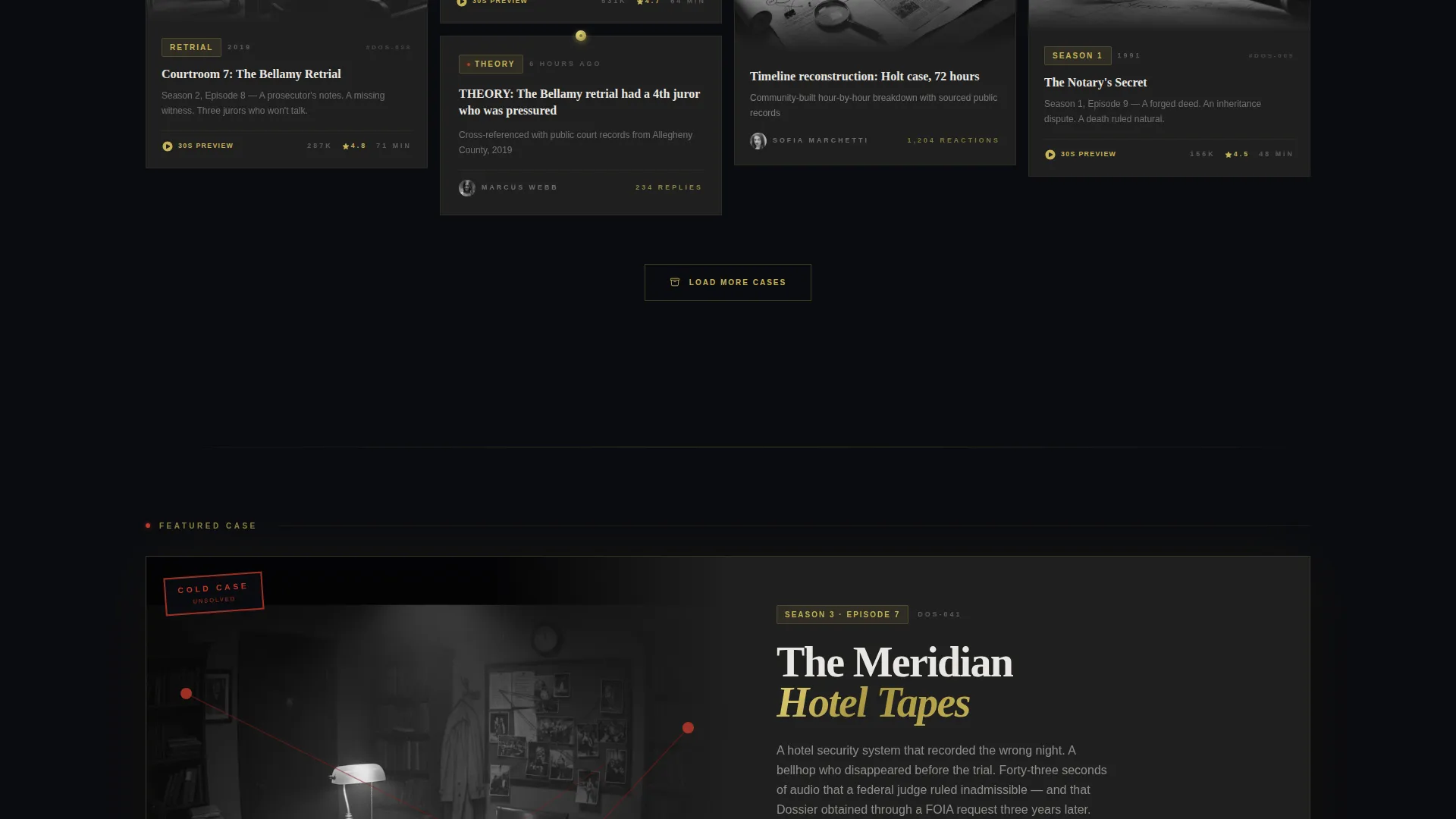
- A masonry community gallery grid with variable card heights, inline audio previews, and featured episode rows
- A persistent mobile app download bar styled as a classified stamp, with App Store, Google Play, and SMS link options
Feature list
This template ships with six distinct design and layout capabilities, each rooted in the source brief and built around the true crime audience experience.
Scroll-Triggered Video Header
The viewport opens completely black and still. One pixel of scroll activates a slow dolly shot pushing into a dimly lit evidence wall covered in pinned photographs, red string, and handwritten notes. Audio waveform lines pulse faintly along the bottom edge as the camera continues forward, dissolving into the masonry grid behind it.
Masonry Community Gallery Grid
Cards vary in height across three types: short quote pulls, medium episode art tiles, and tall community deep-dives. Every third row introduces a featured episode block with an inline audio player and waveform visualization. Scrolling deeper moves visitors backward through the archive, from newest cases to the coldest unsolved files.
Thirty-Second Episode Preview Players
Each masonry card supports a thirty-second cold-open audio clip that plays directly from the grid. Visitors do not need to leave the page or open a separate player to sample the content before committing to a download.
Adaptive App Download Bar
The primary call to action reads "Listen to the Evidence" and floats as a persistent bar at the bottom of the mobile screen. After a visitor samples three episode clips, the bar pulses once and updates its message to "You've opened 3 cases, take them with you," then reveals App Store, Google Play, and an SMS direct-link option.
Evidence Wall Visual Transition
As the scroll-triggered video pushes through the evidence wall, the masonry episode grid materializes behind it. Each card appears as though being tacked to a corkboard, reinforcing the investigative mood and making the episode catalog feel like discovered evidence rather than a content list.
Editorial Magazine Color System
The layout uses a four-tone palette: deep obsidian black for backgrounds and section dividers, case-file manila gold for episode titles and hover states, evidence-tag off-white for body text on dark cards, and redacted-ink charcoal for layered depth in card elements. The result is a visual language that feels like a vintage crime desk under lamplight.
Page sections overview
| Section | Purpose |
|---|---|
| Video header | Scroll-triggered cinematic entry into the evidence wall |
| Waveform pulse bar | Ambient audio signal running below the header video |
| Masonry episode grid | Community gallery of episodes, theories, fan art, and discussions |
| Featured episode rows | Inline audio player and waveform, appearing every third row |
| Persistent call to action bar | Floating app download prompt with adaptive messaging |
| App download modal | Two-button App Store and Google Play choice plus SMS link |
Design & branding system
The color system and typographic choices draw from an editorial magazine tradition filtered through true crime archives. Every visual decision reinforces the sensation of handling a real case file.
- Four-tone palette: obsidian black (#0B0C10), case-file manila gold (#C5B358), evidence-tag off-white (#E8E6E1), and redacted-ink charcoal (#1F1F1F)
- Gold is reserved for episode titles, interactive hover states, and the classified-stamp call to action treatment on the persistent download bar
- Off-white carries all body text on dark cards, keeping readability strong against the obsidian background without breaking the noir atmosphere
Mobile & speed optimization
The template is designed with mobile listeners as the primary visitor type. Commuters and transit users are explicitly part of the target audience, so the mobile layout makes every key action reachable with one thumb.
- The persistent app download bar floats at the bottom of the mobile viewport so the primary call to action is never out of reach
- The SMS direct-link option inside the download modal removes friction for visitors who want to continue on their phone without searching app stores manually
- Masonry card heights are defined to work within a vertical-scroll mobile flow, keeping the community gallery engaging on smaller screens
How this template helps you convert
Dossier is built around a specific conversion path: from passive visitor to active app installer. Every design and interaction choice serves that goal.
- The thirty-second in-grid audio previews let visitors sample content before committing, lowering the barrier to the first meaningful action.
- The adaptive call to action bar changes its message after three samples, creating a personalized moment that makes the download prompt feel earned rather than pushed.
- The evidence wall entry sequence and the deepening archive structure hold attention long enough for casual visitors to become invested listeners before they ever see the download button.
Other information about this template
Dossier works particularly well for production teams that already have an episode back catalog, because the masonry grid rewards depth. The more content available, the more convincingly the page reads as a living investigation board.
- The template style is Masonry and Pinterest-inspired, making it well-suited for content brands that publish frequently and want a visual archive rather than a linear feed
- The community gallery creative direction means listener-submitted content, fan art, and timestamped discussion threads can fill cards alongside official episode tiles
- This template fits within the Media and Entertainment category and the Content Creator Niches subcategory, making it adaptable to other serialized audio formats with strong communities


Theme
Editorial Magazine
Creative direction
Community Gallery
Color system
Obsidian & Gold
Style
Masonry/Pinterest
Direction
App Download
Page Sections
Scroll-triggered Cinematic Video Header
Masonry Community Gallery Grid
In-grid Thirty-second Audio Previews
Adaptive Persistent App Download Bar
Evidence Wall Visual Transition
Editorial Obsidian and Gold Color System
Related questions
Is Dossier a single-page landing page or a multi-page website?
Can I use the masonry grid for episodes only, without community submissions?
How does the adaptive app download bar change its message?
Do I need to supply my own video footage for the header?
What kind of podcast brand benefits most from this template?


