Authentic Trinidadian Restaurant Landing Page Template
The Doubles landing page template is built for authentic Trinidadian restaurants that lead with food and culture. A gallery-driven, scroll-narrative layout moves visitors from golden-hour kitchen photography through a clickable dish menu to a sticky pickup order bar. Warm Stone colors, editorial typography, and a day-in-the-life story make every plate feel personal before a single order is placed.
by Rocket studio
Quick summary
Doubles is a gallery-forward landing page template designed for Trinidadian restaurants. It follows a day-in-the-life scroll rhythm, opening with lifestyle photography and moving through a clickable dish gallery to a sticky "Order for Pickup" call-to-action bar. The design speaks directly to diners who already know what they want and visitors who are about to find out.
Who this template is for
This template works best for restaurant owners who want their food to do the talking. It suits establishments where the cook, the recipe, and the story behind each plate matter as much as the menu price.
- Trinidadian restaurants and Caribbean food businesses selling pickup orders or table reservations online
- Diaspora-focused eateries whose customers crave doubles, roti, stew chicken, and other comfort dishes from home
- Food-forward operators who want a site that converts first-time visitors into regulars
What problem this template solves
Most restaurant pages bury the menu, hide the food behind text blocks, and lose hungry visitors before they reach the order button. This template solves that by leading every section with food photography and a clear path to purchase.
- Visitors arrive on a full-bleed lifestyle shot and immediately feel the warmth of the kitchen
- The gallery presents each dish as a photo card with name, heat level, and price, so decisions happen visually
- A sticky amber "Order for Pickup" bar stays on screen after the first gallery scroll, reducing the steps between appetite and action
What you get with this template
You get a complete single-page layout structured around five core content sections. Every element is tied to a specific job: show the food, tell the story, take the order.
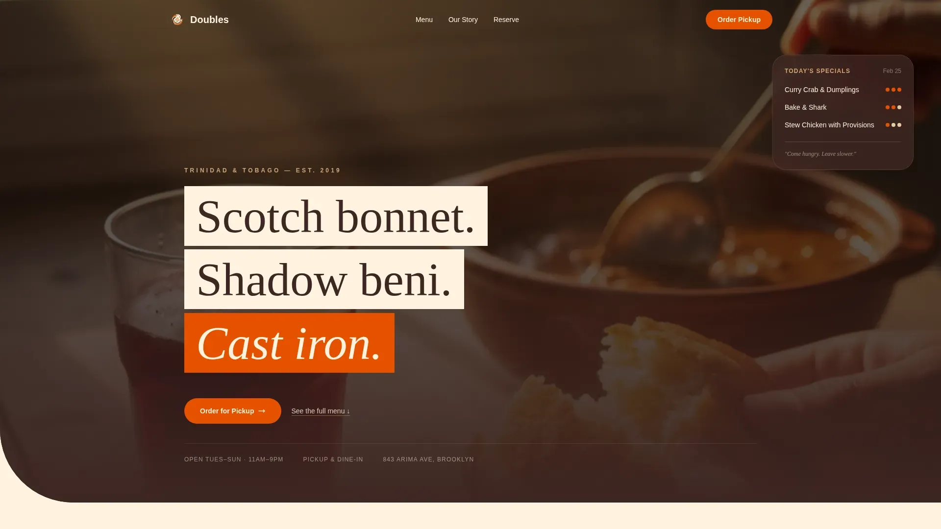
- A cinematic hero section with a golden-hour lifestyle photograph of hands tearing fried bake, a bowl of curry mid-stir, and a glass of sorrel with condensation running down the side
- A full dish gallery with clickable photo cards that open into modal detail views showing the story, ingredients, and price of each plate
- A day-in-the-life narrative section, a sticky pickup order bar, a table reservation path, a restaurant origin story block, and a Pattern 7 footer
Feature list
This template packs a focused set of design and layout features, each rooted in the brief and built around the doubles-and-beyond menu experience.
Cinematic Hero with Lifestyle Photography
The hero is a full-bleed, golden-hour photograph taken from across a weathered wooden table. Depth of field keeps focus on food and hands while the kitchen dissolves into soft bokeh. A parallax scroll effect adds depth as visitors move down the page.
Clickable Dish Gallery with Modal Detail View
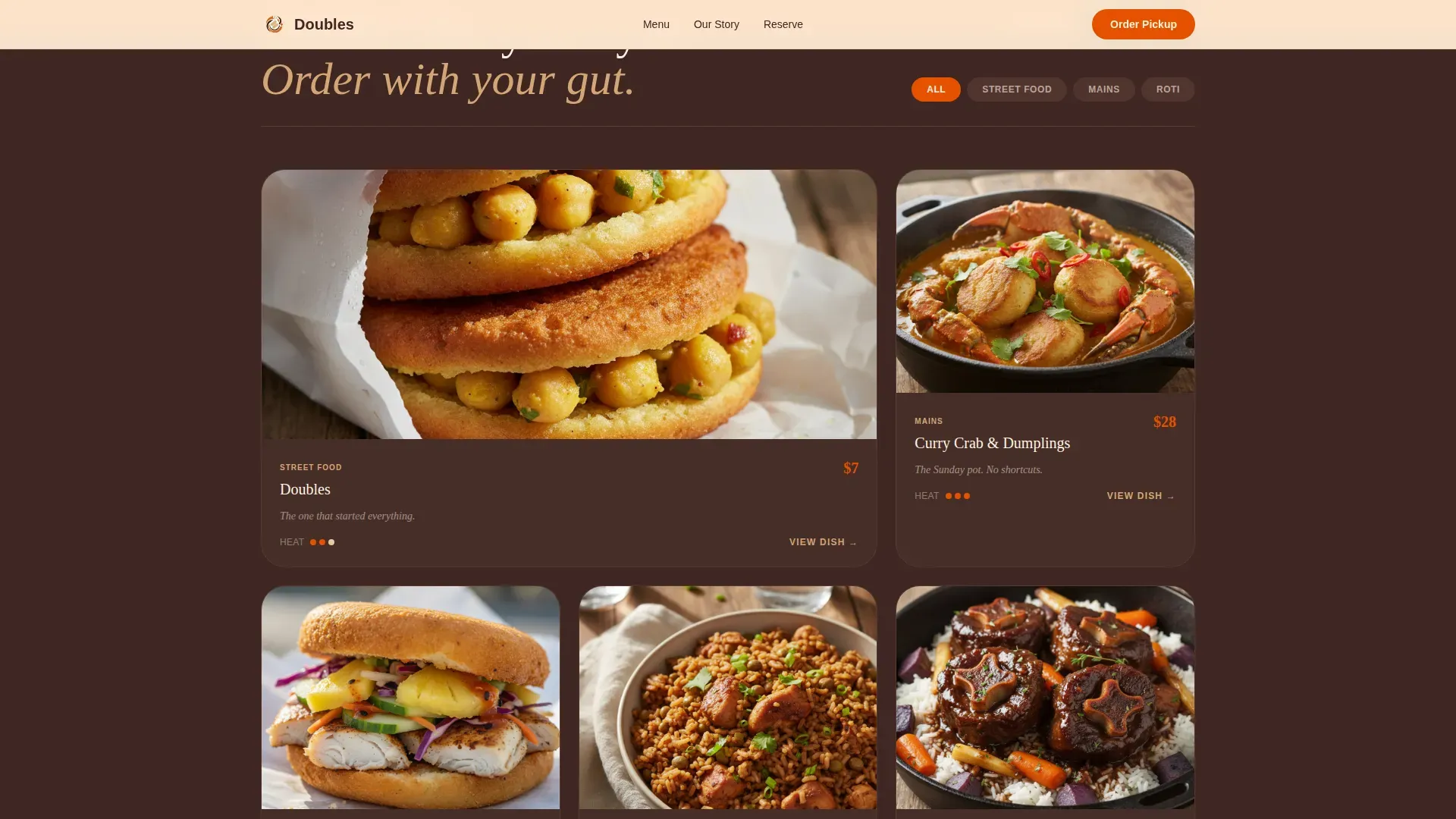
Each dish appears as an overhead photo card showing the name, heat level indicator, and price. Clicking a card opens a modal with the dish story, key ingredients, and an order prompt. The gallery uses a staggered card animation on scroll reveal.
Sticky Pickup Order Bar
After the first gallery scroll, a warm amber bar fades into view and stays pinned at the top. It holds a streamlined menu selector so visitors can choose a dish and move toward pickup without losing their place on the page.
Day-in-the-Life Narrative Scroll
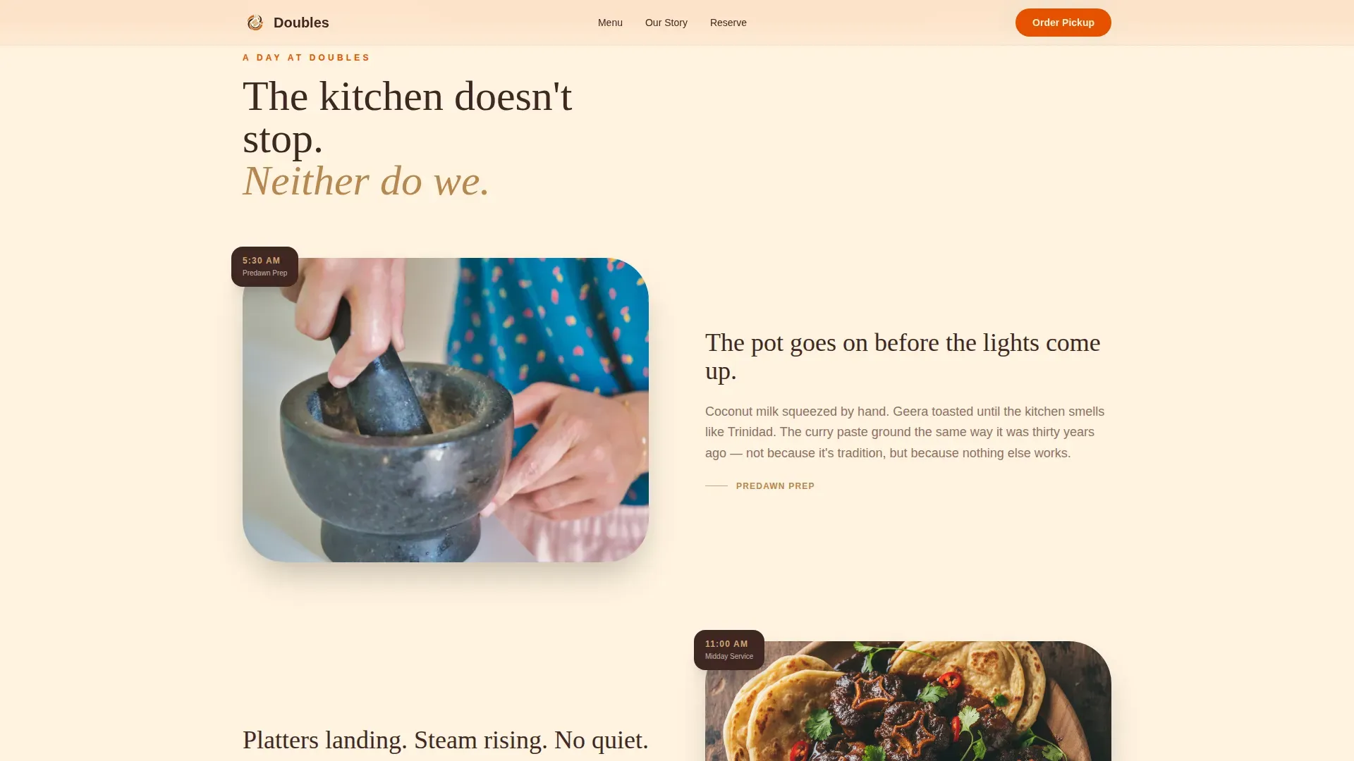
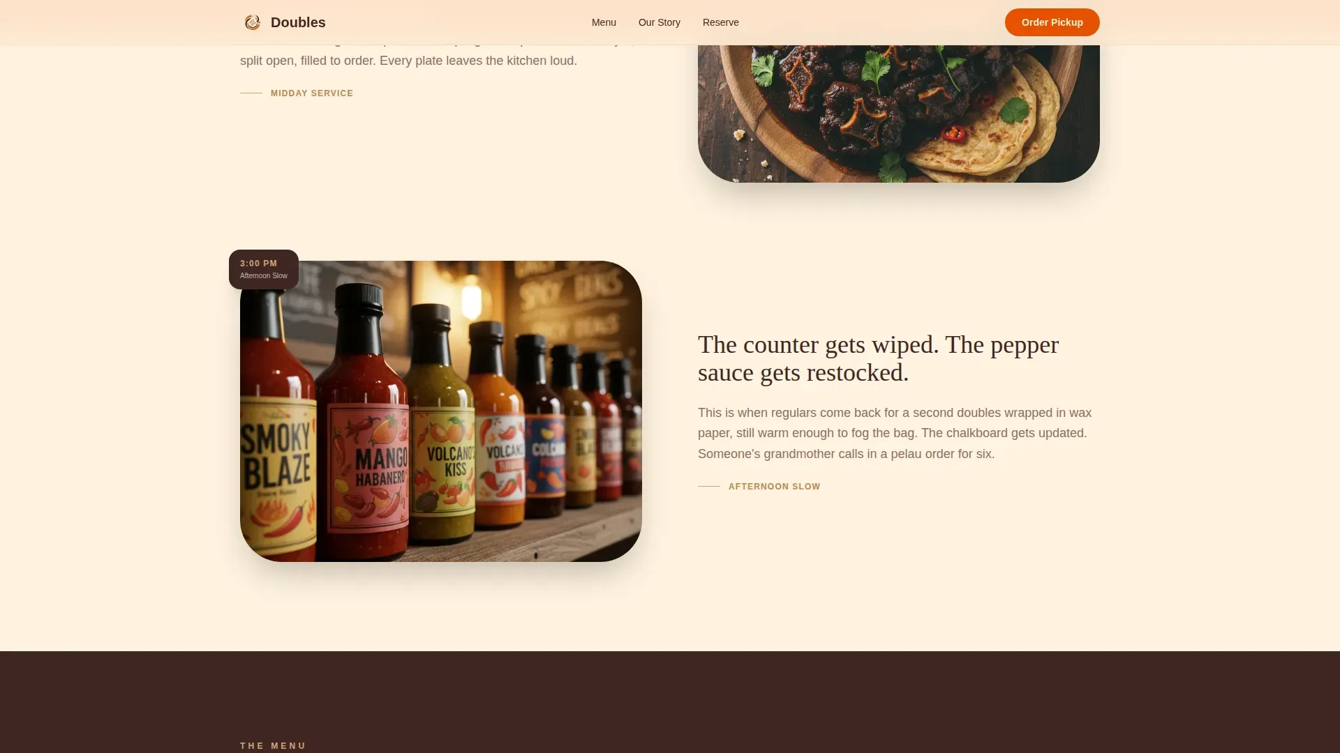
The page follows the restaurant from predawn prep through midday service to afternoon calm. Editorial photography shifts in mood as the visitor scrolls: dim kitchen light early, bright overhead dish shots at midday, and close-up details like pepper sauce bottles and a handwritten chalkboard in the afternoon.
Warm Stone Color System with Scotch Bonnet Accents
Sun-bleached clay, deep cocoa bark, and soft plantain cream form the base palette. Scotch bonnet amber is reserved for buttons, price tags, and hover states, directing the eye exactly where action is needed.
Fraunces and DM Sans Typography Pairing
Fraunces serif headings bring editorial warmth to every dish name and section title. DM Sans handles body copy with clean readability. Together they balance personality and clarity across every plate description and call-to-action label.
Page sections overview
| Section | Purpose |
|---|---|
| Hero lifestyle shot | Opens with golden-hour food photography and sets emotional tone |
| Dish gallery menu | Displays photo cards with heat level, price, and clickable story modals |
| Day-in-life narrative | Scrolls from morning prep to afternoon close with editorial photography |
| Order for pickup | Sticky amber bar with a photo-card menu selector for direct ordering |
| Reserve and story | Table reservation link, restaurant origin story, and chadon beni close-ups |
| Pattern 7 footer | Logo and tagline left, navigation links right |
Design & branding system
The Pastoral Calm visual identity uses a Warm Stone palette that feels like a wooden table worn smooth by years of Sunday lunch. Every color choice is intentional, pulling warmth and appetite from natural textures.
- Palette: sun-bleached clay (#D4A574), deep cocoa bark (#3E2723), soft plantain cream (#FFF3E0), and scotch bonnet amber (#E65100) for all interactive and action elements
- Typography: Fraunces for display headings and dish names, DM Sans for body text and labels, creating an editorial yet approachable reading experience
- Texture cues: corrugated tin roof references in section dividers, warm grain in background tones, and golden-hour light direction carried through the photography art direction
Mobile & speed optimization
This template is built mobile-first because street food ordering happens predominantly on a phone. The layout adapts from desktop gallery grids to single-column mobile cards without losing hierarchy or warmth.
- Hero image loads with priority rendering while gallery cards use lazy loading to keep the initial experience fast
- Smooth scroll behavior and scroll-linked section reveals are handled in CSS, keeping interaction fluid on mobile without heavy scripting
- The sticky pickup bar is designed to remain accessible at the top of the screen on small viewports, keeping the order action always within thumb reach
How this template helps you convert
The gallery does the selling before the order form ever appears. By the time a visitor reaches the pickup bar, they have already chosen with their eyes.
- The hero photograph creates an immediate, appetite-first impression that pulls visitors into the scroll before a single word of copy is read
- Clickable dish cards with heat indicators and prices let visitors self-select, removing friction and making the decision feel personal rather than transactional
- The sticky "Order for Pickup" bar appears at exactly the right scroll moment, keeping the primary call-to-action visible without interrupting the storytelling rhythm
Other information about this template
The doubles authentic trinidadian restaurant landing page template is grounded in the real food culture of Trinidad. Doubles are a beloved street food with deep history. The name comes from the practice of serving two bara together to form a sandwich. Bara are slightly crispy fried dough pillows made from a mixture of flour, salt, turmeric, cumin, yeast, and warm water. You combine the dry ingredients, knead the dough until smooth, cover it with a damp cloth, and let it rest before you divide it and fry thin rounds in hot oil over high heat using a frying pan or heavy pan.
The filling is channa, a spiced chickpea curry. Drained chick peas cook with garlic, onions, curry powder, cumin, turmeric, and a stir of pepper until soft and a bit mushy. The channa filling is the soul of every plate of doubles. Street vendors wrap two bara filled with channa in wax paper, then top it with condiments: tamarind sauce, cucumber chutney, and hot pepper sauce. A sweet tamarind chutney adds depth, while cucumber chutney cools the bite. Hot pepper brings the fire that doubles fans miss when they eat anywhere else.
Trinidadian doubles carry a rich history linked to East Indian indentured laborers who brought these flavors to Trinidad. Today the dish is a point of national pride and a symbol known around the world. It is delicious, cheap, and completely vegan, making it one of the most accessible street food options in the Caribbean.
- The template design draws on these cultural flavors through color, photography direction, and narrative copy structure
- Cilantro and chadon beni (shadow beni) are referenced in the art direction brief, connecting the visual identity to real kitchen ingredients
- Friends sharing a plate of doubles and roti at the restaurant is the social proof story the gallery and narrative sections are designed to tell
Theme
Pastoral Calm
Creative direction
Day-in-the-Life
Color system
Warm Stone
Style
Gallery + Detail
Direction
Direct Sales
Page Sections
Cinematic Hero with Parallax Scroll
Clickable Dish Gallery with Modals
Sticky Pickup Order Bar
Day-in-the-life Narrative Layout
Warm Stone Color and Typography System
Pattern 7 Footer with Logo and Links
Related questions
What types of restaurants suit this template best?
Can I customize the dish gallery to show my own menu?
Does the sticky order bar work on mobile devices?
How does the day-in-the-life narrative section work?
Is there a place on the page to describe the food and its cultural story?



