Transparent Midwife Landing Page Template
A split-screen landing page built for certified nurse-midwife practices that want to earn trust before asking for a booking. The template leads with animated birth statistics, walks visitors through every stage of care in sequential split panels, and drives clicks to a scheduling calendar. No forms, no clutter, just full transparency laid out like a care plan.
by Rocket studio
Quick summary
This is a single-page, click-through landing page for a midwifery practice that pairs expecting families with certified nurse-midwives. It opens with animated data, unfolds the full care journey in sequential split panels, and closes with a persistent booking call to action. Every section is designed to replace confusion with clarity before a visitor ever clicks.
Who this template is for
This template suits midwifery practices that want to attract modern, research-driven clients. It works best when the practice is ready to publish honest numbers and walk visitors through a defined care process.
- First-time parents comparing midwifery to standard OB care and wanting clear answers
- Second-time mothers who have a previous birth experience and want to make an informed change
- Partners researching late at night who need reassurance about availability and on-call access
What problem this template solves
Most midwifery websites bury the practical details that clients most need. Visitors leave without understanding what happens at each prenatal visit, who is in the room during labor, or what the transfer rate actually is. This template solves that by making every step visible.
- First-time visitors feel overwhelmed comparing care models without a clear side-by-side breakdown
- Prospective clients cannot find concrete data like labor-support hours or postpartum visit scope
- People ready to book still hesitate because costs and included services are never listed upfront
What you get with this template
The template delivers a fully structured landing page built around radical transparency. Every panel is designed to answer a question before the visitor thinks to ask it.
- An animated data header that displays live-style birth statistics in a monospaced typeface
- Sequential split panels that walk through each care stage from initial consult to postpartum visit
- A persistent bottom-bar call to action and a secondary email-capture overlay for undecided visitors
Feature list
This template is built around a small set of purposeful, high-impact components that work together to build trust and drive bookings.
Animated Statistics Header
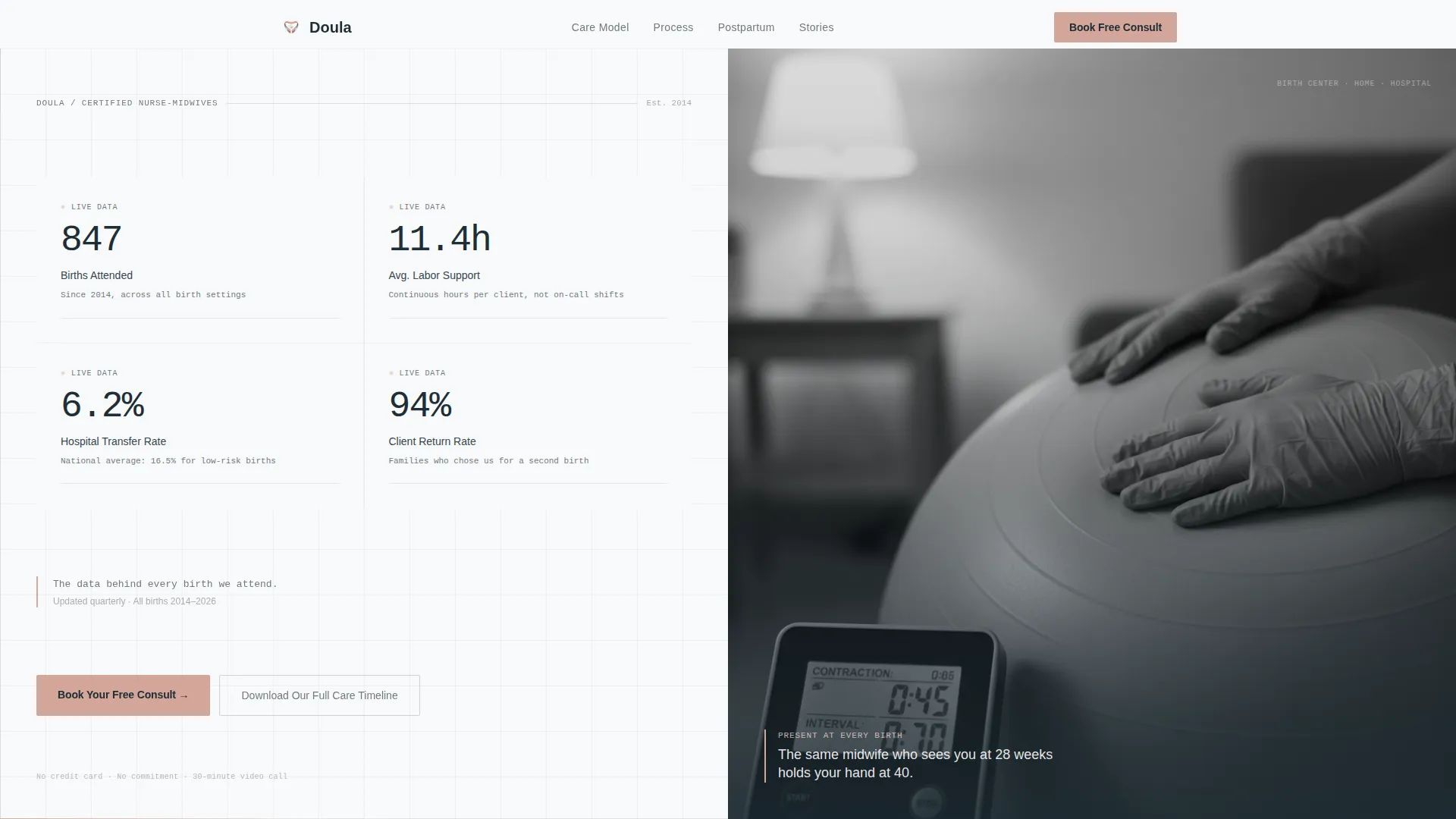
The left panel of the header displays four key practice metrics: births attended, average labor-support hours per client, hospital-transfer rate, and client-return rate. Each number counts up from zero in a clean monospaced typeface, mimicking a vitals monitor coming online. No headline competes with the data.
Sequential Care Journey Panels
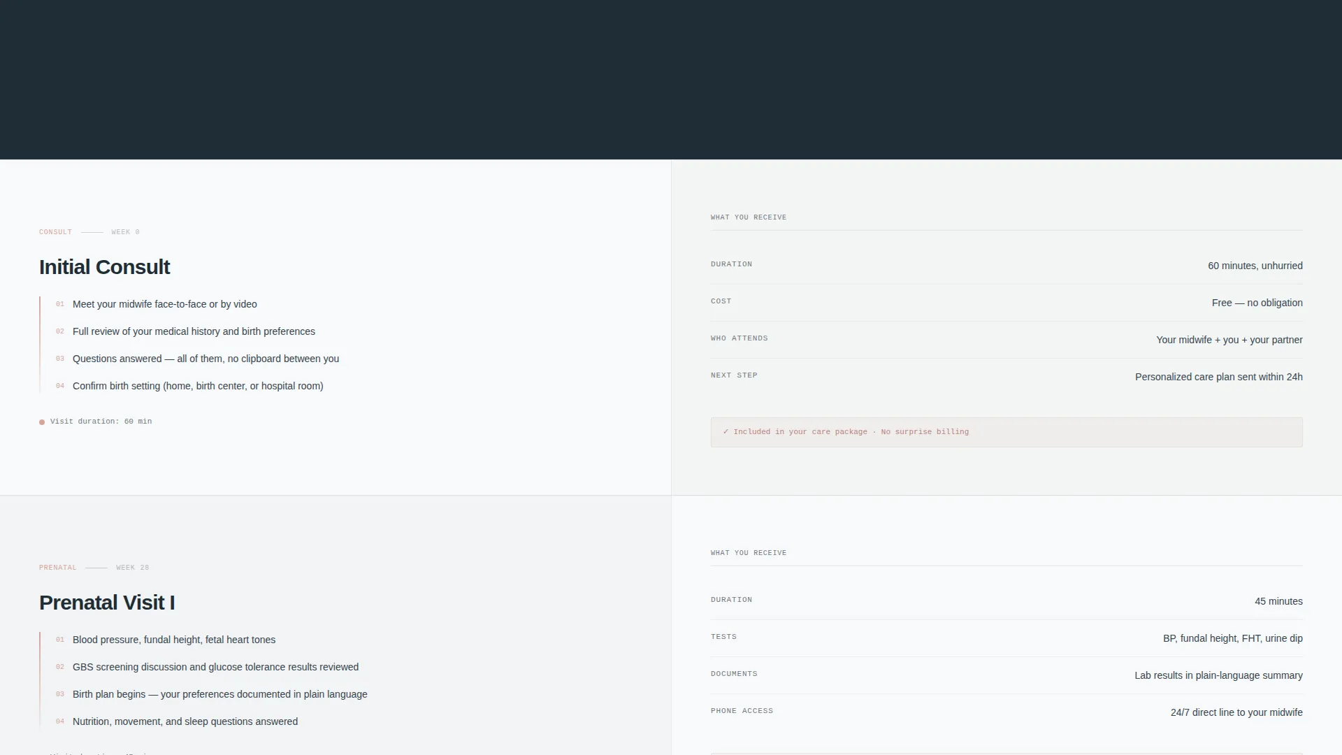
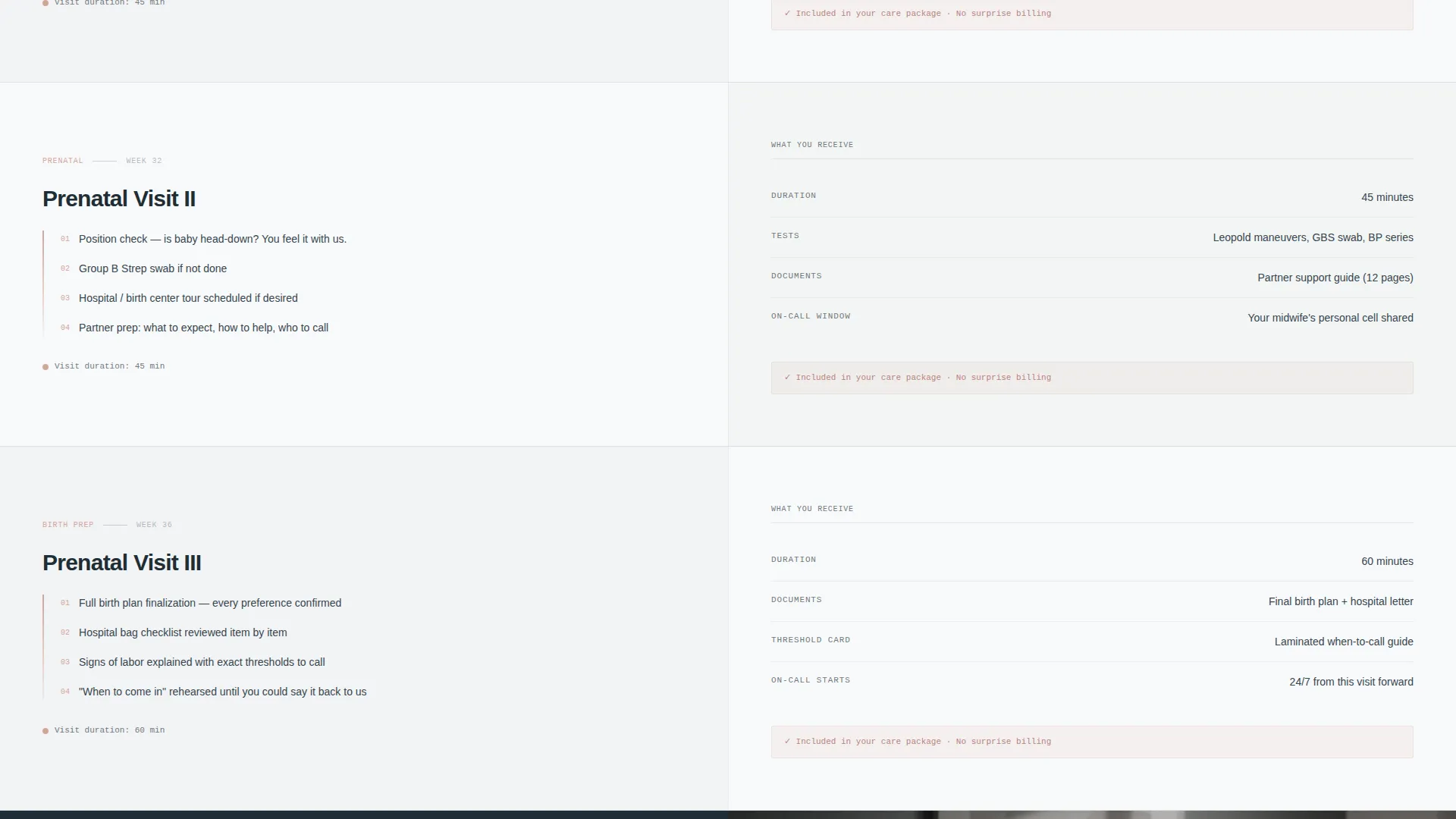
Each stage of the midwifery process gets its own split panel. The left side describes what happens at that stage. The right side lists exactly what the client receives, including visit duration, tests performed, phone-access hours, and who is in the room. Panels slide in like pages of a care plan being turned.
Persistent Booking Call to Action
The primary call to action, "Book Your Free Consult," appears first inside the header data panel. After the second scroll section, it reappears as a fixed bottom bar that stays visible throughout the rest of the page. No form lives on this page; the click opens the practice's booking calendar with the consult visit type pre-selected.
Secondary Email Capture Overlay
A text link reading "Download Our Full Care Timeline" triggers a single-field overlay for visitors who are not yet ready to book. This secondary path captures email addresses without interrupting the main booking flow.
Transparent Pricing and Service Listing
Before either call to action asks for commitment, the page lists every included service and every cost. This approach converts hesitant visitors by removing the most common reason people delay booking.
Black-and-White Hero Photograph
The right panel of the header holds a single black-and-white photograph of a midwife's gloved hands resting calmly on a birth ball beside a contraction timer. The image is deliberately quiet so the data panel can lead.
Page sections overview
| Section | Purpose |
|---|---|
| Animated Data Header | Opens with live-style birth statistics and a calm hero photograph |
| Initial Consult Panel | Explains the first meeting and what the client receives from it |
| Prenatal Visits Panel | Details visits at 28, 32, and 36 weeks with tests and durations |
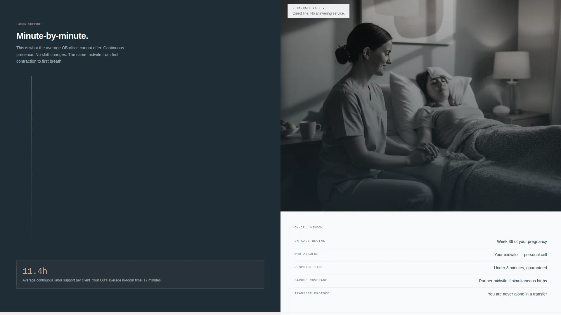
| On-Call Window Panel | Shows phone-access hours and who answers during labor onset |
| Labor Support Panel | Presents a minute-by-minute timeline of in-person labor presence |
| Postpartum Visit Panel | Outlines the home visit scope and what is checked and discussed |
| Persistent Booking Bar | Keeps the primary call to action visible after the second section |
| Care Timeline Overlay | Captures email via a single-field form for undecided visitors |
Design & branding system
The visual identity follows a Service Utility theme using a Monochrome Steel color system. The palette is deliberately spare, reading like a freshly prepared clinical environment rather than a typical wellness brand.
- Core colors are surgical steel (#71797E), instrument white (#F8F9FA), charcoal scrub gray (#36454F), and skin-tone blush (#D4A59A) reserved for calls to action and active states
- Backgrounds alternate between instrument white and a faint steel wash; all body text sits in charcoal; dividers are thin steel lines that read like ruled medical paper
- Typography uses a monospaced typeface for the animated statistics header to reinforce the clinical data-readout feel across the hero panel
Mobile & speed optimization
The split-screen layout is structured so that each panel reflows cleanly on smaller screens. The sequential panel structure keeps content digestible regardless of viewport size.
- Each 50/50 split panel stacks vertically on mobile so both sides remain fully readable without horizontal scrolling
- The persistent booking bar remains anchored at the bottom of the screen on all device sizes, keeping the primary call to action always within reach
- The single-field email overlay is sized for thumb-friendly interaction on mobile without covering essential page content
How this template helps you convert
The page is built as a click-through landing page, meaning every design decision points toward one outcome: getting the visitor to tap the booking button with genuine confidence.
- The animated statistics header creates immediate credibility. Visitors see real practice data before reading a single paragraph of marketing copy, which reduces skepticism in the first ten seconds.
- The sequential care journey panels build stakes gradually. Early panels feel informational, but by the labor-support section the visitor is reading minute-by-minute timelines and understanding a depth of presence that no standard OB office visit can match.
- The transparent cost and service listing removes the last objection before the call to action appears. Visitors who have seen every included service and every fee are far more likely to click through to the booking calendar than visitors who still have unanswered questions.
Other information about this template
This template was designed specifically for the midwife booking page use case inside the Professional Services category. It is a strong fit for birth center practices, home-birth providers, and hospital-based midwifery teams that want a single focused page rather than a full multi-page site.
- The template style is Split Screen (50/50), which works well for care-process comparisons and side-by-side information delivery
- The creative direction is Transparent Process, meaning the scroll narrative is built around full disclosure rather than persuasion-first copywriting
- The header concept is Data Storytelling, placing practice metrics at the center of the first impression rather than testimonials or stock imagery
- The landing-page direction is Click-Through, so no inquiry form lives on the page; all conversion paths lead to an external booking calendar or the email-capture overlay
Theme
Service Utility
Creative direction
Transparent Process
Color system
Monochrome Steel
Style
Split Screen (50/50)
Direction
Click-Through
Page Sections
Animated Birth Statistics Header
Sequential Split-panel Care Journey
Persistent Bottom-bar Booking Call to Action
Single-field Email Capture Overlay
Transparent Service and Cost Display
Calm Black-and-white Hero Image
Related questions
Does this template include a contact or inquiry form?
Can the animated statistics in the header be updated with real practice numbers?
What care stages are covered in the sequential panels?
Is this template suitable for a solo midwife practice?
What does a visitor see when they click 'Book Your Free Consult'?



