Empty Nester Insurance Comparison Website Template
The Downsize Precision Coverage Audit landing page template is a structured, data-forward single-page experience built for recently-downsized homeowners who carry six-figure personal property into rental living with zero renters coverage. It uses animated counters, audit-style comparison tables, and a seven-question interactive assessment to reveal coverage gaps and guide visitors toward a personalized quote.
by Rocket studio
Quick summary
The Downsize landing page template is a high-conversion, single-purpose audit experience built for empty nesters transitioning from homeownership to rental living. It combines animated data storytelling, three structured coverage comparison tables, and a seven-question interactive quiz to surface real coverage gaps. The goal is simple: show visitors exactly what they are missing, then guide them toward a quote.
Who this template is for
This landing page is built for insurance brands, InsurTech platforms, and independent agents targeting recently-downsized homeowners in their fifties and sixties. These visitors carry significant personal property value into rental living but have never held a renters policy. They often assume their old homeowners coverage still protects them, which it does not.
This template is the right fit for:
- Insurance providers who want to reach first-time renters with high-value belongings and a homeownership background
- Marketing teams building a focused landing page campaign targeting the empty nester transition moment
- Agents and brokers who need a lead-generation audit tool that does the educational heavy lifting before the first call
What problem this template solves
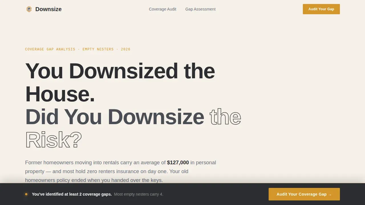
Most renters insurance landing pages talk at the visitor. This one puts the visitor through an audit. The problem is that recently-downsized homeowners carry an average of $127,000 in personal property into a two-bedroom rental and genuinely do not know they are unprotected. A generic landing page does not make that real. This template does.
The landing page solves several connected problems at once:
- Unclear coverage status: visitors arrive unsure whether they are protected and leave knowing exactly where their gaps are
- Visitor drop-off: a checklist-and-audit structure keeps users engaged section by section instead of bouncing after the first few seconds
- Low conversion rate: the seven-question quiz creates a personalized gap report that gives visitors a concrete reason to submit their information
What you get with this template
This template delivers a fully structured landing page built around three core content layers: data storytelling, audit comparison tables, and an interactive quiz. Every section is purposeful. There is no filler copy and no stock photography. The page is designed to focus the visitor's attention on a single conversion action from the moment they land.
You get:
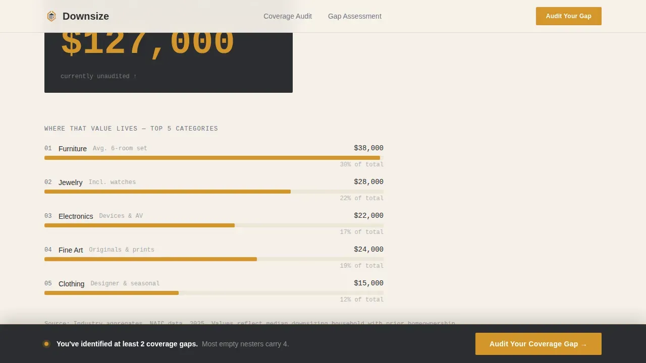
- A hero section with an animated counter that ticks to $127,000 and a horizontal bar chart breaking down the five highest-value personal property categories
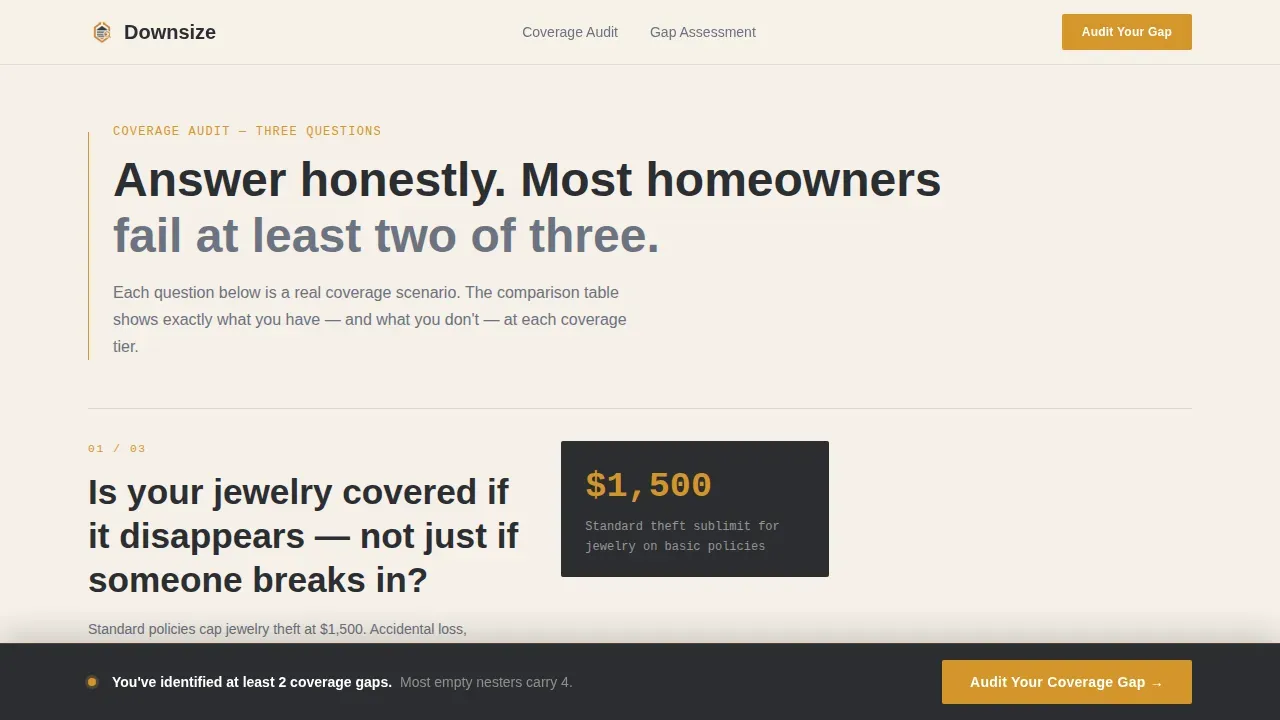
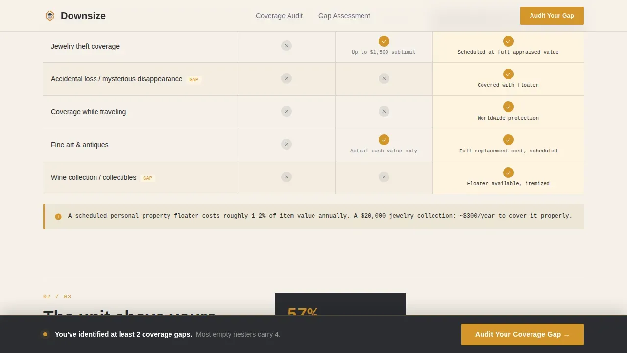
- Three audit comparison tables covering jewelry coverage, water damage scenarios, and liability plus loss-of-use scenarios, each with a no-coverage, basic, and recommended column
- A seven-question interactive coverage quiz with a dynamic scoring sidebar and a personalized gap report delivered at completion
Feature list
This section describes the core built-in capabilities of the Downsize landing page template. Each feature is grounded in the brief.
Animated Data Hero Section
The hero opens with a clean typographic headline over a counter that animates upward to $127,000. Below it, a horizontal bar chart fills left to right in amber, showing furniture, jewelry, electronics, art, and clothing as the five highest-value property categories. No photography is used. The data does the persuasion work in the first few seconds a visitor is on the page.
Audit-Style Comparison Tables
Three structured comparison tables form the backbone of the landing page. Each table is triggered by a coverage audit question and presents three columns: no coverage, basic renters, and the recommended plan. Amber checkmarks accumulate in the right column as the visitor scrolls, building visual evidence of the gap. This structure keeps the bounce rate low by making each section feel like a question that demands an answer.
Seven-Question Interactive Coverage Quiz
The primary interactive element is a seven-question assessment that launches from a sticky bottom bar. Questions cover property type, estimated belongings value via a slider, prior homeownership, high-value item presence, liability concerns, deductible range, and move-in date. A sidebar score updates dynamically with each answer. At completion, the visitor receives a personalized gap report.
Personalized Gap Report with Lead Capture Form
At the end of the quiz, visitors see a customized gap report based on their answers. A secondary call-to-action prompts them to enter their name, email address, and ZIP code to receive the full recommendation as a downloadable document. The form is intentionally minimal, asking only for essential information to reduce friction and improve conversion rate.
Sticky Bottom call to action Bar
The page includes a sticky bottom bar that activates after the visitor scrolls past the second comparison table. The bar contains the primary call-to-action button labeled "Audit Your Coverage Gap." This persistent cta button is action oriented and ensures the conversion path is always visible without interrupting the audit reading experience.
No-Navigation Minimalist Layout
The landing page removes standard site navigation entirely. Eliminating navigation and external links keeps the visitor focused on a single goal. There are no pop ups that interrupt the flow, no unclear ctas competing for attention, and no distracting links pulling users away from the audit experience before they reach the quiz.
Page sections overview
| Section | Purpose |
|---|---|
| Data Hero | Animate personal property value and bar chart to establish stakes |
| Audit Table One | Compare jewelry coverage across no-coverage, basic, and recommended plans |
| Audit Table Two | Compare water damage and replacement cost scenarios |
| Audit Table Three | Compare liability and loss-of-use coverage options |
| Quiz Assessment | Seven-question interactive audit with dynamic sidebar scoring |
| Gap Report | Personalized coverage summary with lead capture form |
| Footer | Single-row linear footer with essential links |
Design & branding system
The visual identity uses a Corporate Precision theme built on a Charcoal and Amber color system. The palette is designed to feel like a leather portfolio opened under a banker's lamp: serious without being cold. Every amber element signals importance and directs the eye to what matters most.
The design system includes:
- Deep boardroom charcoal (#2B2D31) as the primary text and structural color, warm parchment (#F5F0E8) as the page background, and muted slate (#6B7280) for secondary labels
- Decisive amber (#D4952A) reserved for call-to-action buttons, toggle states, active column highlights in every comparison table, and bar chart fills to create consistent visual hierarchy
- DM Sans for headlines, IBM Plex Mono for all data and number displays, and Manrope for body copy, combining readable text clarity with a data-forward typographic system
Mobile & speed optimization
The template is built desktop-first to match the browsing behavior of the target audience, but it is fully responsive across all screen sizes. The animated counter, bar chart, and comparison tables all reflow cleanly on smaller screens. The quiz slider and sidebar score remain usable on mobile devices without layout breakage.
Optimization considerations built into the layout include:
- Server-rendered static sections for the hero, comparison tables, and footer to keep load speed fast and reduce the risk of slow load times affecting the bounce rate
- Client-side components limited to the animated counter, bar chart fills, and quiz interactivity, keeping the overall page performance lean across different screen sizes
- Scroll-triggered reveals for each audit table that load content progressively, reducing the initial page weight and supporting fast core web vitals scores
How this template helps you convert
A high-converting audit landing page does not simply explain a product. It makes the visitor feel the problem before offering the solution. This template is engineered around that principle at every scroll point.
- The hero section communicates the value proposition within the first few seconds using real dollar data instead of abstract claims, giving visitors an immediate reason to keep reading and reducing early bounce rate
- The audit comparison tables build quiet urgency with each scroll, accumulating amber checkmarks in the recommended column and making the coverage gap feel personal and measurable rather than hypothetical
- The seven-question quiz converts passive reading into active participation, so visitors arrive at the gap report already invested in their result, which makes the lead capture form feel like a natural next step rather than an interruption
Other information about this template
This template is positioned as a specialized, high-conversion, single-purpose landing page designed to attract prospects interested in optimizing their current service coverage. It functions as a lead-generation audit tool for service-based insurance businesses identifying gaps and inefficiencies in a visitor's existing or missing renters coverage.
The audit checklist structure embedded in the comparison tables mirrors how a content audit works: it inventories the visitor's current coverage situation against a defined set of criteria, then reveals strengths and weaknesses. Just as a content audit helps a business evaluate its existing assets against a clear goal, the coverage audit helps the visitor evaluate their protection against real risk scenarios. Having a clear goal for your audit will always help you discern necessary changes from nice-to-haves, whether you are auditing content or coverage.
This template can support tracking setup for user behavior monitoring when connected to appropriate analytics tools. For example, an insurance marketing team could pair this landing page with Google Analytics to monitor which audit table drives the most quiz starts, track conversion rate by traffic source, and evaluate scroll depth as a proxy for engagement quality. Google Analytics event tracking can also flag where visitors drop off in the quiz, helping teams test and improve individual questions over time.
Teams running paid traffic through Google Ads can use this landing page as a dedicated destination for empty nester insurance campaigns, keeping the page focused and the conversion path clean. Because the page has no outbound navigation or competing links, it preserves the relevance signal that helps paid traffic campaigns perform efficiently.
For teams who want to evaluate technical performance after launch, pairing the page with Google PageSpeed Insights gives a clear read on load speed, core web vitals, and any opportunities to tighten performance further. Tools like Screaming Frog can audit the page for broken links, missing meta tags, and meta descriptions that need updating. Internal links within a broader site can point to this landing page using clear anchor text so that organic traffic finds the page through relevant entry points. Reviewing meta descriptions and meta tags periodically ensures the page stays accurate as the product offering evolves.
Social proof is built into the template through statistic-driven callouts: 84 percent of empty nesters are unaware of their liability coverage exposure, and 57 percent do not know about loss-of-use provisions. These facts function as social proof signals even without customer testimonials because they validate the visitor's situation through third-party data. If you want to add customer testimonials or success stories later, the layout can accommodate a testimonial row above the quiz section. Security badges near the lead capture form can also reinforce trust at the moment of conversion.
Additional details worth noting for teams setting up this template:
- No credit card required to access the quiz or receive the gap report, reducing friction at the highest-intent moment
- Cancel anytime language can be added near the policy call to action if the product includes a trial or subscription tier
- The page avoids pop ups that interrupt the audit flow, keeping the reading experience clean and focused
- Supporting content such as a blog post or coverage guide can be linked from a post-conversion thank-you page rather than from within the landing page itself, preserving the single-goal focus
- Social media platforms can be referenced in the footer for brand reinforcement without pulling visitors away from the conversion path during the audit
- The lead capture form uses helpful error messages to prevent submission errors and keep the process smooth for users who may be less familiar with online forms
Theme
Corporate Precision
Creative direction
Checklist & Audit
Color system
Charcoal & Amber
Style
Comparison Table
Direction
Quiz/Assessment
Page Sections
Animated Data Hero with Bar Chart
Three Audit Comparison Tables
Seven-question Interactive Coverage Quiz
Personalized Gap Report with Lead Capture
Sticky Call to Action Bar and No-navigation Layout
Related questions
Who is this landing page template designed for?
What sections are included in this template?
Can I customize the quiz questions and comparison table content?
How does the lead capture form work?
Does this template work on mobile devices?



