Consultant Career Advanced Portfolio Website Template
Drafted is a storybook-style consulting cover letter landing page built for serious applicants targeting elite firms. It pairs a collage-style header with a case study narrative scroll, walking visitors through real redline edits, structural frameworks, and polished final letters. The result is a resource destination that earns trust before asking for anything.
by Rocket studio
Quick summary
Drafted is a single-page resource destination for management consulting applicants. It uses an editorial collage header, a three-beat case study narrative scroll, and a focused call-to-action flow to deliver cover letter templates that feel earned rather than generic. Every section builds trust by showing real problems, structural fixes, and polished outcomes.
Who this template is for
This template was built for applicants who know they are qualified but are struggling to prove it on paper. It speaks directly to the people who lose sleep over whether their cover letter sounds like everyone else's.
- MBA candidates refining applications to top-tier consulting firms late at night
- Experienced professionals pivoting from industry roles who have a compelling story but lack the right structure
- Undergraduate applicants facing a blank page after networking conversations and informational interviews
What problem this template solves
Most cover letter templates look the same. They give you a box to fill in, not a lens to see through. Consulting recruiters scan letters in seconds, and a generic structure gets filtered out before a human even reads it.
- Applicants cannot see what a weak letter looks like until they read their own rejection
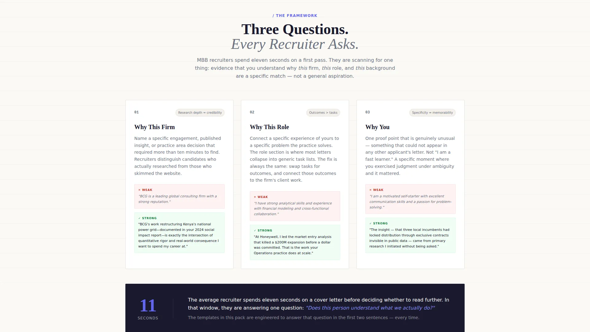
- The "why this firm, why this role, why you" architecture is widely referenced but rarely taught with annotated examples
- There is no standard resource that walks through the before, the fix, and the polished result in one place
What you get with this template
This is a full-page content destination built around three escalating case studies. Each case study moves from a redlined original letter to a structural principle to a finished, interview-winning version.
- A collage-style scrapbook header with overlapping letter fragments, handwritten red-pen annotations, sticky notes, and an acceptance email visible underneath
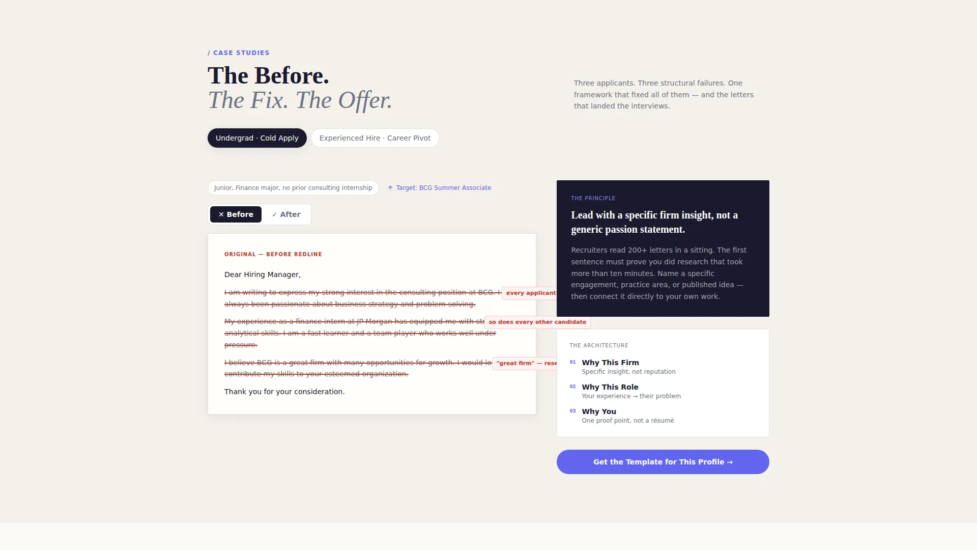
- Three case study narrative sections covering an undergraduate cold apply, an experienced hire career pivot, and an internal transfer scenario
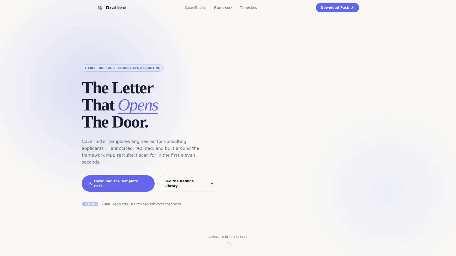
- A primary download call-to-action, a secondary redline library path, and a tertiary quiz button that segments visitors by background and target firm tier
Feature list
This template includes a focused set of page components, all grounded in the brief described above.
Collage Scrapbook Header
The header is a layered composition of overlapping cover letter fragments. Some are set in serif type, some carry handwritten red-pen edits circling weak verbs, and sticky notes reading "too generic" and "lead with impact" are pinned throughout. A coffee ring stains one corner. An acceptance email peeks from underneath. Nothing is perfectly aligned, and that is intentional.
Three-Beat Case Study Scroll
Each scroll section tells one applicant story in three stages. First comes the original weak letter, redlined and annotated. Then comes the structural principle that fixed it. Finally comes the polished version that landed the interview. The three case studies escalate in difficulty from undergraduate to experienced hire to internal transfer.
Layered Call-to-Action Flow
The primary call-to-action reads "Download the Template Pack" and appears after the first complete case study, so value is demonstrated before anything is requested. A secondary path offers "See the Full Redline Library" for visitors who want to browse first. A tertiary sticky button labeled "Which Template Fits Your Background?" is always visible.
Background-Matching Quiz Button
The sticky quiz button leads to a three-question flow that segments visitors by experience level and target firm tier. It then delivers the most relevant template directly, reducing decision friction for applicants who are unsure where to start.
Minimal Lead Capture Form
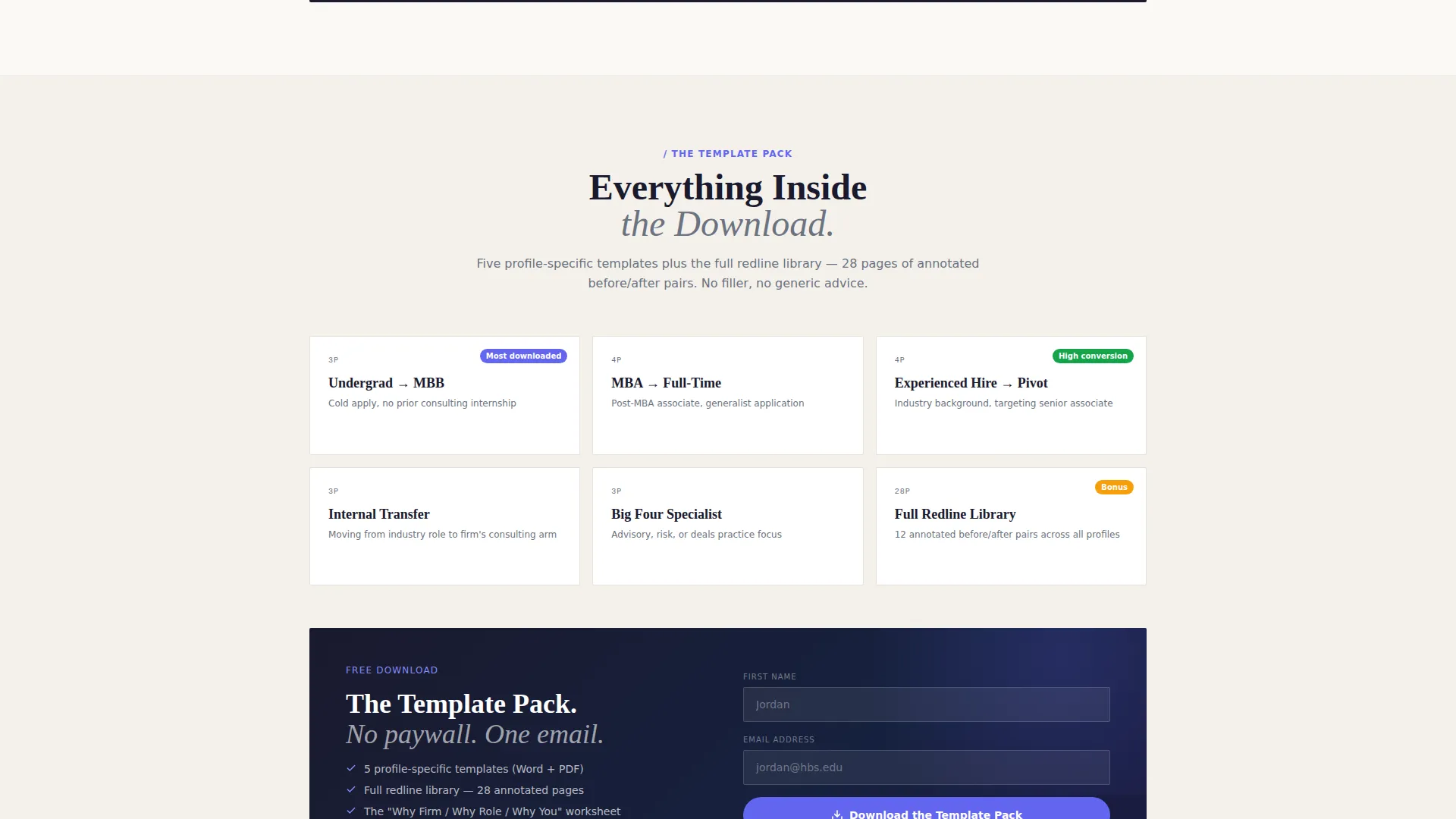
The download form requests only a first name and email address. Nothing else is asked. This keeps the entry barrier low and the exchange feel proportional to the value being offered.
Editorial Typography System
The headline "The Letter That Opens The Door" is set in a bold serif that feels both editorial and personal. It punches through the collage composition without losing warmth. Typography is a core part of the page's storytelling identity, not just a formatting choice.
Page sections overview
| Section | Purpose |
|---|---|
| Collage Header | Establish editorial tone and hook attention visually |
| Case Study One | Undergraduate cold-apply story with redline and fix |
| Case Study Two | Experienced hire career pivot with structural framework |
| Case Study Three | Internal transfer scenario with polished final letter |
| Primary call to action Block | Prompt template pack download after demonstrated value |
| Redline Library Path | Secondary browse option for undecided visitors |
| Sticky Quiz Button | Persistent segment-and-deliver entry point |
| Lead Capture Form | Collect first name and email only |
Design & branding system
The visual identity follows a Lens and Frame theme built around the Electric Indigo color system. The palette is designed to feel like a Moleskine notebook cracked open under a desk lamp in a business school library: warm paper, sharp ink, electric sticky-note tabs.
- Deep editorial black (#1A1A2E) for structural elements and primary type, electric indigo (#6366F1) for highlights and interactive pulls, soft vellum cream (#FAF9F6) as the page background, and muted graphite (#6B7280) for body text
- Typography is anchored by a bold serif headline style that pairs editorial weight with personal warmth, carrying the annotated-notebook tone throughout the scroll
- The overall aesthetic is intentionally imperfect: curated, lived-in, and real, with slight angle offsets, overlapping layers, and visible handwritten edits reinforcing the mentor-notebook metaphor
Mobile & speed optimization
The storybook layout is designed to remain readable and engaging at every scroll depth. The layered collage header and case study sections are structured to translate across screen sizes without losing their editorial character.
- Overlapping collage elements are composed to remain legible and visually coherent on smaller viewports
- The sticky quiz button is always accessible regardless of scroll position, keeping the tertiary conversion path reachable on any device
- The lead capture form is kept intentionally minimal, with only two input fields, which reduces friction on mobile keyboards
How this template helps you convert
This page is built as a content destination that earns attention before it asks for action. The conversion architecture follows a clear progression tied to demonstrated value.
- The collage header creates an immediate emotional connection, signaling that this resource understands the applicant's experience before a single word of body copy is read.
- The three-beat case study scroll proves the template's value in a visible, before-and-after format, so the "Download the Template Pack" call-to-action arrives with credibility already established.
- The tiered conversion flow (primary download, secondary library browse, tertiary quiz) means visitors at different stages of readiness all have a natural next step, reducing drop-off across the full audience.
Other information about this template
This template was designed with a very specific applicant audience in mind: people targeting selective consulting firms, including the firms commonly grouped under MBB and the Big Four accounting and consulting networks. The resource approach, rather than a hard-sell product page, reflects how this audience actually researches and evaluates tools.
- The case study narrative structure was chosen because consulting applicants are trained to think in frameworks, making the problem-principle-solution format immediately credible to them
- The page style is described as Storybook and Full-Page, meaning the entire experience is designed as a single immersive scroll rather than a multi-section product catalog
- The Lens and Frame theme and collage header concept reinforce the idea that cover letter writing is an act of editing and perspective, not just filling in a template
- The mentor-notebook metaphor, crossed-out lines, and margin annotations are visual storytelling choices that signal expertise without making explicit claims
Theme
Lens & Frame
Creative direction
Case Study Narrative
Color system
Electric Indigo
Style
Storybook/Full-Page
Direction
Content/Resource
Page Sections
Collage Scrapbook Header
Three-beat Case Study Scroll
Tiered Call-to-action Flow
Background-matching Quiz
Minimal Lead Capture Form
Editorial Typography System
Related questions
Who is this landing page template designed for?
What is the three-beat case study format used in this template?
How does the background-matching quiz work?
Does the page gate its content behind a sign-up form?
What does the download form ask for?



