Elegant Residential Architect Landing Page Template
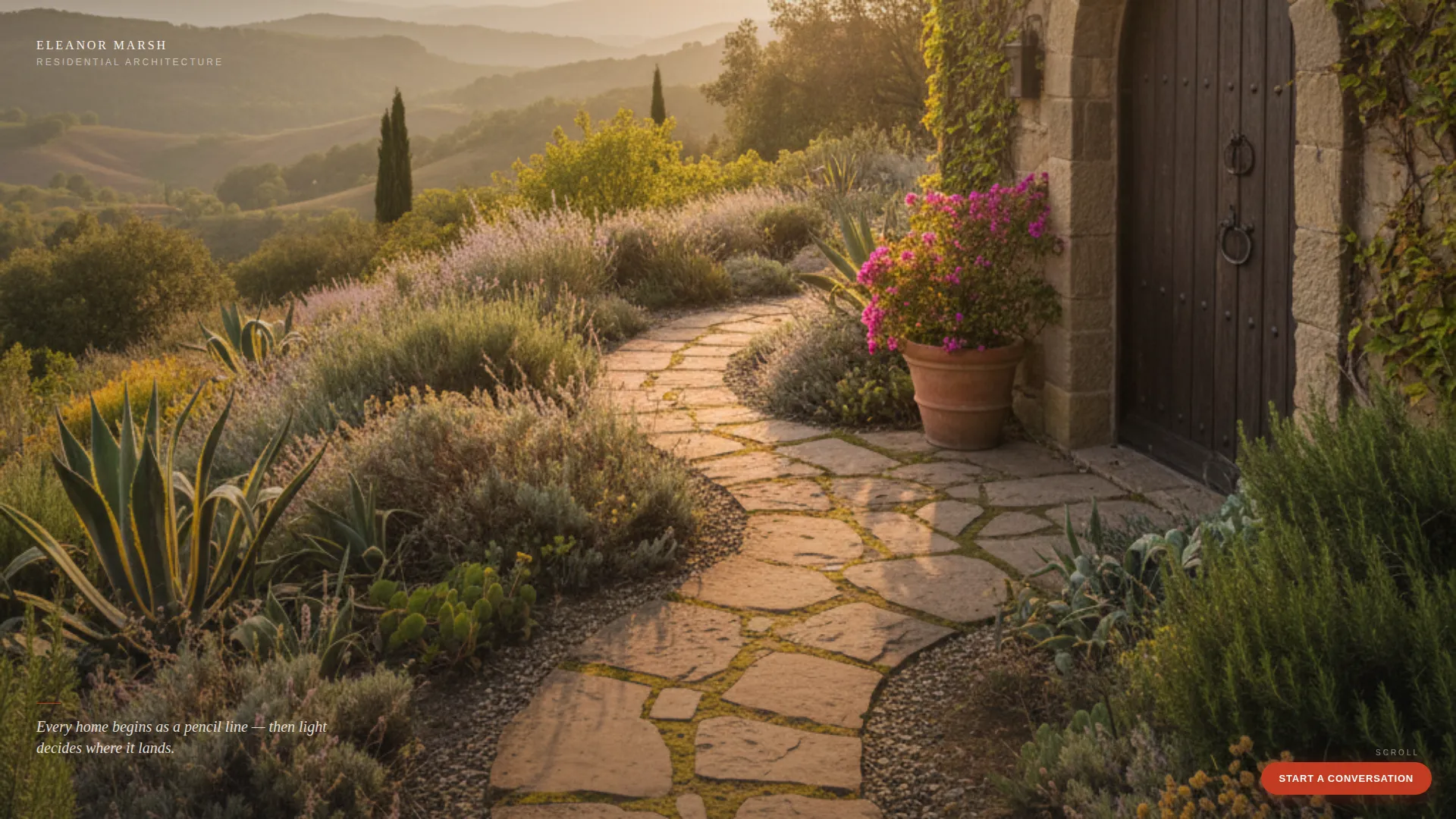
Drafthouse is a bento grid landing page for residential architects. It pairs a full-bleed golden-hour photograph with an asymmetric project gallery that lets the work speak first. The Ink and Paper color system keeps every element understated, and a single architect's red call-to-action button earns clicks by the time a visitor reaches the bottom of the page.
by Rocket studio
Quick summary
Drafthouse is a single-page residential architect portfolio built on a bento grid layout. A full-bleed header photograph sets the tone immediately, followed by an asymmetric project gallery where each tile expands into a filmstrip view without leaving the page. The Ink and Paper palette keeps the design quiet so the architecture does the talking.
Who this template is for
This template suits residential architects who want their portfolio to feel as considered as their buildings. It works especially well for practitioners whose projects span custom homes, renovations, and small multi-unit developments.
- Architects seeking new clients from hillside lots, renovations, or townhome developments
- Solo practitioners and small studios who want a portfolio that feels editorial rather than corporate
- Design professionals who want the work to lead and the sales pitch to follow quietly
What problem this template solves
Most architect portfolio pages either look like a generic agency site or drown the work in navigation and copy. The result is that strong projects get overlooked because the page competes with them. Drafthouse removes that friction entirely.
- Visitors lose interest when a portfolio feels like a brochure rather than a gallery
- Contact opportunities slip away when a call-to-action appears too early and feels pushy
- Responsive, curated presentation is hard to achieve without a purpose-built layout
What you get with this template
Drafthouse delivers a complete, ready-to-use landing page structure built around one guiding idea: let the portfolio accumulate until the visitor is already imagining their own project inside it.
- A full-bleed header section with a delayed architect name reveal in lightweight serif type
- An asymmetric bento grid gallery with hover overlays and in-page card expansion
- A fixed "Start a Conversation" call-to-action pill and a full-width closing band
Feature list
This section outlines the specific built-in components and interaction patterns included in the Drafthouse template.
Full-Bleed Header with Delayed Signature
The header fills the entire viewport with a single residential project photograph shot at golden hour. For the first two seconds no text interrupts the image. Then the architect's name appears quietly in the upper-left corner in lightweight serif type, styled like a pencil signature on a drawing.
Asymmetric Bento Grid Gallery
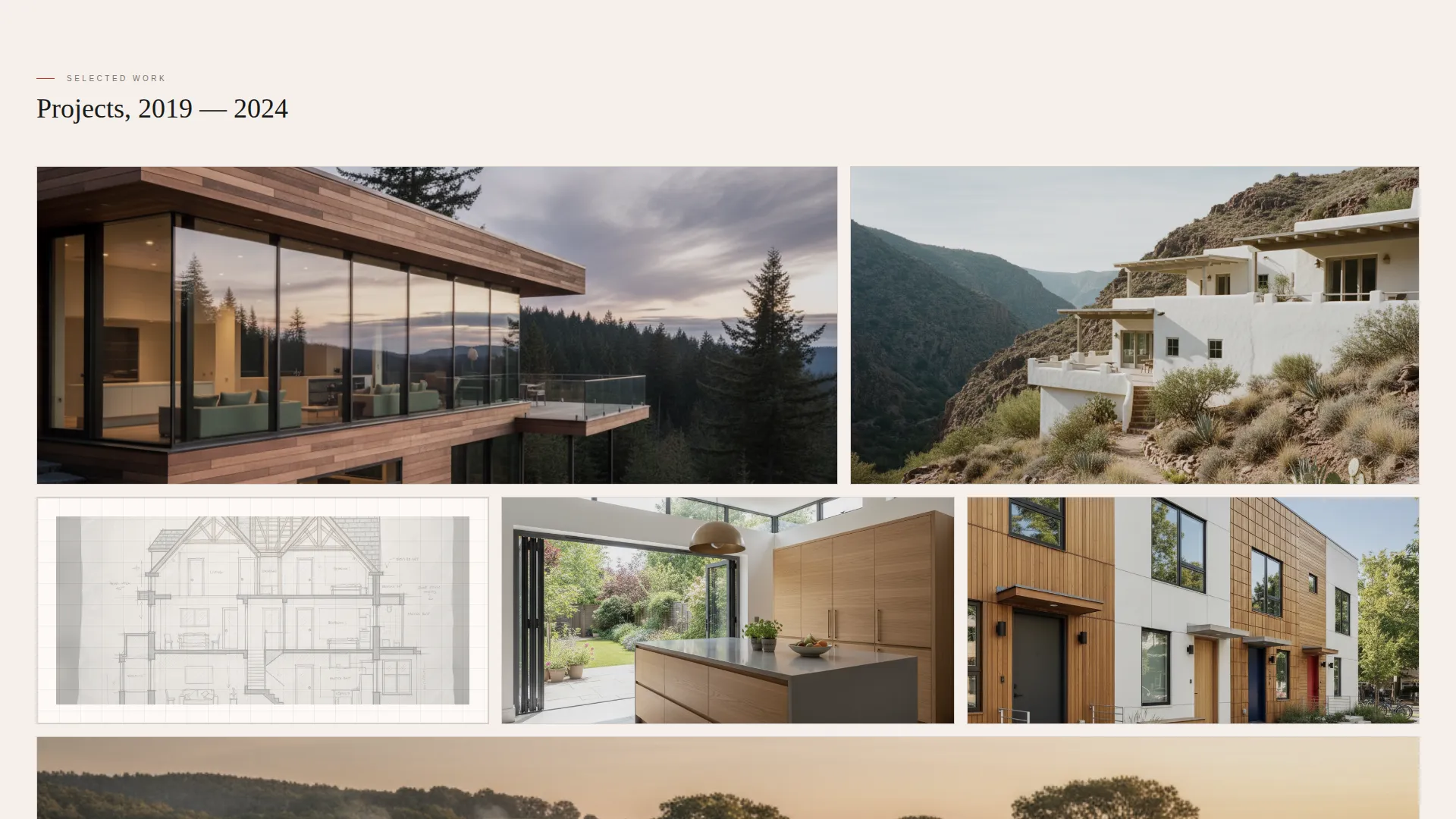
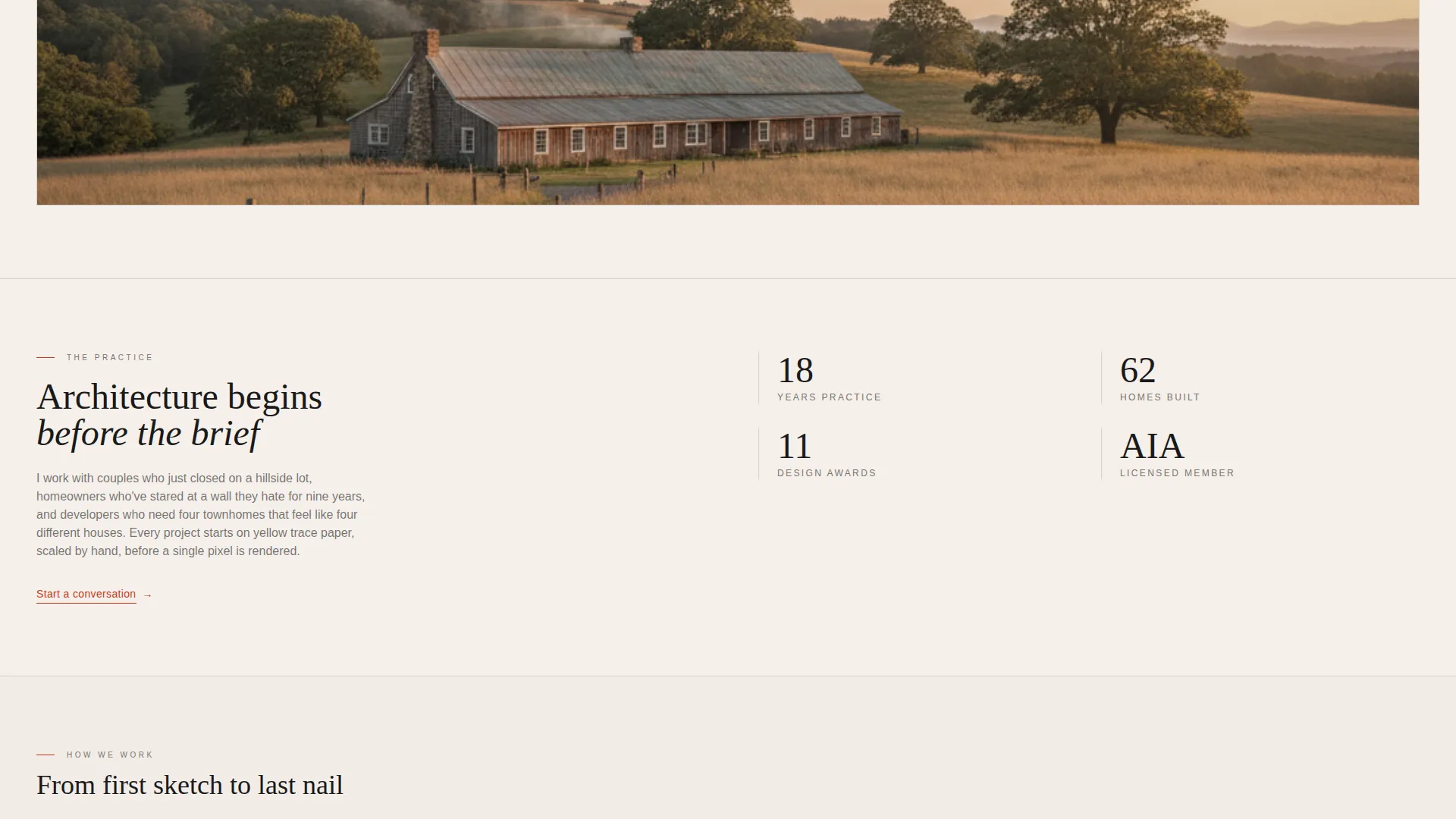
Projects are arranged in a deliberate rhythm: two large tiles, then three small, then one panoramic. This pattern moves the eye the way a curated exhibition would. Each tile holds either a project photograph or a hand-drawn section placed on its own card.
Hover Overlay with Project Details
When a visitor hovers over any tile, a translucent overlay surfaces the project name, location, and square footage. No descriptions interrupt the grid itself. The information appears only on demand, keeping the visual rhythm intact.
In-Page Card Expansion Filmstrip
Clicking a tile does not open a new page. Instead, the card expands smoothly into a horizontal filmstrip of images accompanied by one short paragraph. The visitor stays inside the gallery experience rather than being sent away from it.
Dual-Position Call-to-Action
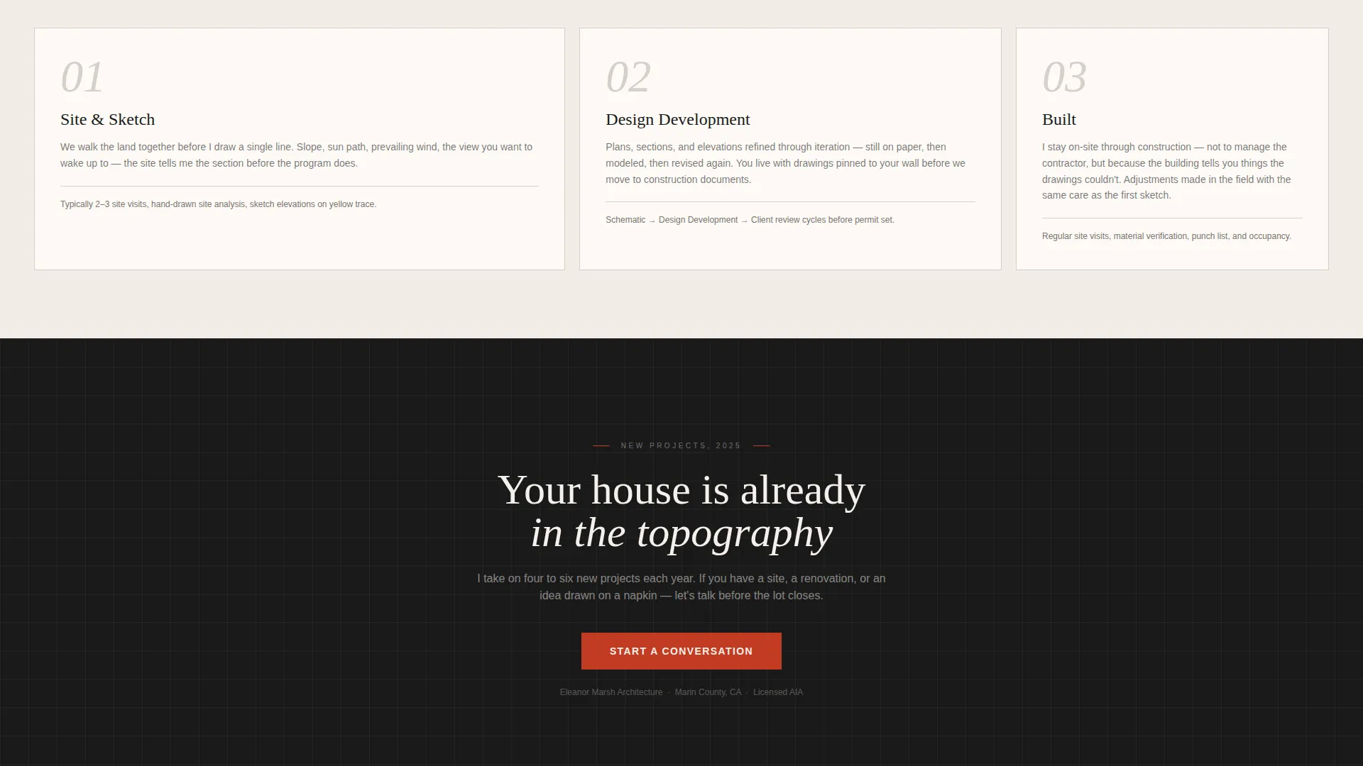
The primary "Start a Conversation" button appears in two places: as a fixed pill anchored to the bottom-right corner throughout scrolling, and as a full-width band after the final project row. Both link through to a dedicated inquiry page. No form lives on this landing page.
Ink and Paper Visual System
The entire page is built around a four-color palette. Warm cotton stock white covers all backgrounds. India ink black handles typography and line drawing elements. Vellum gray defines card borders and secondary surfaces. Architect's red is reserved exclusively for buttons, hover states, and the active project underline.
Page sections overview
| Section | Purpose |
|---|---|
| Full-Bleed Header | Opens with a golden-hour project photo and a delayed architect name reveal |
| Bento Grid Gallery | Displays projects as asymmetric tiles in a curated rhythmic arrangement |
| Hover Overlay Details | Surfaces project name, location, and square footage on tile hover |
| Card Expansion Filmstrip | Expands any tile into an image filmstrip with a short project paragraph |
| Fixed call to action Pill | Keeps "Start a Conversation" accessible throughout the scroll experience |
| Full-Width call to action Band | Closes the page with a prominent invitation to begin an inquiry |
Design & branding system
The Ink and Paper theme treats the page as a frame, not a feature. Every color decision supports the architecture rather than decorating the interface. Typography stays light and editorial throughout.
- Four-color palette: warm cotton stock white (#F5F0EB), India ink black (#1A1A1A), vellum gray (#D4CFC9), and architect's red (#C23B22)
- Lightweight serif type for the architect name and structural headings, keeping the tone monograph-like
- Architect's red used only for interactive elements: buttons, hover states, and the active project underline
Mobile & speed optimization
The bento grid layout is structured to reflow cleanly across screen sizes. Tile proportions adjust to maintain the editorial rhythm on smaller viewports without losing the asymmetric character that defines the desktop experience.
- Large tiles and panoramic tiles scale down without cropping critical composition areas
- The fixed call-to-action pill repositions appropriately so it remains accessible on touch screens
- Hover overlays translate to tap interactions on mobile devices
How this template helps you convert
Drafthouse is built around a specific conversion philosophy: earn the click by letting the work build emotional investment first. The call-to-action never interrupts; it simply opens a door the visitor is already reaching for.
- The gallery accumulates project after project so the visitor moves from passive browsing to active imagination, picturing their own home among the tiles before the call-to-action appears.
- The dual-position "Start a Conversation" button stays present throughout the scroll as a fixed pill, then lands with full-width emphasis at the page's close, meeting the visitor at exactly the moment they are ready.
Other information about this template
Drafthouse was designed specifically for the residential architecture niche, where the portfolio is the primary sales tool and the work must speak without interference from heavy branding or complex navigation.
- The template style is bento grid, which is well suited to portfolios with varied project scales and image orientations
- The creative direction follows a Gallery Walk approach, drawing from the logic of curated physical exhibitions
- The header concept is Full-Bleed Photo, chosen to replicate the first-approach experience of encountering a building in person
- The landing page direction is Click-Through, meaning no form or booking widget lives here; the page's only conversion goal is a single button click to an inquiry page
- This template fits the Architecture and Interiors Portfolio subcategory within the broader Portfolio and Agency category
Theme
Ink & Paper
Creative direction
Gallery Walk
Color system
Ink & Paper
Style
Bento Grid
Direction
Click-Through
Page Sections
Full-bleed Header with Delayed Name Reveal
Asymmetric Bento Grid Gallery
Hover Overlay with Project Details
In-page Card Expansion Filmstrip
Dual-position Call-to-action Button
Ink and Paper Four-color Palette
Related questions
Does this template include a contact form?
Can I use this template for a practice with different project types?
How does the in-page filmstrip expansion work?
Who is the intended visitor this landing page is designed for?
Is the accent color easy to update to match my own brand?



