Color Analyst Landing Page Template | Sidebar Companion
Drape is a sidebar companion landing page template built for color analyst businesses. It pairs a stats-led header with a scrolling testimonial mosaic and a fixed sidebar that updates context as visitors move down the page. The design uses a warm Cloud Canvas palette and a single click-through call to action: "Find Your Season."
by Rocket studio
Quick summary
Drape is a single-page, sidebar companion template designed for color analysis consultancies. It opens with three oversized credibility figures, guides visitors through a mosaic of real client stories, and closes with a full-width booking prompt. The fixed sidebar quietly shifts context as visitors scroll, reducing the path to a booking to one button and zero form fields.
Who this template is for
This template is built for practitioners who work closely with clients to identify their most flattering colors based on skin undertone and seasonal type. It suits professionals at different stages of their business.
- Color analysts and image consultants offering in-person or virtual draping sessions
- Independent style coaches who want to attract clients in their thirties and forties with a polished, trust-first page
- Consultants building or upgrading their color analyst business website to support a premium service tier
What problem this template solves
Most service pages for color analysis businesses either look too clinical or too generic. They fail to convey the sensory, personal nature of the work. Visitors leave without feeling the value of the experience.
- Potential clients cannot picture the transformation, so they hesitate to book
- Testimonials are buried or presented as plain text, losing their emotional weight
- The booking path asks visitors to fill out forms before they feel ready to commit
What you get with this template
You get a fully structured landing page layout that does the selling through social proof and smart design. Every section earns the visitor's trust before asking for the click.
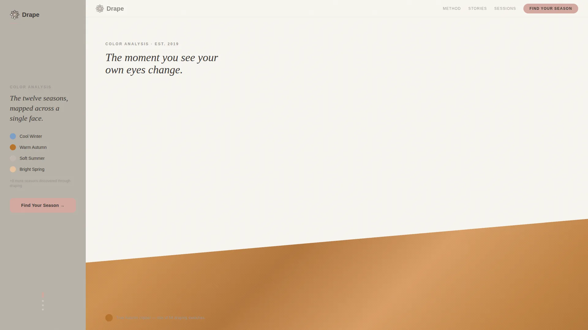
- A stats-driven header with three oversized credibility figures and a diagonal fabric swatch
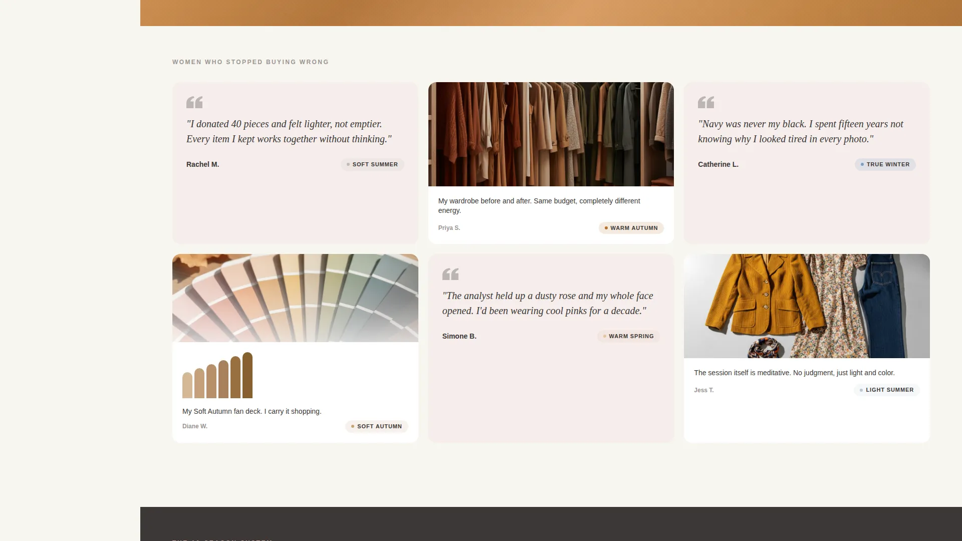
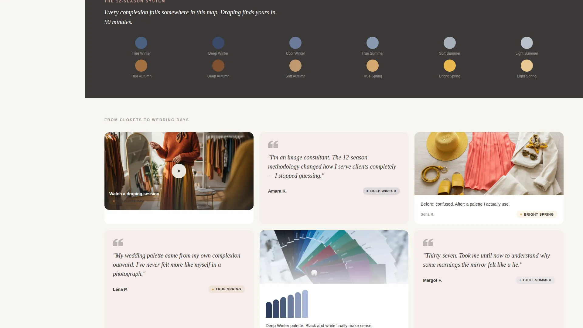
- A scrolling testimonial mosaic with pull-quotes, flat-lay wardrobe photos, seasonal palette fan deck imagery, and video snippet slots
- A fixed sidebar that transitions through service tiers, a mini-quiz teaser, and a booking prompt as the visitor scrolls
Feature list
This template is built around a focused set of layout components that work together to move a visitor from curiosity to commitment.
Stats and Metrics Header
Three oversized figures are arranged like a gallery wall against the warm cloud white background. The copy reads "2,400+ clients draped," "12-season accuracy methodology," and "94% say they stopped buying wrong colors within 30 days." A diagonal swatch of autumn copper silk cuts across the lower third as a visual accent. No portrait is needed because the numbers and the fabric do the credibility work.
Scrolling Testimonial Mosaic
Client stories are tiled in staggered cards that mix short pull-quotes with before-and-after flat-lay wardrobe photography, seasonal palette fan deck visuals, and video draping session slots. The mosaic never reads as a review wall. It feels like eavesdropping on women who finally understand their own coloring.
Fixed Contextual Sidebar
The sidebar stays anchored on the left as the visitor scrolls. It quietly updates its content in three stages: service tier overview first, then a mini-quiz teaser ("Not sure if you're warm or cool?"), then the primary booking prompt. This progressive reveal keeps the sidebar useful at every scroll depth without feeling intrusive.
Click-Through Booking Bar
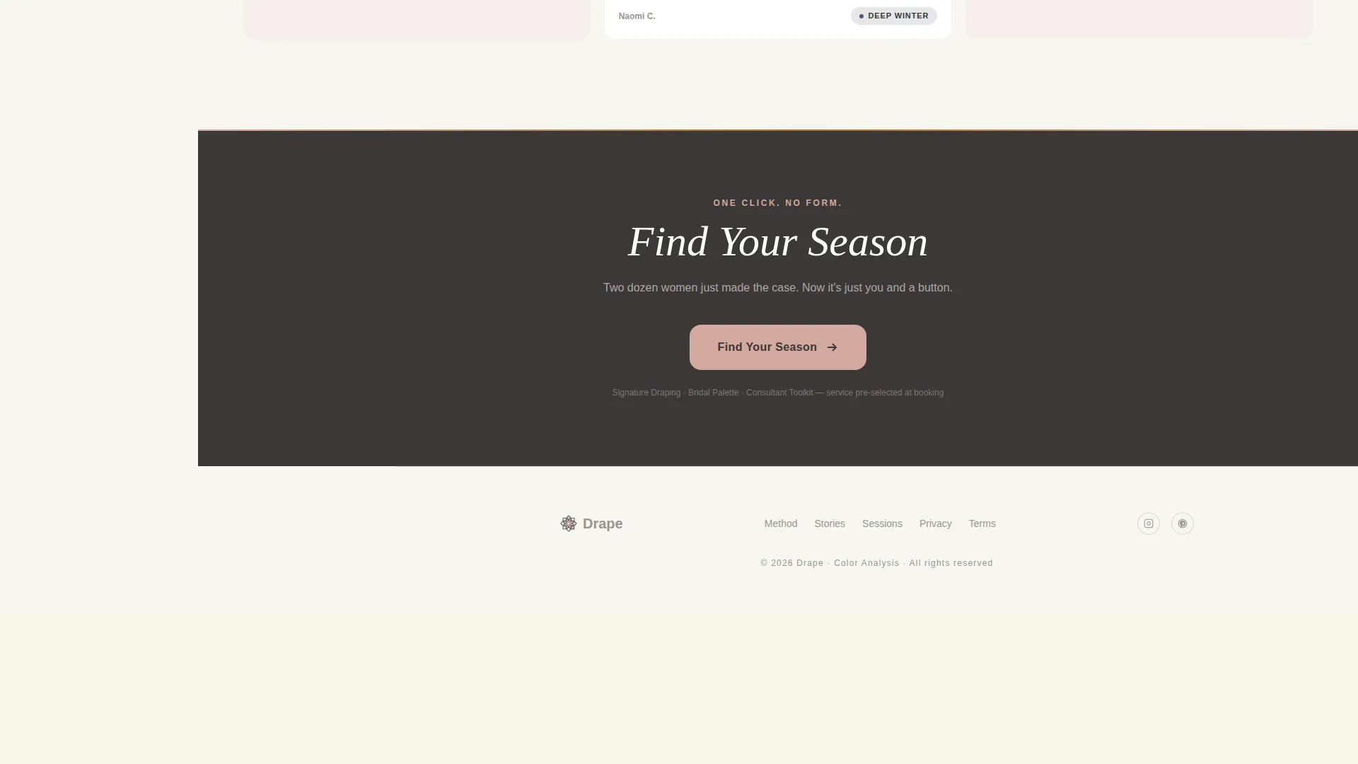
After the testimonial mosaic resolves, a full-width bar presents the primary call to action a second time. The button reads "Find Your Season" and links directly to a scheduling tool with the service pre-selected. There are no form fields on this page. The only ask is a single click.
Cloud Canvas Color System
The palette uses soft warm white (#F7F5F0), dove gray (#B8B2A8), muted blush (#D4A9A1), and graphite (#3B3836). Backgrounds live in the warm white. The sidebar anchors in dove gray. Blush marks active states and key moments. Graphite carries all typography with quiet authority.
Service Utility Theme Layout
The overall theme is Service Utility, meaning every design choice supports a clear service transaction. The layout prioritizes scannable credibility signals, emotional social proof, and a frictionless path to booking over decorative complexity.
Page sections overview
| Section | Purpose |
|---|---|
| Stats Metrics Header | Establishes credibility with three oversized figures and a fabric swatch accent |
| Fixed Left Sidebar | Updates context progressively through service tiers, quiz teaser, and booking prompt |
| Testimonial Mosaic Cards | Builds trust through staggered client stories, pull-quotes, and visual evidence |
| Mini-Quiz Teaser | Engages undecided visitors with a warm-or-cool prompt inside the sidebar |
| Full-Width Booking Bar | Converts visitors with a single "Find Your Season" click-through button |
Design & branding system
The visual identity follows a Service Utility theme built on the Cloud Canvas color system. The palette feels like unbleached linen on a marble countertop on an overcast morning: neutral enough to let every draped color sing, warm enough to feel human rather than clinical.
- Four core colors: soft warm white (#F7F5F0) for backgrounds, dove gray (#B8B2A8) for the sidebar, muted blush (#D4A9A1) for active states and key moments, and graphite (#3B3836) for all typography
- Typography is set in thin graphite type to convey quiet authority without competing with the draped fabric visuals
- The single diagonal swatch of autumn copper silk in the header acts as a sensory anchor, replacing portraiture with tactile suggestion
Mobile & speed optimization
The sidebar companion layout is designed to reflow cleanly for smaller screens without losing its progressive reveal logic. Key layout decisions support a smooth experience across devices.
- The fixed sidebar collapses gracefully on smaller viewports so the service tier content, quiz teaser, and booking prompt remain accessible in a logical stacked order
- The testimonial mosaic uses a staggered card grid that adapts its column count to available screen width, keeping the social proof readable and visually varied at any size
How this template helps you convert
Every layout decision in this template is pointed toward a single outcome: a visitor clicking "Find Your Season" and landing on the scheduling tool with the service already pre-selected.
- The stats header earns trust immediately with specific, verifiable figures before the visitor reads a single testimonial, setting a high credibility baseline from the first scroll position.
- The testimonial mosaic lets roughly two dozen real client experiences make the emotional case, so by the time the full-width booking bar appears, the visitor has already been persuaded by peers rather than by the consultant's own claims.
- The sidebar's progressive reveal removes friction at every stage: first explaining what is on offer, then addressing indecision with the mini-quiz teaser, then presenting the booking button at the exact moment the visitor is most likely to commit.
Other information about this template
This template is a sidebar companion page, meaning it is designed to sit alongside a broader color analyst business website rather than replace it. It focuses entirely on converting visitors who arrive with some awareness of color analysis services.
- The template style is Sidebar Companion, and the creative direction is Testimonial Mosaic, making it well suited for practitioners who have strong client results to showcase
- The header concept is Stats and Metrics, which works particularly well for color analysis consultancies that can cite client outcome data
- The landing page direction is Click-Through, so no lead capture form is included by design; the page's only conversion goal is the scheduling click
- This template suits a color analyst online presence that wants to position the service as a premium, transformation-focused experience rather than a commodity booking
Theme
Service Utility
Creative direction
Testimonial Mosaic
Color system
Cloud Canvas
Style
Sidebar Companion
Direction
Click-Through
Page Sections
Stats and Metrics Header
Scrolling Testimonial Mosaic
Fixed Contextual Sidebar
Click-through Booking Bar
Cloud Canvas Color System
Related questions
Does this template include a contact form or intake form?
Can I use this template if I am just starting out as a color analyst?
How does the sidebar work on mobile devices?
Is this template suitable for virtual color analysis sessions as well as in-person ones?
What is the purpose of the mini-quiz teaser in the sidebar?



