Curated Hosiery Subscription Landing Page Template
Drawer is a gallery-and-detail landing page template built for a curated hosiery subscription box. It combines a browsable brand gallery, expandable sock detail panels, animated tier comparisons, and a personalization quiz flow. The result is a candy-colored, scroll-driven page that turns curious visitors into committed subscribers or one-time buyers.
by Rocket studio
Quick summary
Drawer is a single-page subscription landing page template designed for a curated socks and hosiery box. Visitors browse a gallery of current-month brands, expand individual sock detail panels, compare three subscription tiers with animated reveals, and complete a short quiz that recommends the right plan before checkout.
Who this template is for
This template is built for founders and marketers running a subscription box in the socks and hosiery space. It also works well for anyone selling curated lifestyle products where discovery and surprise are core to the brand.
- Subscription box operators who want to showcase curated hosiery brands month by month
- Gift retailers needing a page that sells both subscriptions and individual one-time pairs
- Independent sock brands or multi-brand marketplaces looking for a browsable, gallery-led layout
What problem this template solves
Most subscription landing pages describe their product in vague terms. Drawer replaces vague copy with real product discovery. Visitors see, explore, and compare actual socks before they commit to anything.
- Generic subscription pages fail to communicate the variety and quality of what is inside the box
- Static tier comparison tables feel transactional and do not build excitement or trust
- Visitors who cannot picture what they will receive are unlikely to subscribe or buy
What you get with this template
The template delivers a full gallery-and-detail landing page structured around discovery and conversion. Every section is purpose-built to move a visitor from curiosity to checkout.
- A browsable brand gallery with card-based layouts, expandable detail panels, and one-time purchase buttons
- A three-tier subscription comparison section with animated sock stack visuals and real monthly contents
- A personalized quiz flow that collects style and frequency preferences before recommending a subscription tier
Feature list
This template packages several purpose-built components into one cohesive landing page. Each feature below is grounded in the prompt brief.
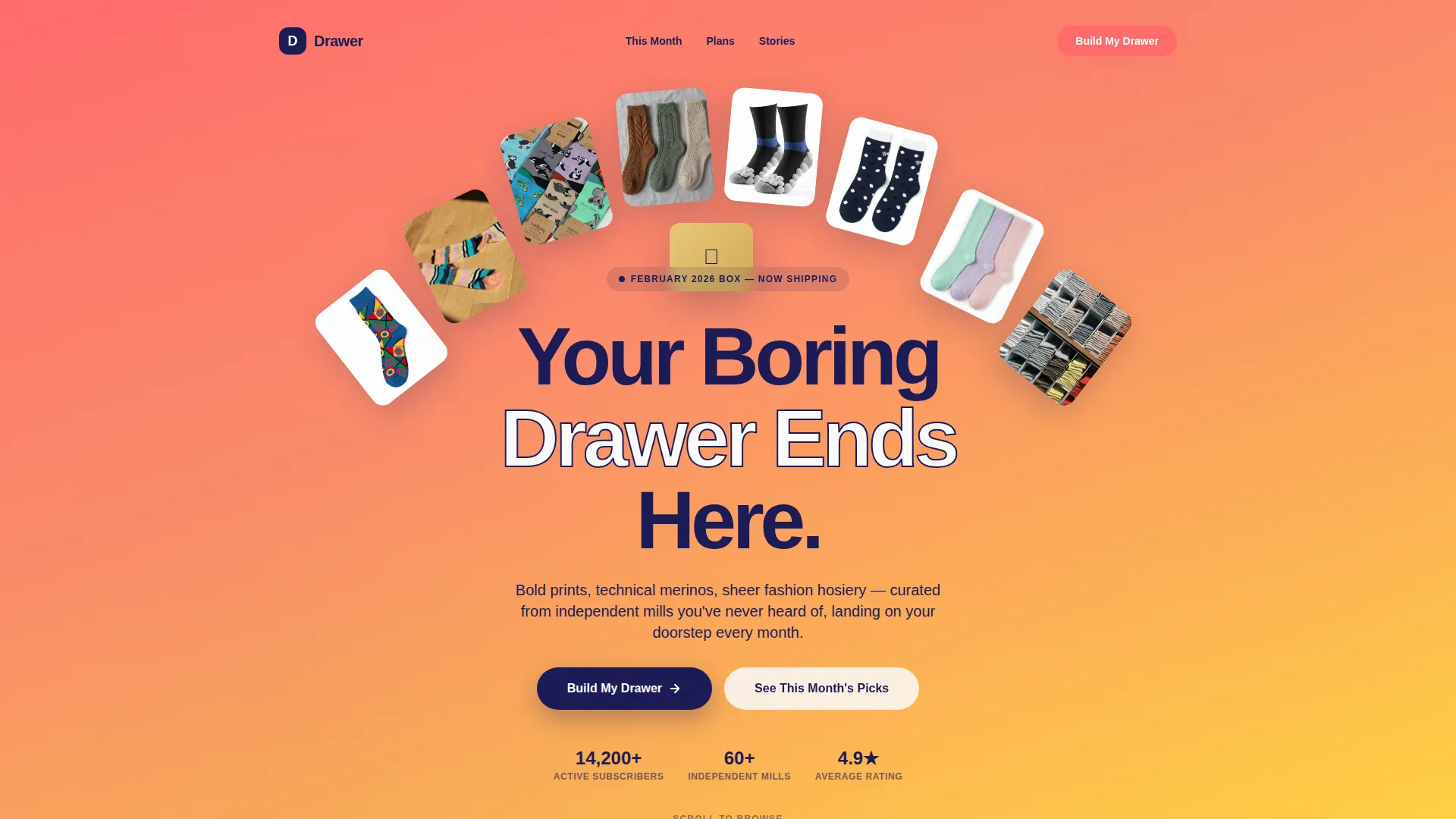
Lifestyle Header with Animated Headline
The header opens with a top-down flat-lay photograph of twelve mismatched socks fanned across a bright coral surface. A headline fades in over the image, setting the brand tone immediately and signaling to visitors that this experience will be different from a standard product page.
Browsable Brand Gallery
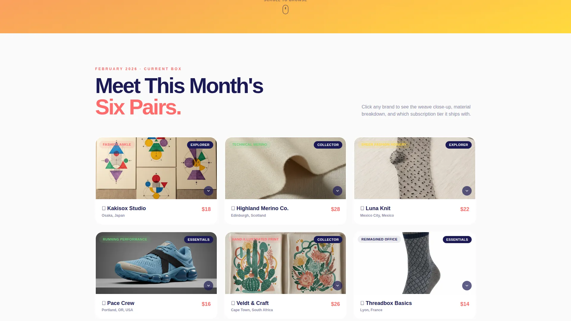
Current-month brands are displayed as scrollable cards. Each card shows the brand name, country of origin, sock type, and a single hero sock image. The gallery layout invites exploration without requiring the visitor to commit to anything.
Expandable Sock Detail Panels
Clicking any gallery card opens a detail panel showing a weave close-up, material breakdown, comfort rating, and a tier tag linking the pair to a specific subscription level. A "Grab This Pair" button allows one-time purchases directly from the panel.
Animated Tier Comparison
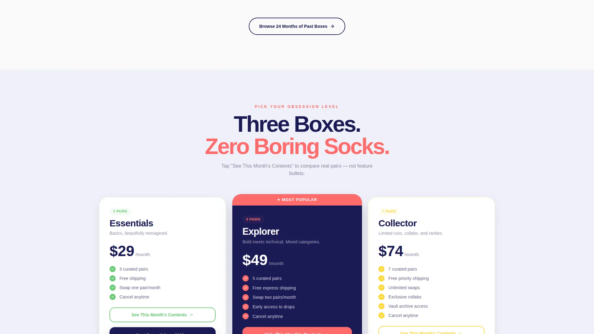
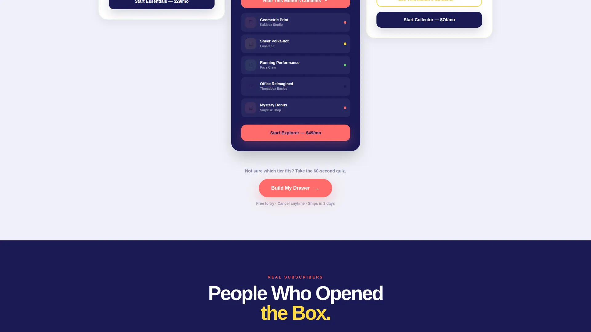
Three subscription tiers sit side by side: Essentials, Explorer, and Collector. Each column animates open to reveal that month's actual sock contents rather than generic feature bullets. A visual sock stack grows taller with each tier to make the value difference immediately visible.
Personalization Quiz Flow
The primary call to action opens a short quiz asking for foot size, style preference, and delivery frequency. The final screen displays a mock drawer illustration populated with sock thumbnails matched to the visitor's answers before presenting the checkout step.
One-Time Cart Path
Visitors who prefer not to subscribe can add individual past-box pairs to a one-time cart using "Grab This Pair" buttons on each detail card. This secondary conversion path keeps non-subscribers engaged and purchasing without forcing a subscription commitment.
Page sections overview
| Section | Purpose |
|---|---|
| Lifestyle Header | Introduces the brand with a flat-lay image and animated headline |
| Brand Gallery | Displays current-month sock brands as browsable cards |
| Sock Detail Panel | Expands on click to show materials, ratings, and tier link |
| Tier Comparison | Compares three subscription plans with animated sock reveals |
| Personalization Quiz | Recommends a tier based on size, style, and frequency inputs |
| Mock Drawer Result | Shows a visual drawer preview before the checkout prompt |
| One-Time Cart | Lets visitors buy individual pairs without subscribing |
Design & branding system
The visual identity follows a Directory and Discovery theme with a Dopamine Pop color palette. The overall effect is lively, tactile, and instantly recognizable on a crowded screen.
- Core palette: electric coral (#FF6B6B), serotonin yellow (#FFD93D), mint rush (#6BCB77), deep drawer navy (#1B1A55), and crisp cotton white (#FAFAFA) for card backgrounds
- Navy anchors all typography and navigation; white gives the gallery room to breathe; coral, yellow, and mint rotate as accent badges, hover states, and category tags
- The layered, overlap-driven layout creates depth across card stacks, tier columns, and the detail panel expansion system
Mobile & speed optimization
The template is structured to remain clear and navigable on smaller screens. Gallery cards, detail panels, and the quiz flow are all designed to work in a vertically stacked mobile context.
- Gallery cards reflow into a single-column scroll on narrow viewports so no image or label is clipped
- The tier comparison columns stack vertically on mobile, preserving the animated sock reveal behavior in a scrollable format
- The quiz flow and mock drawer illustration are sized to fit standard mobile screens without horizontal scrolling
How this template helps you convert
Drawer is built around two conversion paths running in parallel. Both paths are optimized for different buyer mindsets without one undermining the other.
- The quiz path earns trust through personalization. Visitors who complete the short quiz see a visual mock drawer tailored to their answers before they reach checkout, making the subscription feel curated rather than generic.
- The one-time cart path captures buyers who are not ready to subscribe. "Grab This Pair" buttons on every detail card let hesitant visitors purchase individual pairs, generating revenue and building familiarity with the brand.
Other information about this template
This template is categorized under Retail and E-Commerce with a focus on the socks and hosiery store niche. A few additional details are worth noting before you build with it.
- The creative direction follows a Comparison Journey structure, meaning the page is intentionally sequenced to guide visitors through discovery before presenting a purchase decision
- The template style uses an Overlap and Layered approach, producing visual depth through card stacking, badge overlays, and panel expansion rather than flat section dividers
- The landing page direction is Click-Through, designed to move visitors toward a defined next action rather than capture a lead form on the page itself
- The header concept is built around a Search Box and gallery entry point, reinforcing the Directory and Discovery theme throughout the scroll
Theme
Directory & Discovery
Creative direction
Comparison Journey
Color system
Cloud Canvas
Style
Overlap/Layered
Direction
Click-Through
Page Sections
Lifestyle Header with Animated Headline
Browsable Brand Gallery
Expandable Sock Detail Panels
Animated Tier Comparison
Personalization Quiz Flow
Parallel One-time Cart Path
Related questions
Can visitors buy individual sock pairs without subscribing?
How does the personalization quiz work?
What are the three subscription tiers included in this template?
Who is this landing page template built for?



