Complete Subscription Box Services Pricing & Packages Website Template
Drawer is a single-page landing page template built for curated sock subscription boxes. It combines a masonry photo wall header, a scrollable three-tier comparison journey, a browsable archive gallery, and a friction-reducing checkout module. The design uses a soft Cloud Canvas palette to deliver a tactile, editorial feel that earns trust before it asks for a sale.
by Rocket studio
Quick summary
Drawer is a gallery-plus-detail landing page template designed for a curated sock subscription box. It opens with a user-generated photo wall, moves visitors through a three-tier plan comparison, and closes with a checkout module that handles plan, size, and frequency selection. The overall feel is calm, editorial, and quietly confident.
Who this template is for
This template is built for subscription commerce brands that lead with curation, not just product. It suits founders who want to sell the story of a box before they sell the box itself.
- Sock subscription brands offering multiple tiers or themed monthly boxes
- Gift-focused e-commerce sellers targeting shoppers with budgets under forty dollars
- Sneaker-adjacent lifestyle brands where the accessory detail matters as much as the main item
What problem this template solves
Most subscription landing pages either overwhelm visitors with features or rush them straight to a paywall. Neither approach earns trust. Drawer solves this by letting the archive do the convincing first.
- Visitors who feel unsure about committing to a recurring plan can browse past boxes before deciding
- Gift shoppers need to see real-world context, not product specs, to feel confident in a purchase
- Brands with multiple subscription tiers struggle to present them without making the page feel cluttered
What you get with this template
The template delivers a complete, single-page purchase flow that moves from discovery to decision without requiring a visitor to leave the page or navigate elsewhere.
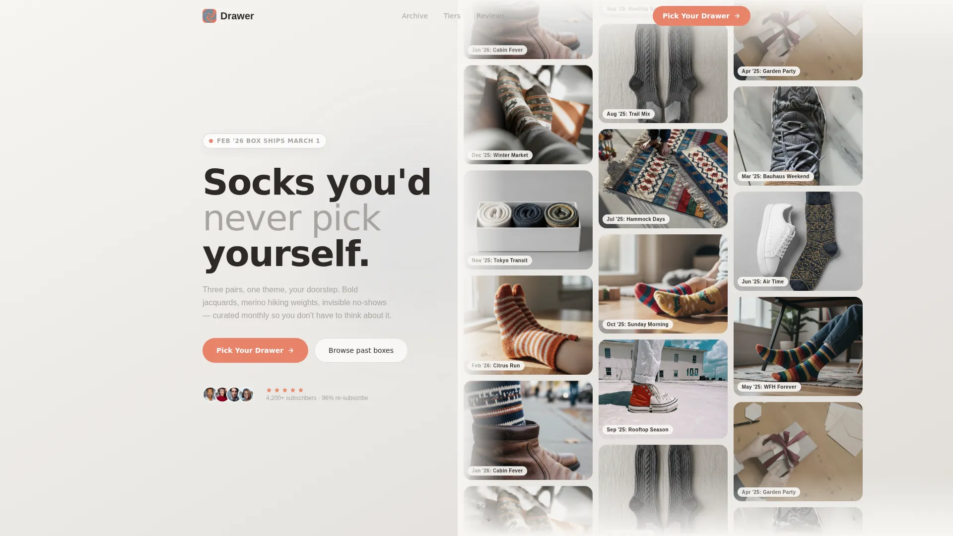
- A masonry UGC photo wall header with parallax scroll and per-photo box-month tags
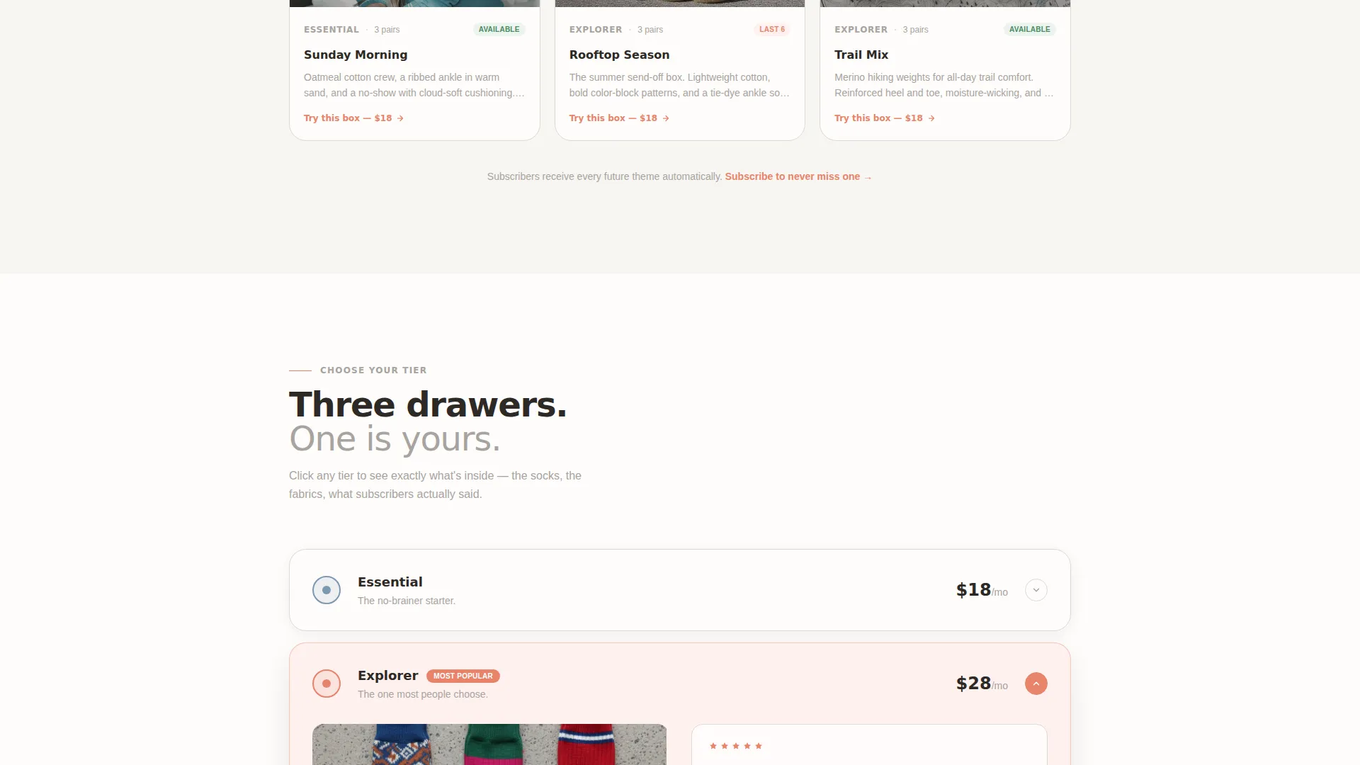
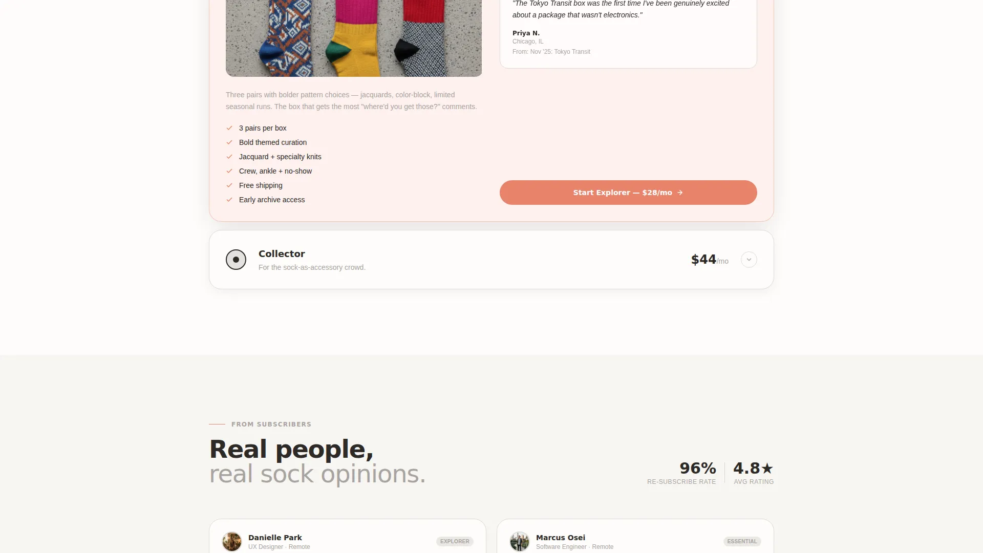
- A side-by-side tier comparison section with expandable detail panels per plan
- A scrollable past-box archive gallery and a checkout module with plan, size, and frequency options
Feature list
This template is built around a clear sequence: show the product in the real world, let visitors compare their options, surface the archive to build desire, then make checkout easy.
UGC Masonry Photo Wall Header
The header is a grid of real subscriber photos showing socks worn in everyday situations. Images are slightly desaturated to match the soft palette, and each photo carries a small tag identifying the box month it came from. A slow parallax upward drift keeps the header feeling alive without being distracting.
Three-Tier Plan Comparison
Essential, Explorer, and Collector plans sit side by side for direct comparison. Each tier expands into a detail panel on click, revealing sock photography, fabric composition notes, and a micro-review from a real subscriber. This turns a pricing section into a mini product discovery experience.
Scrollable Past-Box Archive Gallery
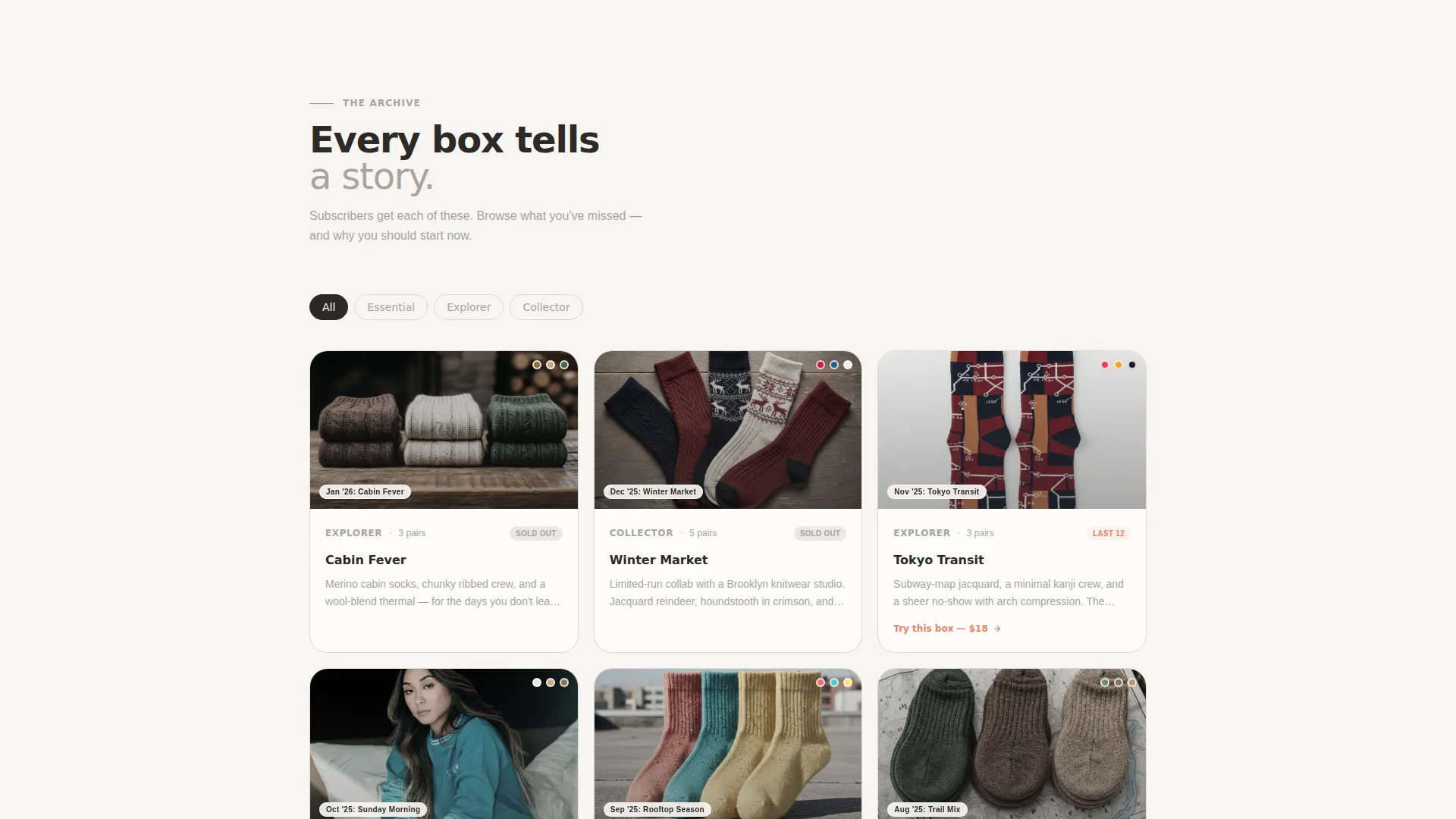
Below the tier comparison, the page transitions into a browsable archive of past monthly themes. Each month is its own visual entry, giving visitors the feeling of joining a story already in progress rather than starting from zero.
Tier-Selection Checkout Module
The primary call to action anchors to an inline checkout module where visitors choose their plan, size range (small/medium or large/extra-large), and delivery frequency. Options include monthly, bi-monthly, and gift durations of three, six, or twelve months.
Low-Commitment Entry Point
A secondary call to action lets hesitant visitors purchase a single past box for eighteen dollars as a one-time transaction. This reduces commitment friction without undermining the recurring subscription offer sitting above it.
Cloud Canvas Visual Identity
The color system uses soft cumulus white, warm sidewalk gray, washed denim blue, and dryer-lint coral. Coral is reserved for buttons, badges, and hover states, keeping the interactive layer visually distinct from the editorial content around it.
Page sections overview
| Section | Purpose |
|---|---|
| UGC Photo Wall | Opens with real subscriber photos in a parallax masonry grid, each tagged by box month |
| Tier Comparison Journey | Presents three subscription plans side by side with expandable detail panels |
| Past-Box Archive | Lets visitors browse every past monthly theme to build desire before checkout |
| Checkout Module | Handles plan selection, size range, frequency, and the one-time single-box purchase |
Design & branding system
The visual identity follows a Directory and Discovery theme built on the Cloud Canvas color system. The palette feels like a flatlay shot on linen at golden hour: airy, tactile, and casual without being careless.
- Core colors: soft cumulus white (#F7F5F2), warm sidewalk gray (#A8A3A0), washed denim blue (#7C98B3), and dryer-lint coral (#E8836B)
- Coral is used exclusively for interactive elements including buttons, badges, and hover states to keep the action layer visually distinct
- All header photography is slightly desaturated to harmonize with the soft background tones rather than compete with them
Mobile & speed optimization
The layout is structured to translate naturally from desktop to mobile without losing the sense of editorial organization that makes the template feel trustworthy.
- The masonry photo wall reflows gracefully at smaller screen widths, keeping the UGC storytelling intact
- Expandable tier detail panels are touch-friendly, so mobile visitors can explore plan details without friction
- The checkout module is designed as a compact, scrollable inline section rather than a redirect, keeping mobile users on a single continuous flow
How this template helps you convert
The page is structured so that by the time a visitor reaches the checkout module, they have already spent time with the product in a low-pressure context. That sequence does the persuasion work before the ask arrives.
- The photo wall builds immediate social proof by showing real subscribers wearing the product in everyday life, with box-month tags that turn each image into a discovery point
- The archive gallery creates desire through completeness: visitors see every past theme and feel the pull of wanting the next one before they have even subscribed
- The one-time single-box purchase option at eighteen dollars removes the biggest objection to a recurring plan, giving hesitant buyers an easy first step
Other information about this template
This template is categorized under Retail and E-Commerce, specifically within the Subscription Box Services subcategory. It is well suited for activewear-adjacent or lifestyle accessory brands that operate a curated monthly model.
- The template supports three distinct subscriber personas: remote workers, gift shoppers, and sneaker-focused lifestyle buyers
- Themed box naming conventions such as "Tokyo Transit" or "Sunday Morning" are built into the archive section's browsable structure
- The design uses an Overlap and Layered template style that gives sections visual depth without requiring complex custom builds
- This template is a strong fit for brands that want a single polished landing page rather than a multi-page storefront
Theme
Neo-Retro
Creative direction
Curated Collection
Color system
Lavender Dream
Style
Overlap/Layered
Direction
Marketplace/Multi
Page Sections
UGC Masonry Photo Wall with Parallax
Three-tier Plan Comparison with Detail Panels
Browsable Past-box Archive Gallery
Inline Checkout Module with Flexible Options
Low-commitment Single-box Entry Point
Cloud Canvas Color System
Related questions
Can I use this template for a subscription box that is not socks?
How does the one-time purchase option work alongside the subscription tiers?
Can I customize the subscription tier names and plan contents?
Does the photo wall require professional photography?
How many past boxes can I display in the archive gallery?



