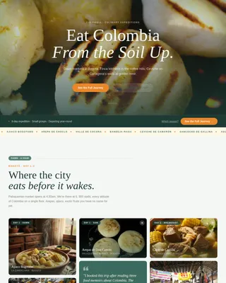
South Africa Travel Blog Website Template
Drift is a storybook-style landing page template built for South Africa coastal travel guides and blogs. It takes readers on a scrollable journey from the Atlantic West Coast to the subtropical KwaZulu-Natal north coast. Each chapter section covers a distinct coastal region with editorial cards, curated detail, and a click-through path into a full itinerary tool.
by Rocket studio
Quick summary
Drift maps South Africa's full coastline in a single, richly designed landing page. It opens with a collage-style header and moves through five coastal region chapters. Curated cards tease specific experiences, lodges, and seasonal tips. Two click-through calls to action guide readers toward a full itinerary planning tool without a single form field on the page.
Who this template is for
This template suits travel bloggers, guide publishers, and content creators who cover South Africa's coast in depth. It works best when you have real itinerary content to back up the design.
- Gap-year travellers researching bus routes and budget coastline options
- European couples planning Garden Route whale-season itineraries
- Cape Town-based writers and expats covering the Wild Coast and beyond
What problem this template solves
Most travel landing pages either look generic or bury useful detail beneath surface-level inspiration. Drift solves this by building trust through specificity before asking for a click.
- Readers bounce when a travel page feels vague and light on practical substance
- A single flat layout cannot convey the geographic and tonal range of a full coastline guide
- No visual hierarchy means readers cannot find where to start or what to read next
What you get with this template
You get a complete, single-page layout designed to hold a reader's attention from the collage header all the way through to the final call-to-action section. Every element is built around editorial depth and regional specificity.
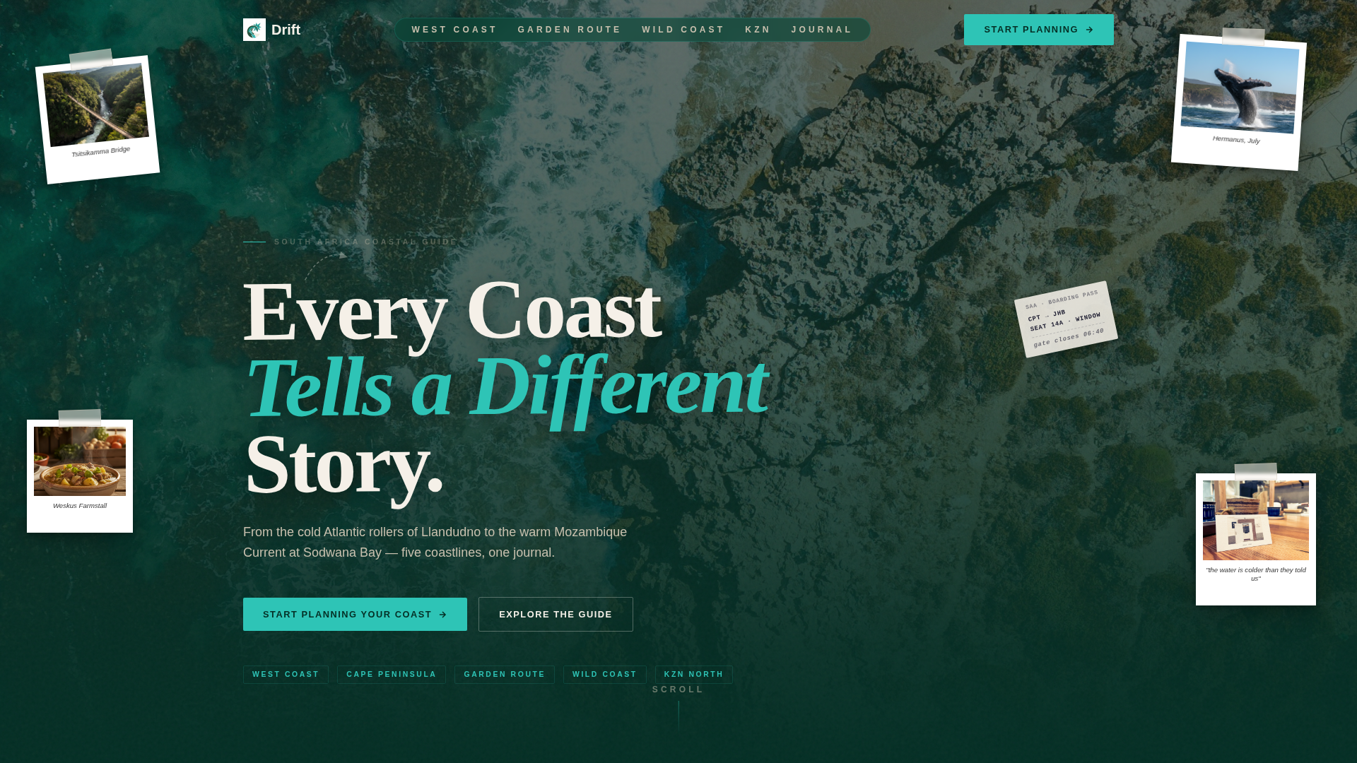
- A scrapbook-style header with overlapping Polaroid frames, masking-tape textures, and a hand-lettered headline
- Five full-page coastal chapter sections, each with a region name, hand-drawn map fragment, and three to four editorial experience cards
- Two placed calls to action: a sticky button after chapter two and a full-width closing section with a secondary path
Feature list
This section describes the core design and content capabilities built directly into the Drift template.
Collage Scrapbook Header
The header layers overlapping Polaroid-style image frames at slight angles against a deep kelp-forest green background. Masking-tape textures, pencil-drawn arrows, and a torn boarding pass stub create a believable travel journal aesthetic. A hand-lettered headline sits slightly off-axis, as if pressed by a wooden letterpress.
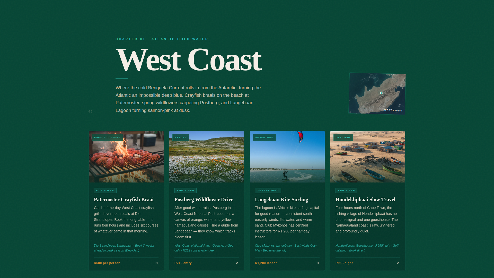
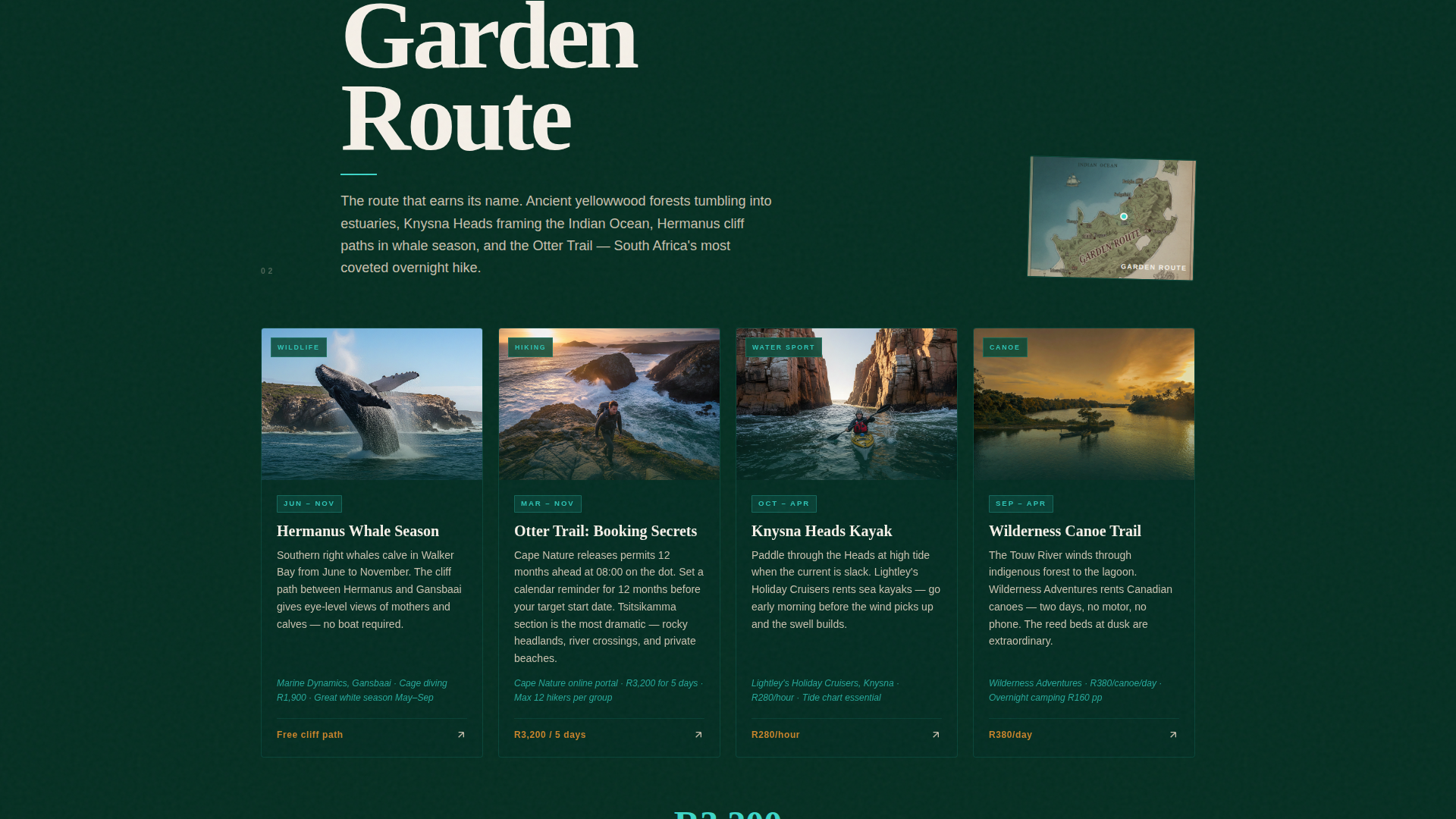
Chapter-by-Chapter Region Scroll
Each of the five coastal regions gets its own full-page section styled as a journal chapter. Region names appear in large serif type alongside a hand-drawn coastal map fragment. The colour temperature deepens as you scroll, shifting from cooler Atlantic greens toward warmer subtropical teals.
Editorial Experience Cards
Every chapter contains three to four cards that highlight specific coastal experiences. Cards include named lodges, rand pricing indicators, seasonal windows, and activity details such as sardine run diving or Otter Trail booking guidance. The level of detail is intentional: it earns reader trust before the call to action appears.
Dual Click-Through Call to Action
The primary call to action, "Start Planning Your Coast," appears first as a subtle sticky button after the second chapter. It returns as a full-width section after the final region. A secondary option, "Read the Full Journal," gives readers a lower-commitment next step. Neither path requires a form on this page.
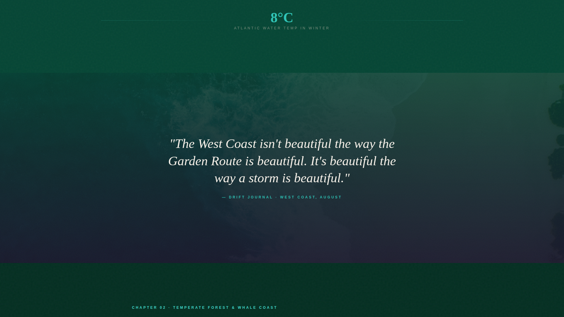
Full-Bleed Quote Breaks
Between chapters, single-line pull quotes float over full-bleed ocean photography. These transitions slow the scroll and reinforce the travel journal tone without disrupting the regional chapter flow.
Dark Emerald Colour System
The palette runs from deep kelp-forest green backgrounds through black rock pool text sections, sun-bleached dune white typography, and bioluminescent teal for hover states and map pins. The result is a high-contrast, visually cohesive design that feels specific to coastal South Africa rather than generic travel.
Page sections overview
| Section | Purpose |
|---|---|
| Collage Header | Opens the page with layered travel-journal imagery and the hand-lettered headline |
| West Coast Chapter | Introduces the Atlantic coastline with Paternoster crayfish braai cards and coastal map |
| Cape Peninsula Chapter | Covers the southern tip with curated Atlantic experiences and editorial cards |
| Garden Route Chapter | Features whale-season timing, Otter Trail tips, and Knysna-area lodge cards |
| Wild Coast Chapter | Highlights Coffee Bay cliff jumps and remote eastern coastline experiences |
| KZN North Coast Chapter | Closes the regional scroll with Sodwana Bay dive cards and sardine run detail |
| Quote Break Panels | Full-bleed ocean photography with single-line blog quotes between each chapter |
| Primary call to action Section | Full-width closing section with "Start Planning Your Coast" and "Read the Full Journal" |
Design & branding system
The visual identity is rooted in a Marine and Coastal theme expressed through the Dark Emerald colour system. Every palette decision references a specific underwater or coastal environment rather than a generic tropical scheme.
- Deep kelp-forest green (#064635) anchors full-page section backgrounds throughout the scroll
- Sun-bleached dune white (#F5F0E8) handles all body typography and creates visual breathing room
- Bioluminescent teal (#2EC4B6) activates across hover states, inline links, and map pin markers
Mobile & speed optimization
The storybook layout is built with scroll-led reading in mind, which translates naturally to a vertical mobile experience. Full-page sections and large editorial cards reflow cleanly for smaller screens.
- Full-bleed photography sections and Polaroid-style frames scale to fit portrait viewports without cropping key focal points
- The sticky call-to-action button remains accessible as readers scroll through lengthy chapter sections on mobile
- Chapter colour shifts and quote break panels retain their tonal progression on any screen size
How this template helps you convert
Drift earns the click rather than demanding it. The entire page is structured to demonstrate the guide's depth before the call to action ever appears.
- Editorial cards with named lodges, seasonal windows, and real pricing signals give readers enough trust to follow the link into the itinerary tool.
- The sticky button introduces the primary call to action only after the reader has moved through two full chapters, so the prompt arrives at the right moment.
Other information about this template
This template is a strong fit for South Africa travel blog publishing projects that need a visually distinct entry point into deeper editorial content. A few additional details worth noting:
- The click-through destination is an interactive itinerary tool where visitors select regions, travel months, and interest categories
- The page covers all five major South African coastal zones: West Coast, Cape Peninsula, Garden Route, Wild Coast, and KwaZulu-Natal North Coast
- The scrapbook header references specific South African details including a waterblommetjiebredie bowl, a South African Airways boarding pass stub, and a Tsitsikamma suspension bridge photograph
- The template style is classified as Storybook and Full-Page, making it suited to immersive, long-form travel content rather than short promotional pages
- The template can support a South Africa travel guide targeting readers at various stages, from early inspiration through to active trip planning
Theme
Marine & Coastal
Creative direction
Curated Collection
Color system
Dark Emerald
Style
Storybook/Full-Page
Direction
Click-Through
Page Sections
Collage Scrapbook Header
Five Coastal Region Chapters
Editorial Experience Cards
Dual Click-through Calls to Action
Full-bleed Quote Break Panels
Dark Emerald Colour System
Related questions
Does this landing page include form fields or email capture?
Can I use this template for a guide covering only one coastal region?
How many calls to action does the template include?
What kind of content do the editorial experience cards support?
Is this template suitable for a travel blog as well as a practical guide?