South Africa Travel Advanced Booking Website Template
Drift is a full-width immersive landing page template built for South Africa budget travel guides. It moves visitors through four travel seasons, summer, autumn, winter, and spring, using atmospheric photography, bookable cards priced in South African rand, a sticky itinerary builder, and a conversion flow designed to feel like a curated travel journal, not a database.
by Rocket studio
Quick summary
Drift is a single-page, full-width immersive landing page template for South Africa budget travel. It blends a Luxe Minimal visual identity with a seasonal scroll narrative, bookable hostel and tour cards priced in ZAR, a sticky itinerary builder, and a smart email-capture flow. The result feels like a well-loved travel journal, warm, browsable, and genuinely useful.
Who this template is for
This template is built for travel content creators, tour operators, and independent travel guide publishers targeting the South Africa budget travel market. If your audience wants real pricing, curated routes, and seasonal inspiration without glossy five-star framing, Drift speaks their language.
- Gap-year travellers and backpackers planning multi-stop South Africa itineraries on a limited budget
- Remote workers and digital nomads looking for reliable-destination content between cities like Johannesburg and Jeffrey's Bay
- Young South African couples planning provincial road trips on a tight long-weekend budget
What problem this template solves
Most travel landing pages either look too corporate or feel too cluttered. Budget travellers are skeptical of sites that bury prices, serve generic stock photography, and treat email capture as a toll gate. Drift fixes all three.
- No visible pricing erodes trust; every bookable card in Drift shows live ZAR pricing with a clear "Lock This Price" call to action
- Generic layouts push visitors away; the seasonal scroll structure and atmospheric full-bleed photography hold attention through the full page
- Forced email signups feel extractive; Drift earns the address by offering a "Send My Route" itinerary delivery after the visitor builds their first trip
What you get with this template
Drift delivers a complete, ready-to-customise landing page structured around four South Africa travel seasons. Every section is designed to alternate between wide, breathable landscape moments and dense, scrollable card grids.
- A full-viewport macro hero header with a single bold headline, four seasonal content sections each containing budget breakdowns and bookable cards, and a sticky bottom itinerary builder bar
- A Sunset Gradient visual system using deep Karoo indigo, Drakensberg amber, fynbos blush, and bleached bone white, with molten gold accents on buttons and price tags
- A lightweight itinerary builder that captures arrival city, number of nights, and travel month, followed by earned email capture framed as a route-delivery service
Feature list
This template packs a focused set of components. Each one is drawn directly from the Drift brief and serves the budget travel conversion flow.
Seasonal Scroll Structure
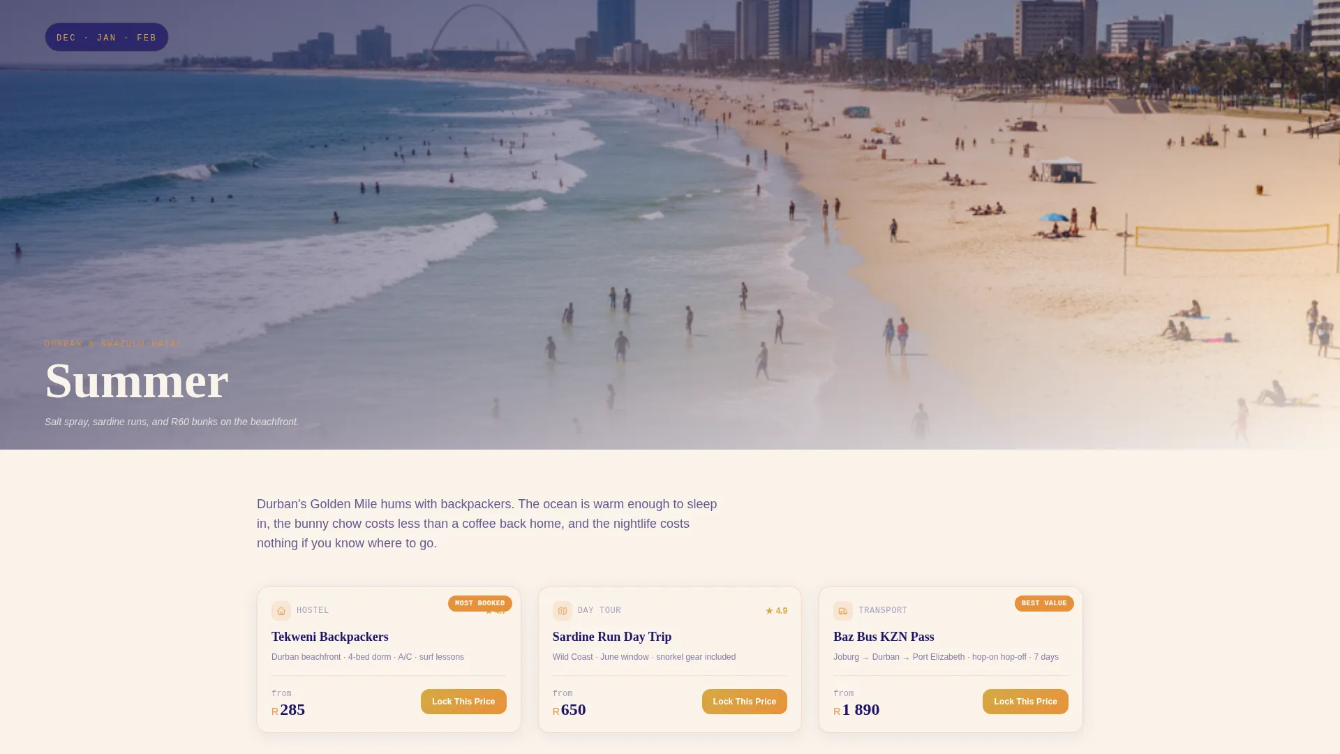
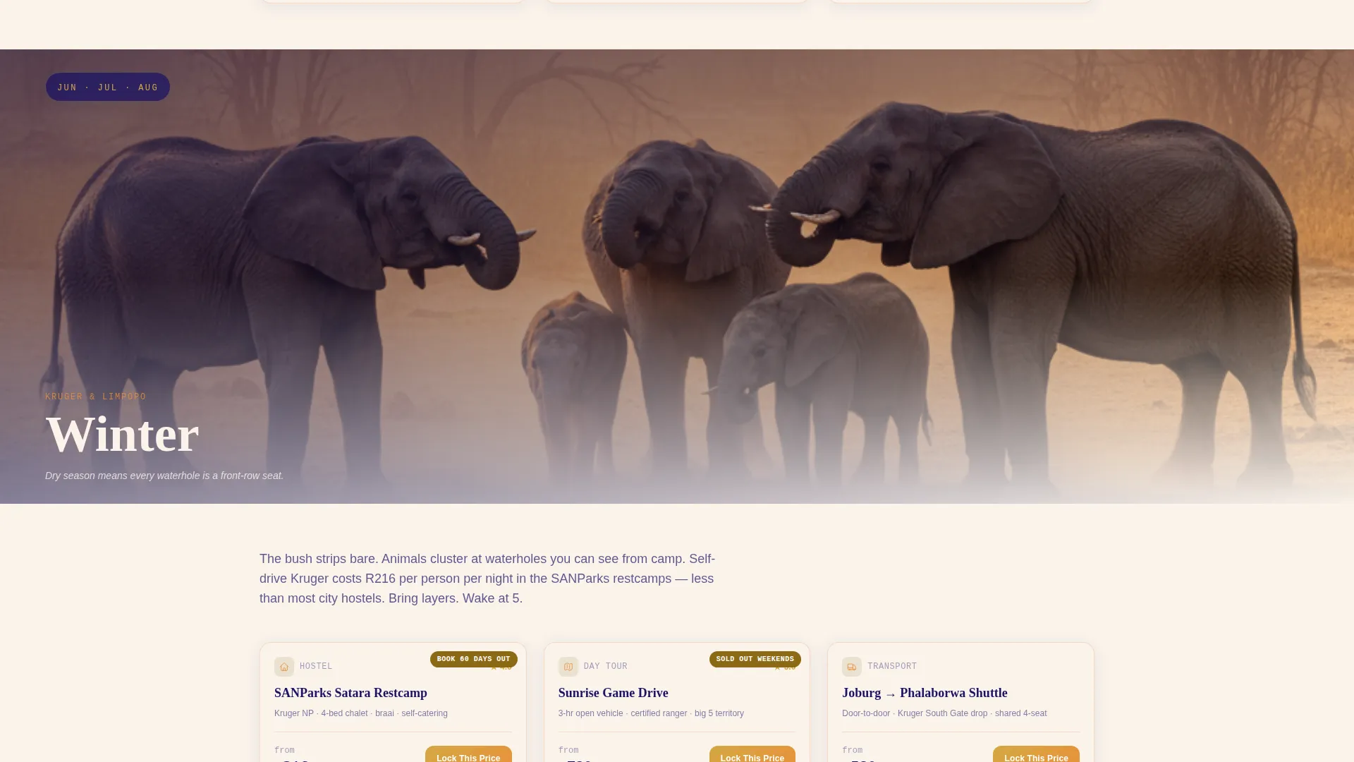
The page is divided into four full-bleed seasonal sections: summer beach hostels in Durban, autumn whale-watching in Hermanus, winter safari deals in Kruger, and spring wildflower routes in Namaqualand. Each section opens with an atmospheric photograph and a month range label, then reveals budget breakdowns and curated itinerary content.
Bookable Cards with ZAR Pricing
Each seasonal section contains a scrollable card grid covering hostels, day tours, and transport passes. Cards display live pricing in South African rand and carry a consistent "Lock This Price" primary call to action to create gentle, honest urgency.
Sticky Itinerary Builder Bar
A persistent bottom bar labelled "Build My Trip" stays visible as visitors scroll. Clicking it opens a lightweight builder that asks three questions: arrival city, number of nights, and travel month. The flow is minimal by design so it does not interrupt browsing.
Earned Email Capture Flow
Email capture happens after the visitor saves a custom itinerary, not before. The prompt is framed as "Send My Route" rather than a newsletter signup. This positions the data exchange as a useful service and reduces friction for budget-conscious, privacy-aware travellers.
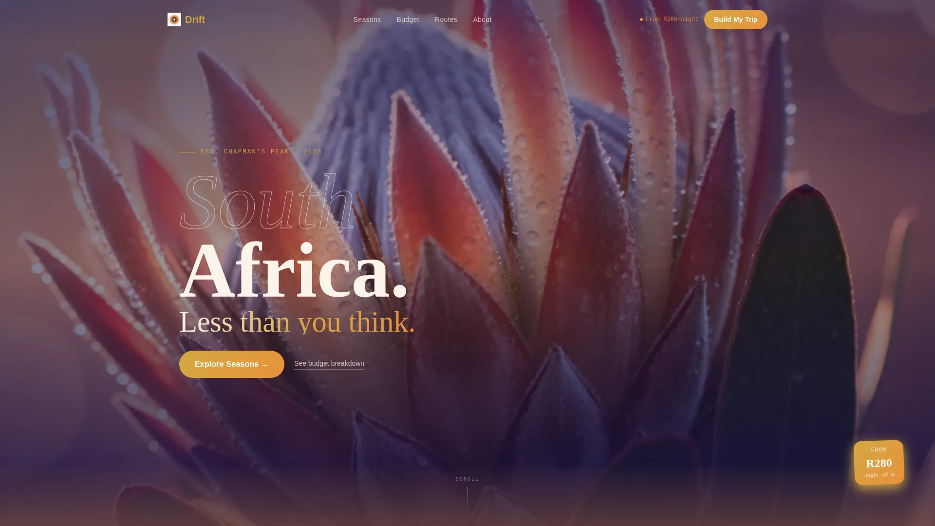
Macro Close-Up Hero Header
The header uses a hyper-detailed, full-viewport photograph of a single protea flower in golden side-light. After a short pause, a single line of light sans-serif type appears over the bokeh background. The result is intimate and tactile rather than a predictable landscape shot.
Luxe Minimal Sunset Gradient System
The color palette moves vertically down the page: deep Karoo indigo anchors the navigation and footer, while Drakensberg amber and fynbos blush wash across hero sections. Molten gold accents highlight buttons and price tags. The overall effect is a bushveld sunset rendered in a clean, modern layout.
Page sections overview
| Section | Purpose |
|---|---|
| Macro Hero Header | Opens with protea close-up and brand headline |
| Summer Season Block | Durban beach hostel cards and summer budget breakdown |
| Autumn Season Block | Hermanus whale-watching tours and autumn itinerary cards |
| Winter Season Block | Kruger safari deals and winter pricing cards |
| Spring Season Block | Namaqualand wildflower routes and spring experience cards |
| Sticky Builder Bar | Persistent "Build My Trip" itinerary entry point |
| Itinerary Builder Panel | Arrival city, nights, and travel month capture form |
| Email Capture Gate | "Send My Route" prompt after first itinerary save |
Design & branding system
The visual identity is Luxe Minimal with a Sunset Gradient color system. The palette is anchored by deep Karoo indigo at the navigation and footer, warming through Drakensberg amber and fynbos blush across the main content sections, and opening into bleached bone white for generous negative space.
- Colors: deep Karoo indigo (#1B1464), Drakensberg amber (#E8913A), fynbos blush (#F4C7AB), bleached bone white (#FAF3EB), and molten gold (#D4A843) for buttons and price tags
- Typography uses a light, airy sans-serif face to keep the editorial tone clean and readable against gradient backgrounds
- Gradients move vertically so the scroll feels like descending from dusk into a warm amber evening, giving the page a continuous cinematic rhythm
Mobile & speed optimization
Drift is structured as a full-width immersive layout, so the scroll experience is designed to translate naturally from desktop to smaller screens. The alternating breathe-and-browse rhythm keeps each mobile viewport purposeful rather than overwhelming.
- The sticky "Build My Trip" bar is always within thumb reach on mobile, keeping the primary conversion path accessible at any scroll depth
- Card grids reflow to single-column layouts on smaller screens so pricing and call-to-action buttons remain easy to tap without zooming
How this template helps you convert
Drift uses three layered conversion mechanisms that work together across the full-page scroll. Each one is low-pressure and earns trust before asking for anything.
- The "Lock This Price" call to action on every bookable card creates soft urgency without countdown timers or manipulative copy, encouraging visitors to commit to a specific hostel, tour, or transport pass before leaving the page.
- The "Build My Trip" itinerary builder deepens visitor investment by letting them personalise a route before any email is requested, making the subsequent "Send My Route" prompt feel genuinely useful rather than intrusive.
Other information about this template
Drift is a strong fit for content publishers and operators building in the South Africa budget travel space. The template's seasonal structure makes it straightforward to update content quarterly, keeping the page relevant across the full year.
- The template supports a travel-journal editorial tone, making it well-suited for long-form travel guide content that pairs storytelling with transactional cards
- Pricing displayed in South African rand makes the template immediately relevant to both local South African travellers and international visitors calculating trip costs
- The Baz Bus route network, which is a hop-on hop-off bus service popular with backpackers, is a natural fit for the transport pass card component within each seasonal section

Theme
Luxe Minimal
Creative direction
Seasonal/Moment
Color system
Sunset Gradient
Style
Full-Width Immersive
Direction
Marketplace/Multi
Page Sections
Seasonal Scroll Structure
Bookable Cards with ZAR Pricing
Sticky Itinerary Builder Bar
Earned Email Capture Flow
Macro Close-up Hero Header
Luxe Minimal Sunset Gradient System
Related questions
Can I customise the seasonal sections for destinations outside South Africa?
How does the itinerary builder work inside this template?
Is the ZAR pricing on the cards live or placeholder content?
What photography style does the hero section use?
Who manages the email list collected through 'Send My Route'?


