Vacation Rental & Villa Professional Website Template
Drift is a storybook-style landing page template for coastal urban apartment rentals. It guides visitors through full-page, mood-driven apartment moments using a Marine and Coastal visual identity, a floating search overlay, and an emotion-first layout that turns browsing into imagining. Built for rental marketplaces that want to sell feeling before showing floor plans.
by Rocket studio
Quick summary
Drift is an immersive, single-page rental marketplace template built around atmosphere and emotion. Each full-page section presents a coastal apartment as a lived moment rather than a listing. The Rainforest color system, parallax header, and floating search overlay work together to slow the visitor down and make them feel at home before they ever tap a button.
Who this template is for
Drift is designed for coastal rental operators, boutique apartment marketplaces, and property managers who want their listings to feel like an invitation rather than a catalog. If your audience chooses where to live based on how a place feels, this template speaks their language.
- Remote workers seeking coastal rentals with reliable connectivity and an ocean view
- Couples and traveling professionals on short-term contracts who need an immediate sense of place
- Boutique rental brands that compete on mood and experience rather than price alone
What problem this template solves
Most rental listing pages look like spreadsheets. They lead with square footage, bedroom counts, and price before the visitor has any reason to care. Drift reverses that order. It earns the click by making the visitor feel the apartment first, then offering the logistics.
- Visitors leave standard listing pages quickly because nothing makes them feel the space
- Generic templates force renters to imagine atmosphere from thumbnail grids and bullet specs
- Short-term and relocation renters need emotional proof of place before committing to a search
What you get with this template
Drift delivers a fully structured, single-page flow built around storytelling and conversion. Every section has a defined role, and the visual system is consistent from header to search overlay.
- A parallax macro close-up header with a delayed, fog-white headline reveal
- Full-page apartment mood sections with sparse poetic text, neighborhood name, price, and availability
- A floating pill-style primary call-to-action and a minimal coastal city search overlay
Feature list
This section breaks down the core built-in capabilities that define how Drift looks and works.
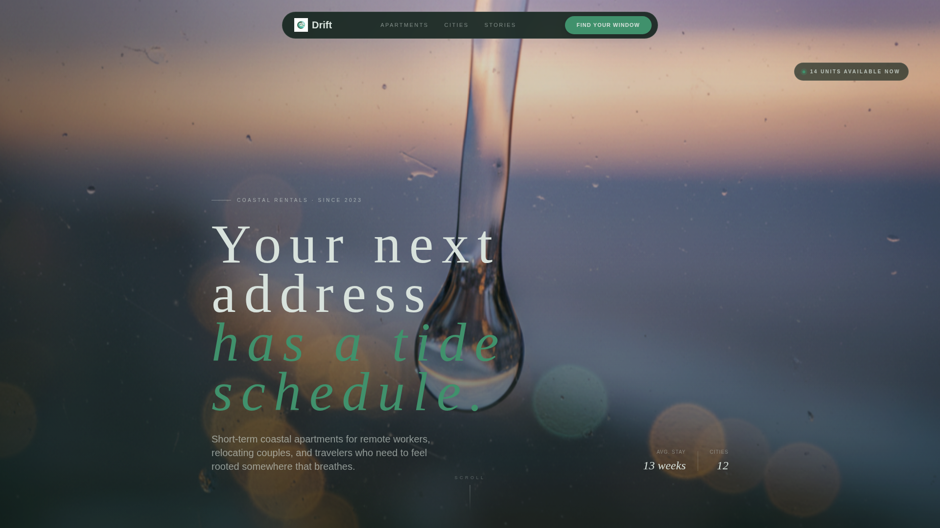
Parallax Macro Header with Delayed Headline
The header uses an extreme close-up of a raindrop on a floor-to-ceiling window. Through the glass blur, a coastal cityscape at dusk is visible. The headline "Your next address has a tide schedule." appears after a two-second delay in fog-white tracking. A subtle parallax drift makes the droplet feel like it is still moving.
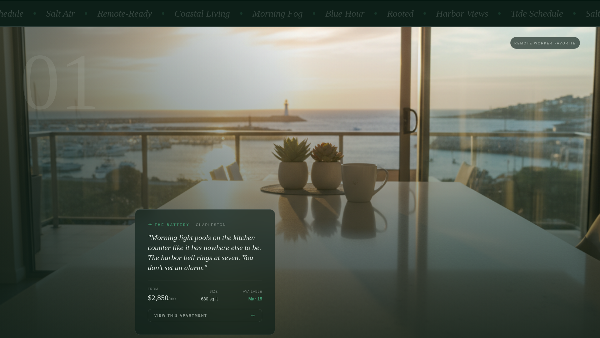
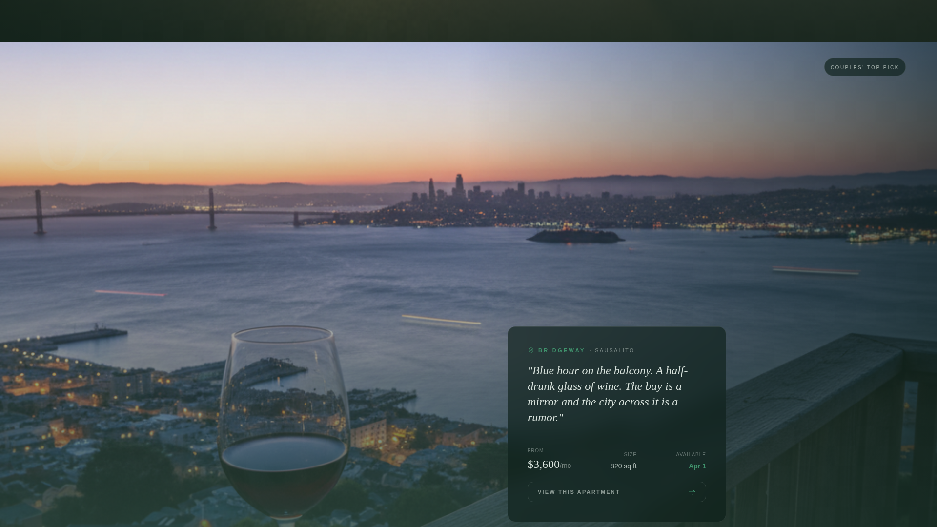
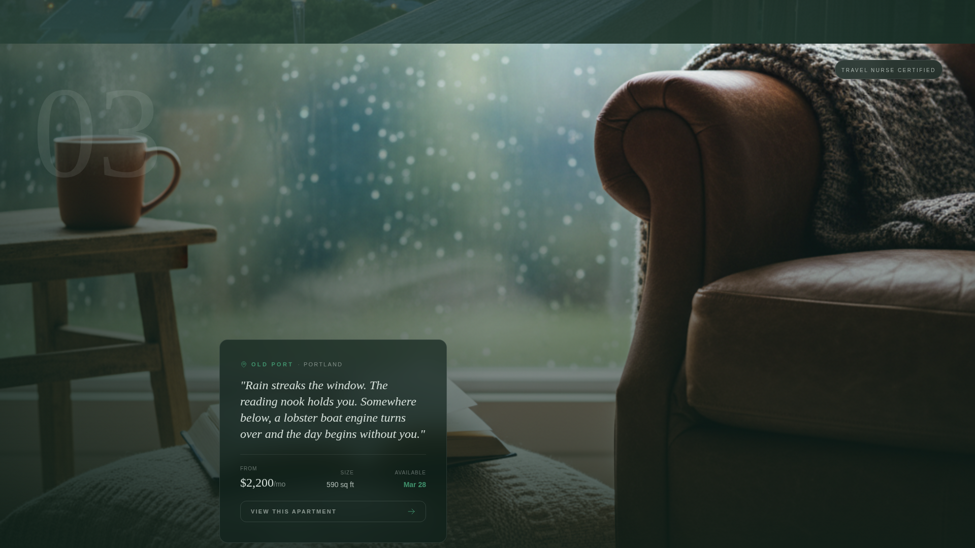
Full-Page Apartment Mood Sections
Each apartment is presented as a single emotional moment: morning light on a kitchen counter, a balcony at blue hour, a rain-streaked reading nook. Text is intentionally sparse, showing only the neighborhood name, one sensory sentence, the price, and availability. The scroll pacing is deliberate, designed to slow the visitor and deepen immersion with each section.
Floating "Find Your Window" Call-to-Action
A canopy green pill button labeled "Find Your Window" appears as a persistent floating element after the second full-page apartment section. It stays accessible without interrupting the visual flow, giving visitors a clear next step whenever they are ready without rushing them.
Minimal Coastal Search Overlay
Tapping the primary call-to-action opens a focused search overlay. Visitors choose from coastal cities displayed as illustrated map pins, select a move-in month, and set a budget using a single draggable slider. The interface is intentionally minimal to reduce friction and keep the mood intact.
Tap-to-Expand Apartment Listings
Any apartment image can be tapped to expand the full listing detail without navigating away from the page. This keeps the visitor inside the experience and removes the friction of opening new tabs or losing their place in the story.
Rainforest Color System
The four-color palette anchors every element in the Marine and Coastal theme. Canopy green grounds headers and navigation, tidal moss washes section backgrounds, morning fog softens negative space, and bioluminescent teal pulses on interactive elements like buttons, map pins, and hover states.
Page sections overview
| Section | Purpose |
|---|---|
| Parallax Header | Opens with the macro raindrop photograph and delayed headline reveal |
| First Apartment Mood | Introduces the first coastal apartment as an emotional full-page moment |
| Second Apartment Mood | Deepens immersion before the floating call-to-action appears |
| Floating call to action Trigger | Activates the persistent "Find Your Window" pill button |
| Third Apartment Mood | Shifts the visitor from browsing to imagining their own mornings |
| Search Overlay | Minimal city, month, and budget filter triggered by the primary call-to-action |
| Expanded Listing View | Full apartment detail revealed in-page on image tap |
Design & branding system
The visual identity is built on a Rainforest color system interpreted through a Marine and Coastal lens. The result feels like a mangrove root system meeting saltwater: lush, alive, and never heavy.
- Canopy green (#1B4332) for headers and navigation, tidal moss (#52796F) for section backgrounds, morning fog (#D8E2DC) for negative space, and bioluminescent teal (#40916C) for all interactive states
- Typography is sparse and poetic throughout, with fog-white tracking on the headline and minimal label text across apartment sections
- The Atmosphere and Mood creative direction keeps imagery dominant and copy secondary at every scroll depth
Mobile & speed optimization
Drift is structured as a single-page flow, which keeps the layout focused and the scroll experience predictable across screen sizes. The full-page section format translates naturally to tall mobile viewports.
- Full-page apartment sections stack cleanly on smaller screens without losing their atmospheric quality
- The floating pill button remains accessible on mobile without blocking the image content behind it
- The search overlay is touch-friendly, with the draggable budget slider and illustrated city pins designed for finger interaction
How this template helps you convert
Drift is built around a principle of emotion first, logistics second. Every structural decision is designed to move a visitor from passive scrolling to active searching without feeling pushed.
- The delayed headline and parallax header create immediate curiosity, slowing the visitor down before they have seen a single listing
- The full-page mood sections build cumulative desire so that by the third apartment, the visitor is no longer comparing options but imagining which mornings belong to them
- The floating call-to-action and frictionless search overlay appear at exactly the moment the visitor is most ready, making it effortless to take the next step
Other information about this template
Drift is categorized under Travel and Hospitality, with a specific focus on the urban apartment rental and vacation rental niche. It is a Storybook and Full-Page style template, meaning each scroll section is treated as a standalone visual spread rather than a traditional content block. The Marketplace and Multi conversion layout means it supports multiple apartment listings within a single continuous page flow.
- The template is designed for coastal city rental contexts and works especially well for markets where lifestyle and location matter more than unit specifications
- The storybook scroll pace is a deliberate design choice: sections linger, transitions are unhurried, and the overall effect is closer to a curated photo book than a property portal
- This template fits naturally within platforms that host boutique or independent rental brands looking to differentiate from large aggregator-style listing sites
Theme
Marine & Coastal
Creative direction
Atmosphere & Mood
Color system
Rainforest
Style
Storybook/Full-Page
Direction
Marketplace/Multi
Page Sections
Parallax Macro Header with Delayed Headline
Full-page Apartment Mood Sections
Floating Find Your Window Button
Minimal Coastal City Search Overlay
Tap-to-expand In-page Listings
Rainforest Four-color Visual System
Related questions
Who is the Drift template built for?
Can visitors browse multiple apartments without leaving the page?
How does the search function work inside Drift?
Is this template suited to short-term and relocation rentals?
Can I adapt the color palette and copy to match my brand?