Cruise & Luxury Travel Booking Website Template
Drift is a horizontal scroll landing page template for a luxury river cruise line. It pairs a cinematic search-box header with immersive destination panels that shift as visitors swipe, creating a journey-like browsing experience. A pinned "Reserve Your Voyage" button and a stepped booking drawer guide visitors from discovery to reservation with unhurried, opulent confidence.
by Rocket studio
Quick summary
Drift is a single-page horizontal scroll template built for a luxury river cruise brand. It opens with a drone-footage header and a frosted-glass search bar, then glides visitors through destination panels that feel like turning pages in a travel journal. Every design choice, from the dark emerald palette to the champagne gold accents, is built to earn trust and inspire a booking.
Who this template is for
This template is designed for river cruise operators who sell a high-consideration, high-value journey rather than a commodity ticket. It speaks directly to guests who expect refinement at every touchpoint.
- Luxury river cruise lines marketing multi-destination itineraries to affluent leisure travelers
- Travel brands targeting retired couples, anniversary travelers, and multigenerational groups who prefer one clean booking over many separate reservations
- Cruise marketers who want a visually immersive presentation that competes with the prestige of their on-board experience
What problem this template solves
Most cruise landing pages feel like inventory lists. They bury destination beauty under pricing tables and generic stock photography. Drift solves a specific problem: it makes the browsing experience feel as considered as the voyage itself, so visitors arrive at the booking step already emotionally invested.
- Visitors lose interest before converting because flat layouts cannot communicate the atmosphere of a luxury river journey
- Operators struggle to present multiple destination rivers in a single page without cluttering the experience
- Potential guests need a secondary capture path when they are not yet ready to book, so warm leads are lost
What you get with this template
Drift delivers a complete, ready-to-customize landing page structure with every major section already designed and in place. The layout follows a horizontal scroll architecture, meaning the page unfolds laterally rather than vertically, giving each destination its own visual stage.
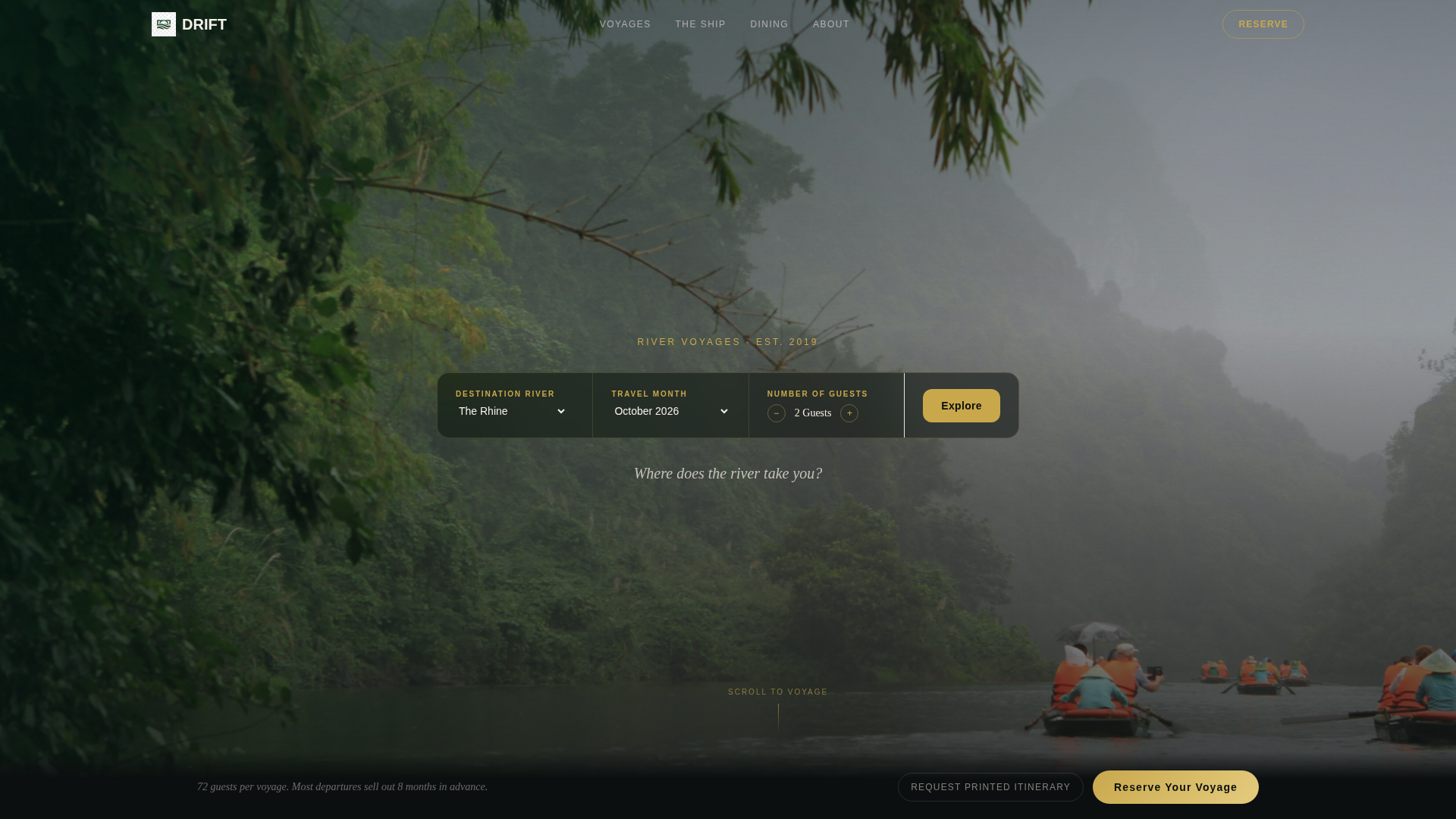
- A cinematic search-box header with frosted glass bar, three search fields (destination river, travel month, number of guests), and a drone-footage background
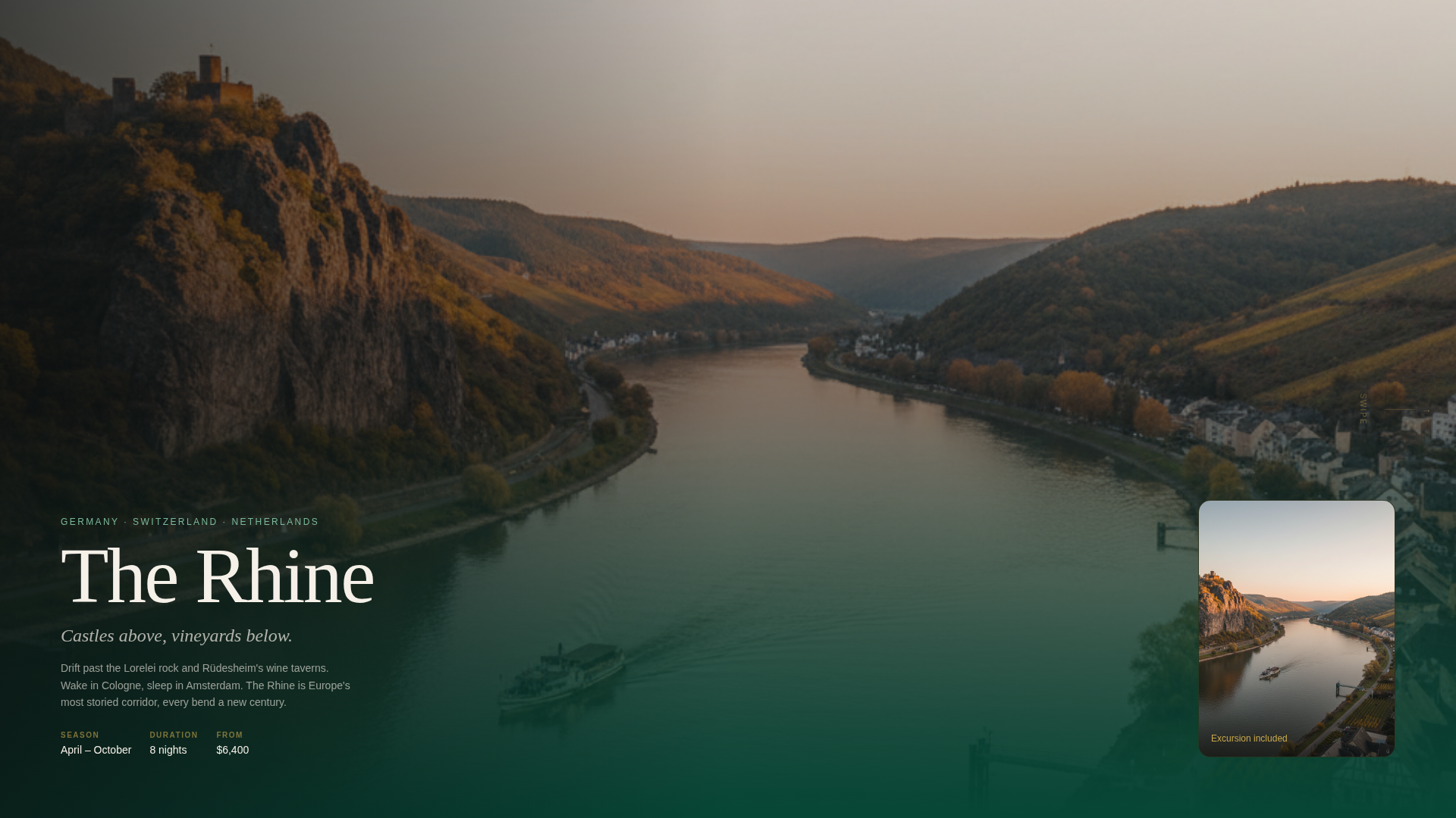
- A multi-panel horizontal scroll section where each destination river, Rhine, Douro, Danube, Mekong, and Nordic fjords, gets its own full-bleed panel with parallax interior and excursion layers
- A stepped booking drawer with a visual calendar, cabin category selector using a cross-section deck diagram, and guest and dining preference inputs, plus a secondary "Request a Printed Itinerary" lead-capture path
Feature list
Drift packages the following capabilities into its core design structure.
Cinematic Search-Box Header
The header pairs a slow aerial drone shot of the vessel with a frosted glass search bar. Three fields, destination river, travel month, and number of guests, float over the footage. A single italic serif line, "Where does the river take you?", sits just below the bar without competing with the image.
Horizontal Scroll Destination Panels
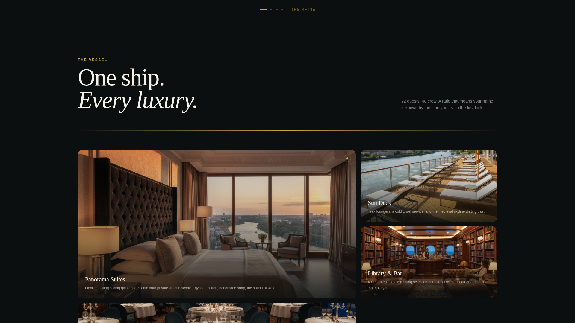
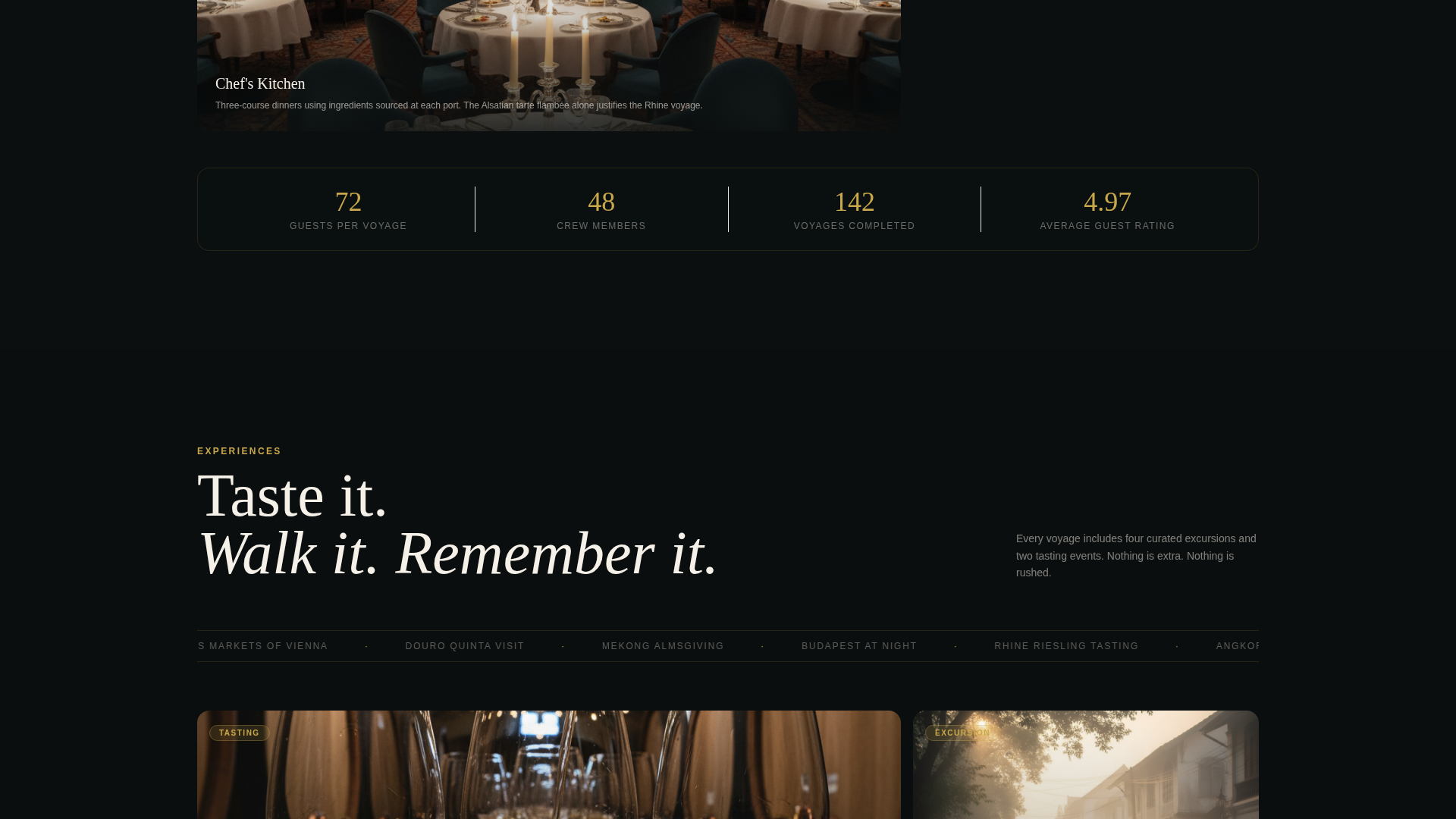
Each lateral swipe carries the visitor to a new destination river. Backgrounds shift from emerald Rhine vineyards to amber Southeast Asian temples to ice-blue Scandinavian fjords. Within each panel, stateroom interiors, tasting menu details, and excursion snapshots layer in parallax as the visitor moves through the scene.
Stepped Booking Drawer
Clicking "Reserve Your Voyage" opens a three-step drawer embedded in the page. Step one presents a visual calendar with availability and starting fares. Step two shows a cross-section deck diagram for cabin category selection. Step three collects guest count and dining preferences.
Pinned Reservation Call to Action
The "Reserve Your Voyage" button is rendered in champagne gold and fixed to the bottom edge of the viewport. It remains visible across every scroll panel so the path to booking is never more than one tap away regardless of how far along in the journey a visitor has traveled.
Printed Itinerary Lead Capture
A secondary conversion path invites visitors to request a printed itinerary by submitting their name and mailing address. This gives the sales team a warm lead from guests who are interested but not yet ready to commit, and it gives those guests a tangible, physical keepsake to consider at home.
Parallax Layered Panel Interiors
Inside each destination panel, multiple image layers move at slightly different speeds as the visitor scrolls, creating depth and the sensation of walking through a real space. Stateroom photography, curated meal imagery, and shore excursion visuals stack naturally within each panel.
Page sections overview
| Section | Purpose |
|---|---|
| Cinematic Search Header | Opens the page with drone footage and a frosted-glass search bar |
| Rhine Destination Panel | Showcases emerald vineyard scenery with stateroom and excursion layers |
| Douro Destination Panel | Presents wine valley imagery with tasting menu and cabin visuals |
| Danube Destination Panel | Features Christmas market scenes and cultural excursion snapshots |
| Mekong Destination Panel | Highlights amber temple landscapes and regional dining details |
| Nordic Fjords Panel | Displays ice-blue fjord vistas with onboard interior photography |
| Stepped Booking Drawer | Guides visitors through river, cabin, and guest selection |
| Itinerary Lead Capture | Collects name and address for visitors requesting a printed brochure |
| Pinned Voyage call to action | Keeps the reservation button visible across every scroll panel |
Design & branding system
The visual identity follows a Luxe Minimal theme built around a Dark Emerald color system. The palette is designed to feel like a lacquered jewelry box, opulent in texture but restrained in noise. Every color has an assigned role that keeps the hierarchy consistent from the first frame to the booking drawer.
- Deep river green (#064635) anchors full-bleed destination backgrounds, ivory (#F5F0E8) breathes across card panels and body text, and champagne gold (#C9A84C) traces dividing lines, hover states, and the primary call-to-action button
- Polished obsidian (#0B0F0F) holds navigation bars, overlays, and the frosted-glass search bar so active interface elements recede cleanly behind photographic content
- Typography uses a light ivory serif for display lines and headline moments, keeping the visual voice quiet, unhurried, and confident
Mobile & speed optimization
The horizontal scroll architecture is built with touch-based lateral swiping in mind, so the destination-panel journey translates naturally to smartphones and tablets. Gesture navigation feels intuitive for mobile users accustomed to swipe-forward interactions.
- Each destination panel is structured to present a complete, legible visual story at portrait mobile viewport widths without truncating imagery or breaking parallax layers
- The frosted-glass search bar and pinned booking button are sized and spaced for comfortable thumb interaction on smaller screens
- The stepped booking drawer opens as an in-page overlay, keeping the visitor within the same browsing context rather than redirecting to a separate page
How this template helps you convert
Drift is engineered around a booking-and-scheduling conversion goal. Every structural decision serves the path from discovery to reservation commitment.
- The horizontal scroll format creates accumulating desire rather than urgency, each new destination panel adds another reason to book, so visitors arrive at the call to action already imagining themselves on board
- The pinned "Reserve Your Voyage" button ensures the booking entry point is never hidden, and the stepped drawer reduces friction by breaking the reservation process into three clear, manageable choices
- The printed itinerary capture path ensures that visitors who leave without booking are not lost, their contact details become a warm lead that the sales team can follow up with a physical, premium-feel brochure
Other information about this template
Drift is part of a broader Travel and Hospitality template library covering the Cruise and Luxury Travel subcategory. It is purpose-built for the river cruise niche and can support any operator who needs a visually led, booking-focused single-page presence.
- The template style is Horizontal Scroll, the theme is Luxe Minimal, and the creative direction is Immersive Visual, a combination suited to destinations where atmosphere sells the ticket
- The header concept is a Search Box integrated into a full-bleed video background, which keeps the primary conversion action visible from the very first moment a visitor lands on the page
- The Dark Emerald color system and the overall design language can be adapted to match a specific brand identity by swapping hex values, typefaces, and photography while keeping the structural layout intact
Theme
Luxe Minimal
Creative direction
Immersive Visual
Color system
Dark Emerald
Style
Horizontal Scroll
Direction
Booking/Scheduling
Page Sections
Cinematic Drone-footage Header
Horizontal Scroll Destination Journey
Parallax Panel Layering
Three-step Booking Drawer
Pinned Reservation Button
Printed Itinerary Lead Capture
Related questions
Who is this landing page template designed for?
Can I customize the destination panels for my own itineraries?
How does the stepped booking drawer work?
What is the printed itinerary capture path?
Can the color system be adapted to match an existing brand?