South Africa Travel Professional Website Template
Drift is a horizontal-scroll solo travel landing page built for South Africa's coastline. Five cinematic chapter cards walk visitors through real routes, from the Wild Coast to iSimangaliso Wetland, with solo-safety notes and hostel picks layered into each panel. The page drives registrations for a live virtual masterclass through earned depth, not pressure.
by Rocket studio
Quick summary
Drift is a single-page horizontal-scroll landing page designed for solo travellers exploring South Africa's coastline. It moves visitors through five coastal chapters, builds trust with real route detail and pull-quote social proof, then presents a low-friction event registration form. The goal is simple: earn the click before asking for it.
Who this template is for
Drift speaks directly to people who journey alone by choice, not circumstance. It is built for creators and communicators who need a landing page that feels as considered as the destination it describes. Whether you are promoting a travel guide, a masterclass, or a solo-travel brand, this template gives your offer a home that matches its ambition.
- Gap-year backpackers who want to walk South Africa's coast at their own pace, route by route, and need a trustworthy guide before they board a bus
- Remote workers and digital nomads who drift between Cape Town and the eastern shore, extending their stay one month at a time, curious about what lies further along the coast
- Travel creators, coaches, and educators who want to launch an event registration page that earns attention through deep local knowledge rather than loud sales copy
What problem this template solves
Solo travel content often fails in one of two ways. It either lists destinations without depth, leaving the reader with no real sense of what it feels like to be there alone, or it leads with a hard sell before the visitor has had time to discover anything worth caring about. Drift solves both problems at once.
- Visitors arrive with questions and mild fear about travelling alone. The page answers those questions section by section, presenting solo-safety notes, local hostel recommendations, and real traveller voices before asking for anything in return.
- Travel educators and guide creators struggle to present rich, multi-destination content without overwhelming the reader. The horizontal snap-scroll format lets visitors explore each coastal chapter at their own pace, one focused card at a time, so the content never feels like a wall of text.
- Event registration pages in the travel space often feel disconnected from the experience they promote. Drift builds the masterclass call to action into the natural end of a content journey, so "Reserve Your Seat" feels like the obvious next step rather than an interruption.
What you get with this template
Drift delivers a complete horizontal-scroll landing page experience, structured around five coastal chapters and one clear conversion goal. Every section is designed to do real work: inform, persuade, and move the visitor forward.
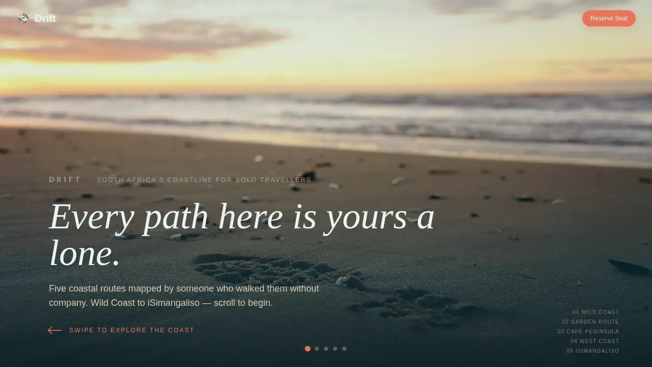
- A full-bleed hero section with a cinematic beach photograph, a letter-by-letter headline animation, and a pulsing coral scroll arrow that invites the first swipe
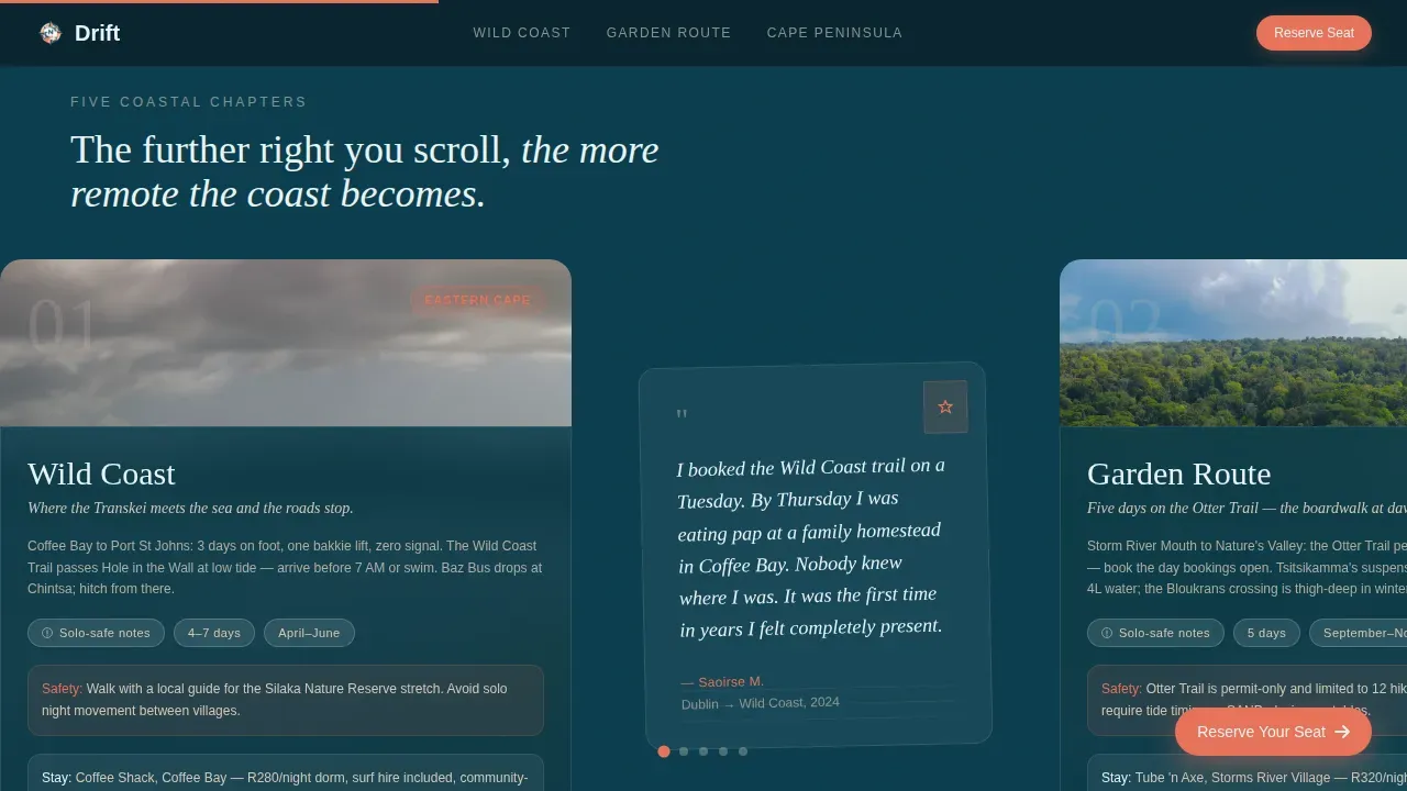
- Five snap-scroll chapter cards covering the Wild Coast, Garden Route, Cape Peninsula, West Coast, and iSimangaliso Wetland, each with a glassmorphism teal panel holding route detail, solo-safety notes, and a local accommodation pick
- Postcard-style pull-quote slides between chapters, a sticky coral call-to-action pill that appears after the second card, a three-field registration form, a masterclass value-proof panel, and a secondary free packing-list download link for colder leads
Feature list
Drift is built around a small number of deliberate, high-impact design and content decisions. Each feature serves the solo traveller audience and the event registration goal directly.
Horizontal Snap-Scroll Chapter Navigation
The page moves sideways through five distinct coastal chapters, each snapping into full focus before the visitor scrolls on. This format turns a single landing page into a journey. Visitors discover each destination at their own pace, and the progressive reveal of deeper, more remote coastline builds a genuine sense of earned solitude. The structure keeps attention locked without requiring the visitor to read everything at once.
Cinematic Full-Bleed Hero Section
The hero opens on a full-width, high-resolution beach photograph shot from chest height on Noordhoek Beach. A single set of footprints trails south toward Chapman's Peak in late-afternoon side-light. After a short hold, the headline appears letter by letter in a light condensed sans-serif typeface. A thin coral arrow pulses left, signalling the first horizontal swipe. A strong, concise headline in the hero section immediately explains the value of the offering and sets the emotional tone for everything that follows.
Glassmorphism Coastal Chapter Cards
Each of the five chapter cards layers a full-bleed coastal photograph behind a translucent deep Atlantic teal panel. Inside each panel, visitors find route details, solo-safety guidance, and a local hostel or guesthouse recommendation. The glassmorphism effect keeps the landscape visible through the information layer, so the beauty of the shore is never hidden behind the content sitting on top of it. The further right a visitor scrolls, the more remote the coastline becomes, rewarding curiosity with a growing sense of discovery.
Postcard Pull-Quote Slides
Between each chapter card, short pull-quotes from solo travellers slide in like postcards from the road. These testimonials establish social proof at exactly the right moment: after a visitor has absorbed route detail but before they are asked to act. Featuring real solo traveller voices builds trust and reduces hesitation, which is especially important for an audience that may be planning their first time travelling alone.
Sticky Coral Call-to-Action Pill
A sticky call-to-action button keeps the "Reserve Your Seat" prompt visible as the visitor moves through the content. The coral pill appears after the second chapter card and remains accessible throughout the rest of the horizontal journey. A sticky call-to-action button keeps critical actions visible as the user scrolls, particularly on mobile devices during the vertical fallback experience.
Three-Field Registration Form and Value Panel
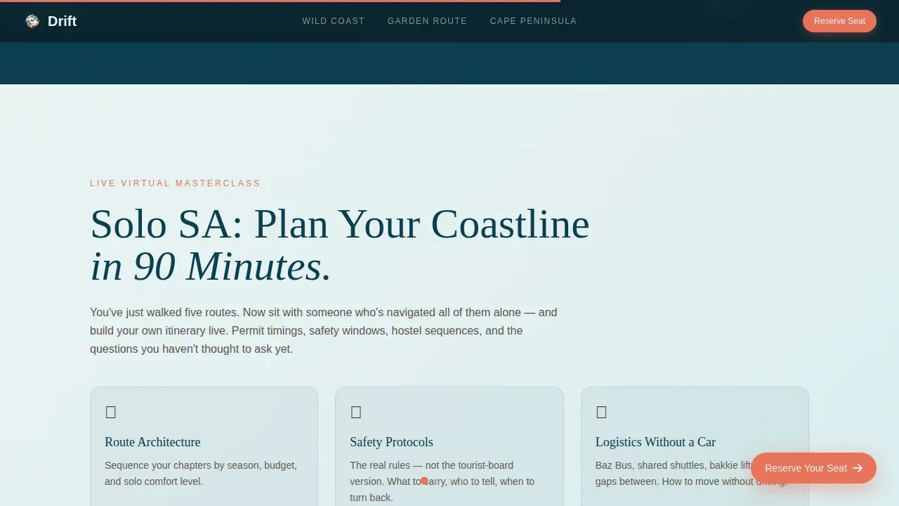
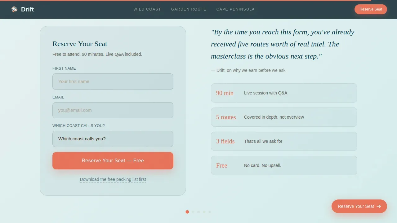
The registration form asks for first name, email address, and one dropdown selection: "Which coast calls you?" with options matching the five chapters. This minimal friction approach reduces drop-off. The masterclass value-proof panel sits immediately before the form, explaining why attending "Solo SA: Plan Your Coastline in 90 Minutes" is worth the visitor's time. A secondary text link beneath the form reads "Download the free packing list first," capturing colder leads through email without requiring full registration commitment.
Page sections overview
| Section | Purpose |
|---|---|
| Hero full-bleed | Opens with cinematic beach photo, animated headline, and coral scroll invitation |
| Wild Coast card | First chapter with route detail, safety notes, and hostel pick |
| Pull-quote postcard | Solo traveller voice slides in after chapter one |
| Garden Route card | Second chapter covering the southern coastal corridor |
| Pull-quote postcard | Second postcard slide anchors social proof mid-journey |
| Cape Peninsula card | Third chapter, kelp forests and Atlantic shore walks |
| Pull-quote postcard | Third solo voice before the sticky call to action activates |
| West Coast card | Fourth chapter, quieter shores and farm-to-table dine stops |
| iSimangaliso card | Fifth chapter, the deepest part of the wild northeastern coast |
| Masterclass value panel | Explains why the 90-minute class is worth attending |
| Registration form | Three-field form driving event sign-ups |
| Minimal footer | Horizontal flow footer with secondary packing-list link |
Design & branding system
The visual identity follows a Marine and Coastal theme built around the Ocean Calm colour system. Every colour decision has a specific job. The palette behaves like a tide pool at low water: cool mineral surfaces, warm sand edges, and one bright element that draws the eye toward action.
- Deep Atlantic teal (#0B3D4E) anchors dark backgrounds and glassmorphism panels; sun-bleached driftwood (#D6C9B6) carries warm-gray body text on light surfaces; Indian Ocean foam (#EAF4F4) provides the soft white used on light-panel backgrounds; living coral (#E8735A) appears exclusively on buttons, scroll progress indicators, hover states, and the sticky call-to-action pill, so it always signals something to touch
- Typography pairs Fraunces, an editorial serif used for all major headlines, with DM Sans for body copy and interface elements; this combination gives the page a cinematic, editorial feeling while staying highly readable at all scroll speeds
- The creative direction is Curated Collection: five chapters presented as tall snap-scroll cards that each fill the viewport, with staggered entrance animations, a letter-by-letter headline reveal in the hero, and coral pulse animation on interactive elements; backgrounds alternate between deep teal and soft foam white to maintain visual rhythm without monotony
Mobile & speed optimization
Drift is designed desktop-first to honour the horizontal scroll experience, but it includes a thoughtful vertical fallback for mobile visitors. The chapter cards restack into a vertical reading flow so the same five routes remain fully accessible on smaller screens. No content is hidden or removed in the mobile view.
- The horizontal scroll is built on CSS scroll-snap, which uses native browser behaviour rather than heavy JavaScript libraries, keeping the scroll feel immediate and responsive
- Entrance animations use Intersection Observer to trigger staggered card reveals and the hero headline animation only when elements enter the viewport, which avoids unnecessary processing during initial page load
- The three-field registration form is designed for fast, low-friction completion on any screen size, and the sticky coral call-to-action pill remains visible throughout the mobile vertical scroll so the primary conversion action is never out of reach
How this template helps you convert
Drift earns the registration before it asks for it. By the time a visitor reaches the form, they have already received five routes of real coastal intelligence. The conversion strategy is built into the page structure itself, not layered on top of it as an afterthought.
- The horizontal chapter journey delivers genuine value first. Visitors discover route maps, solo-safety notes, and local hostel recommendations across all five coastal chapters before they encounter a single call to action. By the time the sticky coral pill appears after the second card, the visitor already trusts the depth of what is being offered, making the masterclass feel like a logical next step rather than a pitch. Successful landing pages in the tech industry often feature clear and compelling calls to action that guide users toward conversion, and Drift applies this principle by building desire through content before presenting the action.
- The secondary download link captures visitors who are not yet ready to register. "Download the free packing list first" sits beneath the primary form as a text link, giving colder leads a lower-commitment entry point. This two-path approach means the page works for both warm and cold audiences without cluttering the primary conversion goal. High-converting landing pages often include a simple and intuitive layout that minimises distractions, and Drift reinforces this by removing standard navigation menus and external links, keeping visitors focused on the single goal of the page.
- Social proof is distributed throughout the journey rather than concentrated in one testimonials block. Pull-quote postcards slide in between each chapter card, so trust is built continuously. Effective landing pages utilise testimonials and case studies to build trust and credibility, and Drift applies this at multiple scroll positions rather than leaving social proof as a footnote at the bottom of the page.
Other information about this template
Drift is part of a broader family of coastal editorial templates that share the Ocean Calm colour system and Marine and Coastal theme. It is optimised for travel educators, solo travel guide creators, and event marketers who want a landing page that feels as rich as the content it promotes. The following context points are useful to know before customising or deploying this template.
- The drift solo coastline discovery landing page template is a single-page website format that can be adapted to other solo travel destinations beyond South Africa's coastline. The five chapter structure works for any tour or route-based guide where visitors benefit from progressive discovery at their own pace.
- The template's colour system and typography are fully customisable. You can swap the five coastal chapters for any set of destinations, update the pull-quote postcards with your own traveller testimonials, and replace the hero photograph with any full-bleed coastal or landscape image that matches your brand.
- The registration form is built for low friction: three fields only (first name, email, and one dropdown). You can adapt the dropdown options to match any tour or destination set you are promoting. The secondary "free packing list" download link can be replaced with any lead-magnet asset relevant to your audience.
- Using templates in web development can significantly speed up the development process. This template provides a consistent design framework so you can focus on content and conversion strategy rather than rebuilding layout from scratch.
- Templates can help non-technical users create polished landing pages without needing extensive coding knowledge. The structure and animation logic are built in, so customisation focuses on content, photography, and colour rather than code.
- AI-powered no-code development tools allow users to create applications without traditional programming skills, and this template is designed to work within those environments. No-code tools enable solo entrepreneurs and small businesses to build and launch production-ready pages quickly, which makes Drift a practical choice for independent travel educators working without a development team.
- The page is designed to identify user needs through engagement. The "Which coast calls you?" dropdown in the registration form gathers preference data at the point of sign-up, giving the host useful segmentation information from the very beginning of the attendee relationship.
- Safety and support details are built into each chapter card. The landing page addresses potential concerns about solo travel, such as accommodation options and local guides, which are essential for building confidence with an audience that may be planning their first solo trip.
- Benefit-driven storytelling is the core content philosophy. The page focuses on the experience of being on the shore alone rather than listing features in abstract terms. This approach is consistent with strong user experience and engagement strategy: the experience itself is the proof.
- A full-width, high-resolution photo or video of a dramatic coastline is recommended to convey the coastal adventure theme in the hero section. The template is pre-structured for this format, with the hero photograph occupying the full viewport before any text appears.
- Canva is excellent for creating visually rich supporting assets such as pull-quote postcard graphics, chapter card backgrounds, or social promotional materials that complement this template's aesthetic. Using a drag-and-drop approach, you can produce on-brand coastal imagery to fill each chapter card without needing a professional photographer for every route.
- Unicorn Platform is designed for quick, high-converting adventure and tourism pages and pairs well with this template's aesthetic and conversion structure if you are choosing a hosting or publishing environment for deployment.
- A/B testing is commonly used to optimise landing pages for better conversion rates. You can test variations of the hero headline, the sticky call-to-action copy, and the masterclass value-proof panel to refine performance once the page is live.
- The template supports customisation options including your own logo, colour overrides, and specific chapter content tailored to your traffic source and audience segment. Each chapter card's teal glassmorphism panel can hold custom route text, safety guidance, and accommodation recommendations relevant to your specific tour or destination.
- The "Coastline" design language refers to a specific aesthetic approach that creates a clean, modern, and engaging user experience across the Solo template series. Drift carries this identity through its consistent use of deep teal, foam white, and coral as the three-tier colour hierarchy, ensuring the page feels intentional and editorial rather than generic.
- For travel content published in January or any early-season period when solo travel planning peaks, Drift's event registration format is particularly effective. The masterclass format allows hosts to gather an engaged audience at a specific moment in the planning calendar, which is valuable for destinations with distinct travel seasons like South Africa's coastline.
- The template's horizontal scroll format is a refreshing mix of editorial magazine layout and interactive web experience. It creates a sense of wonder that standard vertical scroll pages cannot replicate, and it rewards visitors who take the time to explore every chapter with increasingly remote and beautiful coastal landscapes.
Theme
Marine & Coastal
Creative direction
Curated Collection
Color system
Ocean Calm
Style
Horizontal Scroll
Direction
Event Registration
Page Sections
Horizontal Snap-scroll Chapter Journey
Cinematic Full-bleed Hero with Animated Headline
Glassmorphism Coastal Chapter Cards
Postcard Pull-quote Social Proof Slides
Sticky Coral Call-to-action Pill
Three-field Registration Form with Dual Lead Paths
Related questions
Can I use this template for a different travel destination?
Does the horizontal scroll work on mobile devices?
How many fields does the registration form include?
Can I capture leads who are not ready to register for the masterclass?
Can I customise the colours, logo, and chapter content?