Thailand Travel Specialist Professional Website Template
Drift is a masonry-style Thailand solo travel landing page built for independent wanderers. It combines a Pinterest-inspired destination card grid, a visual itinerary sidebar, and a personalized trip-builder quiz into one cohesive page. The Organic Flow design and golden-hour photography make every scroll feel like flipping through a well-loved travel journal.
by Rocket studio
Quick summary
Drift is a single-page Thailand solo travel guide template built on a masonry grid layout. It is designed for creators and businesses serving independent travelers. Destination cards are bookable, the sticky footer drives quiz-led conversions, and a free packing checklist captures browsers not yet ready to commit.
Who this template is for
This template suits anyone building a content-led or marketplace-style resource for solo travelers heading to Thailand. It works equally well for travel bloggers, independent tour curators, and hostel collectives publishing route guides.
- Solo travel content creators and bloggers covering Thailand destinations
- Small travel businesses offering bookable experiences, hostel listings, or route guides
- Digital entrepreneurs building a Thailand-focused trip-planning or affiliate platform
What problem this template solves
Planning a solo trip to Thailand without a group or a fixed itinerary is genuinely hard. Most travel pages dump long lists of destinations on visitors without helping them decide what fits their budget, style, or timeline.
- Visitors leave without booking because the page gives no clear next step
- Budget travelers, remote workers, and first-time solo travelers each need different guidance
- A static page cannot match listings to a traveler's actual preferences
What you get with this template
You get a fully designed, single-page layout ready to fill with your Thailand content and listings. Every section serves a specific job, from drawing visitors in with the header to retaining browsers with the email capture.
- A masonry destination card grid with hover states, price tags, save buttons, and traveler review quotes
- A sticky footer with a primary "Build My Thailand" call to action that opens a personalized trip quiz
- A free downloadable packing checklist section gated behind an email capture field
Feature list
This template ships with a set of purpose-built components that work together to guide solo travelers from browsing to booking.
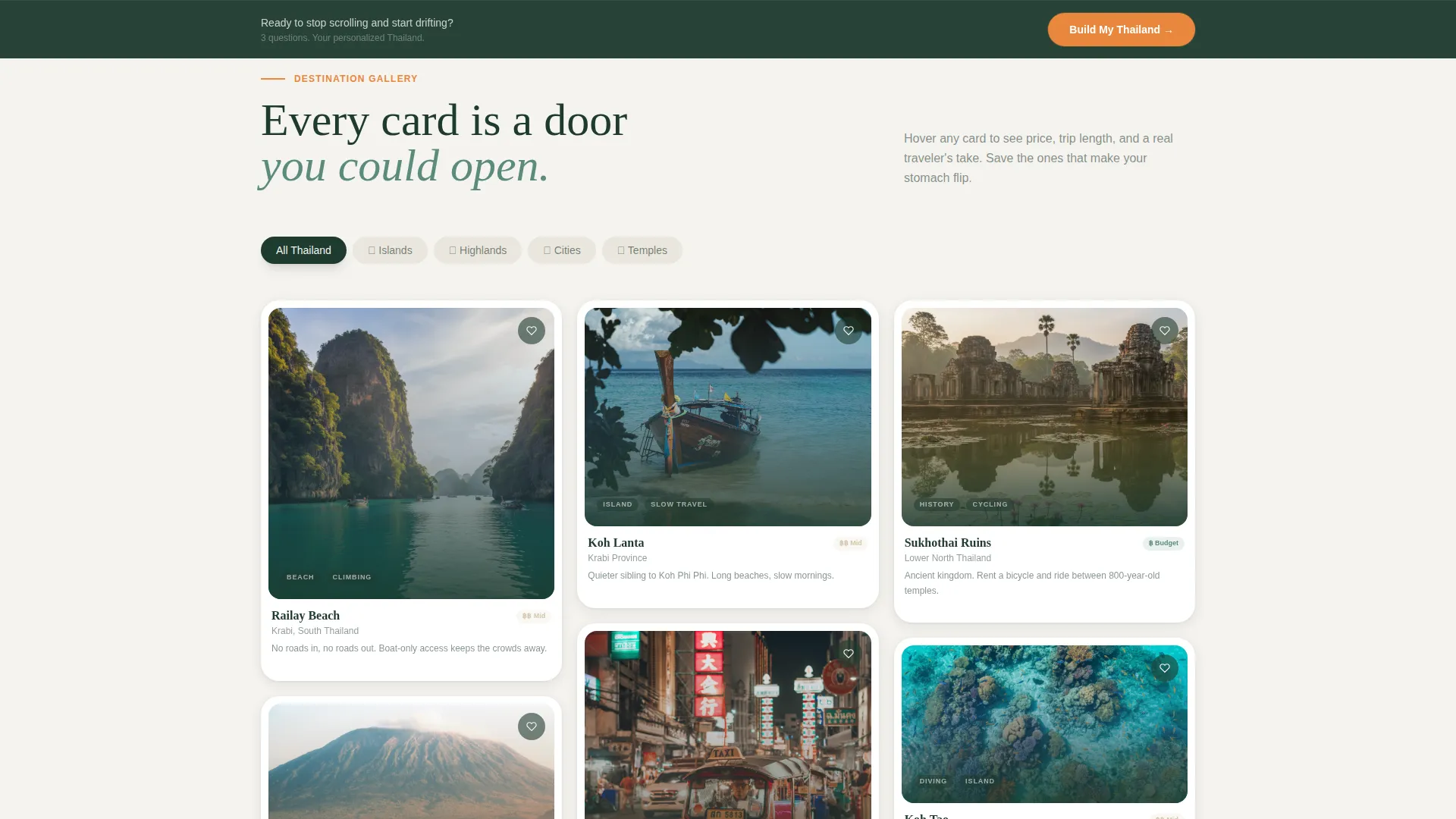
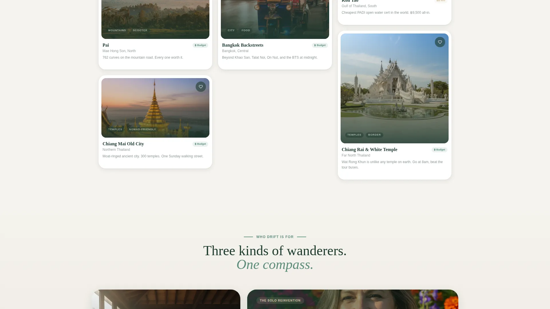
Masonry Destination Card Grid
Cards are arranged asymmetrically in a Pinterest-style grid, grouped into thematic clusters by region. Each cluster shifts in color temperature: cool blues for southern islands, warm ambers for the northern highlands, and dusty neutrals for Bangkok. Hover states lift cards with a soft shadow and reveal price, duration, and a short traveler review quote.
Save to Trip Sidebar
Every destination card carries a "Save to Trip" soft-commit button. As visitors click cards they like, a visual itinerary sidebar builds alongside the grid. This turns passive browsing into an active, personalized trip-planning session without requiring sign-up upfront.
Trip Builder Quiz
The sticky footer's primary call to action opens a lightweight quiz. It asks about solo travel style (shoestring, comfort, or splurge), region preference, and trip length. The quiz then generates a personalized results page of matched listings, making the conversion feel like helpful advice rather than a hard sell.
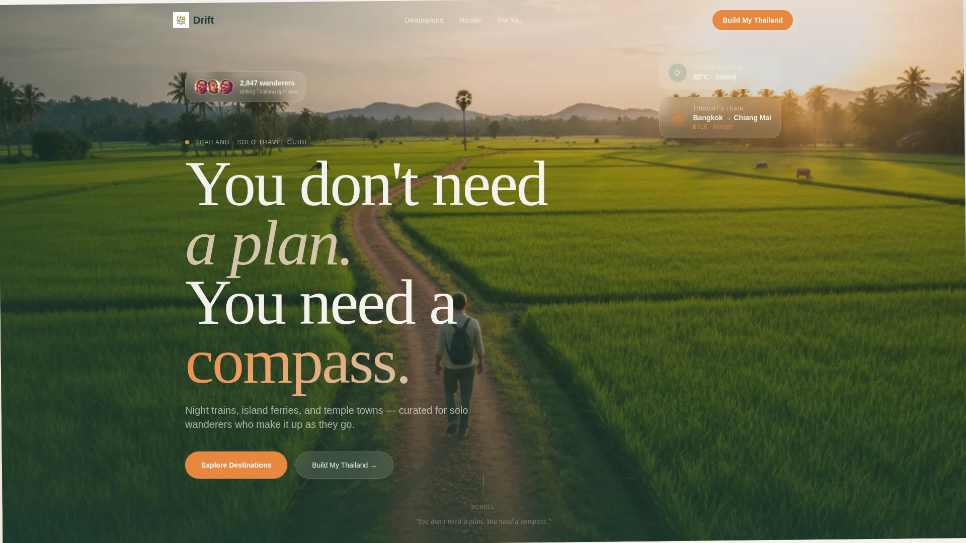
Lifestyle Shot Header
The header uses a full-viewport photograph of a solo traveler shot from behind on a laterite path outside Chiang Rai. Golden hour light and a handheld composition make it feel real and personal. A single typographic line, "You don't need a plan. You need a compass.", sits at the bottom of the viewport.
Email-Gated Packing Checklist
A secondary conversion section offers a free Thailand packing checklist. It is gated behind a simple email field, giving the page a way to capture visitors who are still in research mode and not yet ready to book.
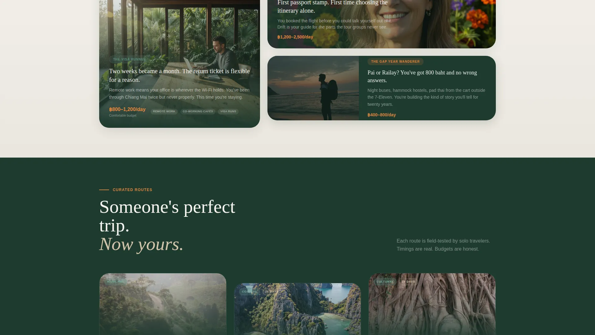
Clustered Regional Scroll Experience
Each scroll reveals a new asymmetric cluster of destination cards covering islands, mountains, cities, and temples. The Gallery Walk creative direction makes the page feel like wandering through someone else's perfect trip, with each card acting as a doorway to a bookable experience or route guide.
Page sections overview
| Section | Purpose |
|---|---|
| Full-Viewport Header | Draws visitors in with a golden-hour lifestyle photo and the brand tagline |
| Masonry Card Grid | Displays destination cards grouped by region with hover-reveal details |
| Save to Trip Sidebar | Builds a live visual itinerary as visitors save cards they like |
| Email Checklist Capture | Converts browsers into leads with a free downloadable packing checklist |
| Sticky Footer Quiz call to action | Drives primary conversions with the "Build My Thailand" trip builder quiz |
Design & branding system
The Organic Flow theme uses the Alpine Fresh color system to give the page a natural, unhurried feel. Every color choice references something tactile: pressed linen, eucalyptus shade, teak wood grain, and a single vivid fruit.
- Cool eucalyptus green (#5B8C7E), washed teak (#D4C5A9), morning mist white (#F5F3EE), and deep jungle shadow (#1E3A2F) form the base palette
- Ripe papaya (#E8873D) is reserved for interactive elements: card hover states, "Save to Trip" buttons, and price tags
- Typography is hand-set in style, grounding the page in a worn-journal aesthetic that feels intimate and editorial
Mobile & speed optimization
The masonry grid and full-viewport header are built with a mobile browsing experience in mind. Solo travelers research destinations on their phones, often in low-connectivity conditions like airport lounges or overnight buses.
- Masonry clusters reflow into a single-column scroll on smaller screens, keeping cards tappable and readable
- The sticky footer call to action remains visible during the full scroll on both mobile and desktop viewports
- Hover-reveal card details adapt to tap interactions on touch screens
How this template helps you convert
Drift is structured around two conversion goals working in parallel. The page guides each visitor toward a natural next step based on how ready they are to commit.
- The "Build My Thailand" quiz on the sticky footer turns engaged browsers into leads by generating a personalized results page based on their travel style, region, and trip length.
- The email-gated packing checklist captures early-stage researchers who are not yet ready to book but are actively planning their solo trip to Thailand.
Other information about this template
Drift fits neatly into the Thailand solo travel content space, where travelers seek practical guides, budget breakdowns, and region-specific recommendations all in one place.
- The template style is Masonry/Pinterest, making it a strong fit for visually rich, destination-led travel content
- The Organic Flow theme and Gallery Walk creative direction give the layout a handcrafted, editorial feel that stands apart from generic booking-site grids
- The Lifestyle Shot header concept avoids stock-photo clichés by using a faceless, mid-stride composition that invites every visitor to see themselves in the frame
Theme
Organic Flow
Creative direction
Gallery Walk
Color system
Alpine Fresh
Style
Masonry/Pinterest
Direction
Marketplace/Multi
Page Sections
Masonry Destination Card Grid
Save to Trip Visual Sidebar
Build My Thailand Quiz
Lifestyle Shot Header
Email-gated Packing Checklist
Clustered Regional Scroll Flow
Related questions
Can I use this template for destinations outside Thailand?
How does the Save to Trip sidebar work for visitors?
Is the packing checklist file included in the template?
Who is the target traveler this template is designed for?
Can the trip builder quiz options be customized?


