Bold Brutalist SaaS Email Marketing Agency Landing Page
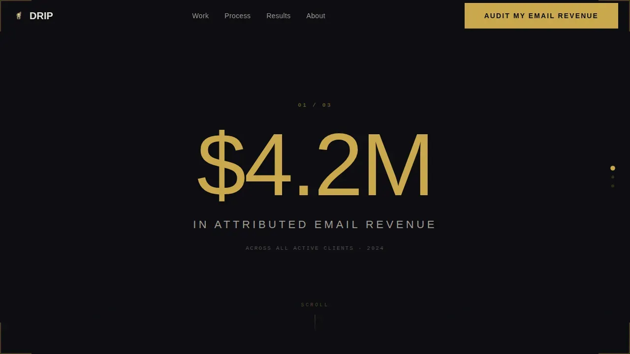
Drip is a bold brutalist SaaS email marketing agency landing page template built for performance-driven agencies. It combines a scroll-jacked stat hero, a masonry trophy wall of case studies, and a pinned audit call to action. The obsidian and gold color system, oversized condensed numerals, and varied card heights make every result feel undeniable before a visitor ever fills out a form.
by Rocket studio
Quick summary
Drip is a single-page brutalist landing page template designed for SaaS email marketing agencies that lead with proof. The hero section locks the viewport on three oversized revenue stats, then releases into a masonry case study grid that builds an overwhelming wall of client wins. Every design choice, from the color palette to the pinned call to action bar, is calibrated to turn curious visitors into booked audit calls.
Who this template is for
This template is built for creative agency teams and independent operators who work in the SaaS email marketing space. It suits any studio or consultancy whose core proposition is measurable revenue from email sequences, lifecycle flows, or subscriber reactivation campaigns. If your agency website needs to lead with proof rather than process, this landing page design was made for you.
- SaaS email marketing agencies presenting revenue case studies to founder-level buyers
- Growth marketing consultancies repositioning their agency website around attributed ROI
- Lifecycle specialists and email strategists launching or relaunching their service pages
What problem this template solves
Most creative agency pages bury their best results. They open with a tagline, walk through a list of services, and only reach social proof halfway down the page. By then, potential customers have already left. A great SaaS landing page turns curious visitors into happy customers, but only if it earns attention in the first few seconds.
- Visitors leave before reaching the proof because the landing page design puts branding ahead of results
- Agency website pages fail to differentiate because they follow the same polished, corporate template layout as every competitor
- High-intent SaaS founders need to see attributed revenue numbers quickly, not read through paragraphs of positioning copy before they can assess fit
What you get with this template
This template delivers a fully structured, high converting landing page with five purpose-built sections, a brutalist visual system, and two separate lead capture paths. Everything is designed to create maximum impact from the first scroll lock to the final form submission. The features and visuals work together so your services speak for themselves.
- A scroll-jacked hero section with three viewport-locked stat counters, a masonry trophy wall with varied card heights, a scrolling marquee, a benchmark report capture section, a three-phase process section, and a linear single-row footer
- A two-path lead generation system: a primary modal form for audit requests and a secondary email capture for the benchmark report download
- The full obsidian and gold design system including typography, color palette, card surfaces, and hover states, ready for you to populate with your own client data and copy
Feature list
This template packages the key features a SaaS email marketing agency needs to build trust fast and convert visitors efficiently. Each section and interaction is grounded in high converting landing page design principles: lead with proof, keep the focus on results, and make the next step obvious.
Scroll-Jacked Stat Hero Section
The hero section is the first visible part of the landing page and it makes an immediate statement. The viewport locks on three oversized gold numerals that count upward in real time, attributed email revenue, average flow return on investment, and total SaaS brands scaled. Each stat slams into frame at 200px condensed uppercase before scroll control releases and drops the visitor into the masonry grid below. This landing page design approach replaces a standard hero image with numbers that carry the entire visual weight.
Masonry Trophy Wall with Case Study Cards
The trophy wall is the heart of the landing page. It uses a masonry grid layout, similar in structure to a Pinterest board, where cards vary in height to create visual rhythm and depth. Tall cards reveal annotated email screenshots with conversion point callouts. Short cards show a client logo and a single revenue number that needs no explanation. Social proof through case studies like these enhances credibility on SaaS landing pages and helps potential customers self-qualify before they ever reach the call to action.
Pinned Audit Call to Action Bar
A clear call to action bar stays pinned to the bottom of the viewport after the scroll-jack releases. It reads "Audit My Email Revenue" in gold type on an obsidian background, providing seamless navigation from content to conversion at any scroll depth. Clear call to action buttons are essential for guiding users towards the desired action, and a pinned bar means this one is never more than a glance away. The high contrast between the gold label and the dark background keeps the button visible and click-ready at all times.
Two-Path Lead Generation Modal
Clicking the pinned call to action opens a brutalist modal form with three sequential fields: monthly email revenue range, email service provider platform, and work email address. A secondary path lets visitors download a benchmark report by entering just their email, capturing top-of-funnel leads who are not yet ready for a direct conversation. SaaS landing pages often include a minimal contact form to keep the user experience clean, and this template uses that principle across both capture paths to reduce friction and improve form completion rates.
Scrolling ESP Marquee Section
A horizontal marquee scrolls the logos of major email service provider platforms beneath the headline "We work inside your stack." Marquee text and animations provide a dynamic feel to brutalist web designs and signal platform fluency without requiring a paragraph of explanation. This section offers reassurance to potential customers that the agency connects to the tools they already use, without overclaiming any specific technical integration.
Three-Phase Process Section
The process section uses an asymmetric three-column layout to walk visitors through how an engagement works. Each phase is presented as a distinct brutalist block, keeping the content scannable and the visual structure consistent with the rest of the landing page design. Highlighting key features and addressing user pain points here reinforces the value proposition and helps visitors understand what happens after they sign up or request an audit.
Page sections overview
| Section | Purpose |
|---|---|
| Scroll-Jacked Hero | Locks viewport on three oversized revenue stats to establish proof before any other content loads |
| Masonry Trophy Wall | Displays varied-height case study cards with client logos, knockout metrics, and annotated email screenshots |
| ESP Marquee Strip | Scrolls platform logos to confirm compatibility with the visitor's existing email stack |
| Benchmark Report Capture | Offers a downloadable report as a secondary call to action for top-of-funnel email capture |
| Three-Phase Process | Explains the engagement structure across three asymmetric brutalist blocks |
| Linear Single-Row Footer | Closes the page with minimal navigation and brand anchoring |
Design & branding system
The visual identity of this landing page is built around a trophy room concept, monolithic, unapologetic, and earned. Bold typography is the backbone of the landing page design. Bebas Neue drives the condensed numerals and headlines while DM Sans handles body copy in chalk white. The color palette is disciplined and intentional. Every gold accent is functional, not decorative, reinforcing brand identity through restraint rather than excess.
- Color palette: deep obsidian black (#0B0B0F) for backgrounds, burnished gold (#C9A84C) for headlines and hover states, ash gray (#1E1E24) for card surfaces, and chalk white (#E8E4DD) for body text
- Bold typography at 200px condensed uppercase in the hero section, scaling down to structured DM Sans body text across cards and process blocks for contrast and readability
- Asymmetric masonry card layout with varied heights, exposed grid structure, and brutalist block forms that give the site a raw, authentic look distinct from polished agency website templates
Mobile & speed optimization
This template is designed desktop-first, matching the browsing behavior of SaaS founders evaluating agency services during work hours. The landing page design prioritizes the full viewport-lock hero experience and masonry grid on wider screens. Mobile layouts adapt the card stack and modal form for smaller viewports without removing any content sections.
- Animations use CSS transforms and Intersection Observer for scroll-triggered reveals, keeping the rendering pipeline light and the page responsive
- The modal form collapses to a single-column flow on mobile, maintaining usability and form completion quality across device sizes
- Minimal text in card blocks and the use of bold, single-line metrics mean the visuals communicate quickly even on smaller screens
How this template helps you convert
A landing page must quickly provide key information to engage users and prevent them from leaving. This template is structured so that every scroll interaction adds another layer of proof before the visitor reaches a decision point. The design of a landing page should reflect the brand identity to create a cohesive user experience, and here the brutalist aesthetic directly reinforces the agency's "no-nonsense, results-first" positioning.
- The scroll-jacked hero replaces a traditional hero section with live-counting revenue stats, establishing credibility before the visitor can scroll past it and setting up the trophy wall as the natural next point of engagement
- The masonry grid escalates in scale from open rate wins to full lifecycle rebuilds, building a cumulative wall of proof that makes the agency's competence feel like settled fact rather than a claim, so that when the pinned call to action bar is clicked, the visitor already believes the offer
- The two-path form system captures both high-intent audit leads and early-stage benchmark report downloaders, giving the agency a contact list that spans the full funnel without requiring a separate landing page for each audience
Other information about this template
This template sits at the intersection of bold brutalist web design and performance-focused SaaS marketing. Designers and developers who want real world examples of brutalist landing page design in a B2B context will find this template a practical starting point. The concept draws directly from the idea that brutalist design prioritizes clear, direct information delivery over aesthetic beauty, which aligns with how SaaS founders prefer to evaluate services.
- Drip bold brutalist design is an evolution of Neo-Brutalism that adds fluid, liquid elements to the high-contrast aesthetic, making it feel current without abandoning its raw structural honesty
- The color system, bold typography choices, and exposed grid structure are consistent with best practices for brutalist web design: oversized sans-serif fonts, high-contrast palettes, and asymmetric layouts that ignore balanced grid systems in favor of irregular spacing
- Designers exploring brutalist landing page inspiration will find this template useful as an article-worthy example of how a creative agency can differentiate itself from competitors by leading with proof rather than polish
- The masonry layout is a flexible collection of card types that designers can adapt for different case study formats, from short logo-plus-metric blocks to tall annotated email screenshots
- Because brutalist sites benefit from fast load times due to minimal CSS and JavaScript, the template's animation approach, CSS transforms and Intersection Observer only, aligns with that principle by keeping the animation layer functional without heavy script dependencies
- This template pairs well with any redesign of an existing agency website where the current design buries social proof or fails to communicate the agency's brand identity quickly enough to retain high-value visitors
- The "next project" flow is embedded in the process section, which walks new visitors through what to expect from an engagement step by step, reducing uncertainty and moving them closer to clicking the audit call to action



Theme
Bold Brutalist
Creative direction
Award & Recognition
Color system
Obsidian & Gold
Style
Masonry/Pinterest
Direction
Lead Generation
Page Sections
Scroll-jacked Revenue Stat Hero
Masonry Trophy Wall Case Studies
Pinned Audit Call to Action Bar
Two-path Lead Generation System
Scrolling Platform Marquee Strip
Asymmetric Three-phase Process Layout
Related questions
Can I use this template without coding experience?
Does this template include two separate lead capture forms?
Is the scroll-jacking hero animation part of the template?
Can I add or remove cards in the masonry trophy wall?
Who is this landing page template best suited for?



