E-Commerce Marketing & Agency Blog Website Template
Drip is a single-page landing page template built for e-commerce email marketing agencies. It blends an editorial Atelier Studio aesthetic with a manifesto-style scroll, a full-bleed photo header, and a content-led conversion flow. The primary call to action delivers a downloadable email teardown resource, while layered overlapping sections build authority before ever asking for a signup.
by Rocket studio
Quick summary
Drip is an overlap and layered landing page template designed for e-commerce email marketing agencies. It uses an Ink and Paper color system, oversized editorial typography, and a manifesto-style scroll to position the agency as a craft-driven expert. The page earns trust through annotated email screenshots and belief-driven copy before presenting its lead-capture offer.
Who this template is for
This template is built for agencies and consultants who treat email marketing as a discipline, not a broadcast channel. It speaks directly to the kind of studio that works with direct-to-consumer founders, e-commerce directors, and scaling Shopify brands who know their email list is underperforming.
- E-commerce email marketing agencies presenting their philosophy and services
- Freelance email strategists building a lead pipeline through a content offer
- Boutique digital studios targeting DTC brands and seven-figure Shopify merchants
What problem this template solves
Most agency landing pages list services and hope the reader connects the dots. This template solves the harder problem: building conviction before the ask. E-commerce founders are skeptical of email agencies because they have seen average results from average approaches.
- Generic agency pages fail to differentiate expertise from commodity service offerings
- Visitors leave before reaching a contact form because nothing earns their attention early
- A weak content offer buried at the bottom of the page misses the chance to convert curious readers into warm leads
What you get with this template
You get a full single-page layout that functions as both a brand statement and a lead generation tool. Every section is pre-structured to guide the reader from belief to action, using editorial design to signal taste and expertise at every scroll point.
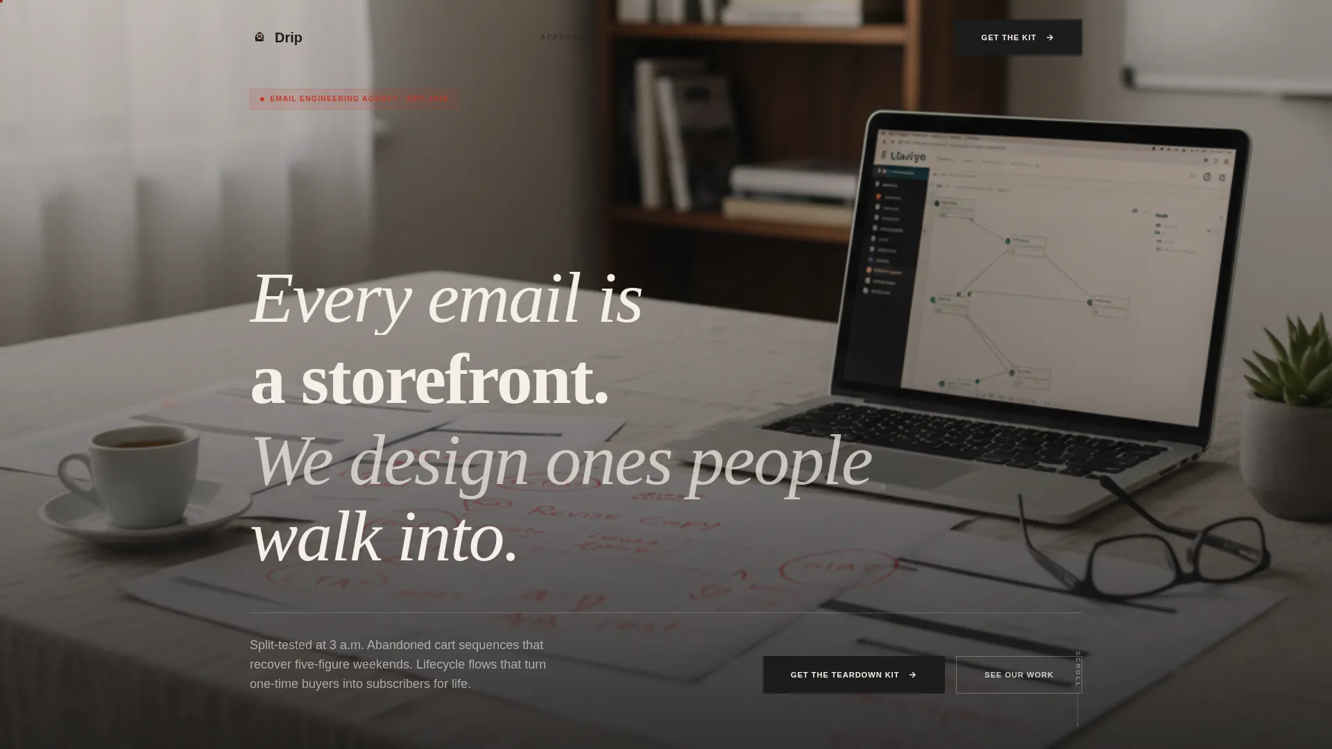
- A full-bleed photo header with an oversized manifesto headline overlapping the image's lower third
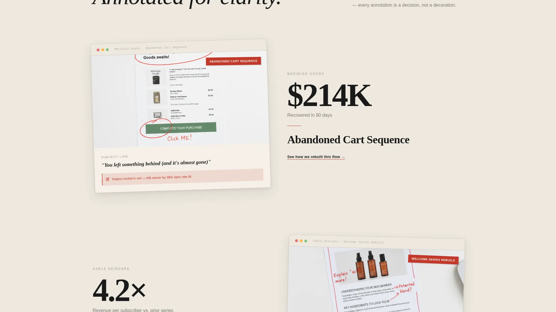
- Layered, overlapping card sections that alternate between conviction statements and real client email screenshots
- A primary lead capture form requesting email address, store URL, and monthly revenue range via dropdown
Feature list
This template is built around a specific creative and conversion architecture. Each feature below reflects a deliberate design or structural decision described in the source brief.
Full-Bleed Editorial Header
The header uses an overhead studio photograph as a full-width background. Hands, printed email mockups, a red pen mid-annotation, and a laptop showing a flow editor fill the frame. An oversized serif headline overlaps the photo's lower third to anchor the manifesto tone from the first scroll position.
Manifesto Scroll Structure
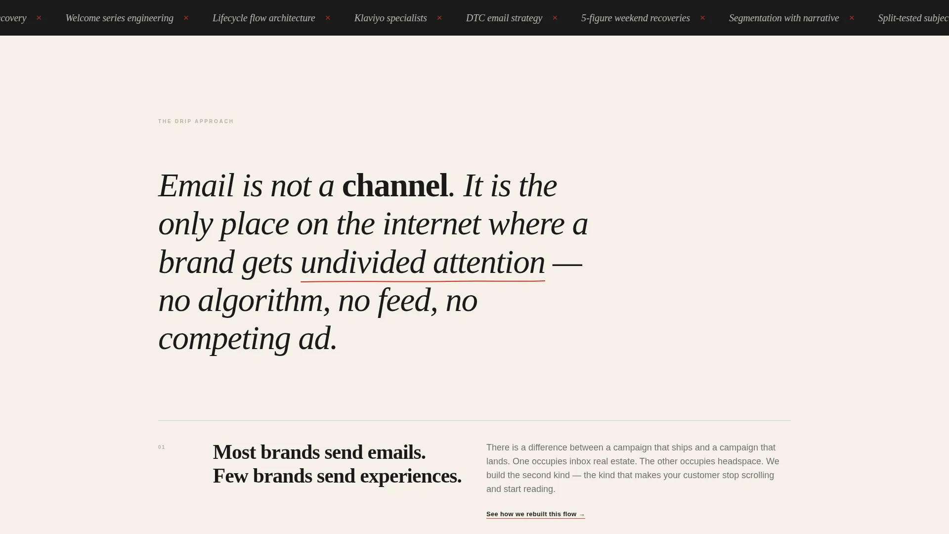
The page is structured as a declaration of belief rather than a service list. Each layered section introduces a principle about email strategy and follows it with visual evidence. The rhythm alternates between conviction statements and annotated client email screenshots, building an argument across the full scroll.
Overlap and Layered Card Layout
Sections are composed as slightly askew cards that overlap one another, casting soft shadows as if placed on a drafting table. This Overlap and Layered template style creates physical depth on screen and reinforces the editorial, studio-craft identity throughout the page.
Content-Led Lead Capture Form
The primary call to action is "Get the Email Teardown Kit," a downloadable PDF of ten annotated e-commerce email sequences. The form collects email address first, then store URL, then monthly revenue range via a low-friction dropdown. The offer is positioned as a continuation of the page experience rather than a standalone transaction.
Inline Secondary Conversion Path
After each manifesto section, an inline text link reads "See how we rebuilt this flow." This secondary path leads to gated case studies, giving readers a lower-commitment way to go deeper without leaving the page flow. It keeps engagement options open at every scroll point.
Ink and Paper Typographic System
Typography is set large and deliberately spaced, following an editorial broadsheet rhythm. Paragraphs are short and separated by generous whitespace. The red editor's mark accent color is reserved for annotations, highlights, and hover states, making every interactive element feel like a handwritten note in the margin.
Page sections overview
| Section | Purpose |
|---|---|
| Full-Bleed Header | Sets editorial tone with manifesto headline over studio photo |
| Opening Manifesto | Establishes belief-driven positioning with conviction copy |
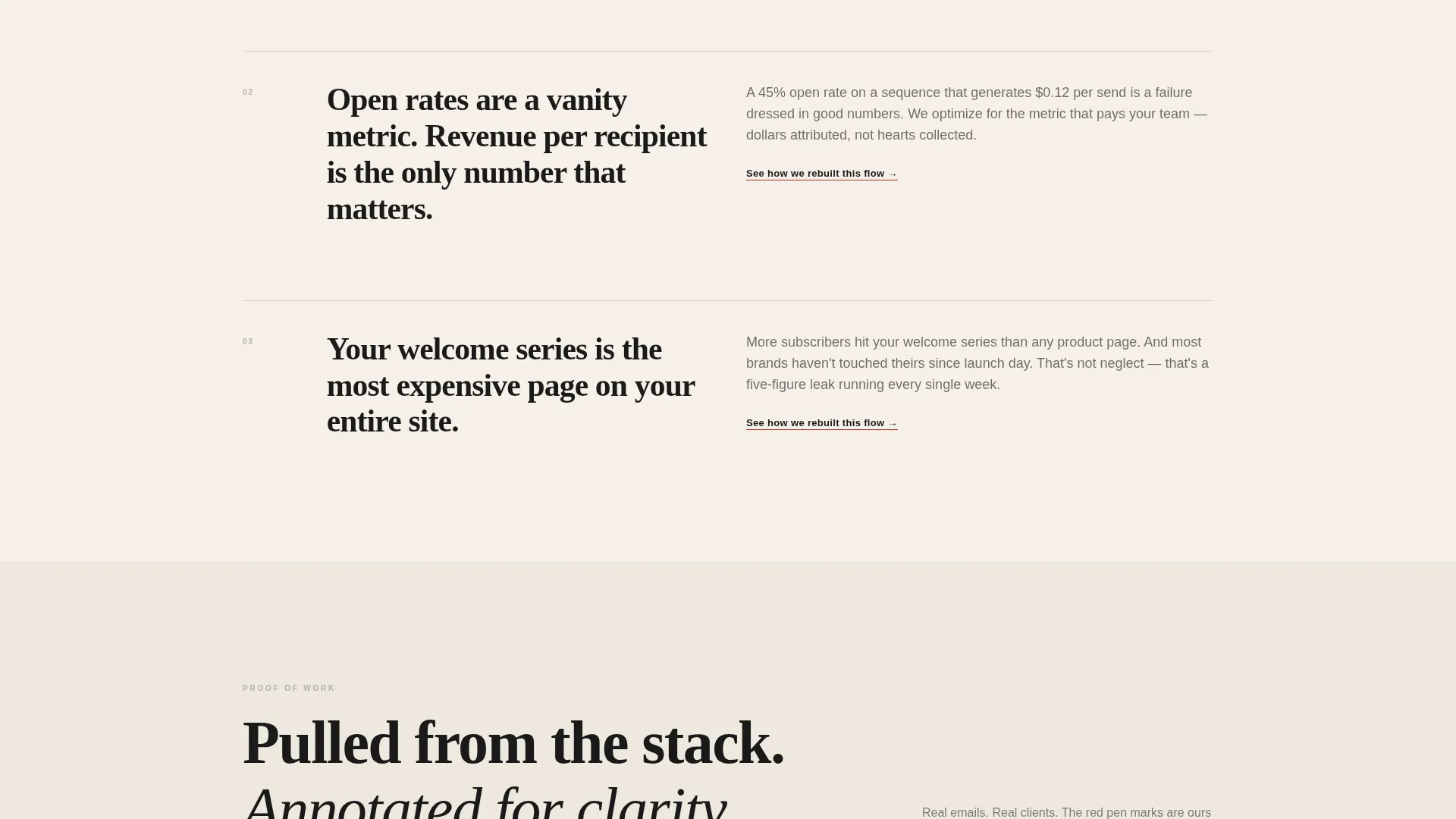
| Principle Section One | Argues why open rates are vanity metrics |
| Principle Section Two | Frames the welcome series as the most expensive page on the site |
| Principle Section Three | Explains why segmentation without narrative is ineffective |
| Email Screenshot Proofs | Slides in real client email visuals as evidence between principles |
| Teardown Kit Offer | Presents the downloadable PDF and lead capture form |
| Inline Case Study Links | Offers secondary gated conversion path after each section |
Design & branding system
The visual identity follows an Atelier Studio theme with an Ink and Paper palette. Every color choice and typographic decision reinforces a sense of deliberate craft, like a creative director's desk laid out with intention.
- Deep manuscript black (#1A1A1A) for body text and dominant backgrounds, warm uncoated stock (#F5F0E8) for surface tones, pencil-line gray (#B8B0A4) for secondary elements
- Red editor's mark (#C2382A) used exclusively for annotations, highlights, and interactive hover states to preserve its visual authority
- Oversized serif type with generous whitespace creates a broadsheet editorial rhythm across every section
Mobile & speed optimization
The template is designed so that the layered, overlapping layout translates across screen sizes without losing its editorial character. Card stacking and depth cues are preserved on smaller viewports through deliberate spacing and type scaling.
- Oversized serif headlines and short paragraph blocks remain legible and impactful on mobile screens
- The lead capture form is structured as a short vertical sequence, keeping friction low on touch devices
- Soft shadow depth cues on layered cards are maintained across viewport sizes to preserve the drafting-table aesthetic
How this template helps you convert
Conversion in this template is earned, not assumed. The page builds the reader's confidence in the agency's thinking before presenting any offer, making the download feel like a logical next step rather than an interruption.
- The manifesto scroll establishes credibility through principles and annotated proof, so readers arrive at the form already convinced of the agency's expertise
- The inline secondary links after each section capture readers who are not ready for the full form but want to go deeper through gated case studies
- The low-friction dropdown form structure reduces abandonment by asking for information in a natural, progressive sequence
Other information about this template
This template is a strong fit for agencies positioning themselves in competitive e-commerce markets where DTC brands have multiple vendor options. The content-first architecture sets it apart from pitch-heavy alternatives.
- The downloadable PDF offer (the Email Teardown Kit) is designed as a trust asset, not a discount hook, making it suitable for premium-positioned agencies
- The page layout supports a narrative selling approach where the agency's worldview does the persuasion work across the scroll
- This template is well-suited to campaigns targeting Klaviyo users and Shopify merchants who are actively looking to improve email revenue
Theme
Atelier Studio
Creative direction
Manifesto
Color system
Ink & Paper
Style
Overlap/Layered
Direction
Content/Resource
Page Sections
Full-bleed Editorial Header
Manifesto Scroll Architecture
Overlap and Layered Card Sections
Content-led Lead Capture Form
Inline Secondary Conversion Links
Ink and Paper Visual Identity
Related questions
What kind of agency is this template designed for?
What is the primary conversion goal of this landing page?
How does the page build trust before asking for a lead?
Can this template work for agencies with a broader service mix?
What design style does this template use?



