Luxe Café Landing Page Template for On-Demand Brands
Drip is a luxe minimal landing page template built for an on-demand café brand. It combines a modular card grid layout, a cinematic App Store Preview header, and a scarcity-driven browsing experience to showcase rotating menu items, guest barista profiles, and curated box sets. The upgrade path guides visitors from a free single-item order toward the premium Luxe Box tier with quiet, confident design momentum.
by Rocket studio
Quick summary
Drip is a single-page landing page template for an on-demand café. It uses a modular card grid, a floating phone mockup header, and a limited-availability creative direction to turn menu browsing into a curated moment. The layout moves visitors naturally from discovery to the Luxe Box upgrade without ever feeling pushy.
Who this template is for
This template is built for founders and designers who want their on-demand food or beverage brand to feel considered and premium from the very first scroll. It works equally well at launch or for a seasonal refresh.
- Remote-work lifestyle brands or specialty coffee businesses launching a direct-to-door ordering experience
- Creative teams building for design-conscious consumers who expect visual quality on par with editorial brands
- Operators running rotating menus, guest collaborators, or limited-edition box sets that need scarcity signaling baked into the layout
What problem this template solves
Most food delivery landing pages look functional but forgettable. They list items and prices but give visitors no reason to linger, no reason to upgrade, and no emotional context for why this brand is worth choosing over a grocery run. Drip solves that gap.
- Visitors scroll past menus without absorbing them because nothing signals urgency or exclusivity
- Brands with tiered offerings struggle to communicate the value gap between a free order and a paid upgrade without feeling salesy
- On-demand businesses lose impulse purchases because the layout gives no rhythm or editorial quality to the menu experience
What you get with this template
Drip delivers a fully structured single-page layout with every visual and interaction element defined in the brief. Each section is purposeful and production-ready as a design starting point.
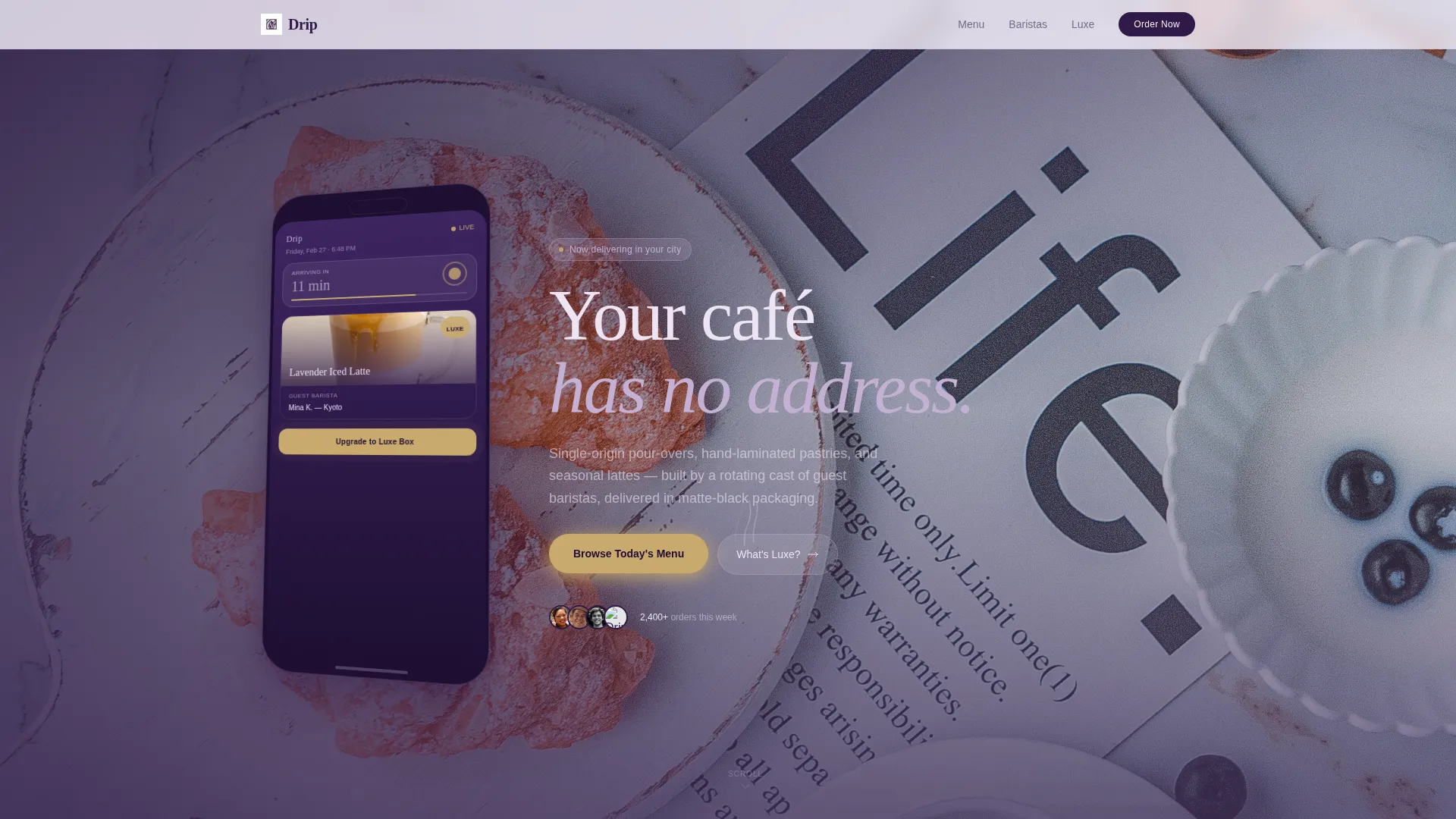
- A cinematic header section with a floating phone mockup, live-order screen detail, and a shallow-depth background photograph
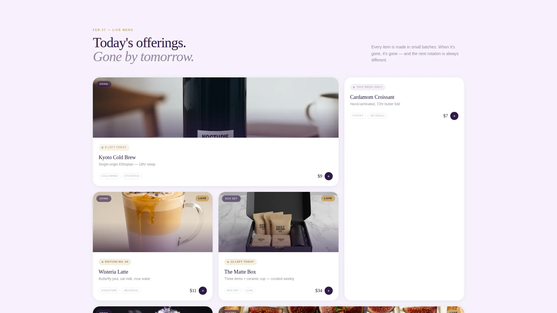
- A modular card grid that alternates between menu items, guest barista profiles, and curated box sets with availability stamps and micro-countdowns
- A pinned upgrade bar, a flip-card tier comparison, and a contextual gift call to action woven into barista profile cards
Feature list
This template is built around a set of deliberate, brief-specific features. Each one serves the on-demand café experience and the Luxe upgrade path.
App Store Preview Header
The header places an angled floating phone mockup front and center. The screen shows a live order in progress, a guest barista credit, and a delivery countdown. A headline fades in alongside the device, and a shallow-focus photograph anchors the background.
Scarcity-Stamped Card Grid
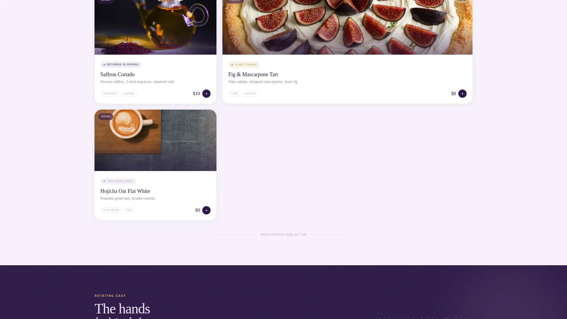
Every card in the modular grid carries an availability marker such as "This Week Only," "12 Left Today," or "Returns in Spring." Cards alternate between menu items, barista profiles, and box sets. As the visitor scrolls deeper, card widths tighten and the brushed-gold accent appears more frequently.
Pinned Luxe Upgrade Bar
A slim bottom bar reading "Upgrade to Luxe" activates after the visitor scrolls past the third card row. The bar stays pinned during continued scrolling, keeping the upgrade prompt visible without interrupting the browsing experience.
Flip-Card Tier Comparison
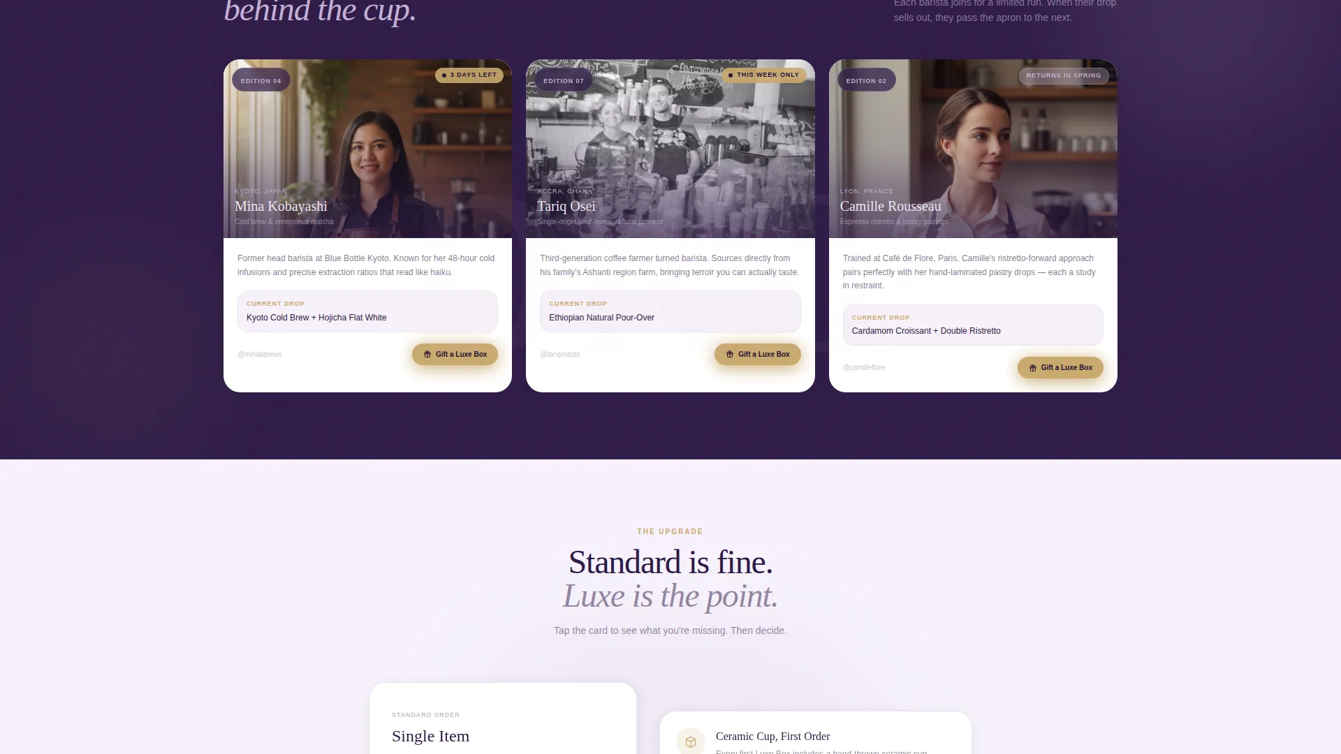
A side-by-side card block compares the free single-item order against the Luxe Box. Tapping or clicking the card flips it to reveal full tier details: three curated items, priority guest-barista drops, and a reusable ceramic cup on first order.
Contextual Gift call to action
A secondary call to action, "Gift a Luxe Box," appears only on guest barista profile cards. This placement captures impulse generosity at the exact moment a visitor is most engaged with the story behind a specific barista.
Lavender Dream Color System
The entire layout is built around a four-tone palette: soft wisteria, muted lilac mist, deep nightshade, and a brushed-gold accent. Gold is reserved for calls to action, pricing toggles, and tier badges, keeping the hierarchy clear and the mood consistent.
Page sections overview
| Section | Purpose |
|---|---|
| App Store Header | Introduce the brand with a live-order phone mockup and atmospheric background photo |
| Hero Headline | Deliver the brand tagline alongside the device mockup for immediate context |
| Card Grid Row 1 | Open the menu experience with full-width featured item cards and availability stamps |
| Barista Profile Cards | Humanize the brand with rotating guest barista stories and a gift call to action |
| Card Grid Row 2 | Continue menu browsing with tightening card widths and rising gold accent frequency |
| Box Set Cards | Showcase curated box sets with edition numbers and seasonal availability labels |
| Tier Comparison Block | Present the free-versus-Luxe flip card to frame the upgrade decision |
| Pinned Upgrade Bar | Keep the Luxe upgrade prompt accessible throughout the lower scroll journey |
Design & branding system
The visual identity is built on a Luxe Minimal theme. Every design decision favors restraint, texture, and quiet confidence over decoration or noise.
- Color palette uses soft wisteria (#C4B1D4), muted lilac mist (#EDE4F3), deep nightshade (#2E1A47), and brushed gold (#C9A96E), with gold strictly reserved for interactive and upgrade elements
- Card surfaces, backgrounds, and section washes draw from the lilac and wisteria tones, while deep nightshade grounds headlines and contrast moments
- The overall mood references a perfume counter at dusk: frosted glass, soft overhead light, and deliberate surface choices that feel curated rather than decorated
Mobile & speed optimization
The card grid and pinned bar are designed with a mobile-first browsing flow in mind. The layout adapts naturally to smaller screens without losing the editorial rhythm that makes the desktop experience feel premium.
- The floating phone mockup in the header is sized and angled to read clearly on mobile viewports without cropping key screen details
- Card grid columns reflow for touch-based browsing, keeping availability stamps and micro-countdowns legible at smaller sizes
- The pinned upgrade bar is designed to sit cleanly above mobile navigation chrome, remaining tappable and visible throughout the scroll
How this template helps you convert
Drip is structured so that every scroll action moves a visitor one step closer to the upgrade decision. The layout earns trust before asking for anything.
- Visitors enter through a cinematic header that immediately communicates quality and live availability, establishing brand credibility before a single price is shown.
- The card grid builds desire progressively: scarcity stamps, rotating baristas, and tightening layouts create a gallery-like urgency that makes the standard menu feel special and the Luxe tier feel essential.
- The pinned upgrade bar and flip-card comparison close the loop by making the value gap between free and Luxe feel emotionally wide, not just logistically different, at exactly the right scroll depth.
Other information about this template
Drip is part of the Retail and E-Commerce category, aligned with the on-demand business subcategory. It was designed with a niche intersection context of on-demand food and beverage delivery.
- The template style follows a bento grid structure, giving each card its own visual weight and breathing room within the modular layout
- The limited-time creative direction is built into the layout logic itself, not applied as a surface treatment, so scarcity feels structural rather than decorative
- The header concept is an App Store Preview rather than a standard full-bleed photograph, which makes it especially suited to brands with a companion mobile ordering experience
- This template fits founders who want to launch quickly with a layout that already thinks in terms of tiers, rotating content, and upgrade moments
Theme
Luxe Minimal
Creative direction
Limited Time
Color system
Dopamine Pop
Style
Bento Grid
Direction
Quiz/Assessment
Page Sections
App Store Preview Header
Scarcity-stamped Card Grid
Pinned Luxe Upgrade Bar
Flip-card Tier Comparison
Contextual Gift Call to Action
Lavender Dream Color System
Related questions
Can I adapt this template for a seasonal menu refresh?
Does the flip-card tier comparison work on mobile?
Can I use this template if my brand does not have a mobile app?
What makes this layout different from a standard food delivery page template?
Is the guest barista profile card section easy to update with new collaborators?



