Teen & Tween Education Website Template
Drip is a zigzag landing page template built for teen fashion brands running capsule collections. It combines a polaroid-style photo grid header, community-submitted style education sections, and a five-question visual quiz that ends at a curated "Shop Your Results" page. The sunset gradient palette and candid editorial aesthetic speak directly to style-conscious teens aged 14 to 18.
by Rocket studio
Quick summary
Drip is a single-page landing page template designed for direct-to-consumer teen fashion brands. It opens with an animated photo grid mosaic, walks visitors through three zigzag style lessons powered by community photos and micro-polls, then drives them into a five-question visual quiz that reveals their style archetype and a matching capsule collection to shop.
Who this template is for
This template is built for anyone launching or running a teen fashion brand that sells capsule collections and wants to convert style-curious visitors into buyers without a traditional browse-and-filter shop experience.
- Teen and tween fashion brands selling limited capsule drops to a Gen Z audience aged 14 to 18
- Direct-to-consumer (DTC) founders who want personality-led discovery instead of a standard product grid
- Parents or gift-buyers looking for a guided way to find the right collection for a teenager
What problem this template solves
Teen shoppers do not browse the way older generations do. They judge a brand in seconds, lose interest fast, and need a reason to stay on the page. A generic product grid does not hold their attention or build the trust needed to push them toward checkout.
- Visitors leave without engaging because there is nothing interactive or community-driven to hold their interest
- Brands struggle to match the right capsule collection to each customer without a guided discovery experience
- Style-curious teens have no clear path from landing on the page to knowing exactly what to buy
What you get with this template
You get a fully structured, mobile-first landing page with a clear journey from hero to checkout path. Every section is purposeful and sequenced to warm the visitor up before the quiz asks anything of them.
- A five-section page layout: hero, three educational zigzag sections, and a visual quiz with an archetype result and shop path
- A complete sunset gradient design system with four defined colors, two paired typefaces, and a candid editorial visual style
- High-interactivity components including a typewriter headline, scroll-reveal animations, tap-to-vote micro-polls, and a five-question visual quiz with an archetype reveal
Feature list
A quick overview of what makes this template work for its niche before the section-by-section breakdown.
Photo Grid Mosaic Header
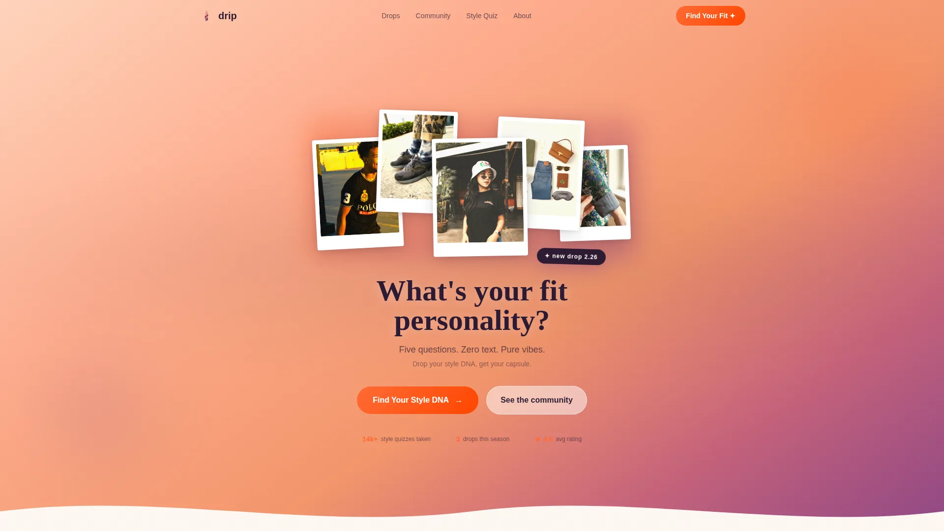
The hero section is a collage of candid teen photos: sleeve details, laughing profiles, sneakers on concrete, a hand adjusting a bucket hat. Images overlap slightly and sit at mild angles, with a sunset gradient bleeding through the gaps. A typewriter animation types the headline "What's your fit personality?" directly over the grid, pulling the visitor into the page's core question immediately.
Zigzag Educational Sections
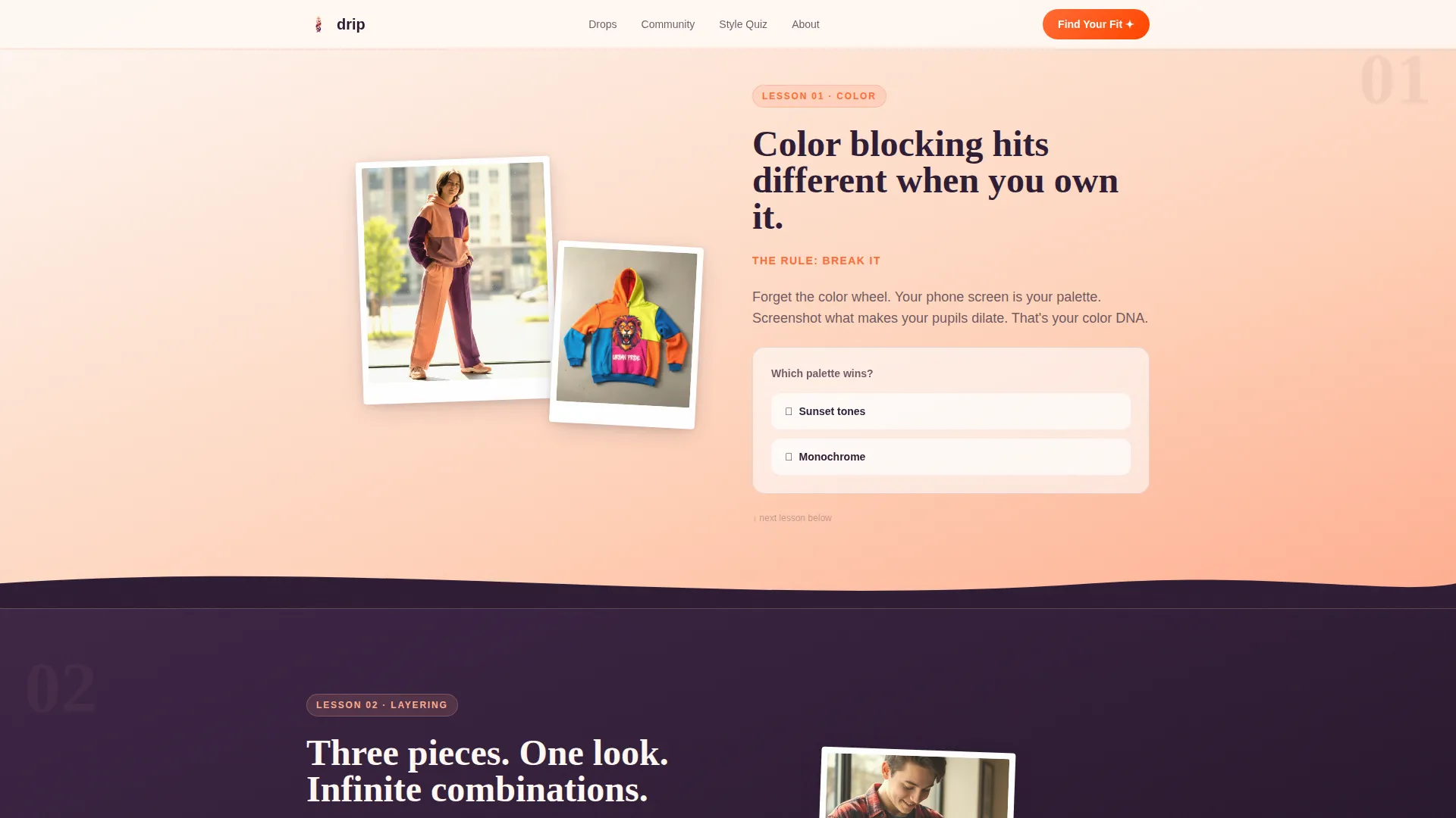
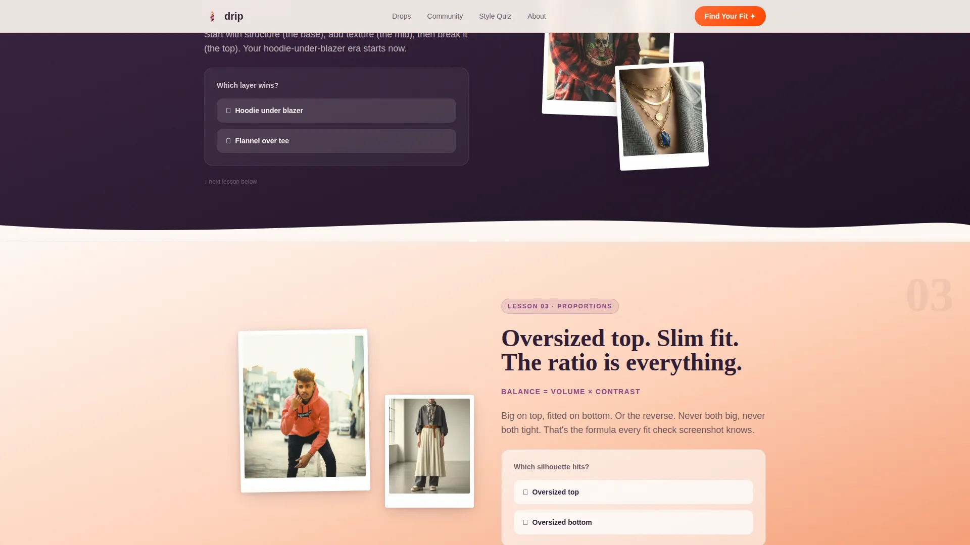
Three alternating layout sections each teach a style concept: color matching, layering, and proportions. Community-submitted photos sit on one side of each section; short, punchy copy sits on the other. The layout flips direction with each section, creating the visual rhythm of flipping through a polaroid wall rather than scrolling a standard feed.
Tap-to-Vote Micro-Polls
Every zigzag section ends with a single-tap micro-poll. Questions like "Which layer wins?" give visitors a reason to interact before reaching the quiz. Poll vote counts are visible, adding a social proof signal that keeps the scroll feeling alive and communal rather than static.
Five-Question Visual Quiz
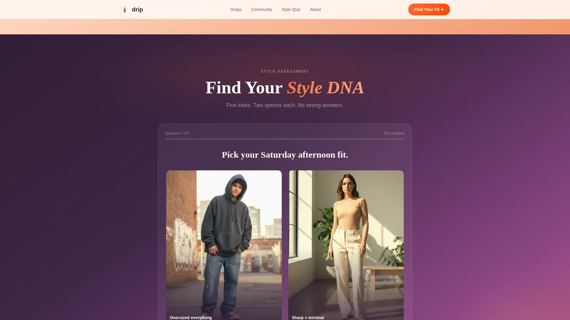
The quiz is built around image choices only, no text answers required. Each of the five questions presents two outfit options inside the sunset gradient frame. Transitions between questions are animated. On completion, the visitor sees their named style archetype and a curated capsule collection matched to their result.
Style Archetype Result Page
After the quiz, visitors land on a result screen showing their style archetype label and a set of curated capsule pieces. A "Shop Your Results" button acts as the secondary conversion path, moving the personality match directly into a purchase intent moment. This is the page's core conversion mechanism.
Scroll Reveal Animations
Sections animate into view as the visitor scrolls. Combined with the typewriter hero, poll tap interactions, and quiz transitions, the animation layer keeps the page feeling like a living editorial rather than a static template.
Page sections overview
| Section | Purpose |
|---|---|
| Hero Photo Grid | Opens the page with a collage of candid teen photos and a typewriter headline that poses the brand's central question |
| Color Matching Lesson | Teaches color pairing using community photos on one side and punchy copy on the other, ending with a micro-poll |
| Layering Lesson | Covers layering concepts with the same zigzag layout and a "Which layer wins?" micro-poll |
| Proportions Lesson | Explores silhouette and fit with community-submitted visuals and a "Which silhouette hits?" micro-poll |
| Style DNA Quiz | Hosts the five-question visual quiz, delivers the style archetype result, and presents the "Shop Your Results" call to action |
| Minimal Footer | Closes the page with a clean horizontal flow layout |
Design & branding system
The visual identity runs on a four-color sunset gradient that moves from warm peach through molten tangerine and dusky violet into a deep twilight base. The result feels like a phone screen glowing against someone's face at golden hour, which is exactly the right reference point for the target audience.
- Colors: warm peach (#FFAD8E) for section backgrounds, molten tangerine (#FF6B35) for buttons and hover states, dusky violet (#8E4585) for headings and quiz progress bars, and deep twilight (#2D1B33) for the footer and text-heavy blocks
- Typography: Fraunces serif display for headlines and Drip moment copy, DM Sans for all body text and micro-poll labels, creating a high-low editorial contrast
- Visual style: candid polaroid wall energy with slightly rotated images, golden hour color treatment, no studio lighting, and community-submitted photography as the primary visual content
Mobile & speed optimization
This template is designed with phones as the primary device. Teens screenshot outfit grids, share links in group chats, and complete checkout on their phones. Every layout decision supports that behavior.
- Mobile-first layout across all sections, with image stacking and touch-friendly tap targets for the micro-polls and quiz choices
- Images are lazy-loaded to keep the initial page load light even with a high volume of community photos in the zigzag sections
- Quiz state is managed in React, keeping transitions smooth and the archetype result instant without a full page reload
How this template helps you convert
The page is structured as a warm-up sequence. By the time the visitor reaches the quiz, they have already tapped three micro-polls and scrolled through content that mirrors their own community. The quiz is the natural next step, not a cold ask.
- Micro-polls in each zigzag section build low-commitment interaction habits before the quiz appears, lowering the resistance to engaging with a five-question format
- The style archetype result reframes browsing as identity, making the "Shop Your Results" button feel like a personal recommendation rather than a generic call to action
Other information about this template
This template sits in the Kids and Family category under the Teen and Tween subcategory, built specifically for the teen fashion brand niche. A few additional details worth knowing before you customize it.
- The template uses the Educational Guide theme, meaning the scroll itself is structured as a lesson with a clear beginning, middle, and payoff rather than a traditional sales page flow
- The Community Gallery creative direction means community-submitted photos are structural, not decorative. The photos carry the visual argument of each section
- The footer follows a minimal horizontal flow pattern, keeping the page's energy focused on the quiz conversion path rather than spreading attention to secondary navigation
- Template style is zigzag alternating, so each educational section flips its image-copy arrangement, creating visual rhythm across the full scroll
- The Quiz and Assessment landing page direction means the primary call to action ("Find Your Style DNA") appears only after three warm-up sections have built engagement
Theme
Educational Guide
Creative direction
Community Gallery
Color system
Sunset Gradient
Style
Zigzag/Alternating
Direction
Quiz/Assessment
Page Sections
Photo Grid Mosaic Hero
Zigzag Style Education Layout
Tap-to-vote Micro-polls
Five-question Visual Quiz
Style Archetype Result and Shop Path
Scroll Reveal Animations
Related questions
Can I replace the community photos with my own brand photography?
Does the quiz connect to a live product catalog?
How many questions does the visual quiz include?
Is this template suitable for a parent shopping for a teen?
Can I update the color palette to match my own brand?