Bhutan Travel Reviews Website Template
Druk is a luxury Bhutan travel agency landing page built on a masonry grid layout with immersive visual storytelling at its core. It showcases private monastery stays, monk-guided treks, and dzong-courtyard audiences through expandable journey cards, full-width testimonial interstitials, and an inline planning form, converting well-traveled visitors into inquiry conversations before they even reach the call to action.
by Rocket studio
Quick summary
Druk is a single-page luxury travel landing page designed for a Bhutan travel house offering access no group tour can match. A full-screen video header, a masonry journey grid with hover animation, expandable itinerary panels, and an inline planning form work together to turn browsing into desire and desire into a booking inquiry.
Who this template is for
This template is built for high-end Bhutan travel agencies and experiential tour operators whose clients are discerning, well-traveled, and done with ordinary itineraries. If you sell journeys rather than packages, this page speaks your language.
- Well-traveled couples in the 40 to 65 age range who have already explored Patagonia and Kyoto and now seek the last unhurried country on earth
- Family offices and private advisors planning milestone journeys for clients marking significant life events
- Solo literary travelers and independent seekers who want a former royal guard as their guide on the Snowman Trek
What problem this template solves
Most travel agency pages look like booking engines. They lead with price and availability before the visitor has felt anything. For a Bhutan luxury travel agency, that approach kills desire before it starts.
- Visitors leave before they feel the pull of the destination, because the page shows logistics before atmosphere
- Journey details are buried in text walls instead of revealed through images that earn the click
- There is no clear path from inspiration to inquiry, so motivated visitors drift away without converting
What you get with this template
This template delivers a complete visual storytelling system for a luxury Bhutan travel landing page. Every structural decision prioritizes atmosphere before action, so visitors are emotionally invested by the time any form appears.
- A full-screen video header with a grain overlay and a typewriter serif headline that sets the Neo-Retro tone immediately
- A masonry journey grid with Ken Burns hover effects, expandable inline panels, day-by-day itinerary views, season calendars, and per-person USD pricing callouts
- Full-width interstitial sections carrying italic traveler testimonials between grid rows, a slim inline planning form with pace preference dropdown, and a persistent mobile WhatsApp call-to-action bar connecting to the Thimphu office
Feature list
This template includes purpose-built components designed around the specific conversion needs of a private Bhutan expedition service.
Full-Screen Video Header with Grain Overlay
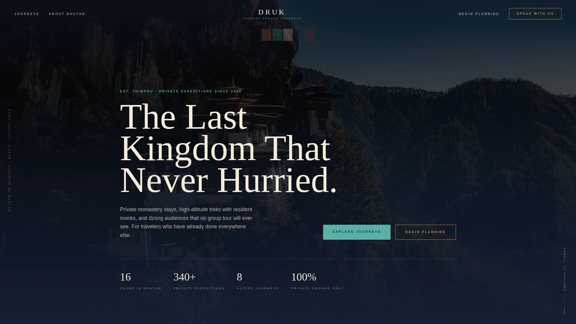
The header opens on aerial drone footage beginning tight on a single prayer flag, then slowly pulling back to reveal Tiger's Nest monastery. A subtle grain overlay and slightly desaturated film grade give the footage a rediscovered 16mm feel. A serif headline types itself onto the screen, locking in the Neo-Retro mood before any copy is read.
Masonry Journey Grid with Ken Burns Hover
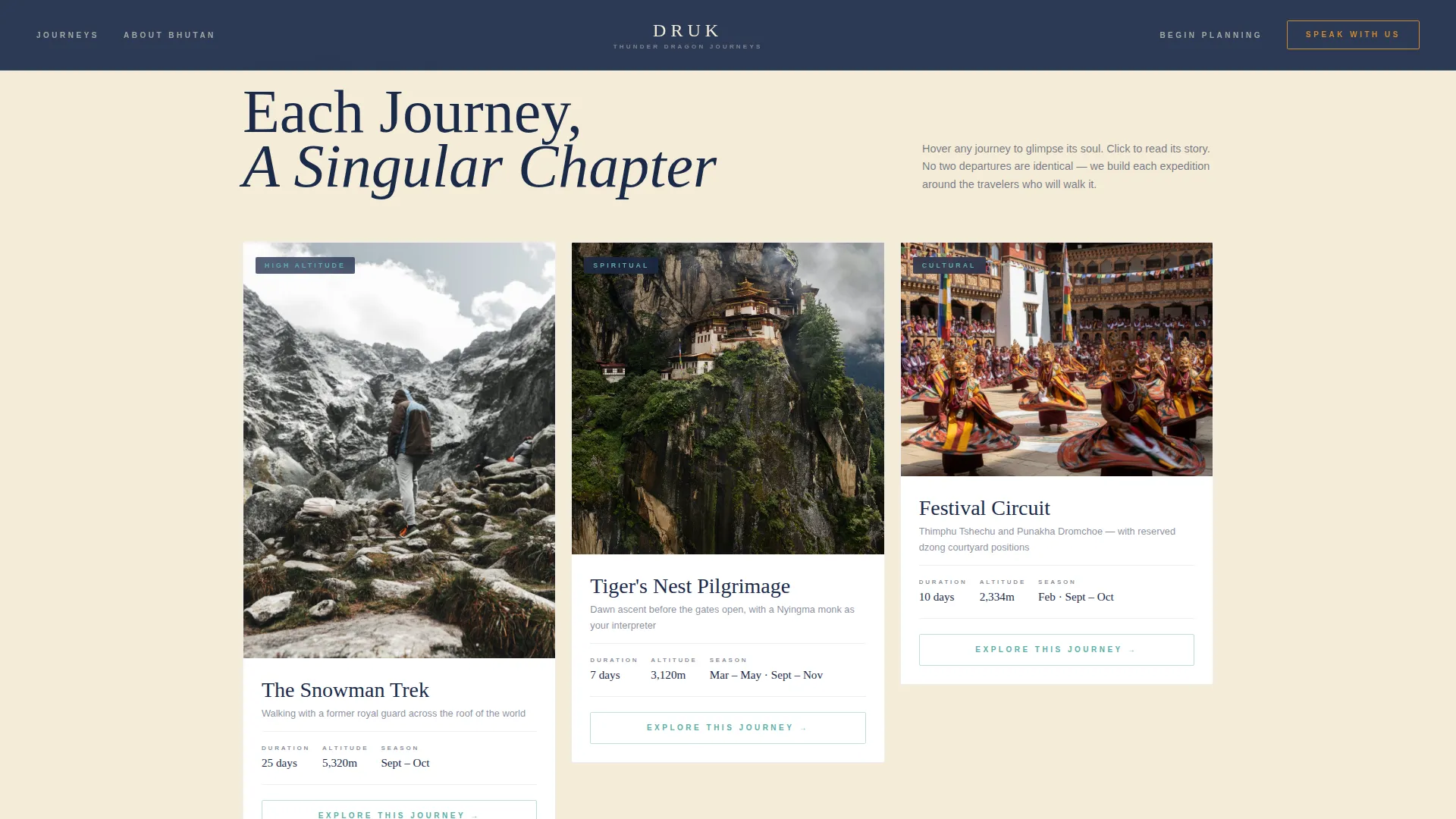
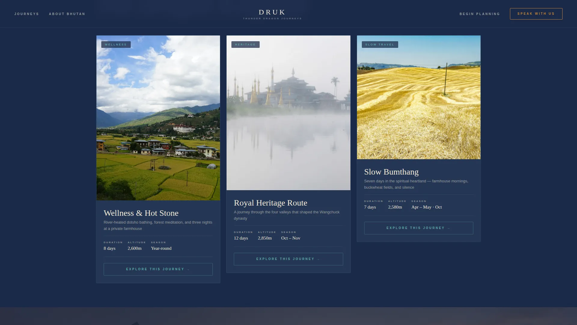
Journey cards vary in height and span across the grid, creating the feel of a private expedition journal rather than a product catalog. Hovering any card triggers a slow Ken Burns zoom into the hero photograph while a single detail line appears, altitude, season, or monastery name. The layout alternates tall verticals, wide panoramics, and small square cards across every three rows.
Expandable Inline Itinerary Panels
Each masonry card carries an "Explore This Journey" button. Clicking it expands an inline detail panel showing a day-by-day itinerary, a season calendar, and a per-person starting price in USD. The primary call to action inside every panel reads "Begin Planning Your Druk Journey" and opens the slim planning form without leaving the page.
Full-Width Testimonial Interstitials
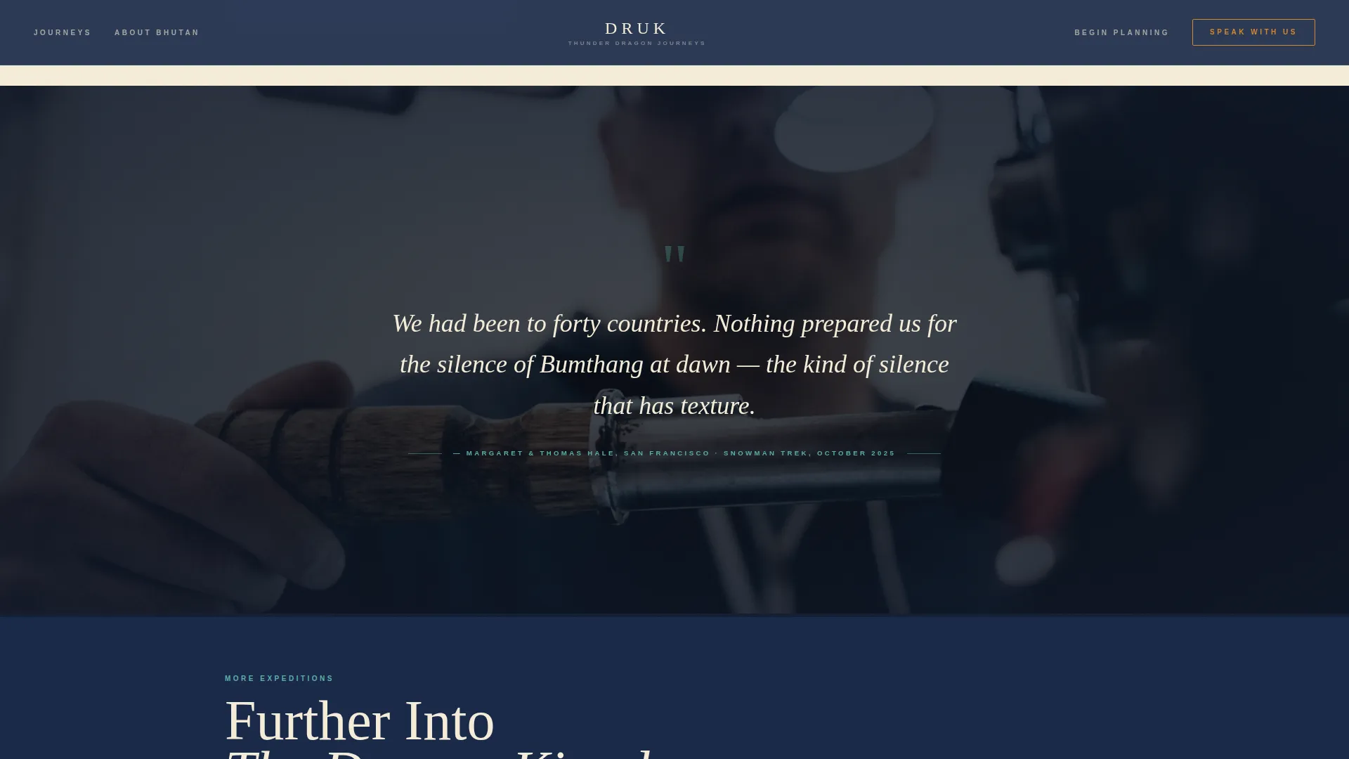
Every three rows of the masonry grid, the layout breaks with a single full-width immersive photograph and one italic serif traveler testimony. These interstitials act as emotional pace-setters, pulling visitors deeper into the journey narrative the way a turned page does in a beautifully produced travel book.
Inline Planning Form with Pace Preference
The planning form is slim and focused. It asks for travel month, party size, pace preference (contemplative, active, or blended) via a single dropdown, and an email field. Nothing more. The restraint keeps the form approachable for high-net-worth travelers who dislike lengthy onboarding processes.
Persistent Mobile WhatsApp Bar
On mobile, a fixed bottom bar carries a secondary call to action labeled "Speak With a Bhutan Specialist." It connects directly to a WhatsApp thread staffed by the Thimphu office, giving on-the-go visitors a frictionless path to a real conversation without navigating away from the page.
Page sections overview
| Section | Purpose |
|---|---|
| Video Hero Header | Opens atmosphere with drone footage, grain overlay, and typewriter headline |
| Masonry Grid Row 1 | Showcases Snowman Trek and Festival Circuit as bookable journey cards |
| Testimonial Interstitial 1 | Full-width photo and italic traveler testimony between grid rows |
| Masonry Grid Row 2 | Continues with Wellness Hot Stone and Royal Heritage Route cards |
| Testimonial Interstitial 2 | Second full-width emotional break before the planning form |
| Inline Planning Form | Slim form capturing travel month, party size, pace preference, and email |
| Footer | Dark indigo horizontal footer closing the page |
Design & branding system
The visual identity follows a Neo-Retro theme built around an Alpine Fresh color palette. The overall aesthetic feels like a 1970s National Geographic spread discovered in a cedar trunk: faded warmth meeting crisp mountain light.
- Core palette uses deep prayer-flag indigo (#1B2A4A) for backgrounds and headline text, aged parchment cream (#F4ECD8) as the light card surface, glacier meltwater teal (#5AAFA7) reserved strictly for interactive elements and map routes, and burnished saffron (#D4872C) for hover states, pricing callouts, and call-to-action borders
- Typography pairs Cormorant Garamond for all serif headlines and testimonial text with DM Sans for body copy and form labels, creating a contrast between literary warmth and clean readability
- Backgrounds alternate between deep indigo and parchment cream across sections, ensuring text always lives in indigo on light cards and cream on dark sections for consistent legibility
Mobile & speed optimization
The template is designed desktop-first, reflecting the research behavior of high-net-worth travelers who typically plan significant journeys on larger screens. Mobile is handled through targeted adaptations rather than a full redesign.
- The masonry grid reflows gracefully for smaller viewports, preserving the journal-like feel without collapsing into a plain list
- GPU-accelerated transforms using will-change properties keep Ken Burns animations and scroll-triggered reveals smooth without taxing mobile hardware
- The persistent WhatsApp bar on mobile ensures that visitors who arrive from social or referral links have an immediate, low-friction contact path regardless of where they are in the scroll
How this template helps you convert
The conversion architecture of this template is built on a deliberate sequence: immerse first, inform second, invite third. Visitors are never asked to act before they have felt something.
- The video header and masonry grid build desire through imagery and atmosphere before any pricing or logistics appear, so by the time a visitor expands a journey panel they are already emotionally invested in Bhutan as a destination
- Expandable journey panels present itinerary depth, season timing, and USD pricing inside the page flow, removing the need to navigate away and keeping the visitor in a state of discovery rather than comparison shopping
- The slim planning form asks only what is necessary, and the persistent mobile WhatsApp bar ensures that visitors who prefer conversation over forms still have a clear next step, covering two distinct decision-making styles in one page
Other information about this template
This template is built specifically for the Bhutan luxury travel agency niche and draws on Bhutanese cultural terminology throughout its copy and structure. The design system, animation stack, and section sequence all reflect the specific brief for the Druk travel house concept.
- Animations are built with GSAP ScrollTrigger for scroll-driven reveals, Ken Burns effects on card hover, and image reveal overlays, giving the page a level of motion polish suited to a premium travel brand
- Bhutanese cultural language including dzong, druk, and Drukair references is woven into the copy and card naming system to reinforce authenticity for well-traveled visitors who will notice generic phrasing
- The footer follows a horizontal dark indigo layout, closing the page with the same tonal weight that opened it in the video header
Theme
Neo-Retro
Creative direction
Immersive Visual
Color system
Alpine Fresh
Style
Masonry/Pinterest
Direction
Marketplace/Multi
Page Sections
Full-screen Video Header with Grain Overlay
Masonry Journey Grid with Ken Burns Hover
Expandable Inline Itinerary Panels
Full-width Testimonial Interstitials
Inline Planning Form with Pace Preference
Persistent Mobile Whatsapp Call-to-action Bar
Related questions
Can I customize the journey cards with my own itineraries and pricing?
Does the expandable itinerary panel work without leaving the page?
How does the mobile WhatsApp bar connect to my team?
Can I replace the video header with a static image if I do not have drone footage?
Is this template suitable for travel agencies covering destinations beyond Bhutan?