Specialty Cleaning Appointment Booking Website Template
A bold editorial landing page built for commercial air duct cleaning services. The template leads with a full-width badge ribbon showcasing industry certifications, then builds authority through magazine-style case studies, facility client logos, and pull quotes. The single call-to-action drives visitors to schedule a duct assessment, removing friction while stacking credentialed proof from top to bottom.
by Rocket studio
Quick summary
This is a single-page, click-through landing page designed for commercial air duct and HVAC cleaning services. It skips stock photography entirely and leads with certification badges as the visual hero. Every scroll section adds a layer of proof, guiding facility managers, property managers, and restaurant owners toward one clear action: booking a duct assessment.
Who this template is for
This template was built for commercial cleaning operators who serve professional, regulated environments. It speaks directly to buyers who need credentials before they pick up the phone.
- Facility managers responsible for indoor air quality audits in office towers and commercial buildings
- Property management companies preparing multi-unit buildings for tenant turnover
- Restaurant owners or operators who need to address kitchen ventilation and grease buildup after a failed health inspection
What problem this template solves
Most service business pages lose credibility by relying on generic stock photography and vague promises. Commercial air duct cleaning clients need proof, not aesthetics.
- Buyers like facility directors and compliance managers need to see certifications and real results before trusting a vendor
- There is no easy way to stack progressive authority on a typical service page without the layout becoming cluttered
- A contact form too early in the page creates friction before trust is earned
What you get with this template
This template gives you a structured, editorial-style landing page that builds trust methodically as visitors scroll. Every section is intentional and prompt-designed to move a skeptical buyer forward.
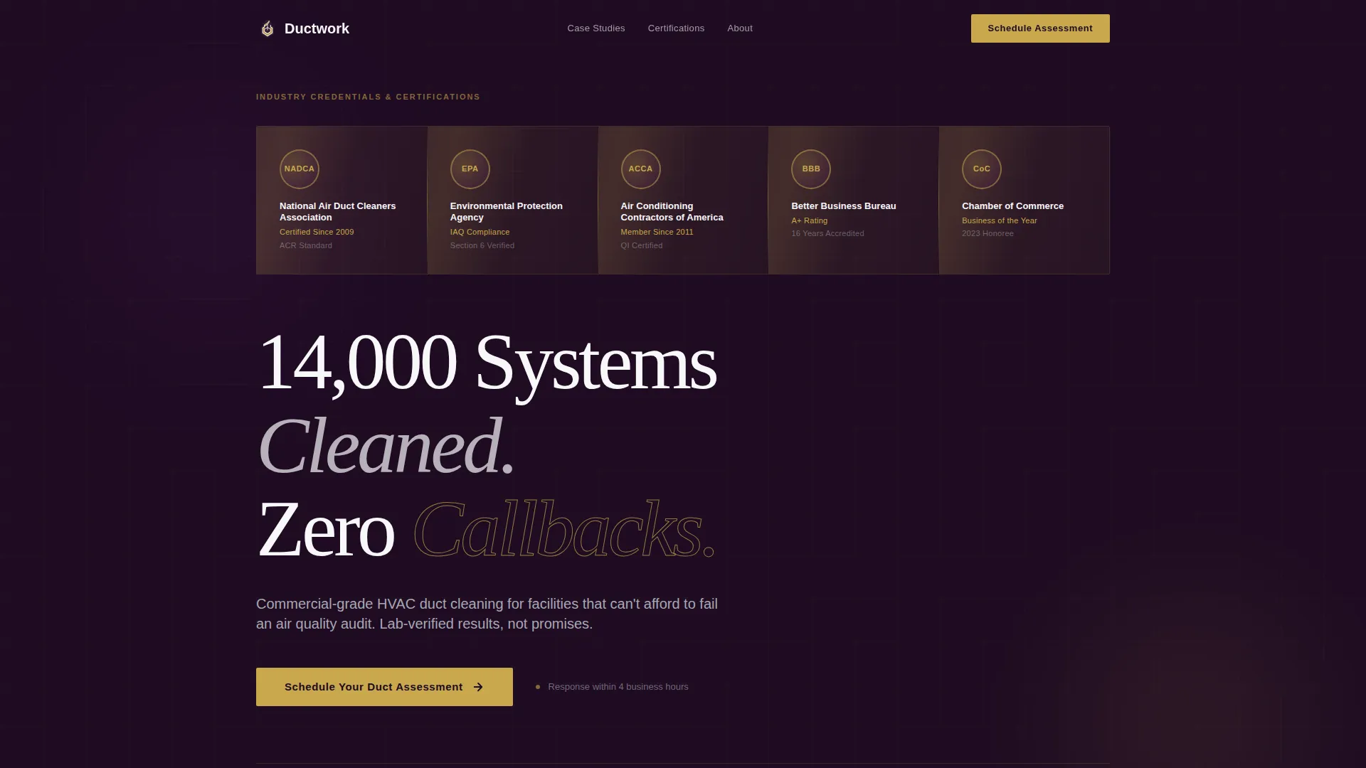
- A full-width header ribbon displaying industry certification badges as the visual centerpiece
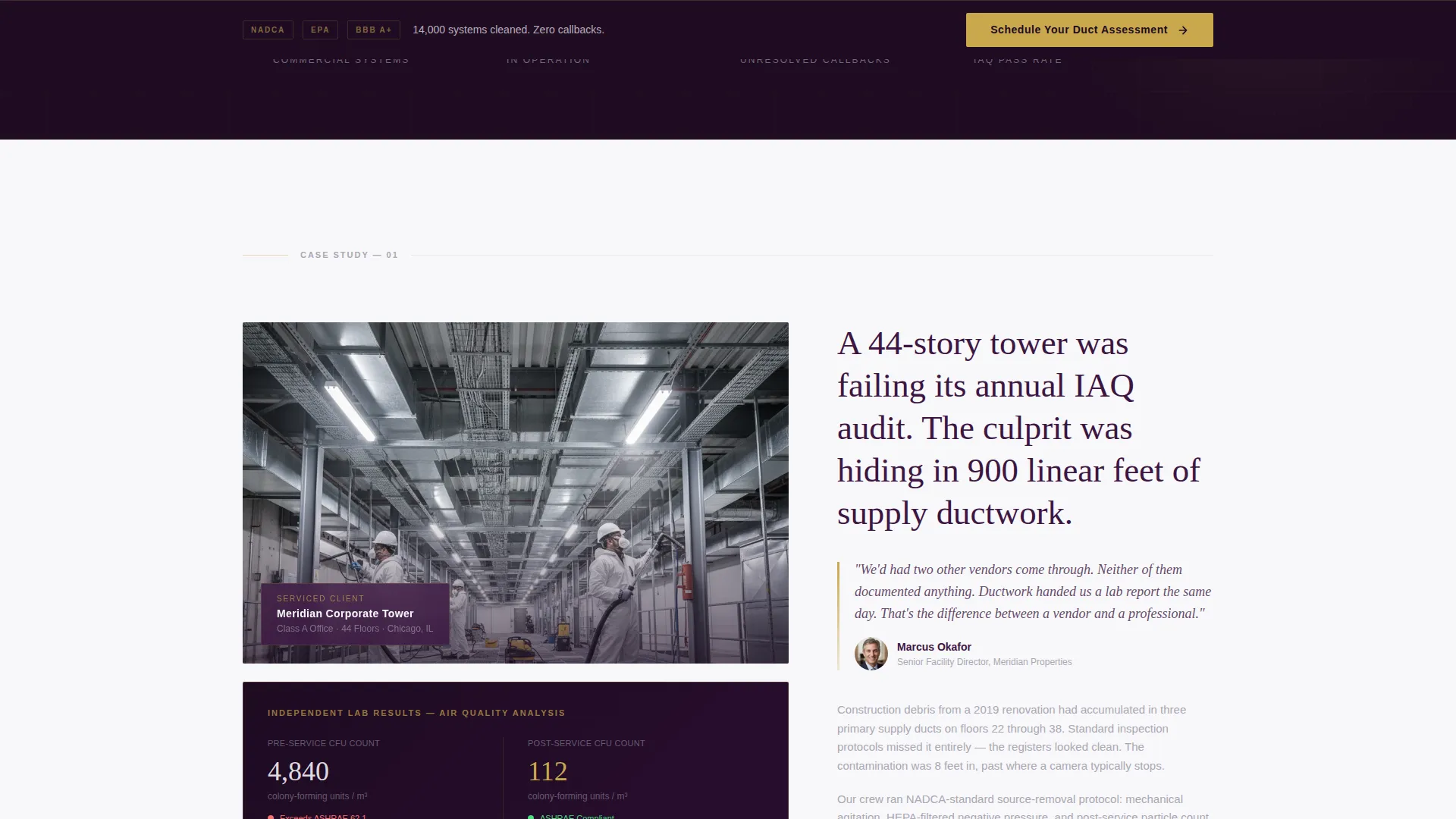
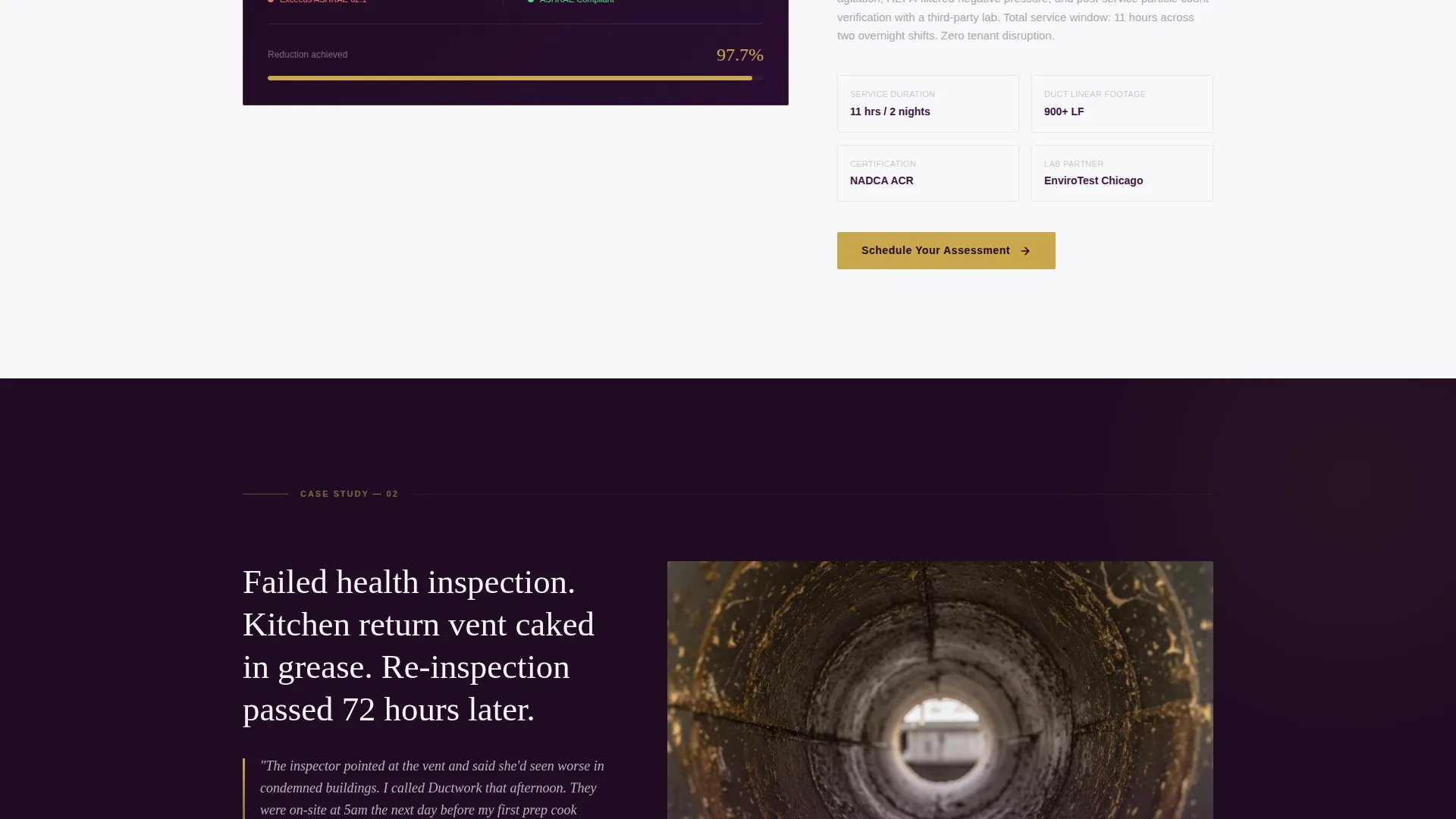
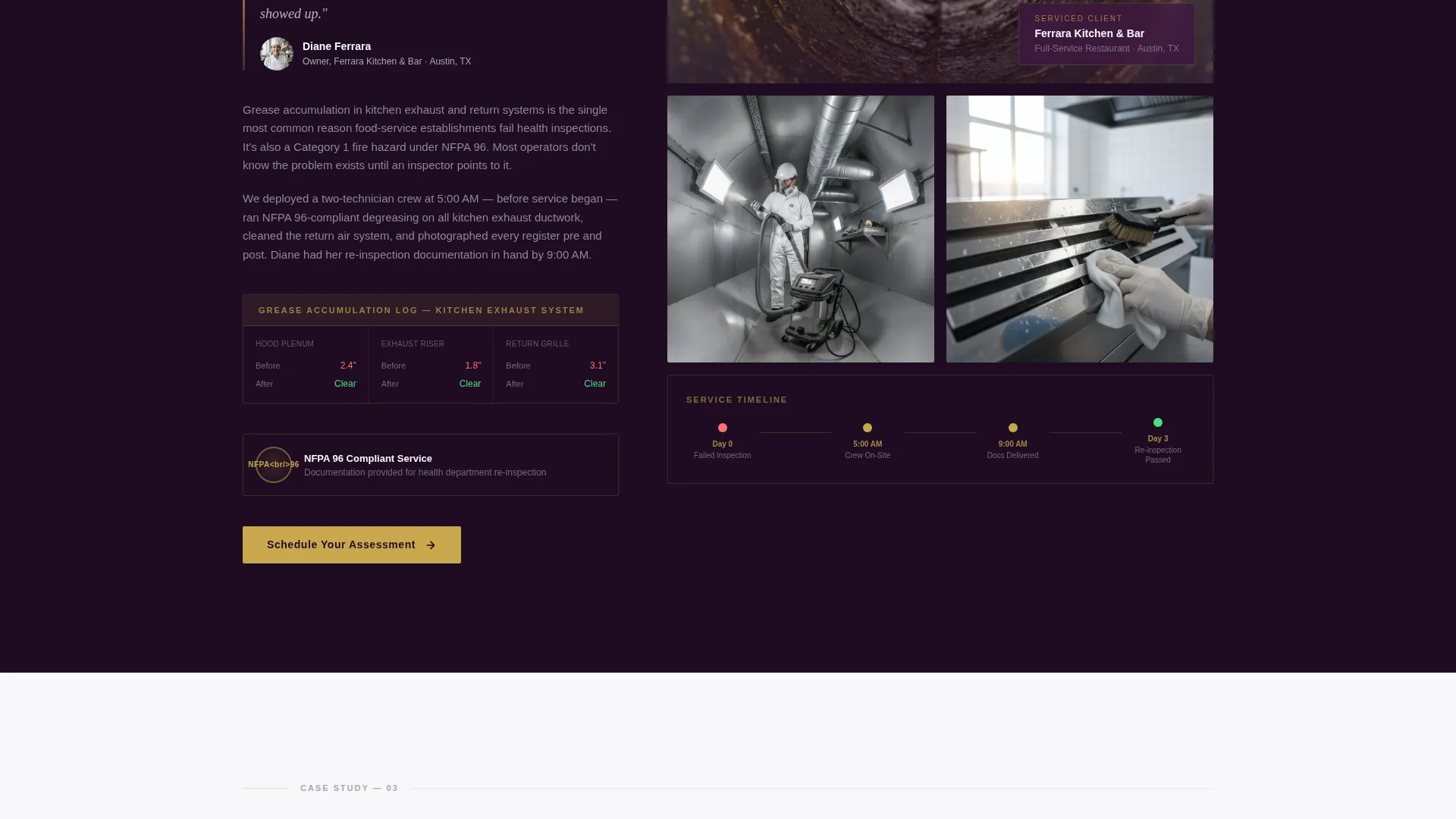
- Magazine-spread case study sections with pull quotes, before-and-after result callouts, and editorial crew photography placeholders
- A persistent bottom bar call-to-action that appears after the second case study and follows the visitor to the page bottom
Feature list
This template is built around a clear editorial structure. Each feature below is directly derived from the layout and creative direction described in the source brief.
Award Badge Header Ribbon
The header spans the full page width and displays certification seals and accreditation marks against a deep plum background. Thin brass rule dividers separate each badge, giving the ribbon the weight of a professional credential wall rather than a decorative header.
Editorial Headline Block
Beneath the badge ribbon sits a single large serif headline. The placeholder reads "14,000 Systems Cleaned. Zero Callbacks." This block is designed to deliver a confident, data-led statement before the visitor reads a single word of body copy.
Magazine-Style Case Study Sections
Each scroll section is formatted like a feature article spread. Sections include pull quotes from facility directors, before-and-after lab result callouts showing particulate and microbial count data, and wide editorial photography areas showing crew work inside ceiling plenums.
Narrative Client Logo Placement
Client logos from hospitals, school districts, and corporate campuses are woven into the case study narrative rather than displayed in a static grid. Each logo appears alongside the story it belongs to, so authority accumulates naturally as the visitor scrolls.
Persistent Click-Through call to action Bar
The primary call-to-action, "Schedule Your Duct Assessment," appears first beneath the badge ribbon. After the second case study it reappears as a sticky bottom bar. No form fields appear on this page; the click-through sends visitors to a dedicated scheduling and assessment page.
Plum Executive Color System
The entire page uses a four-color palette: deep aubergine for headers and dividers, muted silver-gray for body text, crisp clinical white for section backgrounds, and warm brass for buttons and certification accent details.
Page sections overview
| Section | Purpose |
|---|---|
| Badge Header Ribbon | Establishes certifications and accreditations as the visual hero |
| Editorial Headline Block | Delivers a bold, data-led credibility statement in large serif type |
| Primary call to action Button | First click-through prompt placed directly beneath the badge ribbon |
| Case Study One | Magazine-spread section with pull quote, lab results, and crew photography |
| Client Logo Placement | Weaves institutional client logos into the narrative of Case Study One |
| Case Study Two | Second editorial spread deepening proof with additional facility context |
| Persistent call to action Bar | Sticky bottom bar activating after Case Study Two to capture scroll-ready visitors |
| Closing Authority Section | Final credential and contact prompt reinforcing trust before the page ends |
Design & branding system
The visual identity follows a Service Utility theme executed through the Plum Executive color system. The palette is chosen to feel polished and authoritative, like the lobby of a building whose mechanical systems run invisibly and perfectly.
- Deep aubergine (#3C1642) anchors all headers and section dividers; muted silver-gray (#A8A8B3) handles body text and secondary surfaces; crisp clinical white (#F8F7FA) fills section backgrounds
- Warm brass (#C9A84C) is used exclusively for buttons, certification seal accents, and the thin rule dividers between badge elements
- Typography uses a large serif for headlines to reinforce editorial authority, with clean body type maintaining readability across all case study and pull-quote sections
Mobile & speed optimization
The editorial layout is structured for clean mobile rendering. Long-form scroll pages like this one rely on clear section stacking and readable type at every breakpoint.
- Section widths and editorial photography areas are designed to reflow cleanly on tablet and mobile viewports without breaking the magazine-spread rhythm
- The persistent bottom call to action bar is positioned to remain visible and tappable on smaller screens without obscuring body content
- Badge ribbon elements are spaced to remain legible at reduced sizes, preserving the authority impression on mobile devices
How this template helps you convert
This template removes the two biggest barriers in commercial service sales: doubt and delay. Every design decision reduces one or both.
- The badge ribbon and editorial headline answer the credibility question before a visitor reads a single case study, establishing trust in the first three seconds of page load
- The progressive case study structure stacks proof incrementally, so by the time a visitor reaches the persistent call to action bar, the remaining question is availability, not whether to hire the service
Other information about this template
This template is part of a broader editorial and magazine template style collection designed for professional services niches that rely on demonstrated expertise rather than visual flair alone. A few additional details worth noting:
- The template style is classified as Editorial and Magazine, making it well-suited for specialty cleaning niches where third-party validation and case evidence carry more weight than promotional photography
- The click-through landing page direction means no form fields appear on this page; all conversion happens on a linked scheduling or assessment page
- The Service Utility theme and Plum Executive color system are part of a matched design system intended for high-trust, compliance-adjacent service categories
- The creative direction follows a Logo Wall Authority approach, meaning client logos serve as evidence woven into narrative rather than decorative brand marks in a footer grid
- The header concept is Award Badges, a deliberate departure from hero images or video, designed to answer the first question a commercial buyer asks: "Are these people certified?"
Theme
Service Utility
Creative direction
Logo Wall Authority
Color system
Plum Executive
Style
Editorial/Magazine
Direction
Click-Through
Page Sections
Award Badge Header Ribbon
Editorial Serif Headline Block
Magazine-style Case Study Sections
Narrative Client Logo Integration
Persistent Click-through Call to Action Bar
Plum Executive Color System
Related questions
Who is this landing page template designed for?
Does this template include a contact form or booking form?
Can I replace the placeholder case study content with my own project data?
What types of credentials can the badge header ribbon display?
Is this template suitable for residential duct cleaning businesses?



