Dwell - Curated Studenthousing Landing Page Template
Dwell is a split-screen student housing landing page template built for property managers who want to feel premium, not paperwork-heavy. It opens with a nine-tile photo mosaic, guides visitors through atmospheric architectural sections, and converts them with a five-step housing match quiz. The result is a page that earns trust before it ever asks for a name.
by Rocket studio
Quick summary
Dwell is a single-page student housing landing page template that blends curated visual storytelling with a built-in quiz-driven conversion flow. A parallax photo grid mosaic opens the experience, while alternating split-screen sections walk visitors from exterior spaces to intimate room details. The page closes with a personalized housing match quiz that recommends available units before asking for contact information.
Who this template is for
This template is designed for anyone managing or marketing student housing who needs a page that feels considered, not corporate. It speaks directly to people who want prospective tenants to feel excited before they ever schedule a visit.
- University housing directors managing multiple units and high seasonal inquiry volume
- Private landlords operating off-campus apartments near colleges or state universities
- Parents researching housing options who need reassurance before committing to a walkthrough
What problem this template solves
Student housing marketing often looks like a generic listing page: a floor plan, a price, a phone number. That approach leaves prospective tenants and their families cold. Dwell solves the gap between a functional listing and an emotionally resonant offer.
- Visitors leave before engaging because nothing on the page makes them feel the space
- High inquiry volume from unqualified leads wastes a property manager's time
- Generic contact forms collect names without helping either party know if the fit is right
What you get with this template
You get a fully structured, single-page landing page layout that combines atmospheric design with a practical conversion path. Every section has a clear job, from the opening mosaic to the final walkthrough request form.
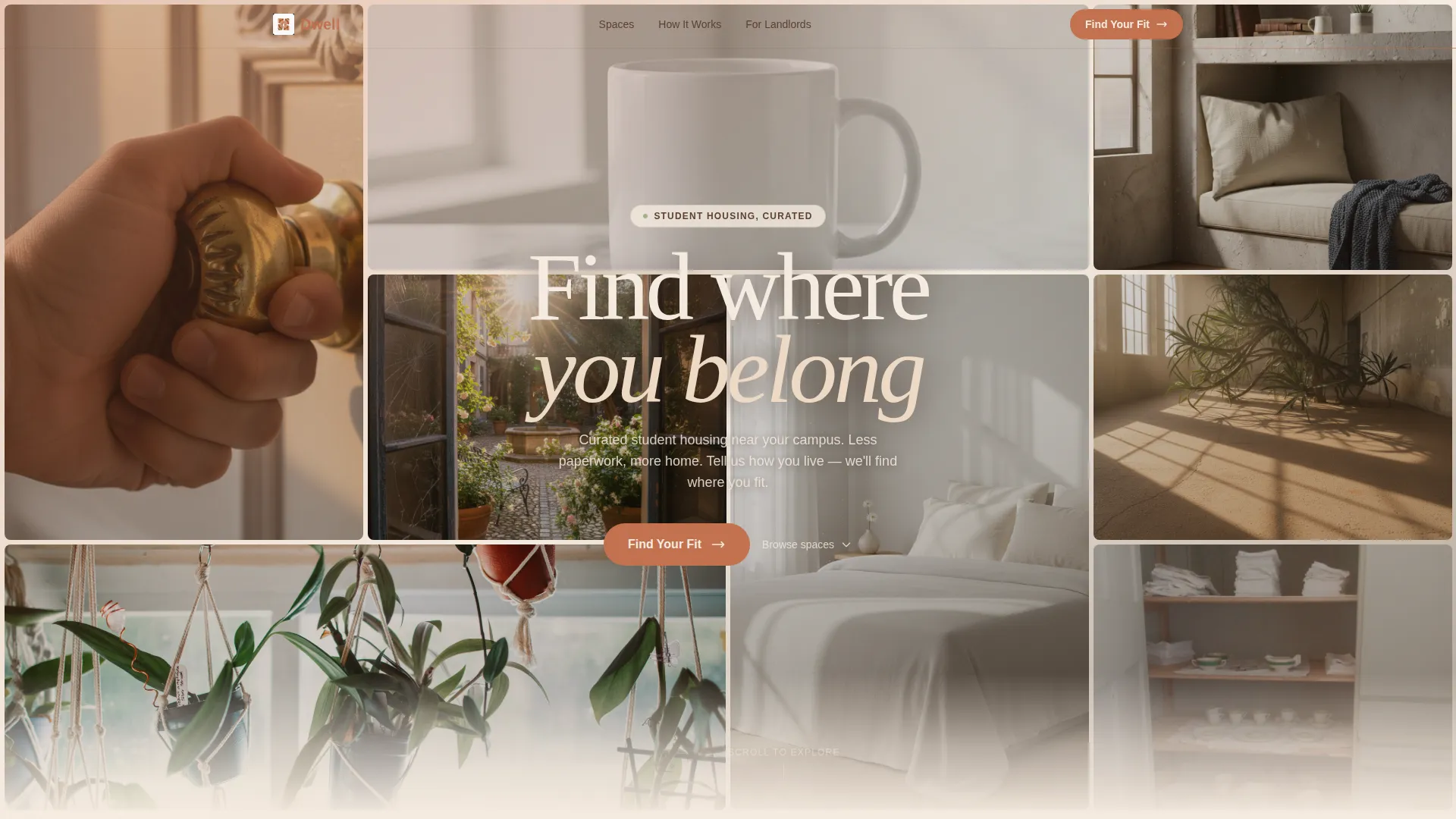
- A nine-frame photo grid mosaic header with subtle parallax scroll behavior
- Alternating 50/50 split-screen sections pairing architectural shots with intimate living detail
- A five-step housing match quiz with a personalized unit recommendation and a secondary walkthrough scheduling form
Feature list
This template delivers a specific set of designed components and interaction patterns drawn directly from the brief. Each one serves the overall goal: making a prospective tenant feel at home before they ever sign anything.
Nine-Frame Parallax Photo Mosaic
The header arranges nine architectural image frames in an asymmetric grid. Each tile shifts at a slightly different scroll speed, creating a dimensional, layered effect. Together the frames compose a feeling of place rather than promoting any single image.
Split-Screen Architectural Sections
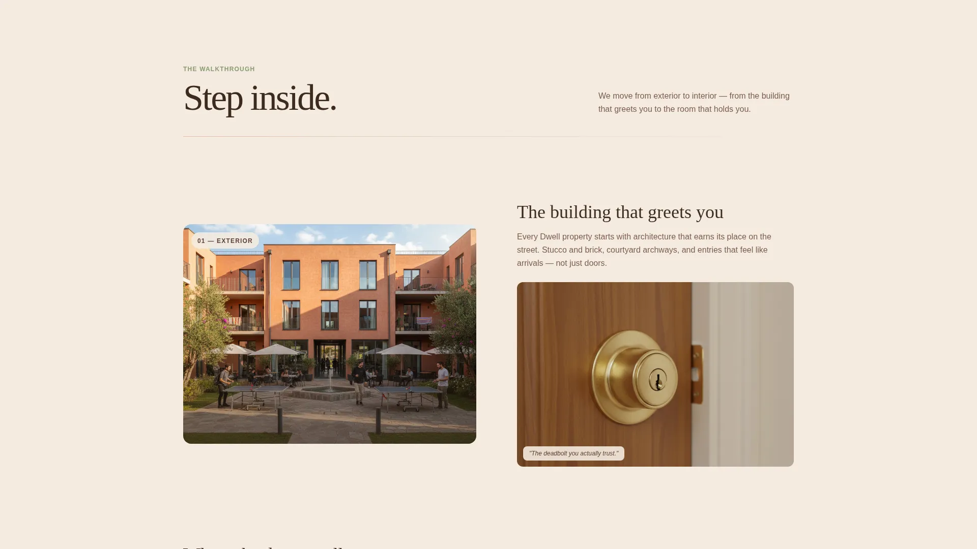
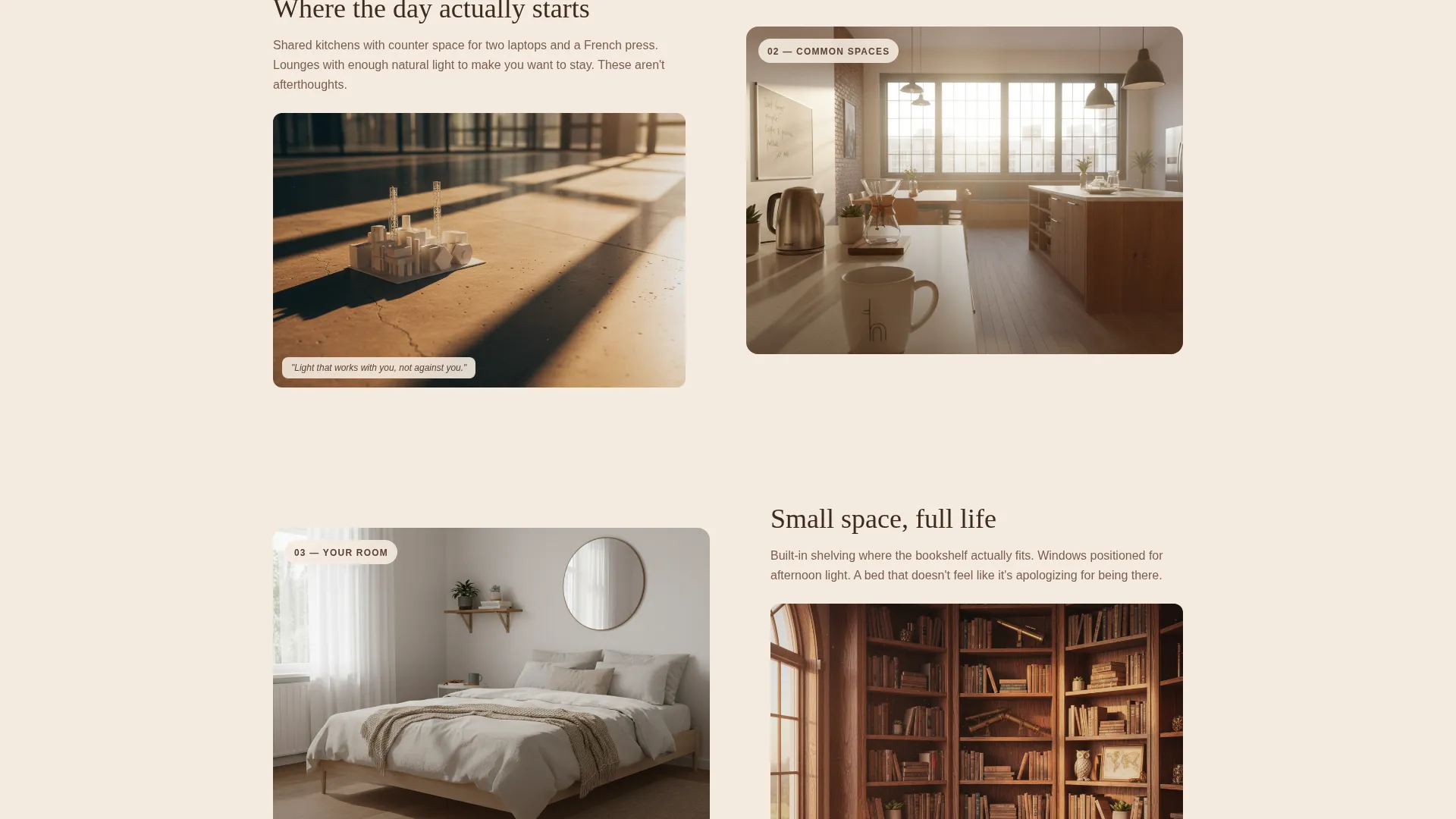
Every content section uses a 50/50 split layout that pairs a wide architectural photograph with an intimate living detail on the opposite side. The visual scale shifts progressively, moving visitors from exterior courtyard views down to close-up room details, building a sense of spatial immersion as they scroll.
Five-Step Housing Match Quiz
The primary conversion tool is a guided quiz that walks visitors through five questions: living style, proximity priority, roommate tolerance, budget range, and move-in semester. Each step occupies a full split-screen frame with an illustration on one side and the question on the other.
Personalized Unit Recommendation Result
After completing the quiz, visitors receive a housing tier recommendation based on their answers, along with available units that match their profile. This makes the conversion feel earned and relevant rather than generic.
Walkthrough Scheduling Form
A secondary call-to-action captures name, email, and preferred visit date after the quiz result is delivered. The form appears only after the visitor has already engaged with the quiz, which means it arrives at a moment of genuine interest.
Spatial Scroll Narrative
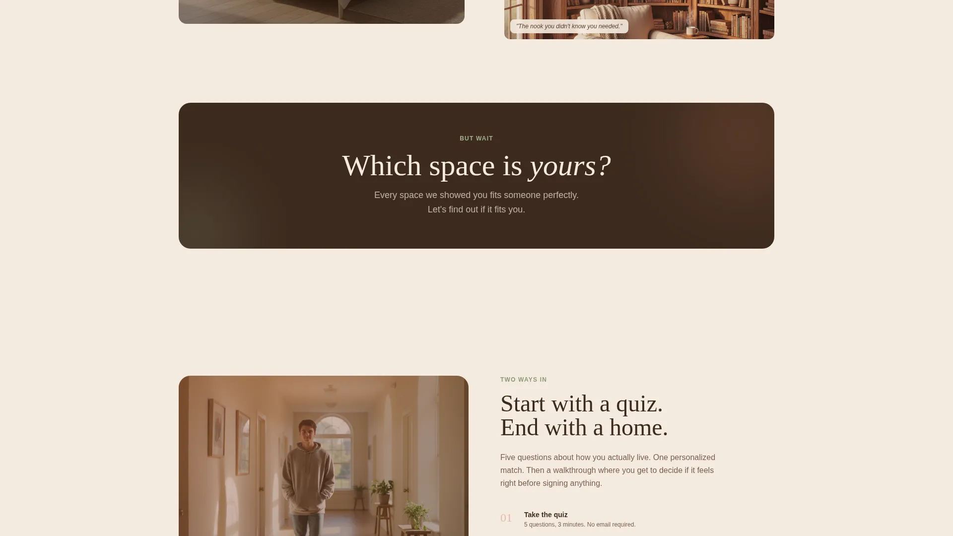
The page is structured like a building walkthrough. Sections move from exterior to interior, from common spaces to private rooms, and from structure to fine detail. A midpoint pivot asks "But which space is yours?" and shifts the page from portfolio to assessment.
Page sections overview
| Section | Purpose |
|---|---|
| Photo Grid Mosaic | Opens the page with nine parallax architectural frames that establish mood and spatial identity |
| Exterior Courtyard Split | Pairs a wide outdoor shot with a warm living detail to ease visitors into the space |
| Common Areas Split | Shows shared spaces alongside everyday objects to suggest community and comfort |
| Private Room Split | Shifts scale inward, presenting bedroom and study details to build personal connection |
| Quiz Pivot Transition | Introduces the "But which space is yours?" moment and frames the assessment ahead |
| Quiz Step One | Captures living style preference with an illustration and a single focused question |
| Quiz Step Two | Asks about proximity priority relative to campus, nightlife, and amenities |
| Quiz Step Three | Covers roommate tolerance across solo, paired, and communal living options |
| Quiz Step Four | Presents a budget range slider for the visitor to set their spending comfort |
| Quiz Step Five | Collects preferred move-in semester to complete the housing profile |
| Results Recommendation | Delivers a personalized housing tier with matched available units |
| Walkthrough Scheduling | Secondary call-to-action form capturing name, email, and preferred visit date |
Design & branding system
The template uses a Sunset Mesa color palette that feels like a desert campus at dusk. Every color has a specific role, so the interface stays coherent without feeling rigid.
- Terracotta clay anchors headlines and section dividers, sandstone warm white dominates backgrounds, and deep adobe shadow handles body text with weight
- Dried sage appears only on interactive states and progress indicators, reserving color as a signal of activity rather than decoration
- The overall visual style follows an Atelier Studio theme: architectural photography, generous whitespace, and a spatial, editorial layout that reads premium without feeling cold
Mobile & speed optimization
The split-screen layout and parallax grid are structured to adapt gracefully to smaller viewports. The quiz steps each occupy a full frame, which keeps the experience focused and readable on any screen size.
- Each quiz step is a self-contained full-screen frame, so it reads clearly on mobile without layout crowding
- The parallax mosaic and split-screen sections are designed to reflow cleanly, preserving the spatial storytelling intent at smaller sizes
How this template helps you convert
Dwell converts by making visitors feel understood before asking them for anything. The quiz does the qualifying work, so by the time the scheduling form appears, the visitor is already invested.
- The five-step quiz segments visitors by living style, budget, and timeline, which means the unit recommendation feels personal and the walkthrough request feels like a natural next step rather than a cold ask
- The spatial scroll narrative builds emotional connection across every section, so visitors arrive at the quiz already warmed up and far more likely to complete it
- The secondary call-to-action form appears only after the quiz result is delivered, catching visitors at the highest point of engagement and reducing the friction that kills generic contact form conversions
Other information about this template
This template is built as a single-page landing page and is well suited to seasonal campaigns tied to university enrollment cycles. It works for fall and spring lease-up periods where the window to capture interest is short and the competition for attention is high.
- The template style uses a 50/50 split-screen layout, consistent with the Asymmetric Grid design direction referenced in the template configuration
- The quiz-first conversion approach aligns with a click-through landing page direction, guiding visitors toward a recommendation before surfacing a contact form
- The color system and Atelier Studio theme make this template adaptable for premium student housing brands that want to differentiate from standard listing pages
Theme
Luxe Minimal
Creative direction
Calculator/Tool First
Color system
Cloud Canvas
Style
Asymmetric Grid (60/40)
Direction
Click-Through
Page Sections
Nine-frame Parallax Photo Mosaic
50/50 Split-screen Section Layout
Five-step Housing Match Quiz
Personalized Unit Recommendation
Walkthrough Scheduling Form
Spatial Scroll Narrative Structure
Related questions
Can I use this template without running the full five-step quiz?
Is this template suitable for a single property or multiple locations?
How does the Schedule a Walkthrough form work?
Can the Sunset Mesa color palette be changed to match a different brand?
Who manages the quiz results and unit recommendations?



