Immersive Furnished Apartment Rental Landing Page
Dwell is a dark, immersive furnished apartment landing page template built for rental platforms that need to make visitors feel at home before they book. An asymmetric 60/40 grid, a parallax photo mosaic header, hover-swappable room previews, an interactive neighborhood map, and a pinned reservation panel work together to turn browsing into booking.
by Rocket studio
Quick summary
Dwell is a single-page furnished apartment rental template that leads with atmosphere and closes with action. A nine-tile parallax mosaic opens the experience. An asymmetric grid carries visitors through each apartment listing. A pinned gold booking bar and a slide-in reservation panel keep the path to commitment short and clear.
Who this template is for
This template is built for furnished rental operators who need their page to do more than list square footage. It works best when the inventory has character and the visitors need to feel it before they fill in a form.
- Furnished apartment brands serving relocating professionals, transitioning couples, or production companies housing talent
- Short-stay and mid-stay rental operators who want a premium, editorial feel without a custom build
- Property managers running multiple neighborhood listings who need one page to showcase them all
What problem this template solves
Most furnished rental pages present a grid of photos and a price. Visitors scan, feel nothing, and leave. Dwell solves the emotional gap between "looking at apartments" and "feeling like one is already yours."
- Visitors struggle to imagine living in a space from static thumbnail galleries
- Generic rental layouts put friction before atmosphere, asking for dates before earning trust
- Multi-neighborhood inventory is hard to browse without a map or clear spatial structure
What you get with this template
Dwell gives you a complete single-page layout that guides a visitor from first impression through apartment exploration to reservation, without ever feeling like a form-first experience.
- A nine-image parallax mosaic header, an asymmetric zigzag apartment grid, and an embedded interactive neighborhood map
- A pinned "Reserve Your Apartment" booking bar with a slide-in panel collecting move-in date, stay duration, and preferred neighborhood
- A "Book a Virtual Walkthrough" secondary call to action beside each listing for visitors who need more before committing
Feature list
A brief paragraph introduces what makes this template's feature set distinct: every component is designed to create a sense of inhabiting the space, not just reviewing it. The features below reflect what is built into the template as described.
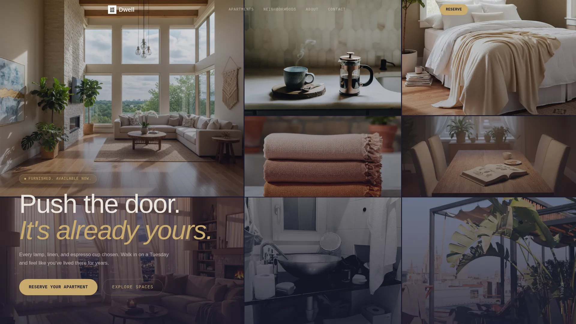
Nine-Tile Parallax Mosaic Header
Nine cropped interior photographs fill the viewport in an asymmetric tile arrangement. On scroll, each tile drifts at a slightly different speed, creating a layered depth effect before the layout transitions into the first full-width apartment section.
Asymmetric 60/40 Apartment Grid
Each apartment listing uses a 60-column hero image paired with a 40-column detail stack showing neighborhood name, square footage, and a short character line. Sections alternate which side carries the image, creating a visual rhythm that mimics moving through a hallway.
Hover-Swap Room Previews
Hovering over room thumbnails within a listing instantly swaps the large hero image. Visitors can click through a space visually without leaving the page, building familiarity before they reach the booking step.
Interactive Neighborhood Map with Pulsing Pins
An embedded map lets visitors filter apartments by neighborhood. Map pins pulse gold on hover and reveal a thumbnail and nightly rate, giving geographic context without leaving the page flow.
Pinned Reservation Bar and Slide-In Panel
After the first scroll, a slim gold booking bar stays pinned to the bottom of the viewport. Clicking it opens a slide-in panel with fields for move-in date, estimated stay duration via dropdown, and preferred neighborhood.
Dual Call-to-Action Architecture
Every apartment listing carries a secondary "Book a Virtual Walkthrough" option alongside the primary reservation path. This gives undecided visitors a lower-commitment next step without removing focus from the main conversion goal.
Page sections overview
| Section | Purpose |
|---|---|
| Mosaic Photo Header | Opens with nine parallax interior tiles filling the viewport |
| First Apartment Showcase | Full-width hero image transitioning from the mosaic |
| Apartment Listings Grid | Zigzag 60/40 sections per apartment with hover image swap |
| Neighborhood Filter Map | Interactive map with pulsing gold pins and rate previews |
| Pinned Booking Bar | Persistent reservation prompt fixed to viewport bottom |
| Slide-In Reservation Panel | Collects move-in date, duration, and neighborhood preference |
Design & branding system
The visual identity follows a Dark Immersive theme built on the Cloud Canvas color system. The palette is designed to feel like a luxury interior photographed at dusk, with shadows doing most of the decorating and every surface absorbing light like velvet.
- Deep charcoal (#1A1A2E) and soft graphite (#30305A) form the base, warm cloud white (#EAE6DF) handles text and detail, and muted gold (#C9A96E) is reserved for buttons, hover states, and pricing highlights
- The asymmetric grid and alternating image placement create a layout rhythm that feels editorial and spatial rather than list-like
- Typography and spacing are kept minimal so photography carries the mood, with text acting as a precise label rather than a decorative element
Mobile & speed optimization
The template is structured so that its visual complexity scales down gracefully on smaller screens. The asymmetric grid, mosaic header, and hover interactions are all designed with layout responsiveness in mind.
- The 60/40 column grid stacks vertically on mobile, keeping apartment details readable without horizontal scrolling
- The pinned booking bar remains accessible on mobile viewports, so the reservation path is never buried below the fold
- Image-heavy sections use a staggered tile approach that maintains visual impact without requiring a wide viewport
How this template helps you convert
Dwell is built around the idea that visitors book when they feel ownership, not just awareness. The layout earns the click by giving visitors enough room experience to feel invested before asking for commitment.
- The parallax mosaic and hover-swap previews create an exploratory, self-guided atmosphere that keeps visitors on the page longer and builds emotional connection with specific apartments.
- The pinned gold booking bar keeps the primary call to action visible at all times after the first scroll, reducing the distance between decision and action without interrupting the browsing experience.
- The dual call-to-action structure means visitors who are not ready to reserve can book a virtual walkthrough instead, keeping them in the funnel rather than losing them to inaction.
Other information about this template
Dwell was designed for the intersection of premium furnished rentals and platforms that serve time-sensitive renters. The template style follows a Zigzag/Alternating layout convention, which is well-suited to multi-listing pages where each property deserves its own visual moment.
- The template fits the Space and Rental Platforms subcategory and works particularly well for artist loft and studio rental contexts where atmosphere is part of the value proposition
- The Atelier Studio theme and Gallery Walk creative direction influence the editorial spacing and photography-forward layout choices
- The booking panel dropdown supports four duration options: 2 weeks, 1 month, 3 months, and 6 or more months, covering the full range of mid-stay use cases described in the brief
- The template is delivered as a ready-to-customize layout, with color tokens, grid structure, and section order pre-configured to the Dark Immersive visual identity


Theme
Atelier Studio
Creative direction
Gallery Walk
Color system
Midnight Blue
Style
Zigzag/Alternating
Direction
Quiz/Assessment
Page Sections
Nine-tile Parallax Mosaic Header
Asymmetric 60/40 Apartment Grid
Hover-swap Room Previews
Interactive Neighborhood Map
Pinned Booking Bar and Slide-in Panel
Dual Call-to-action Structure
Related questions
Who is this template best suited for?
Can I show multiple apartments on one page?
How does the booking flow work?
What if a visitor is not ready to book yet?
Can I adapt the color system to my own brand?


