Student Co-Living Landing Page Template
Dwell is a dark, immersive landing page template built for a co-living student housing network operating out of converted Victorian townhouses. It combines a Before/After Slider header, interactive modular room cards, real-time availability indicators, and a three-step room reservation flow to turn curious visitors into committed residents.
by Rocket studio
Quick summary
Dwell is a single-page, card-grid landing page template designed for a postgraduate co-living network. It uses a deep charcoal and warm amber visual identity to evoke late-night belonging. The interactive layout lets visitors explore room types, shared spaces, and resident quotes before committing to a reservation or booking a viewing.
Who this template is for
This template is built for student housing operators who want a page that feels lived-in and trustworthy, not clinical or corporate. It suits co-living networks with a mix of private rooms and shared communal spaces across multiple houses.
- Student accommodation providers managing converted properties with distinct room types
- Co-living operators targeting postgraduates, international students, and professional students
- Housing brands that want direct online reservations rather than third-party listing referrals
What problem this template solves
Student housing pages often feel transactional and cold. Prospective residents cannot picture themselves in the space, and operators lose warm leads to hesitation. Dwell closes that gap by making the browsing experience feel like an actual open-house walkthrough.
- Visitors struggle to commit without a sense of atmosphere and community
- Generic listing formats fail to differentiate a premium co-living offer from a standard halls page
- Missing urgency signals mean visitors leave without reserving, even when rooms are available
What you get with this template
The template delivers a fully structured single-page layout that guides a visitor from first impression through to room reservation. Every component serves either discovery, trust-building, or conversion.
- A Before/After Slider header that reveals the Victorian-to-furnished transformation in real time
- Modular room and space cards that flip, expand, or rotate to show floor plans, 360-degree snapshots, and resident quotes
- A pinned "Reserve Your Room" call to action on every expanded card, feeding into a three-step booking flow with a refundable holding deposit option
Feature list
This template is built around interactive exploration and confident, direct conversion. Each feature below is grounded in the brief.
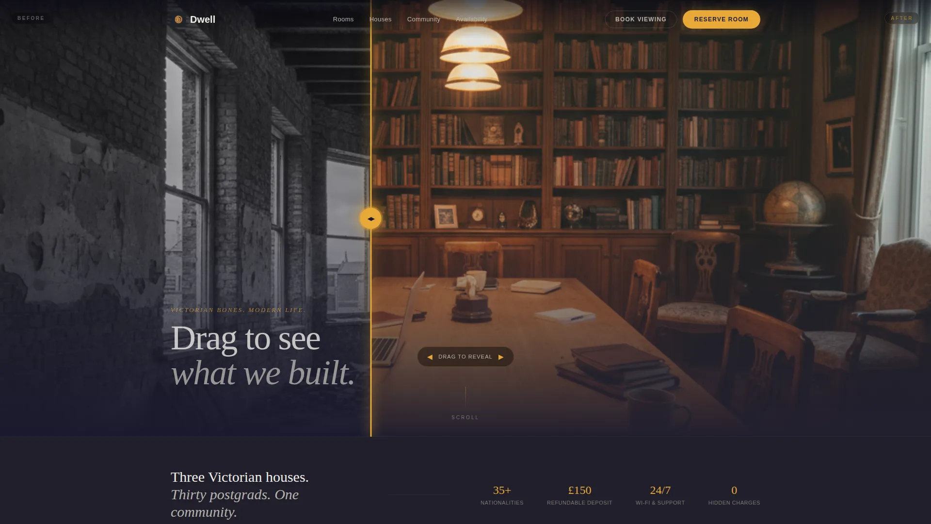
Before/After Transformation Slider
The header opens with a split-view slider. The left side shows a gutted Victorian shell with exposed brick and bare joists. The visitor drags an amber glowing handle to reveal the same space transformed into a warm, furnished common room. A headline fades in after interaction: "We kept the bones. We built the life."
Interactive Modular Room Cards
Every card represents a room type or shared space. Visitors can flip, expand, or rotate each card to reveal a floor plan, a 360-degree snapshot, and a real resident quote. The layout mimics an open-house walkthrough where the visitor chooses which door to open next.
Real-Time Availability Indicators
Amber availability badges surface live room counts directly on the page, for example "3 rooms left for September." This creates natural urgency without resorting to aggressive countdown timers or pressure tactics.
Three-Step Reservation Flow
The primary call to action, "Reserve Your Room," is pinned to the bottom of every expanded card. It leads into a three-step flow: choose house and room type, select a move-in date from a live availability calendar, and pay a refundable £150 holding deposit by card.
Secondary Viewing Capture Path
Visitors not ready to reserve can follow a lighter conversion path. "Book a Viewing" asks only for a name, preferred house, and a date slot, keeping the barrier low while still capturing a qualified lead.
Dark Immersive Visual System
The charcoal and amber color system is applied consistently across backgrounds, card surfaces, hover states, pricing highlights, and availability badges. Chalk-white body text stays legible against dark surfaces without breaking the nocturnal mood.
Page sections overview
| Section | Purpose |
|---|---|
| Before/After Slider Header | Reveals Victorian-to-furnished transformation and sets atmosphere |
| Headline Fade-In | Delivers the brand message after visitor interaction |
| Room Type Cards | Lets visitors explore private rooms with floor plans and quotes |
| Communal Space Cards | Showcases shared kitchens, living areas, and rooftop terraces |
| Availability Badges | Surfaces live room counts to signal real demand |
| Reserve Your Room call to action | Pinned conversion trigger on every expanded card |
| Three-Step Booking Flow | Guides room selection, move-in date, and deposit payment |
| Book a Viewing Form | Captures leads from visitors not yet ready to reserve |
Design & branding system
The visual identity is built around a Dark Immersive theme using a Charcoal and Amber color system. The palette is deliberately nocturnal, referencing the feeling of a reading nook lit by a single desk lamp pooling gold onto dark wood.
- Deep charcoal (#1A1A2E) and worn timber dark (#2D2A26) dominate backgrounds and card surfaces
- Warm amber (#E8A838) activates hover states, pricing highlights, and availability badges to draw the eye without disrupting the mood
- Chalk-white (#F0EDE8) is used for body text to maintain legibility across all dark surfaces
Mobile & speed optimization
The card-grid layout is modular by design, which means it adapts cleanly to narrower viewports. Interactive elements like the slider and expandable cards are built to function on touch screens as naturally as on desktop.
- Modular card structure scales gracefully from large desktop grids to single-column mobile views
- The Before/After Slider is touch-enabled so mobile visitors can drag the amber handle just as easily as desktop users
- Pinned call-to-action buttons remain accessible at the bottom of expanded cards on all screen sizes
How this template helps you convert
The page is structured around two conversion paths, one for ready buyers and one for visitors still in discovery mode. Every layout decision supports either commitment or continued engagement.
- The "Reserve Your Room" path captures high-intent visitors directly through the three-step booking flow, from house selection and move-in date to a refundable £150 card deposit, reducing drop-off at each micro-step.
- The "Book a Viewing" path keeps hesitant visitors in the funnel by asking only three fields, lowering the barrier to a qualified first interaction without requiring any financial commitment.
Other information about this template
Dwell is designed specifically for the co-living student housing niche, where the audience includes international postgraduates, second-year law students, and medical students with demanding schedules. The template acknowledges those real-world pressures in its copy prompts and card content rather than defaulting to generic student accommodation language.
- Template style is Card Grid (Modular), making it straightforward to add or remove house locations and room types as the network grows
- The interactive explorer creative direction means the page rewards repeat scrolling, with visitors building familiarity across multiple card interactions before committing
- The holding deposit mechanic, £150 and refundable, is baked into the booking flow copy, giving operators a low-friction way to secure intent without overpromising


Theme
Pastoral Calm
Creative direction
Case Study Narrative
Color system
Navy Authority
Style
Card Grid (Modular)
Direction
Click-Through
Page Sections
Before/after Transformation Slider
Interactive Modular Room Cards
Real-time Availability Indicators
Three-step Reservation Flow
Secondary Viewing Capture Path
Dark Immersive Visual System
Related questions
Who is this landing page template designed for?
Can I add more house locations or room types to the card grid?
How does the three-step booking flow work?
What is the 'Book a Viewing' option for?
Does the Before/After Slider work on mobile devices?


