Mixed-Use Mortgage Specialist Landing Page Template
Dwell is an asymmetric 60/40 landing page template built for mixed-use mortgage specialists. It combines an interactive location input, live affordability sliders, and a progressive underwriting walkthrough to guide self-employed buyers through the complexity of live/work property finance. The Warm Stone color system and Corporate Precision layout give it the quiet authority the niche demands.
by Rocket studio
Quick summary
Dwell is a single-page template for mortgage specialists who work with mixed-use and live/work properties. The layout uses a 60/40 asymmetric grid, an animated map-based location input, and draggable income sliders to walk visitors through dual-valuation underwriting. It is built to earn trust before it asks for anything.
Who this template is for
This template is designed for mortgage brokers and specialists who regularly underwrite mixed-use and live/work property deals. If your clients are self-employed professionals navigating lenders who do not understand dual-purpose buildings, this page speaks directly to them.
- Mixed-use mortgage specialists advising self-employed architects, café owners, and creative professionals
- Live/work property finance consultants handling warehouse conversions and combined studio-residence deals
- Independent mortgage advisers who need a page that demonstrates specialist knowledge upfront
What problem this template solves
Standard mortgage landing pages are built for straightforward residential buyers. They offer generic copy, stock photography, and simple forms. That approach fails completely when the borrower is a café owner buying the flat upstairs or an architect whose studio is also their home.
- Lenders and advisers alike struggle to communicate the layered logic of commercial percentage thresholds, permitted use classes, and income blending rules
- Visitors arrive anxious and leave unpersuaded because nothing on the page proves the specialist understands their specific situation
- Generic forms capture the wrong leads and waste the adviser's time qualifying buyers who were never a fit
What you get with this template
You get a fully structured, single-page layout that walks the visitor through the underwriting logic of mixed-use property finance at their own pace. Every section is designed to reduce anxiety and build credibility progressively.
- An animated location input header with a line-drawing map that sketches zoning districts in real time
- A dual-valuation interactive explorer with draggable sliders for rental income assumptions and live affordability feedback
- A two-path conversion flow: a primary rate enquiry form and a secondary lead-capture download offer
Feature list
This section describes the core interactive and structural features built into the Dwell template.
Animated Location Input Header
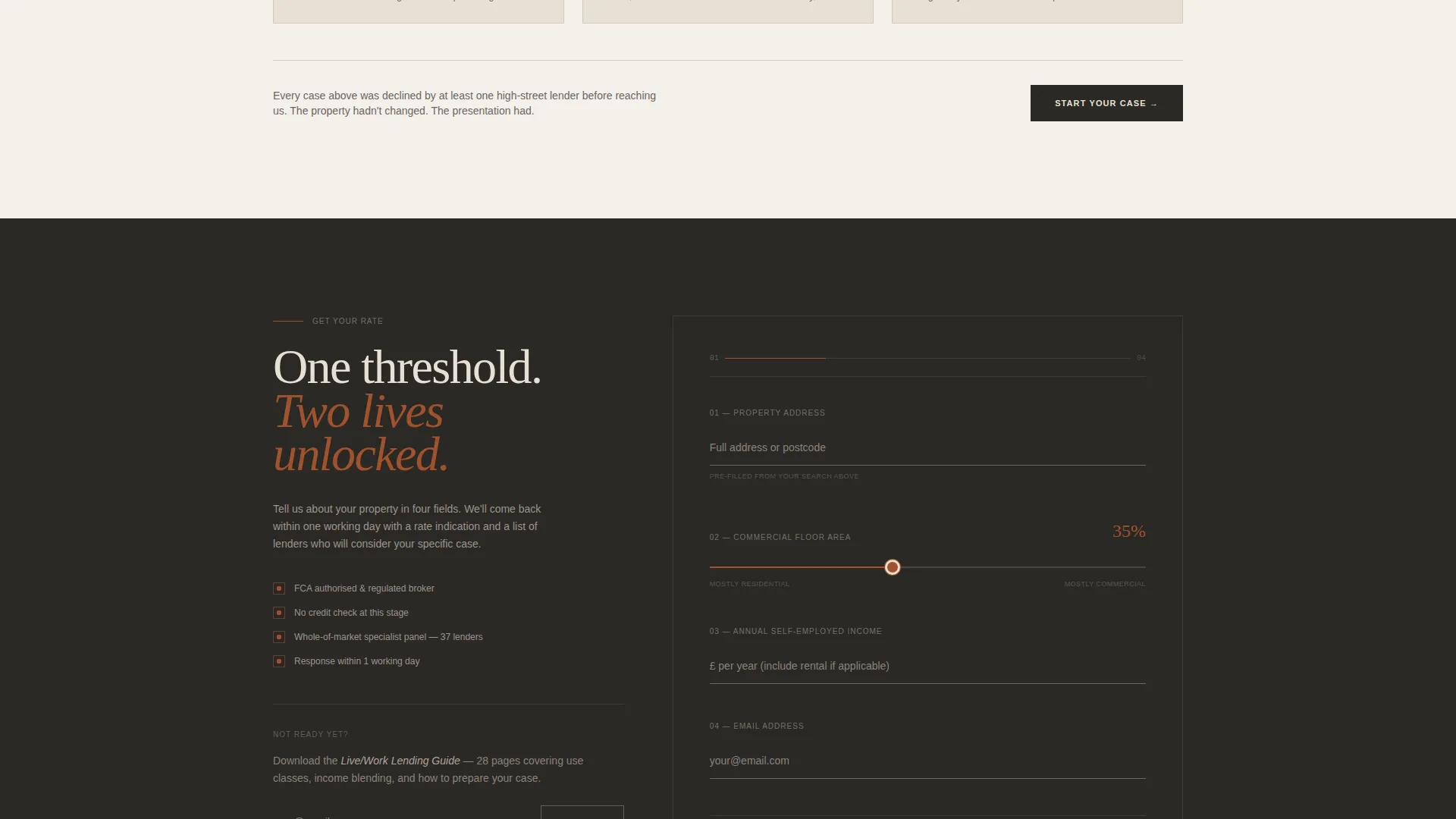
The header centers a single address field over a softly animated line-drawing map. As the visitor types a postcode or street name, the map zooms and crosshatches eligible live/work zoning districts in fired clay. One line of charcoal type sits above the field: "Where do you want to live and work?" No stock photography, no distractions.
Dual-Valuation Affordability Explorer
After the location input, the 60-column reveals a split property valuation view. Draggable sliders let visitors adjust rental income assumptions and watch affordability figures shift in real time. The 40-column stacks contextual lending criterion cards that swap as the visitor interacts, covering topics like commercial percentage thresholds and income blending rules.
Progressive Underwriting Walkthrough
The scroll is structured as a self-guided educational journey. Each section deepens complexity, moving from basic eligibility through rate comparison to real funded case studies. The visitor feels progressively more informed and less anxious with every section they pass through.
Sticky and End-of-Page call to action Flow
The primary call to action, "Get Your Live/Work Rate," appears first as a sticky bar after the location input and returns as a full-width form at the end of the page. The form collects four fields in deliberate order: property address, commercial split slider, annual self-employed income, and email.
Secondary Lead Capture Path
A secondary conversion path targets earlier-stage visitors with a "Download the Live/Work Lending Guide" offer. It requires only an email address. This captures prospects who are not yet ready to enquire but are clearly in the research phase.
60/40 Asymmetric Grid Layout
The layout divides every scroll section into a 60-column primary content area and a 40-column contextual sidebar. The 60-column uses warm cream backgrounds with deep charcoal type. The 40-column anchors in mortar gray with fired clay interactive elements, buttons, and data highlights.
Page sections overview
| Section | Purpose |
|---|---|
| Location Input Header | Drops visitor into an address search with animated zoning map |
| Dual Valuation Explorer | Shows residential and commercial split with live affordability sliders |
| Lending Criteria Cards | Explains commercial thresholds, use classes, and income blending rules |
| Rate Comparison Section | Lets visitors compare lending scenarios side by side |
| Funded Case Studies | Demonstrates real approved deal examples to build credibility |
| Sticky Rate call to action Bar | Keeps the primary conversion action visible during scroll |
| Full-Width Enquiry Form | Collects four key fields to qualify and convert serious applicants |
| Guide Download Capture | Offers a secondary email-only path for early-stage visitors |
Design & branding system
The template uses a Corporate Precision theme built on a Warm Stone color system. The palette is drawn from the textures of converted industrial buildings: limestone cream, mortar gray, fired clay, and deep charcoal. It feels warm enough to live in and serious enough to do business in.
- Core palette: limestone cream (#E8E0D5), mortar gray (#6B6560), fired clay (#A0522D), and deep charcoal (#2B2926) for primary text
- The 60-column carries warm cream backgrounds with charcoal type; the 40-column uses mortar gray with clay-colored buttons and data highlights
- Interactive elements, sliders, and call to action buttons use fired clay to draw the eye without breaking the professional tone
Mobile & speed optimization
The 60/40 grid adapts across screen sizes so the dual-column layout remains clear and navigable on smaller devices. Interactive elements like sliders and swapping contextual cards are designed to work with touch input as naturally as they do with a mouse.
- Slider and card interactions are built for touch-friendly use on mobile screens
- The sticky call to action bar remains accessible during scroll on both desktop and mobile viewports
- The animated map header is designed to load progressively so the input field is immediately usable
How this template helps you convert
The page earns the click by proving expertise before asking for anything. By the time the visitor reaches the form, they have already interacted with the tool, read real funded examples, and understood that this specialist knows the language their high-street bank never learned.
- The location input and live sliders create an immediate sense of personalised engagement, making the visitor feel the tool is already working for them before any contact is made.
- The progressive walkthrough structure reduces decision anxiety at each scroll step, so the visitor arrives at the form already informed and already trusting the specialist's credentials.
- The two-path call to action system means no visitor leaves empty-handed: serious buyers request a rate, and research-phase visitors download the guide, keeping both segments inside the conversion funnel.
Other information about this template
The Dwell template sits at the intersection of live/work space real estate and specialist mortgage advice, a niche where very few landing page templates exist. It is purpose-built for the self-employed buyer who owns a category of property most lenders struggle to assess.
- Template category: Real Estate and Property, subcategory Live/Work Space Real Estate
- The asymmetric grid and Corporate Precision theme distinguish this page from generic finance or property templates
- The fired clay interactive layer ensures call to action elements always contrast clearly against both the cream and gray column backgrounds
- The template supports a direct sales conversion goal and a parallel lead generation path through the guide download
- It can support a specialist live/work space appraiser or mortgage consultant looking to position themselves as the definitive expert in this underserved property niche


Theme
Executive Suite
Creative direction
Before/After Reveal
Color system
Sunset Mesa
Style
Split Screen (50/50)
Direction
Lead Generation
Page Sections
Animated Zoning Map Header
Live Affordability Sliders
Swappable Lending Criteria Cards
Progressive Scroll Walkthrough
Dual-path Call to Action System
60/40 Asymmetric Grid Layout
Related questions
Who is the Dwell template designed for?
Can I customise the slider values and lending criteria cards?
Does the template support two different conversion goals at once?
What makes this different from a standard mortgage landing page?
Is the four-field enquiry form easy to modify?


