Arthritis Care Education Website Template
Ease is a warm, human-centered arthritis patient education landing page template. It pairs educational resource blocks with woven patient voices, a staggered mosaic layout, and a soft healing-space visual identity. Designed for newly diagnosed adults and long-term patients alike, it guides visitors from anxious midnight searches toward a trusted, free resource library.
by Rocket studio
Quick summary
Ease is an arthritis patient education landing page built around one idea: understanding comes before instruction. The template pairs four educational resource blocks with patient quote mosaics in a zigzag layout. A gentle Cloud Canvas color system and stacked typographic hero create a space that feels warm, unhurried, and clinically safe.
Who this template is for
This template is built for health educators, patient advocates, and digital health teams who serve people living with arthritis. It works especially well for organizations that want to move beyond pamphlet language and build genuine trust with their audience.
- Newly diagnosed patients and caregivers searching for plain-language guidance
- Rheumatology practices or patient nonprofits launching a free resource hub
- Digital health content teams who want community voices woven into education
What problem this template solves
People newly diagnosed with arthritis often find clinical websites cold, overwhelming, and hard to act on. They arrive anxious and leave without answers. This template closes that gap by combining warm copywriting structure, real patient validation, and clear resource pathways in one focused page.
- Clinical language creates distance; this template uses approachable, human-centered structure
- Resource hubs that bury calls to action lose sign-ups; the library gateway appears at exactly the right scroll depth
- Patients skip resources they do not trust; the mosaic proof model builds that trust before any form appears
What you get with this template
You get a fully structured single-page layout with eight distinct sections, ready to fill with your own copy and resources. Every section is purpose-built for an arthritis education audience.
- A stacked typographic hero, four zigzag content blocks, two conversion gateways, and a footer
- Watercolor-wash avatar placeholders and mosaic quote grid slots for patient testimonials
- Two conversion paths: a free library sign-up with interest tiles and a printable flare journal email download
Feature list
The following features are built directly into the Ease template layout and design system.
Stacked Type Tower Hero
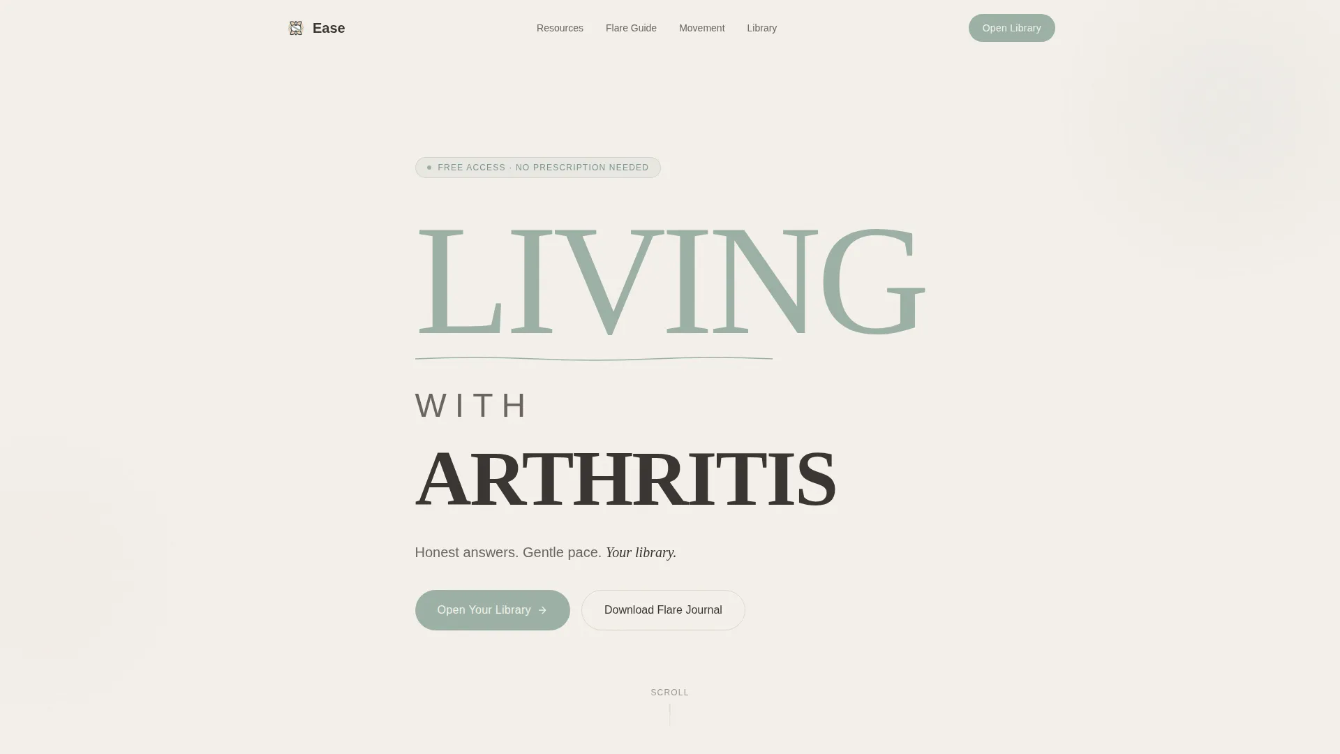
The hero uses three stacked lines of large display type, each line scaled differently to create a vertebrae-like visual rhythm. A single animated sage-colored SVG line slowly draws itself between the words, mimicking a joint finding its range of motion. A quiet subline anchors the section without competing with the typography.
Zigzag Resource and Mosaic Layout
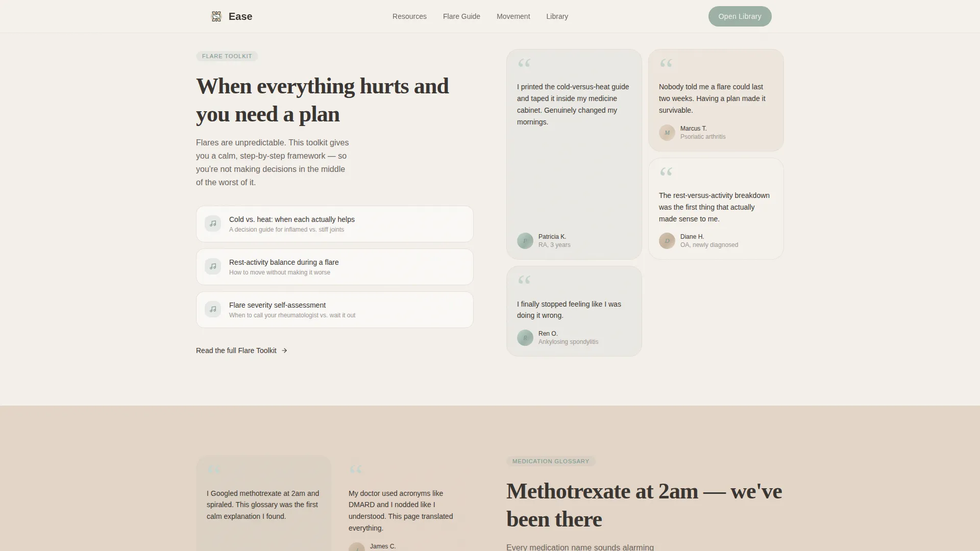
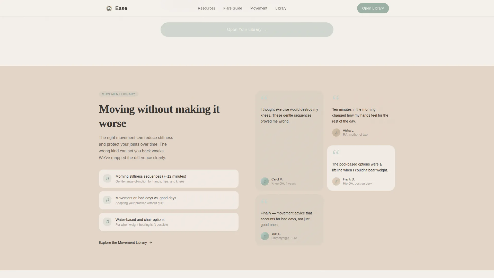
Four alternating content blocks each pair an educational topic on one side with a patient quote mosaic grid on the other. The grid shifts from right to left with each block, creating a breathing rhythm of information and community. This layout structure makes the page feel like a dialogue rather than a lecture.
Staggered Mosaic Fade-In Animation
Mosaic tiles use scroll-triggered staggered fade-ins via IntersectionObserver. Each tile appears in sequence as the visitor scrolls, giving the impression of a waiting room gradually filling with people who understand. Soft watercolor-wash avatars in sage and linen replace face photography.
Library Gateway with Interest Tiles
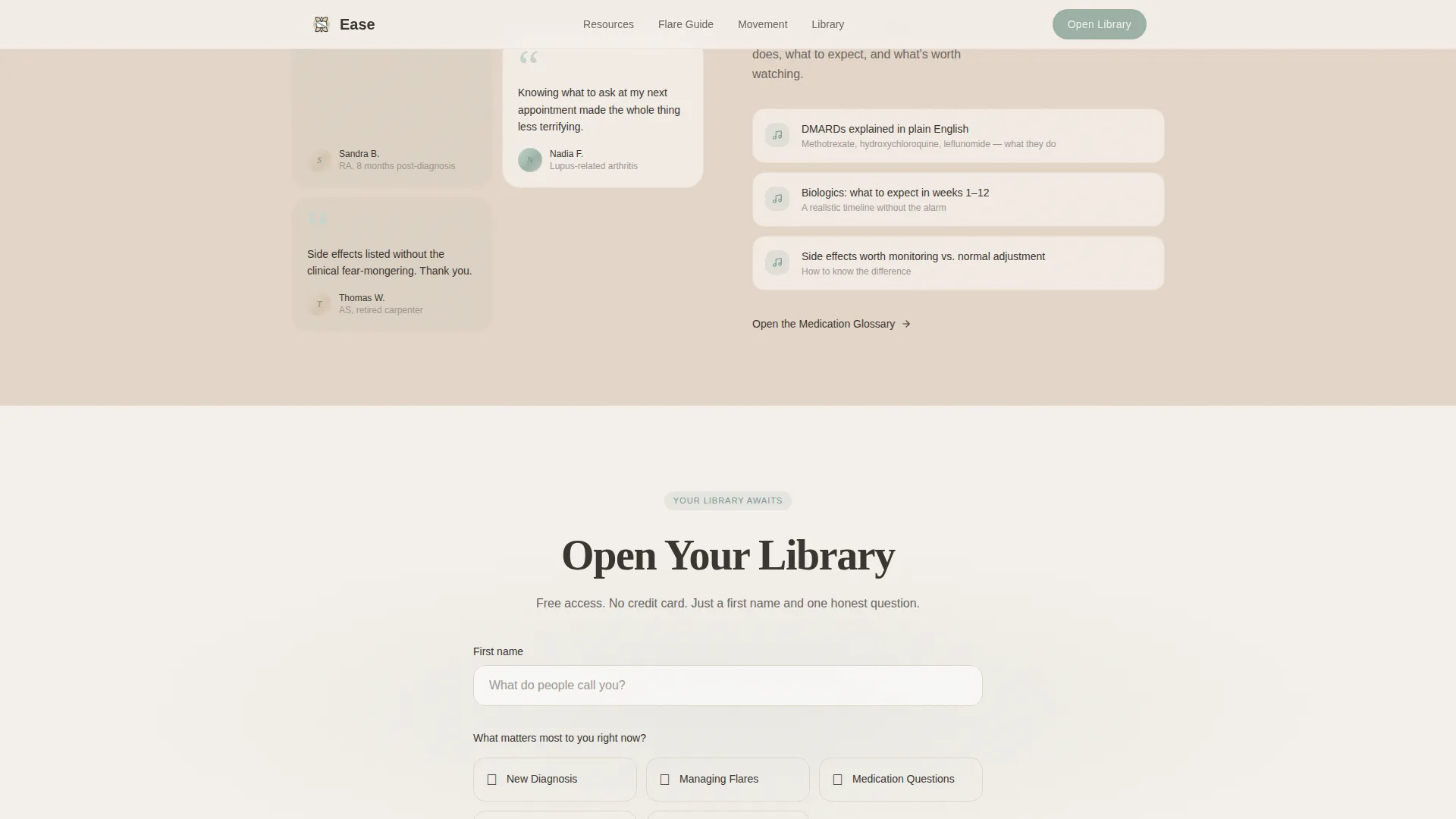
After the second zigzag block, a conversion gateway collects a first name and a single question: "What matters most to you right now?" Selectable interest tiles cover five topics: New Diagnosis, Managing Flares, Medication Questions, Daily Movement, and Emotional Support. This low-friction approach makes sign-up feel like personalization, not a gate.
Flare Journal Download Path
A secondary conversion block offers a printable flare journal as a downloadable file, captured with an email-only field. This gives visitors who are not ready for the full library a smaller, still-useful first step. It lowers the barrier to entry without reducing value.
Cloud Canvas Color and Typography System
The full palette uses fog white, warm linen, muted sage, and deep charcoal in deliberate roles across every section. Fraunces serif handles display headings while DM Sans carries body text. Alternating section fills in warm linen create visual rhythm without introducing new colors.
Page sections overview
| Section | Purpose |
|---|---|
| Stacked Type Hero | Introduces the platform with large display typography and an animated sage line draw |
| Zigzag Block One | Pairs the Flare Toolkit resource with a patient quote mosaic grid on the right |
| Zigzag Block Two | Pairs the Medication Glossary resource with a patient quote mosaic grid on the left |
| Library call to action Gateway | Collects name and interest tile selection to open the free resource library |
| Zigzag Block Three | Pairs the Movement Library resource with a patient quote mosaic grid on the right |
| Zigzag Block Four | Pairs the Nutrition Guide resource with a patient quote mosaic grid on the left |
| Flare Journal Download | Secondary conversion block with an email-only field for a printable PDF download |
| Footer | Horizontal flow footer with navigation and supporting links |
Design & branding system
The Cloud Canvas palette was chosen to feel like morning light through sheer curtains onto a linen bedspread. Every color decision reinforces the sense of being unhurried and safe, which is the core emotional promise of the template.
- Fog white (#F4F0EB) as the dominant background, warm linen (#E3D5C7) on alternating section fills, muted sage (#9BB0A5) for interactive elements, and deep charcoal (#3A3632) for body text
- Fraunces serif for display headings gives warmth and personality; DM Sans for body copy keeps reading easy
- Watercolor-wash avatar illustrations in sage and linen tones replace photography throughout the mosaic grids
Mobile & speed optimization
The template is designed mobile-first, recognizing that most arthritis patients search at night on a phone. The zigzag layout stacks cleanly into single-column blocks on smaller screens.
- Static sections use Server Components to reduce unnecessary client-side rendering
- Interactive elements including the interest tile selector and email forms are isolated as Client Components
- Scroll-triggered animations use IntersectionObserver so they activate only when elements enter the viewport
How this template helps you convert
The Ease template is structured to earn the click before asking for it. Visible, scrollable proof of resource quality appears well before any form field.
- The mosaic quote grids appear alongside every resource block, so visitors see community validation at the exact moment they encounter new information, building trust progressively as they scroll.
- The library gateway appears after two full zigzag blocks, when the visitor has already seen specific resource topics and patient voices. The ask is small: a first name and one question, which feels like personalization rather than a barrier.
Other information about this template
Ease is part of the Healing Space theme family, a design direction built specifically for health and wellness digital products that prioritize emotional safety. The template style is Zigzag/Alternating, and the creative direction is Testimonial Mosaic. The header concept follows the Stacked Type Tower pattern, and the landing page direction is Content/Resource. It sits in the Health and Medical category under the Arthritis Care subcategory, with a niche focus on arthritis patient education platforms.
- The template uses Fraunces and DM Sans, both available as variable web fonts, making them easy to customize
- Animation intensity is set to medium: present enough to feel alive, restrained enough not to distract someone in pain
- The footer follows the Vercel Horizontal Flow pattern, keeping navigation clean and low-profile at the base of the page
Theme
Healing Space
Creative direction
Testimonial Mosaic
Color system
Cloud Canvas
Style
Zigzag/Alternating
Direction
Content/Resource
Page Sections
Stacked Type Tower Hero
Zigzag Resource and Mosaic Layout
Staggered Mosaic Fade-in Animation
Library Gateway with Interest Tiles
Flare Journal Download Path
Cloud Canvas Color and Type System
Related questions
Who is this landing page template designed for?
Can I replace the patient quote placeholders with my own testimonials?
How does the library sign-up gateway work?
Is this template suitable for mobile users?
Can the flare journal download section be adapted for other resources?



