Chronic Pain Telehealth Landing Page Template
Ease is a chronic pain telehealth landing page built for board-certified pain specialists who meet patients where conventional medicine has failed them. The split-screen layout, embedded five-step assessment quiz, and alternating Expert Panel scroll sections create a calm, credible experience. The Alpine Fresh color system and unhurried Organic Flow design make fatigued patients feel genuinely seen before they book.
by Rocket studio
Quick summary
Ease is a single-page telehealth landing page designed for chronic pain practices. It pairs an Expert Panel scroll format with an embedded five-step guided assessment quiz. The Alpine Fresh palette and Organic Flow visual theme communicate safety and credibility to patients who have spent years being dismissed by the healthcare system.
Who this template is for
This template suits telehealth practices and pain clinics that want to convert skeptical, exhausted patients through trust-first design rather than clinical pressure. It works best when the practice employs multiple board-certified specialists and wants to showcase each one individually.
- Chronic pain telehealth services treating fibromyalgia, nerve pain, and post-surgical conditions
- Pain practices offering direct-to-patient intake without referral requirements
- Healthcare teams that want to lead with specialist credibility before asking for patient information
What problem this template solves
Chronic pain patients have often cycled through many providers without feeling heard. A generic healthcare landing page feels cold and transactional to someone who is already exhausted and skeptical. This template solves the trust gap before it becomes a conversion barrier.
- Patients arrive fatigued and doubtful; the design signals belief and calm rather than urgency
- Generic intake forms feel impersonal; the guided quiz feels like a real clinical conversation
- Visitors cannot identify whether the practice understands their specific condition; the Expert Panel answers that directly
What you get with this template
You get a fully structured single-page layout with every major section pre-built and ready to customize. The design system, typography choices, and interaction patterns are all defined and consistent throughout.
- A hero section with a centered serif headline, atmospheric blur orbs, and an SVG wave transition
- An alternating Expert Panel scroll with specialist photos, credentials, and video question-and-answer pairs
- An embedded five-step assessment quiz with body map, duration slider, treatment multi-select, open text field, and insurance toggle
- Horizontal scroll snap patient testimonial cards and a three-step How It Works section
- A persistent floating secondary call-to-action banner for visitors too fatigued to complete the quiz
Feature list
This template ships with five purposeful, interconnected components that work together to move a hesitant visitor toward booking.
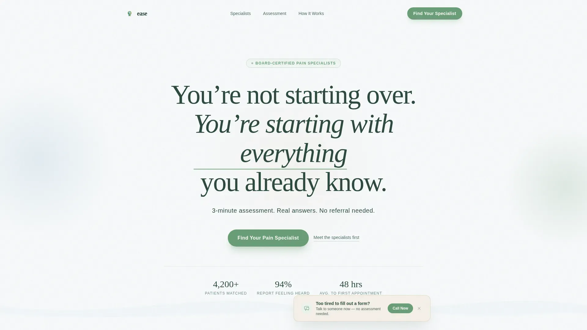
Centered Giant Headline Hero
The hero opens with a single oversized serif headline on a clean fog-white field. A meadow-green underline pulses once like a slow heartbeat. A short subline in glacial blue states the three-minute assessment promise clearly. No competing imagery distracts from the message.
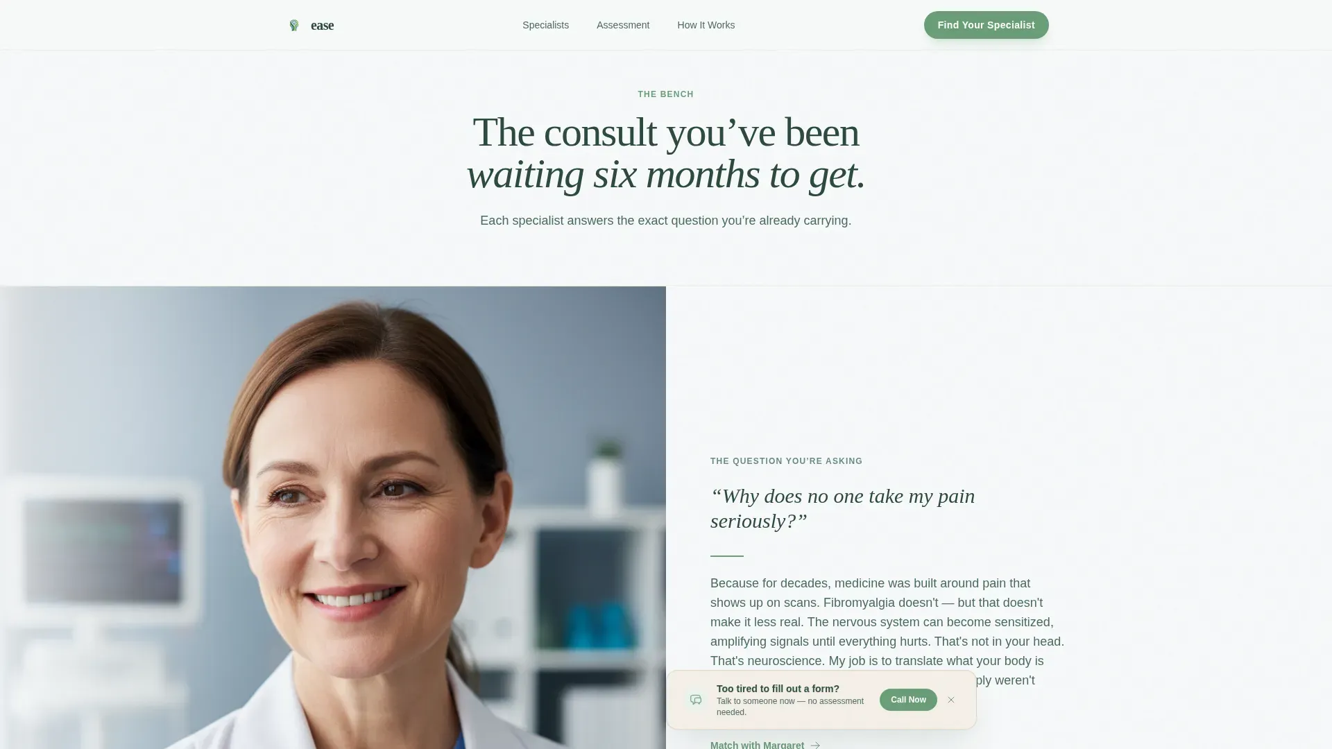
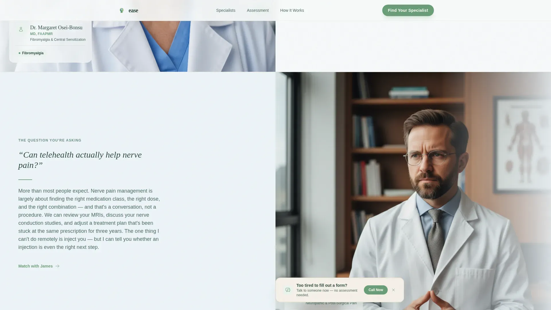
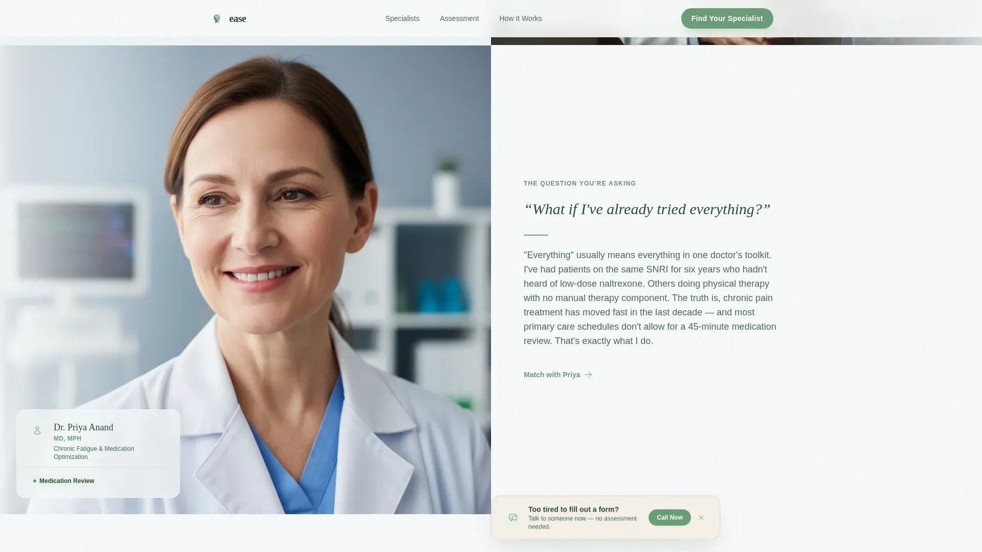
Alternating Expert Panel Scroll
Each scroll step reveals one pain specialist on one side and a short video of that specialist answering a patient question on the other. The layout alternates left-right with each new clinician. This rhythm builds a visible bench of credibility before the quiz ever appears.
Five-Step Embedded Assessment Quiz
The quiz lives mid-page after the third Expert Panel section, so clinical trust is already established. Steps include a visual body map for pain type, a duration slider, a multi-select treatment history, an optional open-text frustration field, and an insurance or self-pay toggle. An alpine-green progress vine grows across the top of each step.
Horizontal Testimonial Scroll
Patient testimonial cards use specific diagnoses and outcomes rather than generic praise. Cards sit on warm birch surfaces and snap smoothly on horizontal scroll. The specificity of each outcome reinforces that the practice handles real, complex cases.
Persistent Secondary Call-to-Action Banner
A floating birch-toned banner reading "Talk to someone now" stays visible throughout the page. It gives visitors who cannot complete the full quiz a low-effort path to contact. This secondary path reduces drop-off among the most fatigued visitors.
Page sections overview
| Section | Purpose |
|---|---|
| Hero Headline | Open with emotional resonance and a clear assessment promise |
| Expert Panel Scroll | Build specialist credibility through alternating doctor and video pairs |
| Embedded Assessment Quiz | Guide patients through a five-step intake matched to their pain profile |
| Patient Testimonial Cards | Reinforce trust with specific diagnoses and real outcomes |
| How It Works | Explain the three-step path from assessment to specialist match |
| Persistent call to action Banner | Provide a low-effort contact option for fatigued visitors |
| Footer | Single-row linear footer with practice links and basic contact |
Design & branding system
The visual identity uses an Alpine Fresh palette that feels restorative without feeling clinical or spa-soft. Typography pairs Fraunces for serif headlines with DM Sans for body text, creating an unhurried reading rhythm.
- Color roles: fog white for backgrounds, evergreen for body text, meadow green for calls to action and the progress vine, glacial blue for section washes and accents, birch for card surfaces and testimonial panels
- Animation choices: scroll-triggered reveals, the once-pulsing headline underline, smooth quiz transitions, and an organically growing progress vine across assessment steps
- Typography: Fraunces serif headlines carry emotional weight; DM Sans body text keeps information clear and easy to read at low energy
Mobile & speed optimization
The template is built desktop-first with a strong mobile fallback, because chronic pain patients frequently research from a bed or couch rather than a desk. Every interactive component is isolated so the static hero and editorial sections load without waiting for quiz logic.
- Static hero section loads independently of the quiz and panel animations
- Client-side components are scoped only to the quiz and interactive scroll panels
- The alternating Expert Panel layout reflows to a single-column stack on smaller screens without losing the doctor-and-video pairing
How this template helps you convert
The conversion architecture is sequenced deliberately. Credibility comes before any ask, and every ask is sized to match a patient's available energy.
- The Expert Panel scroll answers the exact doubts patients carry before a single form field appears, lowering resistance early in the scroll journey.
- The embedded quiz replaces a cold intake form with a guided five-step conversation that patients can complete in roughly three minutes, matched to their specific pain type and treatment history.
- The persistent floating banner catches visitors who drop off from the quiz, offering a direct contact path so no fatigued visitor leaves without an option.
Other information about this template
This template is part of a Health and Medical category build focused on the chronic pain telehealth service niche. It is designed for direct-to-patient acquisition in a B2C healthcare context.
- Localization is set for English (United States), United States dollars, and MM/DD/YYYY date formatting
- The template style is Split Screen at a fifty-fifty ratio, using the Organic Flow theme throughout
- The creative direction follows an Expert Panel format with the Quiz and Assessment as the primary conversion path
- The header concept is a Giant Headline Centered approach with deliberate white space as a design element
- The footer follows a linear single-row pattern
Theme
Organic Flow
Creative direction
Expert Panel
Color system
Alpine Fresh
Style
Split Screen (50/50)
Direction
Quiz/Assessment
Page Sections
Giant Headline Hero with Pulse Underline
Alternating Expert Panel Scroll
Five-step Guided Assessment Quiz
Horizontal Testimonial Snap Cards
Persistent Floating Secondary Call to Action
Related questions
Can I replace the specialist photos and videos with my own team's content?
Does the five-step quiz require a third-party form tool?
Can this template support more than three specialist panels?
Is this landing page suitable for a practice that does not accept insurance?
How does the persistent floating banner work for visitors who skip the quiz?



