E-Commerce Marketing & Agency Portfolio Website Template
A full-width, dark-themed landing page built for e-commerce SEO agencies. It follows a case study narrative structure, cycling through real client results and animated revenue counters. The design uses a deep graphite and signal green palette to feel like a live analytics dashboard. A two-step audit form and a gated benchmark report capture leads at every stage of buyer readiness.
by Rocket studio
Quick summary
This is a single-page, full-width landing page template for an e-commerce SEO agency. It leads with a blurred search results header, delivers three escalating client case studies, and converts visitors through a free visibility audit form. The dark graphite palette and signal green accents make every result feel urgent and data-driven.
Who this template is for
This template is built for agencies and consultants who sell organic growth to online retailers. It speaks directly to the decision-makers those agencies are trying to reach.
- Direct-to-consumer founders losing margin to paid acquisition and looking for organic alternatives
- E-commerce directors managing large product catalogs with little or no organic visibility
- Shopify Plus operators whose product copy and category pages are not ranking competitively
What problem this template solves
Most agency landing pages lead with credentials and end with a contact form. That sequence asks for trust before it earns it. This template flips the order entirely.
- Prospects arrive skeptical and leave before reading generic service descriptions
- Without proof of results at the visitor's scale, the agency pitch feels theoretical
- Two-field contact forms feel like cold asks that interrupt rather than invite
What you get with this template
You get a structured narrative page that proves capability before requesting any commitment. Every layout decision is designed to move a cautious buyer toward a natural next step.
- A full-viewport header with oversized headline and auto-typing animated metrics
- Three complete case study sections, each presenting a before state, a method breakdown, and animated result counters
- A two-step lead capture form plus a secondary gated report download for early-stage visitors
- Single-stat interstitial breaks between case studies that function like chapter markers
- A sticky bottom bar anchoring the primary call to action from the second case study onward
Feature list
This template is built around a small number of high-impact layout decisions. Each one serves the core conversion goal of turning skepticism into a booked audit call.
Full-Viewport Search Results Header
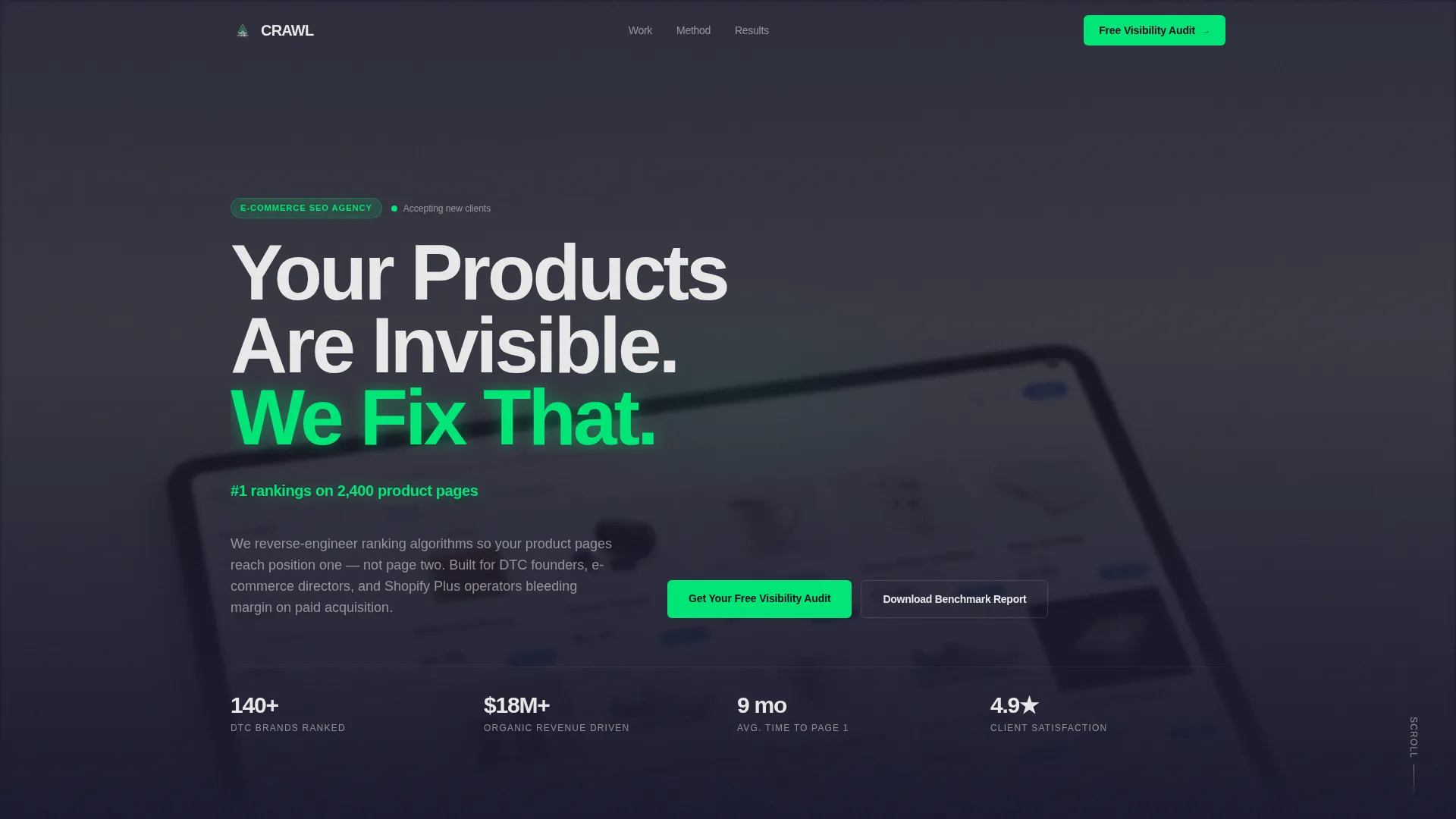
The header fills the entire screen with a dense, slightly blurred e-commerce search results image. Oversized white grotesque typography is punched directly over it. The headline "Your Products Are Invisible. We Fix That." is set tight and engineered-looking, not decorative.
Auto-Typing Animated Metrics Bar
Directly below the main headline, a single line of signal green text types out a real client metric, erases it, and types the next one. Three results cycle on a loop before the visitor scrolls. This communicates proof of results without requiring any interaction.
Escalating Case Study Sections
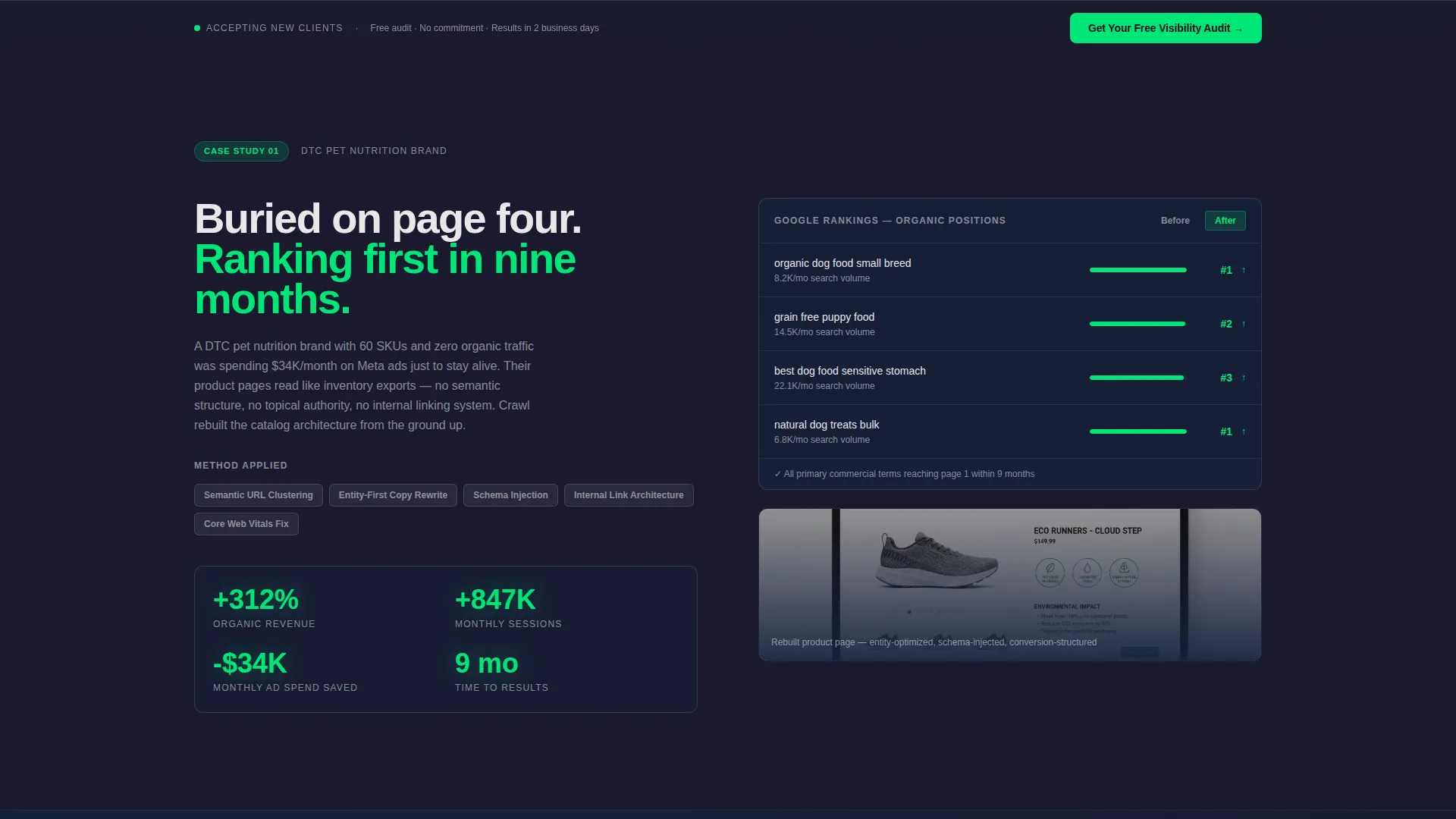
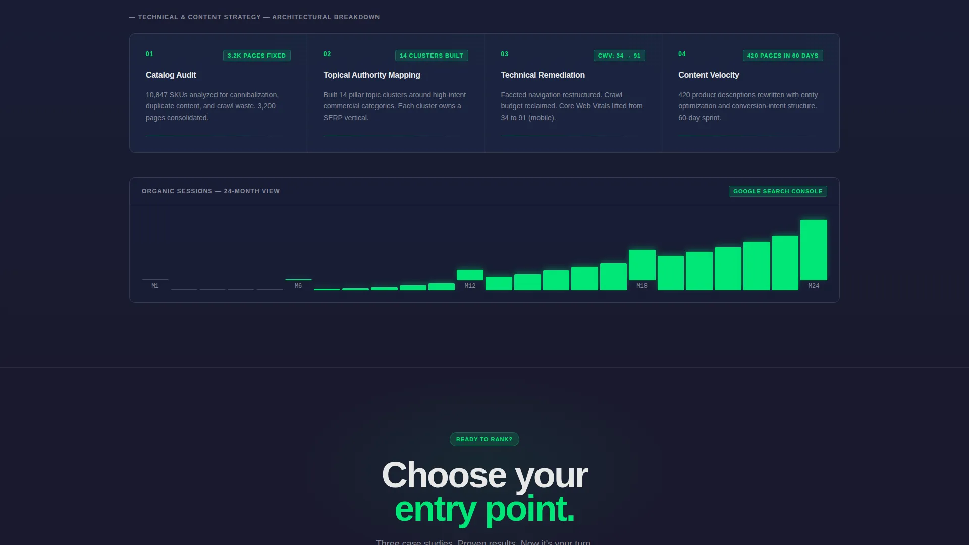
Three case study blocks build in scope from a small direct-to-consumer brand to an enterprise-level catalog. Each block shows the problem with a before-state screenshot, walks through the method with a schematic-style visual, and closes with animated counters hitting real revenue and traffic figures in signal green.
Single-Stat Interstitials
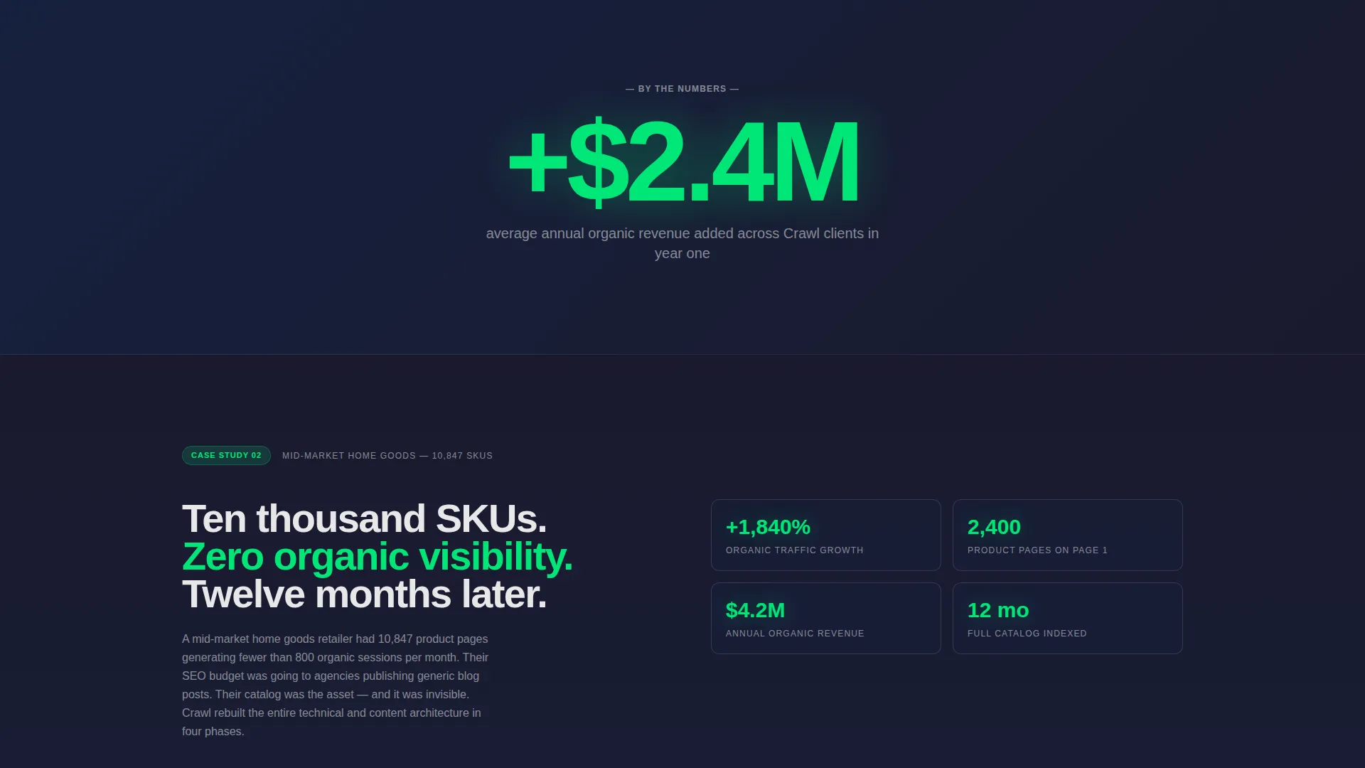
Between case studies, full-width breaks display one large number and one sentence in white on graphite. These act as visual chapter breaks and give high-impact data points room to land without competing with surrounding content.
Two-Step Audit Request Form
The primary conversion path is a two-step form. Step one collects the store URL and a monthly organic revenue range via dropdown. Step two asks for name, role, and the prospect's biggest SEO frustration as an open text field. The structure reduces friction on entry while creating a sense of being heard at the close.
Gated Benchmark Report Download
A secondary conversion path offers a downloadable e-commerce SEO benchmark report behind an email gate. This captures prospects who are not yet ready to book an audit but are still actively researching. It keeps the agency in their inbox without requiring a sales conversation.
Page sections overview
| Section | Purpose |
|---|---|
| Full-Viewport Header | Establishes the core problem with a blurred search results image and bold headline |
| Animated Metrics Bar | Cycles through real client results in signal green before the visitor scrolls |
| Case Study One | Tells the story of a small DTC brand with before rankings, method, and results |
| First Interstitial Stat | Delivers a single high-impact number as a visual chapter break |
| Case Study Two | Scales the narrative to a mid-market catalog with richer method visuals |
| Primary call to action Block | Introduces the free visibility audit call to action after the second case study |
| Second Interstitial Stat | Reinforces momentum with another standalone metric before the final case study |
| Case Study Three | Closes the escalation with an enterprise-level result and animated counters |
| Benchmark Report Section | Offers the gated downloadable report to capture early-stage visitors |
| Sticky Bottom Bar | Anchors the audit call to action persistently from mid-page onward |
Design & branding system
The visual identity is built around a Dark Immersive theme using a Cloud Canvas color system. The palette is designed to feel like a live analytics dashboard late at night, where the only color that matters is the color of things that are working.
- Backgrounds stay in the deep graphite (#1A1A2E) to muted slate (#16213E) range throughout
- Body text and data overlays use soft cloud white (#E8E8E8) to stay readable against dark surfaces
- Signal green (#00E676) appears only on growth metrics, call-to-action elements, and upward-trending chart lines, making it feel like a notification worth reading every time it appears
- Typography uses a grotesque sans-serif set tight, giving the page an engineered rather than decorative tone
Mobile & speed optimization
The full-width immersive layout is structured to translate cleanly to smaller screens. Dark backgrounds and high-contrast text combinations remain readable without relying on color alone.
- Oversized headline type scales down gracefully while keeping the visual weight of the header intact
- The two-step form collapses into a focused single-column flow on mobile, reducing tap errors
- Sticky bottom bar behavior is preserved on mobile so the audit call to action stays reachable at all times
How this template helps you convert
The page is designed around a specific conversion philosophy: earn trust with proof before asking for anything. Every layout choice reinforces that sequence.
- The animated metrics bar and three escalating case studies build credibility progressively, so by the time the audit form appears, the visitor has already seen results at their scale
- The two-step form structure lowers the barrier to entry by starting with a URL and a dropdown, then asks the more personal question only after the prospect has already started
- The gated benchmark report gives undecided visitors a low-commitment reason to share their email, keeping the agency visible throughout a longer buying cycle
Other information about this template
This template is a strong fit for agencies positioning themselves as technical partners rather than generalist marketers. The case study narrative structure works especially well when the agency has real, quantifiable results to present.
- The creative direction is Case Study Narrative, meaning the page's persuasive logic depends on having at least two or three real client stories with measurable outcomes
- The template style is Full-Width Immersive, so every section spans the full browser width with no boxed or card-based containment
- The header concept is Type Over Image, placing large typographic statements directly over photographic or screenshot-based backgrounds
- The conversion direction is Partnership and Business-to-Business, meaning the form and copy are calibrated for considered purchases, not impulse decisions
- The theme and palette are purpose-built for data-heavy service industries where dashboard aesthetics signal expertise
Theme
Dark Immersive
Creative direction
Case Study Narrative
Color system
Cloud Canvas
Style
Full-Width Immersive
Direction
Partnership/B2B
Page Sections
Full-viewport Search Results Header
Auto-typing Animated Metrics Bar
Three-beat Case Study Sections
Two-step Lead Capture Form
Gated Benchmark Report Path
Sticky Audit Call to Action Bottom Bar
Related questions
What kind of agency is this landing page template built for?
Can I use this template if I only have one or two case studies?
How does the two-step form lower the barrier for potential clients?
What is the purpose of the gated benchmark report section?
Does this template suit agencies outside the e-commerce niche?



