Home & Garden E-Commerce Professional Website Template
Grove is a Neo-Retro bento grid landing page built for organic home and garden stores. It leads visitors through a sensory unboxing journey, from a kraft-box hero tableau to an interactive box builder with a running total. The design uses a warm Citrus Burst color system and high-touch scroll animations to earn every upsell before checkout.
by Rocket studio
Quick summary
Grove is a bento grid landing page template designed for organic home and garden retailers who sell direct-to-consumer bundles. The page guides visitors through a layer-by-layer unboxing experience, building trust through ingredient transparency, real customer video tiles, and a live box builder that updates a running total as shoppers toggle add-ons. Every design detail signals warmth, purity, and care.
Who this template is for
Grove is built for founders and store owners who sell organic home goods and want a page that earns the upsell through story and sensory design. It suits brands whose customers read every ingredient line before anything touches their skin or their soil.
- Weekend gardeners and new parents switching from synthetic to natural products
- Hobby herbalists, gifters, and health-conscious consumers who value ingredient transparency
- Direct-to-consumer organic and natural home goods brands building a bundle-first sales strategy
What problem this template solves
Most organic store pages treat the product as a list of items. Grove treats the box as the product. The page solves the core conversion problem for organic retailers: visitors arrive curious but cautious, and they need to feel the weight and meaning of a purchase before they commit.
- Visitors can not visualise what they are buying when products are shown as flat catalog tiles
- Upgrade paths on most e-commerce pages feel pushy, collapsing trust at the moment it matters most
- Bundle stores struggle to communicate the sense of abundance and care that justifies a premium price point
What you get with this template
Grove delivers a fully structured, high-animation bento grid landing page with five distinct content sections and a footer. Every section is designed around the Unboxing Experience creative direction, so the scroll itself tells the story of opening a thoughtfully packed box.
- A hero overhead tableau with dotted price tags and a sticky tangerine call-to-action bar
- An asymmetric bento product grid with peek micro-animations and ingredient texture close-up tiles
- An interactive box builder with real-time toggle mechanics, marginal add-on pricing, and a gift overlay path
Feature list
Grove packs a specific set of design and interaction tools into every tile and section. Each feature serves the organic brand's need to build trust, communicate value, and move a cautious, label-reading shopper toward a confident purchase.
Overhead Bundle Hero with Live Price Tags
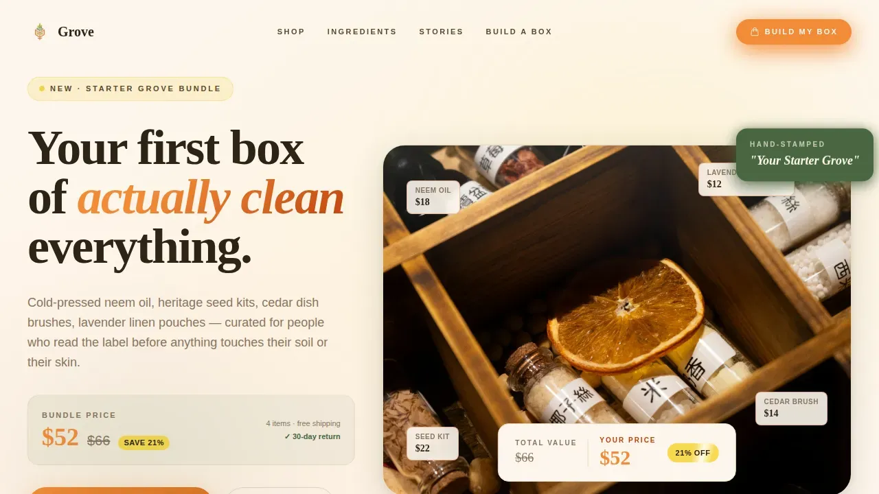
The hero section is shot from directly above. A kraft box lid sits halfway open, revealing glass bottles, linen pouches, a wooden dish brush, and a hand-stamped card reading "Your Starter Grove." Dotted lines connect each item to a small price tag. A slashed total in deep kumquat rind sits beside the bundle price in bold tangerine, making the savings visible before the visitor reads a single word of copy. This design approach reflects a key principle in e-commerce: high-quality images of organic products can significantly improve trust and conversion on a landing page.
Bento Grid with Scroll-Reveal Tile Animations
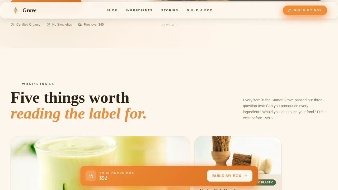
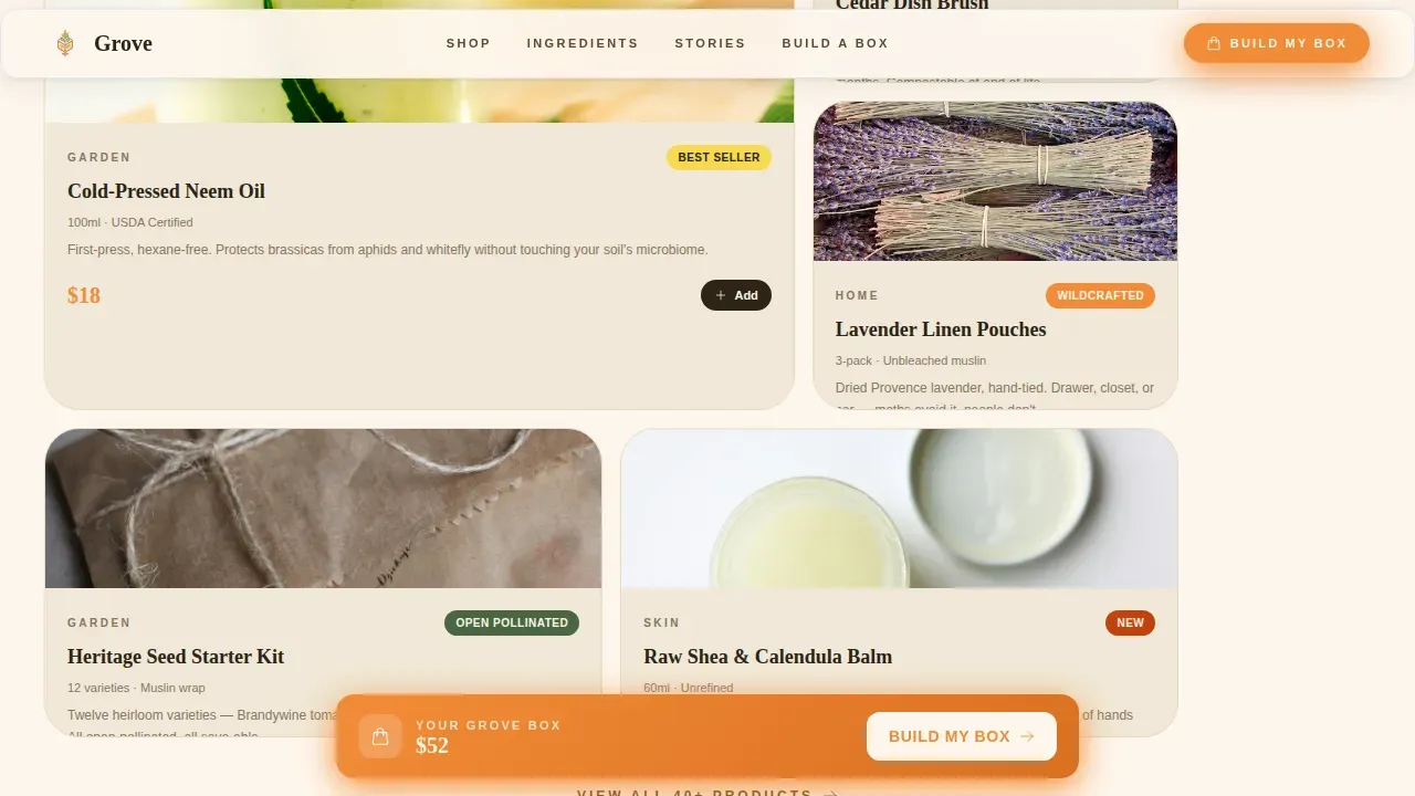
The bento grid layout turns the scroll into a layer-by-layer reveal. Each tile lifts like the next item being unwrapped from a box. First comes the hero bundle tile. Then individual product tiles peek into view with soft micro-animations. Further down, tiles alternate between close-up ingredient textures, including raw shea, dried calendula petals, and coarse pink salt, and customer video thumbnails filmed on real kitchen counters. The rhythm accelerates as tiles get smaller and more numerous, showing add-ons and upgrades with a playful, building energy.
Interactive Box Builder with Running Total
The "Build My Grove Box" box builder is the page's conversion engine. Visitors toggle add-on tiles, and each toggle adds the item to the overhead photograph in real time. Every add-on tile shows the marginal cost rather than the full price, for example "+ $4 for the cedar diffuser set," collapsing the decision to something that feels like pocket change. A sticky bottom bar in tangerine updates the running total as selections change, keeping the full picture visible at all times.
Gift Overlay Path
A secondary call to action, "Gift This Box," opens a simple name-and-address overlay. This path serves gifters and the shoppers who want to send a thoughtful organic bundle to someone they care for. The overlay keeps the flow clean and the primary purchase path undisturbed.
Ingredient Texture Tiles and Certification Badges
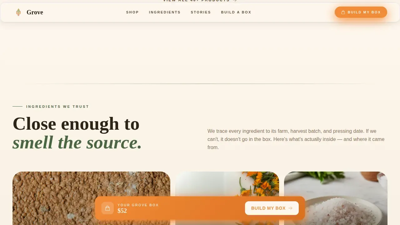
The "Ingredients We Trust" section uses close-up photography of raw, natural materials to ground the brand in transparency and purity. Texture tiles sit alongside certification badges, giving the label-reading visitor the visual evidence they need before they sign off on a purchase. This is a welcoming approach to ingredient storytelling that works across organic food, agriculture, and home care product categories.
Real Customer Unboxing Video Grid
The social proof section arranges customer unboxing videos in a bento grid pattern. Each tile shows a video thumbnail, a star rating, and a real name with location. This user-generated content builds the kind of trust that no brand description alone can achieve. Optimizing landing pages with real customer content can significantly improve engagement and conversion rates for organic e-commerce sites.
Page sections overview
| Section | Purpose |
|---|---|
| Hero Bundle Tableau | Overhead kraft-box shot with dotted price tags and bundle savings callout |
| What's Inside Grid | Asymmetric bento tiles revealing individual organic products with peek animations |
| Ingredients We Trust | Texture close-up tiles and certification badges building ingredient credibility |
| Real Unboxings Grid | Customer video thumbnails, star ratings, and real names for social proof |
| Build Your Box | Interactive toggle grid with marginal add-on pricing and live running total |
| Sage Green Footer | Arc Browser Split footer pattern anchored in sage green with brand links |
Design & branding system
Grove's visual identity follows a Neo-Retro theme that feels like a 1970s seed catalog reprinted on thick cotton stock. The color system is called Citrus Burst, and it is warm, analog, and slightly sun-faded while remaining punchy enough to drive action. Colors play a vital role in shaping the user experience, and the Grove palette is a strong example of how color combinations can be strategically chosen to align with brand values and a specific target audience.
Understanding color theory is key to creating impactful color combinations. The Citrus Burst system draws from the color wheel's warm quadrant, balancing bright fruit tones against a grounding cream base. Color psychology tells us that warm colors evoke feelings of comfort and approachability in user interfaces, and that is exactly the sense Grove is designed to create. Using earthy tones can evoke a natural and organic feel, and the sage green anchor and cream background in Grove are a direct application of that principle.
- Sun-warmed tangerine drives buttons, price callouts, and the sticky call-to-action bar
- Freshly zested lemon highlights badges and savings tags; deep kumquat rind marks urgency text; sage green anchors section dividers and the footer; creamy unbleached-paper base keeps every tile breathing
- Typography uses Fraunces for serif display headings and DM Sans for body copy, a pairing that feels natural, approachable, and luxurious without being cold or corporate
Color harmony refers to how colors are arranged to create a visually pleasing design. Grove uses lighter shades for tile backgrounds and darker hues for primary buttons, enhancing visual interest. The color wheel relationship between tangerine, lemon, and kumquat rind creates a monochromatic warmth in the fruit family while sage green introduces a complementary cool contrast. Experimenting with hues, value, saturation, and temperature can change a color's appearance, and the Citrus Burst system uses this principle to keep the page feeling sunny and alive without becoming overwhelming. Natural greens promote a connection to nature, which is ideal for wellness and organic brands, and the sage green in Grove serves exactly that grounding role.
Mobile & speed optimization
Grove is designed desktop-first for the interactive box builder experience, where the real-time overhead photography mechanic works best on larger screens. However, the template is fully structured for mobile response, with a mobile-optimized sticky call-to-action bar that keeps the primary action reachable on smaller devices. Mobile-first design principles ensure that all elements, especially call-to-action components, are easy to interact with on smartphones. Mobile optimization is crucial for organic e-commerce landing pages, and Grove addresses this by maintaining a clean, approachable layout at every breakpoint.
- The sticky tangerine bottom bar with running total is mobile-optimized and always visible during scroll
- Static content sections use server components for performance, while the interactive builder runs as a client component, keeping the page load light and the user experience smooth
- Tile animations are tuned for scroll-reveal behavior on both desktop and mobile, so the unboxing rhythm reads correctly on any screen size
How this template helps you convert
Optimizing landing pages can significantly improve user engagement and conversion rates for organic e-commerce sites. Grove is built around a specific conversion logic: earn the upgrade by making the value visible before the price is asked. A clear and compelling call to action is essential, and Grove's sticky tangerine bar keeps that action present at every scroll position.
- The overhead hero makes savings visceral before a single word of copy is read, using visual price tags to sign the value clearly
- The interactive box builder shows the physical box filling up in real time as visitors toggle add-ons, making the purchase feel tangible and the upgrade feel natural rather than forced
- Real customer unboxing videos and ingredient texture tiles address the label-reading habits of organic shoppers, building the deep trust needed to convert a cautious visitor into a confident buyer
Other information about this template
Grove is a strong fit for organic home goods brands that want a page with real design personality and a conversion structure that respects their audience. The following details are useful to know before you start your project.
- The Grove Neo Retro organic home store landing page template is tailored for e-commerce and features mobile-first optimization and intuitive navigation, making it suitable for both new store owners and established brands
- The Grove landing page template is designed for both Shopify and Webflow ecosystems and appeals to health-conscious consumers who value natural, ingredient-transparent products
- The Grove Neo Retro template blends retro aesthetics with a modern, clean, and responsive design, sitting at the intersection of nostalgia and clarity
- The template includes built-in CMS capabilities, optimizing for fast, Retina-ready performance and product-driven layouts, so your organic products always look their best
- The Cottonwood template includes multiple pre-designed patterns and section types that allow for easy customization without coding knowledge, and Grove shares that same no-code philosophy
- No-code tools can help users quickly launch landing pages by providing pre-designed templates that are easy to customize, and Grove is built with that same adjusting-friendly structure in mind
- No-code landing page templates allow users to create websites without needing extensive coding knowledge, which means the store owner can focus on their products and their customers
- Many no-code platforms offer templates specifically designed for e-commerce and organic product stores, and Grove is purpose-built for that specific niche
- Templates for no-code landing pages often include features like drag-and-drop functionality, making them user-friendly for any skill level
- Using no-code landing page templates can significantly reduce the time it takes to create a website for an organic home store, getting your products in front of customers faster
- The design caters specifically to organic home goods and sustainable lifestyle brands, offering a unique aesthetic that feels honest and welcoming to the natural products world
- The Neo Retro style evokes a sense of timeless quality and authenticity, suitable for organic brands that want to signal heritage and care without feeling dated or stiff
- The template enhances brand trust by utilizing warm color palettes and classic typography, both of which are critical for organic brands building long-term relationships with cautious buyers
- To improve conversions and sales, the template includes call-to-action sections and layouts that highlight product benefits and eco-standards in a clear, approachable way
- Color combinations can be tailored to fit specific themes such as organic or retro aesthetics, and the Citrus Burst system is a direct and strong example of this principle in action
- Using pastel colors can create a calming and inviting atmosphere; the cream base in Grove functions in a similar way, giving each tile breathing space and a relaxed, unhurried feel
- Color combinations like olive green tones can bring a natural and earthy vibe to designs; Grove's sage green serves this grounding role across section dividers, the footer, and the logo placement area
- The color wheel organizes colors based on relationships including primary, secondary, and tertiary colors; Grove's Citrus Burst palette is a carefully considered set of warm tertiary and analogous tones
- Successful organic websites often feature natural imagery such as plants, textures, and landscapes to reinforce their theme; Grove builds this directly into the ingredient texture tile section
- Incorporating organic elements in web design can enhance user experience by creating a calming atmosphere; Grove uses whitespace on the cream background to achieve exactly this effect
- Organic websites often utilize whitespace effectively to create a clean and uncluttered look, and the cream base color in Grove ensures that even the busiest bento grid tile sections remain readable
- Typography that mimics natural forms can enhance the organic feel of a website; Fraunces as the display font carries a hand-drawn warmth that feels grounded in agriculture and craft
- Using organic shapes and forms in web design can create a more inviting and approachable user interface; the bento grid in Grove uses rounded, soft tile edges that reinforce this principle
- A clean and simple layout is essential for an organic home store landing page to ensure easy navigation; Grove achieves this by giving each section a single clear job and a focused visual hierarchy
- Incorporating user-generated content such as customer reviews or photos can enhance trust and engagement; the Real Unboxings bento section is built specifically around this strategy
- High-quality images of organic products can enhance the visual appeal of landing pages and increase conversion rates; Grove's hero and ingredient tile photography direction are central to this goal
- User testimonials and reviews can build trust and credibility on e-commerce landing pages; Grove integrates star ratings, real names, and locations directly into the video thumbnail tiles
- Clear navigation helps users find products easily, which can lead to higher conversion rates on landing pages; Grove's section flow is linear and purposeful, guiding the visitor from curiosity to commitment
- A/B testing different elements of landing pages can help identify what works best; Grove's modular bento structure makes it practical to swap tiles and test different add-on arrangements
- Fast loading times are essential for keeping users engaged on e-commerce landing pages; Grove separates static and interactive sections to keep initial load light and the experience responsive
- The page is inspired by the sensory world of organic food, agriculture, and home care, making it relevant for any store in that broad natural products space including cafes with a retail shelf, restaurants with a house line, and garden-focused furnishings brands
- The design sits at the intersection of food culture, agriculture, and organic home care, making it broadly applicable across the natural products space
Theme
Neo-Retro
Creative direction
Unboxing Experience
Color system
Citrus Burst
Style
Bento Grid
Direction
Upsell/Upgrade
Page Sections
Overhead Bundle Hero with Price Tags
Bento Grid with Scroll-reveal Animations
Interactive Box Builder with Running Total
Ingredient Texture Tiles and Badges
Real Customer Unboxing Video Grid
Gift Overlay and Secondary Call to Action Path
Related questions
What type of store is Grove built for?
Can I customize the colors and logo placement?
Does the page support gifting as well as direct purchase?
Is Grove suitable for no-code platforms?
How does the interactive box builder work?



