Bento Grid Landing Page for Cannabis Video Agencies
Elevate is a bento grid landing page built for cannabis video production agencies. It leads with an oversized typographic header, flows through client case study rows packed with real results, and drives visitors toward a portfolio and intake form with two clear calls to action. The design uses a cold Monochrome Steel palette that lets video content do the talking.
by Rocket studio
Quick summary
Elevate is a single-page, click-through landing page for a cannabis video marketing agency. It uses a bento grid layout to present client case studies in a cinematic steel aesthetic. Every section builds proof before directing visitors to a full portfolio and intake form. The page carries no form fields, just curated results and controlled restraint.
Who this template is for
This template is built for cannabis-industry video production studios and content agencies that need to demonstrate credibility fast. It suits teams whose clients face platform advertising restrictions and rely on organic video content to grow.
- Dispensary chains entering new state markets who need a production partner's track record laid out clearly
- Cultivators, extract brands, and edible companies looking for a production house that understands their regulatory environment
- Cannabis content studios pitching chief marketing officers who need proof before booking a call
What problem this template solves
Cannabis brands cannot run paid ads on most major platforms. That forces their marketing budgets into organic video, yet most agency pages still look indistinguishable from generic creative shops. A production house serving this niche needs a page that signals expertise without a single word of explanation.
- Standard portfolio pages bury results inside case study PDFs that no one reads in full
- Generic green-and-leaf aesthetics undermine the premium positioning that extract and edible brands need to project
- Visitors arriving from referrals or organic search decide within seconds whether the agency operates at the right level
What you get with this template
You get a fully structured, single-page bento grid layout designed around the cannabis video production use case. Every cell, row, and typographic choice is deliberate and ready to populate with your own client work.
- A giant centered headline section with a pale cyan subline, setting tone before a single image loads
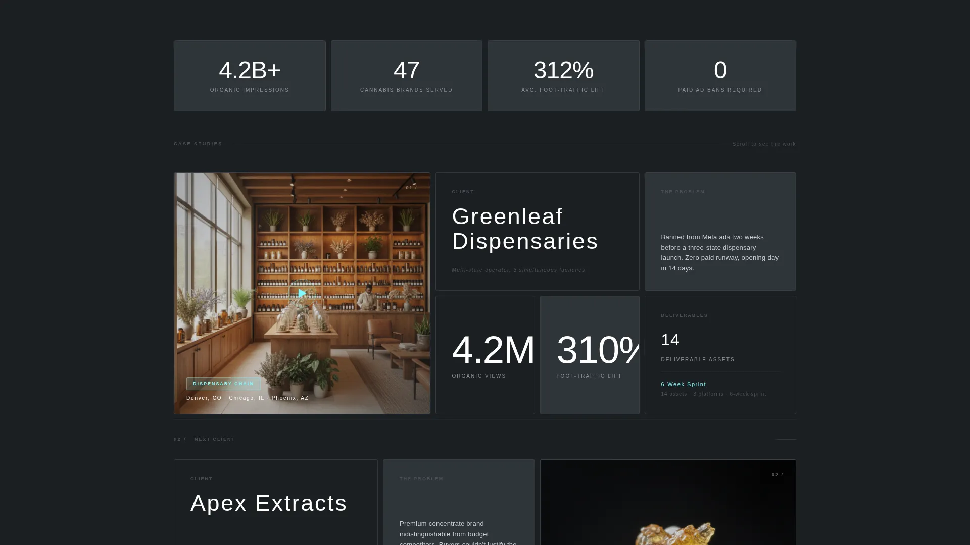
- A scrolling sequence of client case study rows, each containing a looping hero clip cell, brand name, strategic problem, deliverable count, and result metric
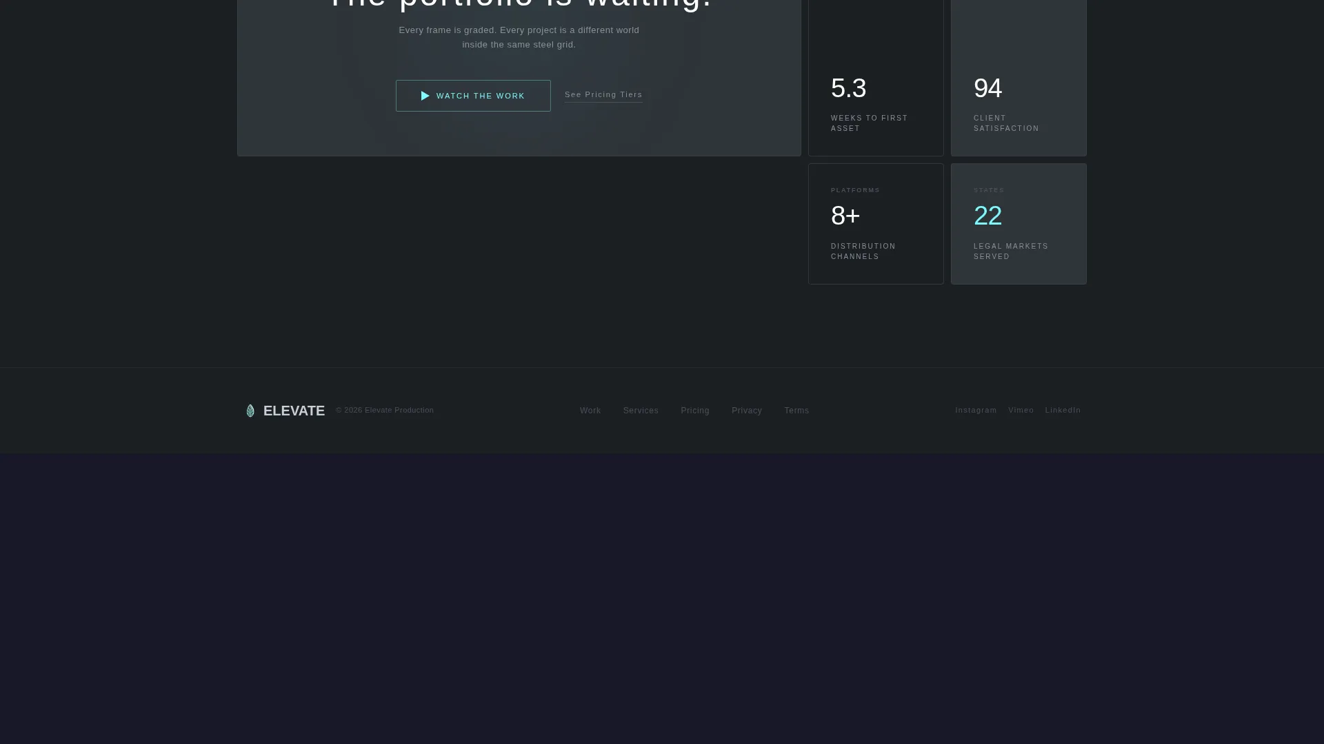
- Two call-to-action placements: a ghost button beneath the header and a persistent bottom bar that appears after the third case study row, both pointing to a portfolio and intake form
Feature list
This section covers the core built-in capabilities that define how Elevate works as a landing page template.
Oversized Typographic Header
The header is a single full-width headline set in ultra-light white type on a smoked-glass background. No competing imagery. The sentence breaks across four lines on desktop, making the statement through scale and restraint alone. A pale cyan subline sits beneath it.
Bento Grid Case Study Layout
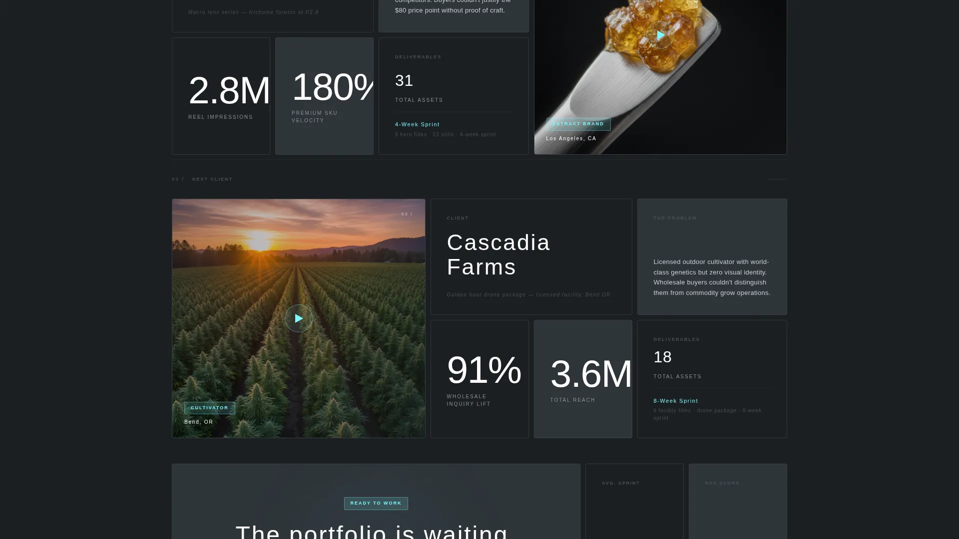
Each row in the grid tells one client story. A wide cell holds a looping silent hero clip. Adjacent cells display the brand name, the strategic challenge, the deliverable summary, and the outcome metric. Some cells span two columns for cinematic aspect ratios; others are tight squares holding a single figure in oversized type.
Dual Call-to-Action System
The primary "Watch the Work" ghost button appears directly beneath the header. A persistent bottom bar recurs after the third case study row, keeping the next-step action visible without interrupting the narrative. A secondary text link labeled "See Pricing Tiers" sits beside the main button for prospects further along in their decision.
Zero-Form Click-Through Flow
This landing page contains no form fields. The entire page is engineered to build enough proof and visual authority that clicking through to the portfolio and intake form feels inevitable rather than forced.
Pale Cyan Accent System
The electric accent color is used exclusively for hover states, play buttons, and active card borders. This restraint keeps the steel palette dominant while giving interactive elements an unmistakable signal. Thumbnails inside each bento cell supply all warm color and visual energy.
Range-Proving Grid Breathing Room
The grid layout varies cell sizes deliberately. Wide cinematic cells sit beside compact data-point squares. This variation demonstrates visual range across client projects without breaking the page's unified steel composure.
Page sections overview
| Section | Purpose |
|---|---|
| Giant headline header | Sets agency positioning with typographic scale and the pale cyan subline |
| Ghost button call to action | Presents the primary "Watch the Work" action directly below the header |
| Case study row one | Introduces the first client story with a looping clip, problem, deliverables, and result |
| Case study row two | Continues the narrative with a second client visual world inside the same grid |
| Case study row three | Completes the initial proof stack before the persistent call to action bar activates |
| Persistent bottom bar | Keeps "Watch the Work" and "See Pricing Tiers" visible as the visitor continues scrolling |
Design & branding system
The visual identity follows a Tech Glass theme built on a Monochrome Steel color system. Every color decision is deliberate: warmth is withheld so that client video thumbnails carry all the visual energy inside each bento cell.
- Four-color palette: deep gunmetal (#1B1F23) for backgrounds, polished chrome (#C9CED6) for body type, smoked glass (#2E3439) for card surfaces, and pale cyan (#7DF9FF) reserved strictly for interactive accents
- Typography uses thin-weight sans-serif faces with oversized, wide-tracked headlines in chrome on gunmetal, reinforcing the cold editorial register
- No green gradients, no cartoon leaves, no stock imagery competing with the header type
Mobile & speed optimization
The bento grid adapts to narrower viewports while preserving the visual hierarchy that makes the page work. Cell sizing and type scale are considered across screen widths so the case study narrative reads clearly on any device.
- Wide cinematic cells reflow to full-width stacks on mobile, keeping the looping clips prominent without cropping key content
- The persistent bottom bar remains anchored at the bottom of the viewport on mobile, maintaining the call-to-action presence throughout the scroll
How this template helps you convert
The page is engineered as a click-through funnel. Every design and copy decision reduces friction and builds confidence before the visitor reaches the portfolio and intake form.
- The oversized header establishes positioning instantly, filtering out unqualified visitors and anchoring premium expectations before a single case study loads.
- Each bento case study row stacks a concrete result metric in oversized type, turning the scroll into an accumulation of proof that makes clicking "Watch the Work" feel like the obvious next move.
Other information about this template
Elevate is designed for a cannabis video marketing agency operating in a niche where organic content is the primary growth channel. The template reflects the realities of the category: platform ad bans, state-by-state expansion, and a market that still treats premium extract brands with skepticism.
- The template style is Bento Grid, the theme is Tech Glass, and the creative direction is Case Study Narrative
- The landing page direction is Click-Through, meaning there are no form fields on the page itself; all conversion happens on the linked portfolio and intake page
- The header concept is Giant Headline Centered, a deliberate contrast to the visual noise common in cannabis marketing
- This template fits the Portfolio and Agency category, with a specific focus on the Cannabis Marketing and Agency subcategory and the Cannabis Video Marketing Agency niche

Theme
Tech Glass
Creative direction
Case Study Narrative
Color system
Monochrome Steel
Style
Bento Grid
Direction
Click-Through
Page Sections
Oversized Typographic Header
Bento Grid Case Study Rows
Dual Call-to-action Placement
Zero-form Click-through Structure
Pale Cyan Interactive Accent System
Variable Grid Cell Sizing
Related questions
Does this landing page include form fields or a contact form?
How many case study rows does the template include?
What makes the bento grid layout work well for a video production agency?
Can I adapt this template for a cannabis agency in a different content format, such as photography?
Is the pale cyan accent color used across the whole page?



