Cannabis Influencer Marketing Agency Landing Page
Elevate is a dark, immersive masonry landing page built for cannabis influencer marketing agencies. It opens with a Before/After Slider that proves creative impact instantly, then scrolls through a manifesto-led layout of campaign imagery, creator portraits, and real performance metrics. Every section builds conviction and drives visitors toward a single campaign consultation click.
by Rocket studio
Quick summary
Elevate is a single-page, masonry-style landing page template designed for cannabis influencer marketing agencies. It combines a cinematic dark aesthetic with a manifesto-driven scroll experience. The layout earns trust through creative proof before asking for the click, making it ideal for agencies that lead with taste and back it up with results.
Who this template is for
This template is built for agencies and creative studios working at the intersection of cannabis culture and influencer marketing. It speaks directly to teams whose work deserves a presentation that matches their creative standard.
- Cannabis influencer marketing agencies pitching dispensary chains, edible brands, or CBD wellness lines
- Creative directors and brand strategists who want a page that leads with vision, not a services list
- Agency founders building credibility with sophisticated clients who can spot generic marketing instantly
What problem this template solves
Most agency landing pages describe their process. Elevate shows the work instead. Cannabis brands face a specific challenge: their marketing needs to feel native to culture, not bolted onto it. A flat, generic agency page signals exactly the wrong thing.
- Generic portfolio pages fail to communicate the difference between a sponsored post and a cultural moment
- Cannabis brands need to trust that an agency understands their audience before they book a call
- Standard landing page layouts bury the proof inside case study PDFs that nobody opens
What you get with this template
You get a fully structured, ready-to-customize landing page that proves creative authority from the first scroll. The layout is built around a specific sequence: disrupt attention, build conviction, then earn the click.
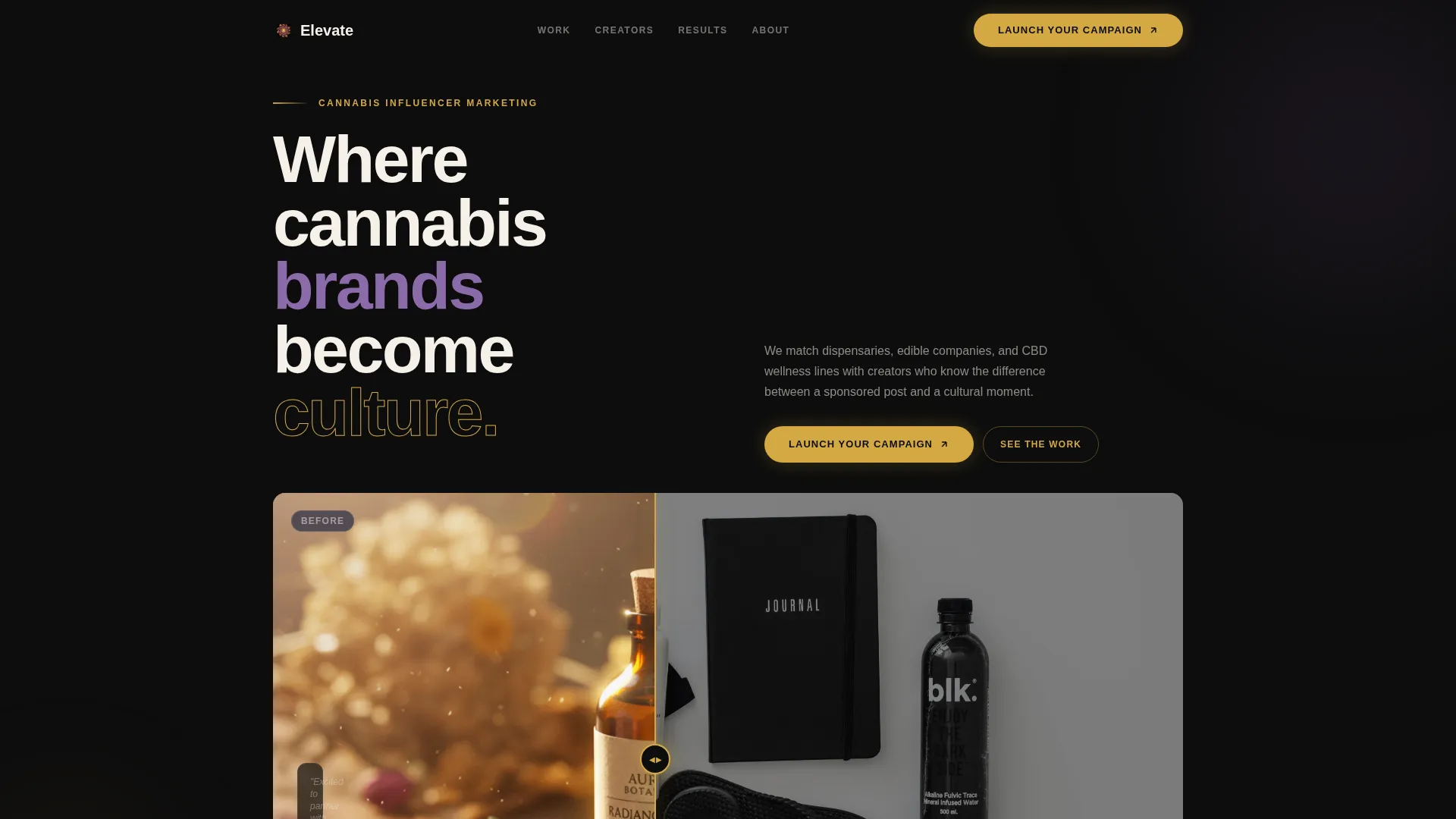
- A Before/After Slider header that immediately contrasts forgettable campaigns with cinematic creative work
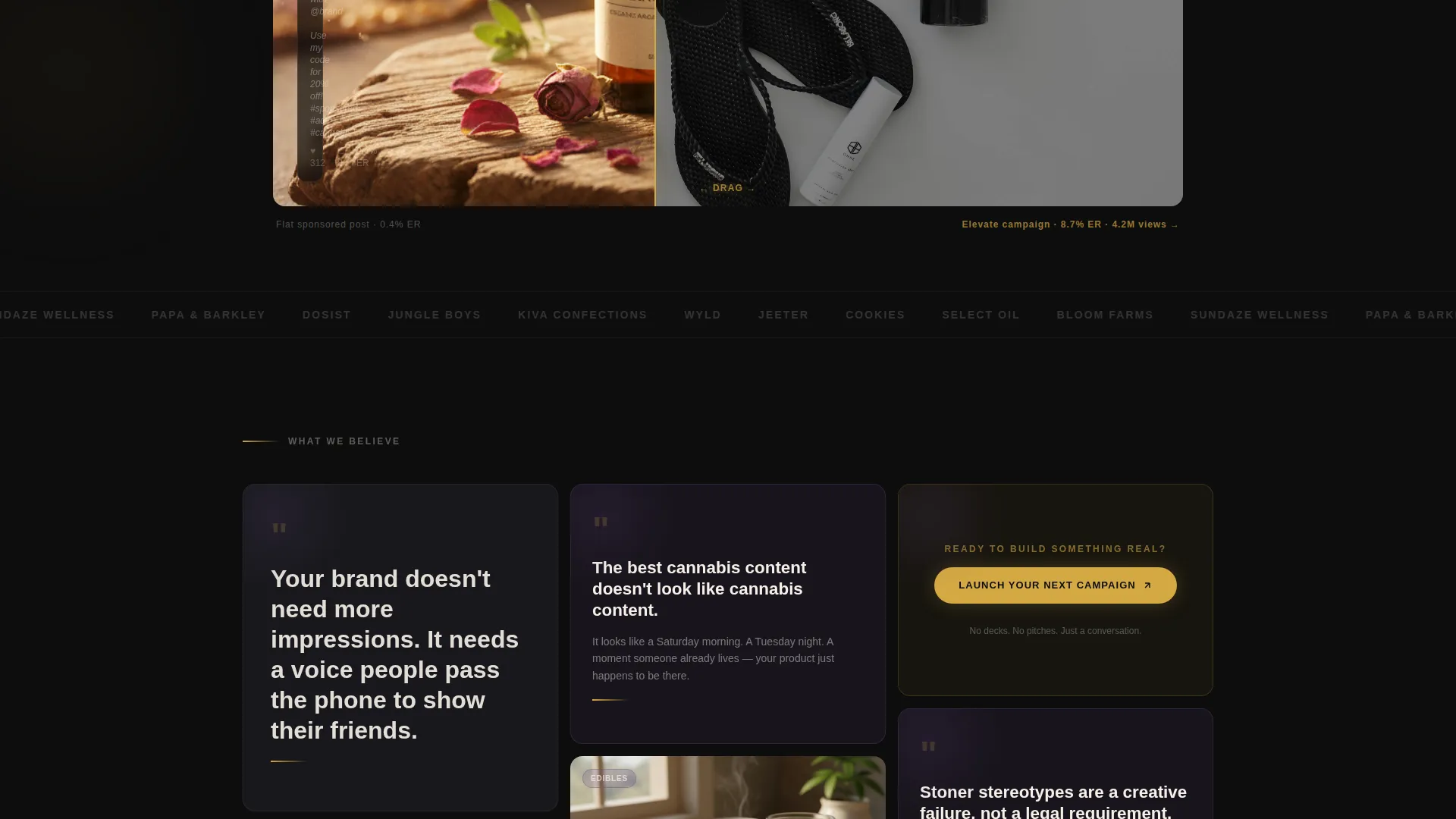
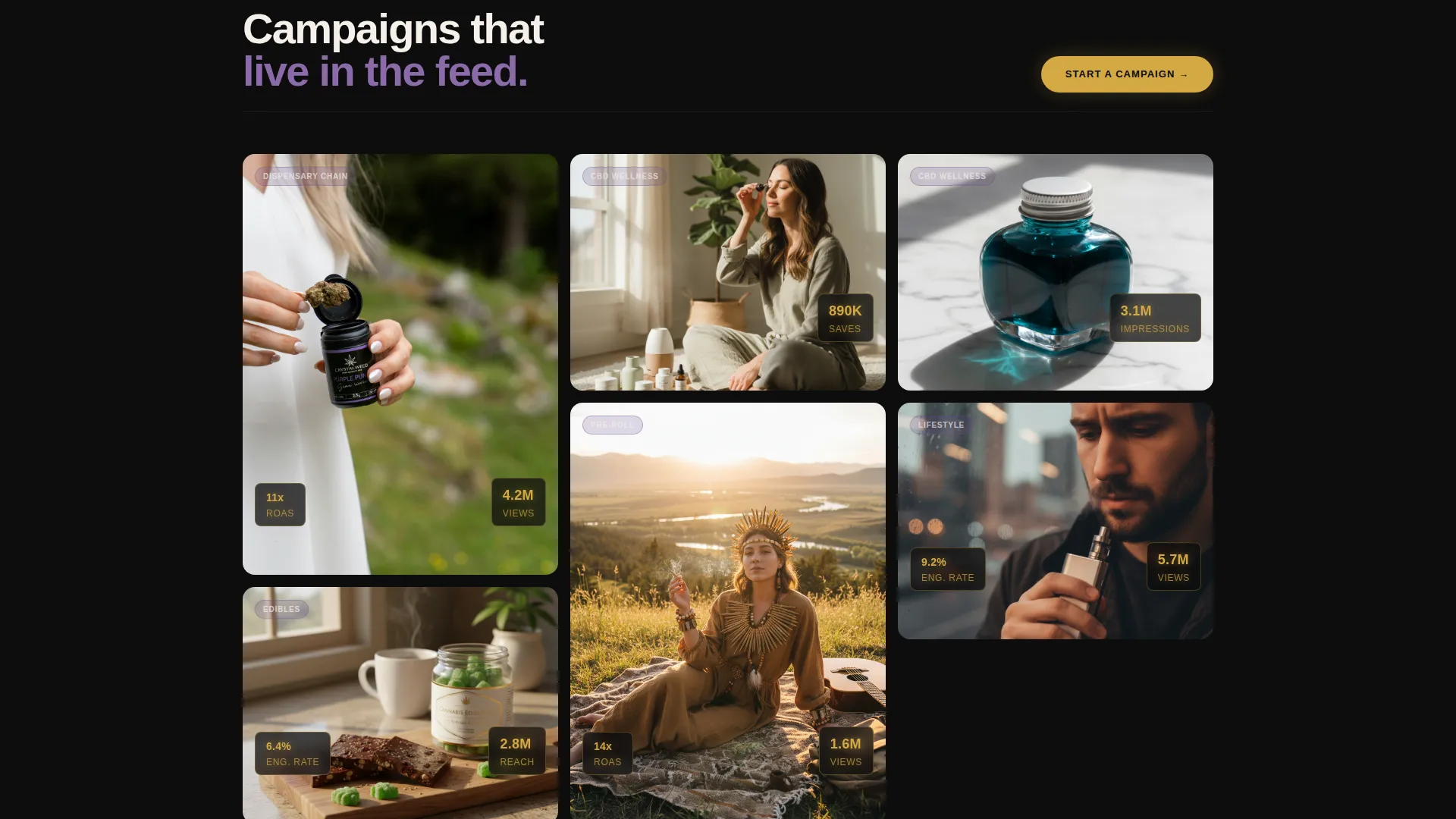
- A masonry-style manifesto scroll mixing campaign imagery, creator portraits, metric overlays, and bold copy fragments
- A click-through call to action system with a floating primary button and secondary case study triggers built into individual campaign tiles
Feature list
Every component in this template serves a deliberate purpose. Nothing is decorative without also being persuasive.
Before/After Slider Header
The header splits the same influencer campaign into two framings side by side. A thin ember gold drag handle separates a flat, generic sponsored post on the left from a cinematic, editorially styled creative frame on the right. Engagement metrics float in ember gold on the right side, making the contrast impossible to ignore before the visitor reads a single word.
Masonry Campaign Grid
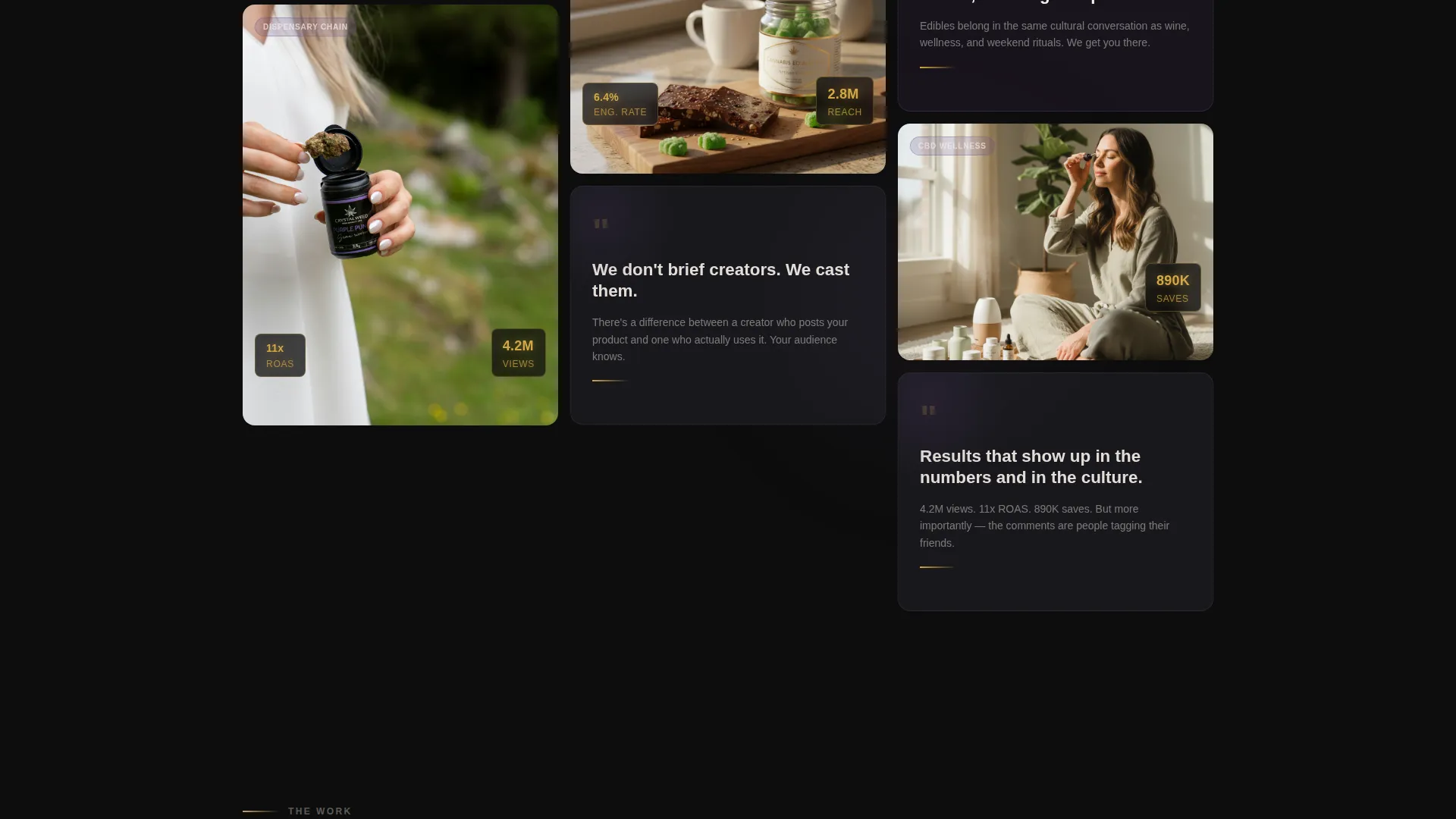
The layout follows a Pinterest-style masonry grid that mixes campaign imagery, creator portraits, and manifesto copy tiles. The grid builds a scrollable case without a linear narrative, pulling visitors deeper with each tile rather than walking them through a predictable agency story.
Metric Overlays on Live Work
Performance numbers appear directly on the work itself, not in a separate stats section. A figure like 4.2 million views is burned into a video thumbnail. An 11x return on ad spend glows beneath a product shot. This keeps proof contextual and visceral rather than clinical.
Manifesto Copy Tiles
Bold, single-line declarations appear as standalone tiles inside the scroll. The first tile drops the opening line against solid black. Each subsequent fragment escalates conviction. The copy does not explain the agency's process; it builds a shared worldview that the right client will immediately recognize.
Floating and Anchored call to action System
The primary call to action, "Launch Your Next Campaign," appears first as a floating ember gold button after the third manifesto tile. It then anchors at the bottom of every subsequent scroll cluster. Secondary calls to action reading "See the Full Case Study" appear on individual campaign tiles and open expanded views without leaving the page.
Dark Immersive Visual Identity
The Cloud Canvas color system uses deep exhale black as the base, with haze purple, rolling smoke gray, and ember gold reserved for interactive and highlight moments. The palette creates a velvet-dark atmosphere where the only bright elements are the ones designed to direct attention.
Page sections overview
| Section | Purpose |
|---|---|
| Before/After Header | Contrast forgettable versus. cinematic campaign creative instantly |
| Opening Manifesto Tile | Anchor the agency worldview with a single bold declaration |
| Masonry Campaign Grid | Show campaign imagery, creator portraits, and manifesto fragments |
| Metric Overlay Tiles | Embed real performance figures directly onto campaign visuals |
| Floating call to action Button | Prompt the consultation click after the third manifesto tile |
| Case Study Triggers | Let visitors explore individual campaigns before committing |
| Anchored Bottom call to action | Repeat the primary call to action at every scroll cluster end |
Design & branding system
The visual identity is built around the Cloud Canvas color system, which treats darkness as a design asset rather than a default. The palette feels like a dispensary after hours: matte, softly lit from within, with every interactive element glowing just enough to invite a touch.
- Deep exhale black (#0D0D0D) as the page base, rolling smoke gray (#3A3A4A) for structural depth, and haze purple (#6B4C8A) for atmospheric layering
- Ember gold (#D4A843) reserved exclusively for calls to action, hover states, and metric highlights to keep visual hierarchy sharp and intentional
- A matte-dominant finish across all imagery and tiles, with glow effects applied only to the elements designed to drive interaction
Mobile & speed optimization
The masonry layout and heavy visual identity are structured to translate well across screen sizes. The scroll experience is designed to feel as immersive on a phone screen at 1 a.m. as it does on a desktop display.
- The masonry grid reflows gracefully for narrower viewports without losing the tile-by-tile pull of the scroll experience
- The floating call to action button and anchored bottom calls to action remain accessible and properly positioned on mobile without overlapping content
- Metric overlays and manifesto tiles scale cleanly so that key proof points remain legible at any viewport width
How this template helps you convert
This template is engineered as a click-through page with a single conversion goal: getting the visitor to book a campaign consultation. It earns that click through a deliberate sequence of proof, conviction, and invitation.
- The Before/After Slider creates an immediate "before I read anything, I already get it" moment that filters for the right client and signals creative sophistication from the first interaction.
- The manifesto scroll and metric overlays build a cumulative case across multiple tiles, so by the time the visitor reaches the final anchored call to action, they are not evaluating services but recognizing a creative standard they want to be part of.
- Secondary "See the Full Case Study" calls to action on individual tiles deepen interest for visitors who need more proof before clicking through, reducing drop-off without adding friction to the primary conversion path.
Other information about this template
This template is part of the Elevate series and sits within the Portfolio and Agency category, specifically designed for the cannabis marketing and agency subcategory. It is well suited to the cannabis influencer marketing agency niche where visual credibility is the primary sales tool.
- The template style is Masonry/Pinterest, and the creative direction is Manifesto, making it distinct from standard portfolio or case study layouts
- The Dark Immersive theme and Cloud Canvas color system are purpose-built for cannabis lifestyle brands and the culture-first positioning that sets leading agencies apart
- The page direction is click-through with no on-page form, keeping the experience clean and sending qualified visitors directly to a dedicated intake or consultation booking page
Theme
Dark Immersive
Creative direction
Manifesto
Color system
Cloud Canvas
Style
Masonry/Pinterest
Direction
Click-Through
Page Sections
Before/after Campaign Slider
Masonry Manifesto Scroll
Contextual Metric Overlays
Floating and Anchored Call to Action System
Dark Cloud Canvas Identity
Related questions
Is there a contact form on this landing page?
Can I replace the campaign imagery and metric overlays with my own work?
Who is the ideal client this template helps attract?
Does the Before/After Slider require any special setup?
Can the manifesto copy tiles be edited to reflect my agency's voice?



