Disability-Owned Business Comparison Website Template
Amplify is a bold, overlap-layered landing page built for a disability-owned marketing agency. It pairs a fanned Bundle Deal hero with a scroll-driven Comparison Journey, vivid Cloud Canvas colors, and a sticky multi-service cart. The page is designed to help visitors feel the gap between performative campaigns and strategy built from lived experience, then convert them before the form even loads.
by Rocket studio
Quick summary
Amplify is a single-page, overlap-layered landing page template built for a disability-owned marketing agency. It opens with three fanned service cards, drives visitors through a visceral before-and-after Comparison Journey, and closes with a sticky multi-service intake form. Every visual choice, layered geometry, electric lilac, marigold buttons, is deliberate and purposeful, not decorative.
Who this template is for
This template is built for a very specific kind of agency: one run by disabled creatives who develop strategy from lived experience rather than a sensitivity checklist. The landing page speaks directly to buyers who have already made a costly mistake with a performative campaign and are ready for something more honest.
The template is a great fit for:
- DEI leads and brand managers at Fortune 500 companies who need strategy informed by real representation, not a sensitivity read tacked on at the end
- Nonprofit communications directors working with lean resources who need authentic disability inclusion baked into their content marketing
- Mid-size consumer brand teams subject to public scrutiny over accessibility theater and looking for professional services that can close the gap
What problem this template solves
Most agency landing pages list services and move on. They focus on credentials and cost, but they never make the visitor feel why the work matters. For a disability-owned agency, that approach lands flat. The audience has seen enough polished decks from firms that talk about inclusion without living it.
This template solves that problem directly:
- It shows the contrast viscerally, a scroll-through Comparison Journey puts "what you've been getting" next to "what we actually build," so visitors notice the gap before they ever reach a form
- It builds trust through the page structure itself, using social proof, layered visuals, and clear direct copy rather than generic agency boilerplate
- It replaces passive browsing with active decision-making, letting visitors add services to a sticky cart and arrive at the intake form already committed
What you get with this template
This template gives you a complete, conversion-focused landing page with every section defined and every interactive element in place. Nothing is left as a placeholder. You get a full visual system, structured intake flow, and a scroll experience that makes a real argument.
Here is what the template includes:
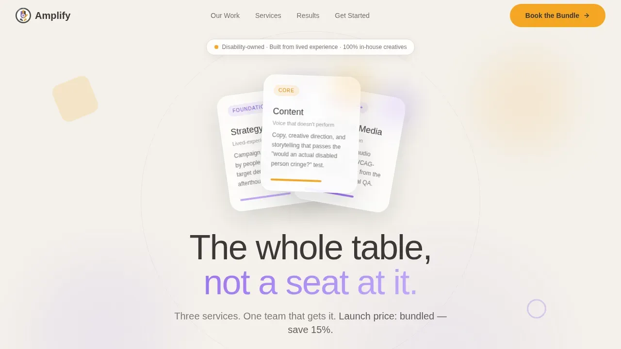
- A hero section with three overlapping, tilted service cards (Strategy, Content, Accessible Media) fanned like a hand of cards, backed by a pulsing electric lilac circle and a marigold call-to-action button
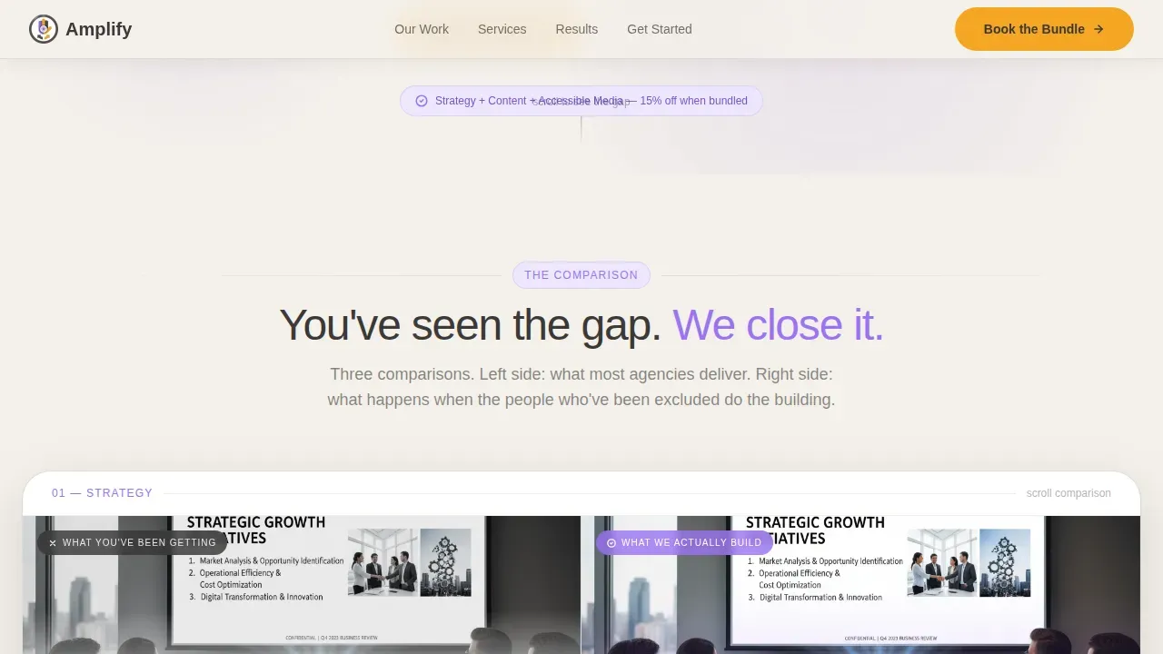
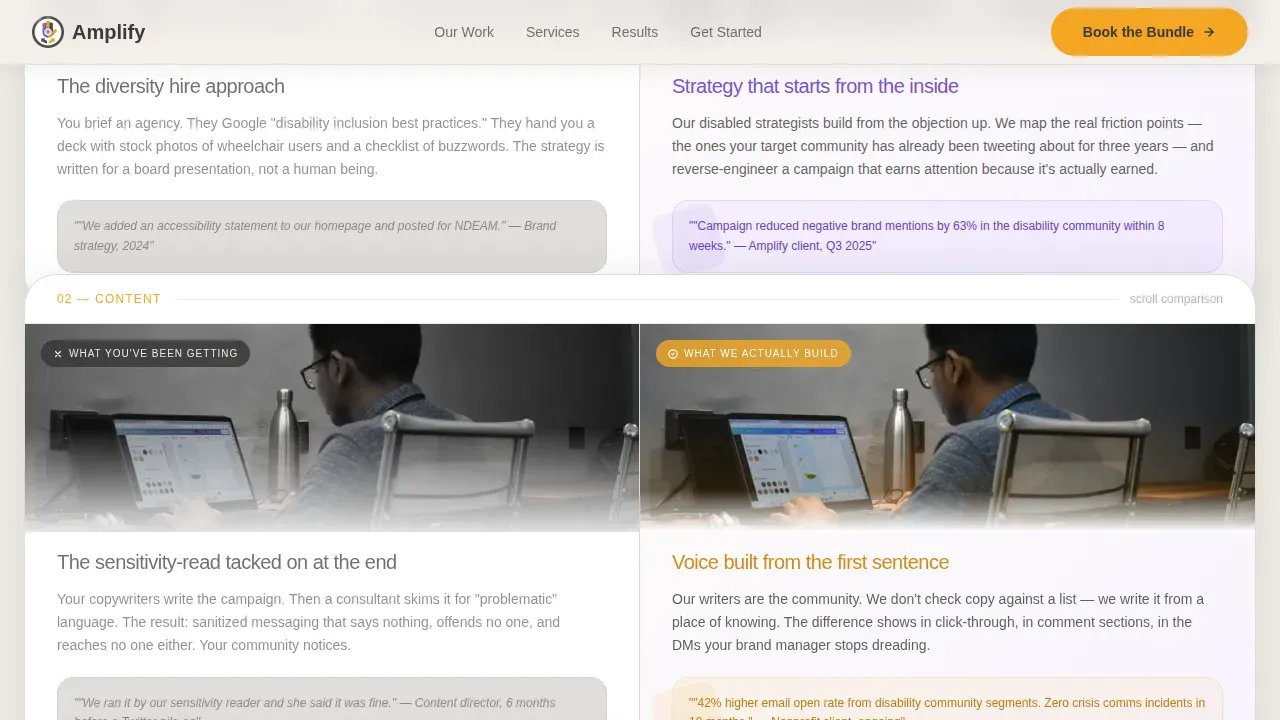
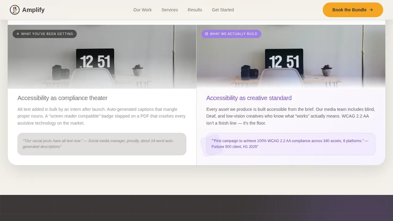
- A three-part Comparison Journey with scroll-triggered reveals that pair flat, desaturated "before" panels against vibrant, layered "after" panels, one comparison each for strategy, content, and media
- A sticky sidebar cart, social proof strip, and a focused intake form asking for company name, selected services, campaign launch window, and one open-text field: "What went wrong last time?"
Feature list
This landing page is built around several standout features that work together to create a complete, persuasive experience. Each one is designed with a specific job to do.
Fanned Service Card Hero
Three rounded service cards, Strategy, Content, and Accessible Media, are tilted at slightly different angles and layered with soft drop shadows. They sit over a large geometric lilac circle that pulses gently in the background. The effect is tactile and inviting. Visitors can immediately access the bundle deal and understand the offer at a glance. The headline "The whole table, not a seat at it" communicates the agency's value statement without needing additional information to land.
Scroll-Triggered Comparison Journey
The core of the page is a three-section Comparison Journey. Each section pairs a muted, desaturated left panel, showing real examples of tone-deaf accessibility practices in marketing, against a vibrant, geometric right panel showing the agency's authentic work. As visitors scroll, each new comparison slightly overlaps the one before it, building a visual argument that stacks. By the third comparison, the gap between generic and genuine is impossible to ignore. This approach helps visitors evaluate the agency's expertise before they ever reach the intake form.
Sticky Multi-Service Cart Sidebar
Each service comparison section includes an "Add to Project" marigold button. As visitors click through, a sticky sidebar cart fills with their selected services. This interactive element turns passive page browsing into an active selection process. It also pre-checks the corresponding services in the intake form, so the visitor does not have to re-enter details they have already decided on. The cart creates a sense of progress and personal investment before the submit step.
Focused Intake Form with Open-Text Field
The intake form is intentionally short. It asks for company name, service selection (pre-filled from the cart), a campaign start date dropdown (30, 60, or 90 days), and a single open-text field: "What went wrong last time?" This last field is the most important. It signals that the agency has seen the challenges before, it gives the team real data to develop a tailored response, and it makes the visitor feel understood at the exact moment they are deciding to sign up. Every form field includes a clear, permanent label and descriptive instructions.
Overlapping Geometric Visual System
The template style is Overlap/Layered. Offset circles, tilted rectangles, and stacked trapezoids layer on top of one another throughout the page, each with a slight drop shadow that creates depth without clutter. No element sits flat. The Cloud Canvas base (#F4F1EB) keeps the space light and airy. Electric lilac (#9B72F2) leads on shape accents. Marigold (#F5A623) punctuates buttons and interactive highlights. The visual system feels like a deliberate creative decision, because it is.
Social Proof Strip with Campaign Outcomes
A dedicated social proof section sits between the Comparison Journey and the intake form. It includes specific campaign outcome data, named client types, and a logo trust strip. Social proof enhances the credibility of the page's claims and can significantly reduce perceived risk for potential customers who are still evaluating whether to proceed. Testimonials from satisfied clients serve as a powerful anchor, reinforcing that the agency delivers measurable success, not just good intentions. This section is one of the best landing page examples of how to use client results rather than generic praise to increase conversions.
Page sections overview
| Section | Purpose |
|---|---|
| Hero Bundle Cards | Introduce the three-service bundle with fanned, tilted cards and a pulsing lilac circle behind them |
| Bundle Headline call to action | State the value proposition and present the primary marigold "Book the Bundle" button above the fold |
| Strategy Comparison | Pair a flat "what you've been getting" panel with a vibrant "what we actually build" panel for strategy |
| Content Comparison | Repeat the before-and-after format for content marketing with overlapping scroll reveal |
| Media Comparison | Close the three-part comparison sequence with the accessible media pair and staggered entrance animation |
| Social Proof Strip | Display specific campaign metrics, named client types, and a logo trust strip |
| Bundle Intake Form | Collect company name, services, start date, and open-text brief field inside a focused, minimal form layout |
| Sticky Cart Sidebar | Track visitor-selected services in real time and pre-fill the intake form accordingly |
| Footer Row | Present a linear single-row footer with essential links and the accessibility statement |
Design & branding system
The visual identity is built around a Playful Geometric theme using the Cloud Canvas color system. The palette feels deliberate and layered: light and airy underneath, bold and precise where it counts. Typography uses Plus Jakarta Sans for headlines (bold weight) and DM Sans for body text. Both are clear, sans-serif fonts that support readable text at any size. The high-contrast pairing of warm graphite (#3B3836) body text against the soft cumulus white (#F4F1EB) base meets the minimum contrast ratio guidelines for users with low vision, aligned with WCAG practices. Color use follows the rule that lilac and marigold never compete: one leads on shape accents, the other punctuates interactive elements.
The key design details include:
- Cloud Canvas base (#F4F1EB), electric lilac (#9B72F2) on geometric accents, and marigold (#F5A623) on all buttons and interactive highlights
- Offset circles, tilted rectangles, and stacked trapezoids as the core geometric vocabulary, each element layered with soft drop shadows to create tactile depth
- Scroll-triggered animations (pulsing circle, fanned card hover states, staggered section entrances) using CSS transforms only, avoiding flashing content that could disorient visitors
Mobile & speed optimization
The template is designed desktop-first, reflecting the work habits of its primary audience: DEI leads and brand managers who operate from an office workstation. Full mobile responsiveness is included so the page functions correctly across devices. Responsive web design ensures the layout adapts cleanly to mobile screens, tablets, and desktops without breaking the layered visual system.
Optimization practices built into the template include:
- Intersection Observer API for scroll-triggered animations, so elements only animate when they enter the viewport
- CSS transforms only for all motion effects, keeping the animation path smooth and controlled without relying on heavy scripting
- A clean layout with ample white space that prevents cognitive overload and keeps the page fast and legible at any screen size
How this template helps you convert
This landing page is engineered to increase conversions by building a case before it ever asks for a commitment. It does not rely on generic persuasion tactics. Every section earns the next one.
-
The Comparison Journey does the selling first. Visitors scroll through three before-and-after panels. By the time they reach the intake form, they have already seen their own past mistakes reflected in the "what you've been getting" panels. That recognition is more persuasive than any testimonial. The page earns the click by making the visitor feel the contrast, not just read about it.
-
The sticky cart creates investment before the form. Each "Add to Project" button in the comparison sections builds a visible cart in the sidebar. Visitors who have already added two or three services arrive at the intake form with a personal stake in completing it. Pre-checked services reduce friction. The single open-text field, "What went wrong last time?", gives the visitor a clear, low-effort way to complete the final step and submit.
-
Social proof and specific data close the gap. The social proof strip presents campaign outcomes with real metrics and named client types. Including social proof with specific data reduces perceived risk for potential customers who are still deciding. Great social proof is not vague praise. It is a specific outcome tied to a recognizable type of client, and this template presents it that way.
Other information about this template
This template is part of a broader ecosystem of professionally built, niche-specific landing page designs available on the platform. It reflects practices drawn from some of the best landing page examples in the agency and professional services space. The design and content strategy push current boundaries for what an agency landing page can accomplish in a single scroll session.
A few additional points worth noting:
- The template is built for the disability-owned business niche but its Comparison Journey structure and sticky cart mechanics translate well to other industries where differentiation from generic competitors is the central challenge
- The intake form follows best practices for accessibility: every field has a clear label, descriptive instructions, and defined error handling, consistent with WCAG 2.1/2.2 Level AA digital accessibility standards that a landing page template for a marketing agency specializing in disability-owned businesses must prioritize
- The page intentionally omits a traditional navigation bar at the top. A great landing page design generally does not include a navigation bar so that the only action a visitor can take is to answer the call to action. This template follows that principle precisely
- Visitors who arrive from a digital marketing campaign, a Google ad, or an email call to action will land on a page whose headline and visual tone match the promise of the ad, ensuring a smooth, congruent transition
- The template supports A/B testing workflows by design. Its well-defined sections and consistent component structure make it straightforward to build different versions of the hero or intake form and evaluate which performs better against your key performance indicators
- Agencies in cities with large nonprofit and Fortune 500 ecosystems, including New York and similar major markets, will find the client language and campaign context immediately relevant to their local prospect base
- The page is built with the understanding that content marketing and digital marketing campaigns drive qualified leads to a landing page with specific expectations. The Amplify template meets those expectations at the first page load, not after several scrolls
- Video testimonials can be embedded in the social proof section to further increase conversions. Landing pages with video have been shown to increase conversions by up to 86%, and this template's layout supports that addition naturally
- The accessibility statement referenced in the footer links to a dedicated page outlining the agency's full commitment to inclusion, following best practices for publishing a clear, accessible policy
- For teams that want to develop the page further, AI-powered no-code tools can be used alongside this template to build out additional functionality from natural language prompts, reducing the time and cost required to launch
- The page uses plain, jargon-free language throughout its copy prompts, making it easier for teams to adapt the content for cognitive accessibility without a full rewrite. Clear, direct copy is one of the most important and most overlooked practices in inclusive digital marketing
- Inclusive marketing strategies help companies connect with diverse audiences by recognizing their unique needs. This template is designed around that principle at every level, from the headline that communicates the agency's value directly, to the form field that asks visitors to share their personal experience before the agency responds
Theme
Playful Geometric
Creative direction
Comparison Journey
Color system
Cloud Canvas
Style
Overlap/Layered
Direction
Marketplace/Multi
Page Sections
Fanned Bundle Deal Hero Section
Scroll-triggered Comparison Journey
Sticky Multi-service Cart Sidebar
Focused Intake Form with Open Brief Field
Social Proof Strip with Campaign Data
Playful Geometric Overlap Visual System
Related questions
Who is the primary target audience for this landing page template?
Can I customize the service cards and intake form fields?
Does this template follow accessibility best practices?
How does the sticky cart sidebar work?
Is this template suitable for agencies outside the disability-owned business niche?



