Magnetic Benefits | Free Website Template | Rocket
Elevate is a sidebar companion landing page template built for startup and scale-up benefits consultants. It segments visitors by persona, walks each one through a three-act case study narrative, and drives clicks toward a benefits audit booking flow. The design follows a Soft Mist color system with a clean, considered aesthetic engineered to earn trust before asking for anything.
by Rocket studio
Quick summary
Elevate is a single-page consultant template that opens with a Persona Selector, flows into staged case study narratives, and closes with a conversion-green call to action. It is built for benefits consultancies serving founders, People Ops leads, and CFOs at growing startups. Every section is designed to feel specific, generous, and considered.
Who this template is for
This template is built for benefits consultants who serve early-stage and scaling companies. If your clients are choosing between platforms at midnight or losing engineers at the offer stage, this template speaks their language before you say a word.
- Benefits consultants working with Series A founders and scale-up People Ops teams
- HR advisory firms targeting CFOs who need to model per-head costs through a fundraise
- Boutique consultancies that close deals through demonstrated expertise, not form fills
What problem this template solves
Growing companies lose great candidates at the offer stage because their benefits packages look like an afterthought. A generic consulting page cannot fix that perception. Elevate is built to prove expertise through specificity, letting real client transformations do the persuading before asking for a single thing.
- Visitors arrive from different roles with different pain points, and a one-size page loses all of them
- Most consulting pages lead with a calendar before earning the click, which kills trust
- Without concrete outcomes, a benefits consultant looks interchangeable with every other HR vendor
What you get with this template
You get a fully structured, desktop-first landing page with high interactivity and a sidebar companion layout. The template is organized around three core journeys: founding teams, people operations leads, and finance-focused executives. Each journey gets its own narrative arc and relevant social proof.
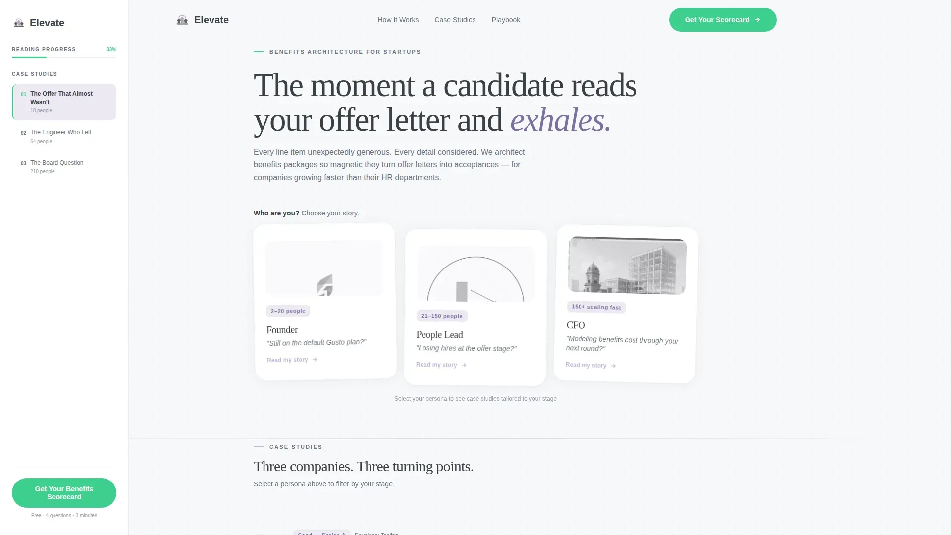
- A Persona Selector header with three illustrated floating cards that reflow the page on click
- A fixed sidebar companion that tracks scroll position and surfaces chapter navigation with live context
- A primary call-to-action booking flow entry point and a secondary email-capture ghost button
Feature list
This section describes the specific built-in components and interaction patterns included in the Elevate template.
Persona Selector Header
Three illustrated cards float against the cloud white background. Each card shows a visitor type and a one-line pain point in quiet graphite. When a visitor clicks their card, the page reflows with case studies, metrics, and language matched to that persona. The selection feels immediate and personal.
Fixed Sidebar Chapter Navigator
The sidebar companion stays fixed on the left throughout the scroll. It acts as a chapter navigator and a live context strip, showing the current case study company's headcount and stage. Visitors always know the story on screen is about someone like them.
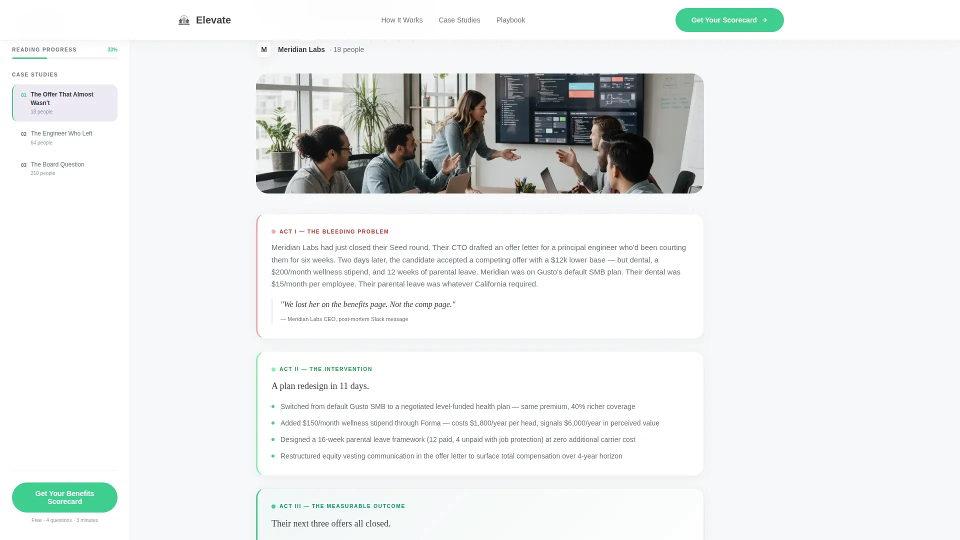
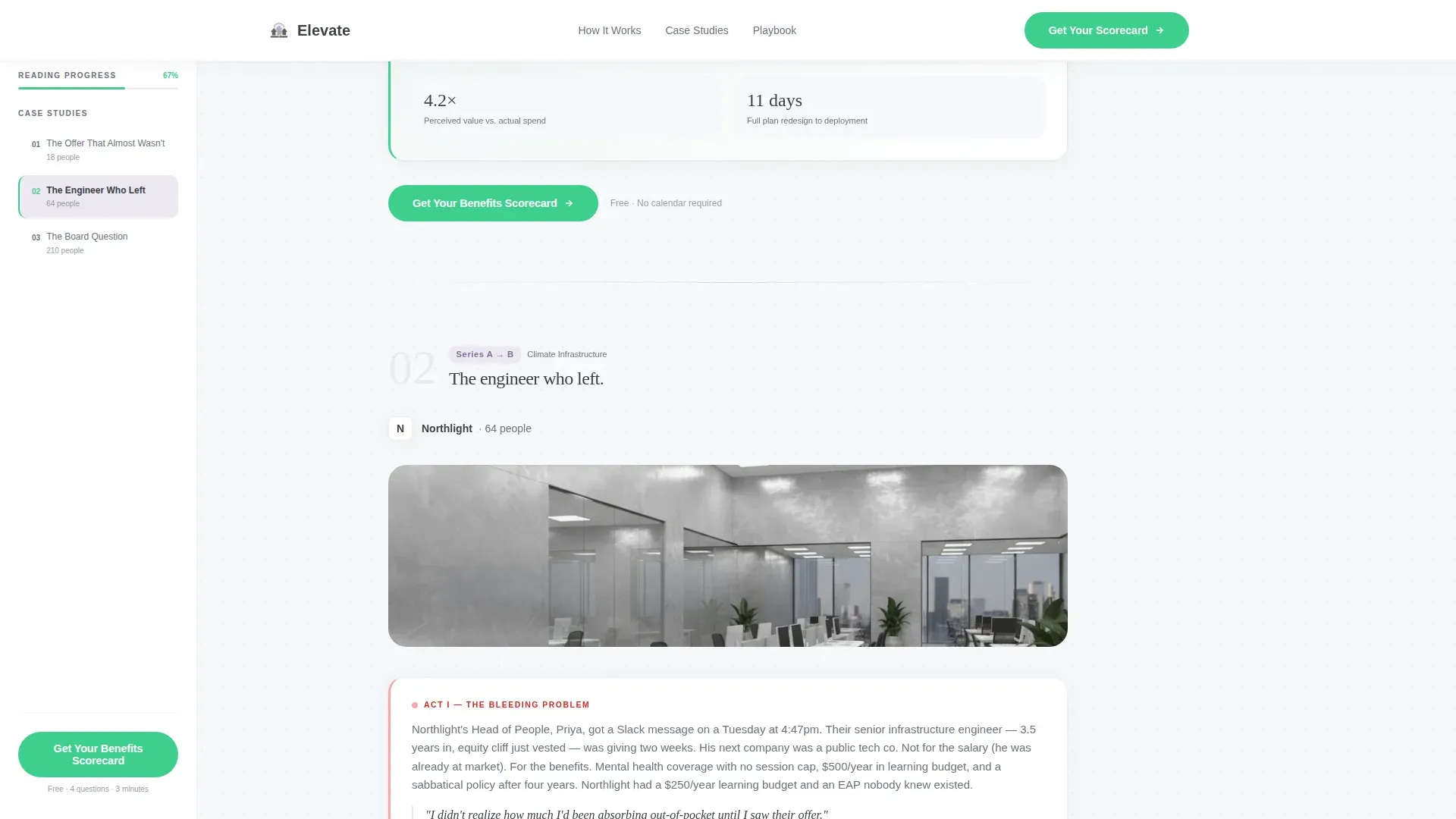
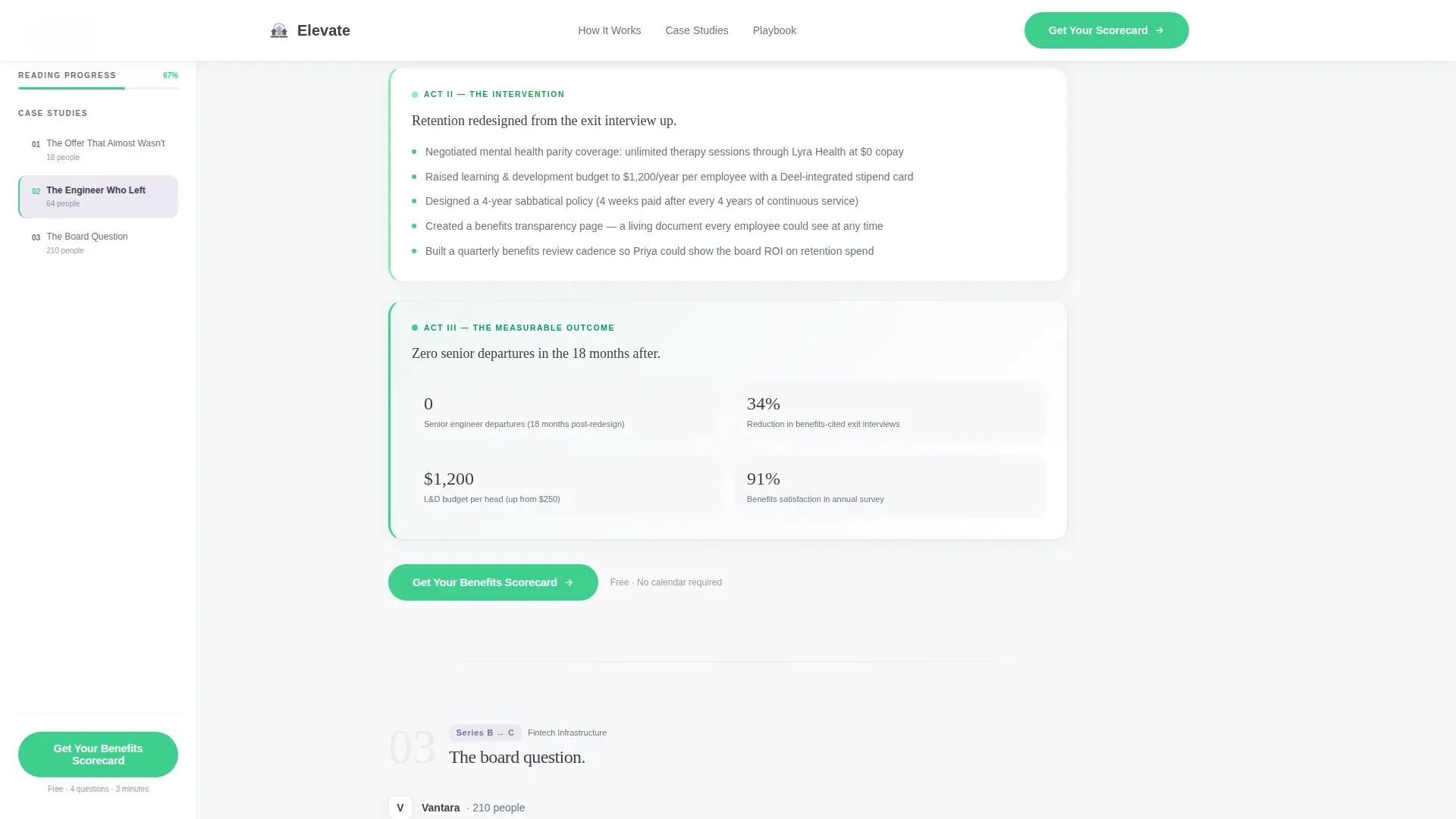
Three-Act Case Study Narrative
Each persona triggers a sequence of three client stories structured as a problem, an intervention, and a measurable outcome. Stakes compound from hiring pain to retention crisis to board-level cost modeling. The narrative arc is the primary persuasion engine before any call to action appears.
Metrics Strip with Social Proof
A dedicated metrics strip surfaces acceptance rate percentages, retention deltas, and per-head cost reductions from the case studies. Headcount and company-stage labels anchor each figure so the numbers feel earned, not invented.
Conversion-Optimized Call-to-Action Placement
The primary call to action, styled in conversion green, appears first inside the sidebar after the opening case study and repeats at the close of each narrative arc. It links to a short diagnostic page, not a calendar, reducing friction at the most critical click.
Secondary Lead Capture Ghost Button
A mist-lilac ghost button reading "Download the Startup Benefits Playbook" catches visitors who are not yet ready to book. It captures an email in exchange for a PDF resource, seeding a follow-up sequence for warmer future outreach.
Page sections overview
| Section | Purpose |
|---|---|
| Hero Persona Selector | Segments visitors and reflows page content by role |
| Fixed Sidebar Navigator | Tracks scroll, shows chapter context and live company stage |
| Case Study Arc | Delivers three-act problem-to-outcome narratives per persona |
| Metrics Strip | Surfaces acceptance rates, retention deltas, cost figures |
| Transformation Gallery | Shows before-and-after offer letter comparisons in a bento layout |
| Final Call to Action | Books benefits audit and captures playbook download emails |
| Footer | Single-row linear footer with essential links |
Design & branding system
The visual identity follows the Startup Velocity theme through a Soft Mist color system. The overall feel is described in the brief as a freshly opened Notion workspace at 7 a.m., clean, gently warm, and free of visual competition.
- Cloud white (#F7F8FA) backgrounds, quiet graphite (#3B3F45) body text, and mist lilac (#C4B8D9) for section dividers and hover states
- Conversion green (#3ECF8E) is reserved exclusively for calls to action and progress indicators, keeping it high-contrast and unambiguous
- Typography pairs DM Sans for body readability with Fraunces, a display serif, for emotional weight in headlines and case study moments
Mobile & speed optimization
The template is designed desktop-first to match the CFO and founder audience, which skews toward large screens. Full mobile support is included so the experience holds across all devices.
- GSAP ScrollTrigger animations handle persona card floats, sidebar scroll tracking, and staggered case study reveals
- Server Components handle static sections for baseline performance, while client-side components manage persona state and animation behavior
- The sidebar companion adapts its layout for smaller viewports so navigation context is never lost on mobile
How this template helps you convert
Every layout decision in Elevate is built to earn the click before asking for it. The page proves expertise through specificity, sequences trust through narrative, and reduces friction at the exact moment a visitor is ready to act.
- The Persona Selector immediately makes visitors feel the page was built for them, increasing engagement before a single line of case study copy is read.
- The three-act narrative structure builds credibility across compounding stakes, so by the time the "Get Your Benefits Scorecard" call to action appears, the visitor has already seen three transformations like their own.
- The secondary ghost button provides an exit ramp for undecided visitors, capturing an email rather than losing the lead entirely.
Other information about this template
This template is a strong fit for consultancies positioning against self-serve HR platforms that leave fast-growing teams with default benefit plans that cannot compete with larger employers. The brief references the kind of client who is actively comparing platform options or who has just lost a senior hire to a more compelling offer package.
- The bento layout in the Transformation Gallery supports before-and-after offer letter comparisons, making abstract consulting value visually concrete
- The diagnostic-first click-through flow is intentional: landing on a short diagnostic page rather than a calendar reduces commitment anxiety at the first conversion point
- The template is localized for the English-language, US-dollar market and uses language calibrated for a US startup audience
- Page interactivity is rated high: persona selection reflows content, the sidebar updates dynamically, and all reveals are staggered through scroll-triggered animation
Theme
Startup Velocity
Creative direction
Case Study Narrative
Color system
Soft Mist
Style
Sidebar Companion
Direction
Click-Through
Page Sections
Persona Selector with Page Reflow
Fixed Sidebar Chapter Navigator
Three-act Case Study Narrative Flow
Metrics Strip with Concrete Outcomes
Conversion-green Primary Call to Action
Secondary Email Capture Ghost Button
Related questions
Does this template include the actual case study content?
Can the persona selector be removed or simplified?
Does the primary call to action link directly to a calendar?
What does the secondary ghost button do?
Is this template suitable for a solo benefits consultant or only larger firms?


