DEI Consulting Landing Page Template for Black-Owned Firms
Elevate is a masonry-style landing page template built for a Black-owned DEI consulting firm. It pairs a warm Lavender Dream color system with a Comparison Journey layout, UGC photo wall header, three service practice cards, a primary intake form, and a gated downloadable guide. The design feels intentional, luxurious, and conversion-ready.
by Rocket studio
Quick summary
Elevate is a single-page consulting landing page template designed for a Black-owned firm specializing in DEI strategy, executive coaching, and organizational transformation. It opens with a UGC photo wall, guides visitors through a scroll-driven Comparison Journey, and closes with two distinct conversion paths: a personalized intake form and a free downloadable guide.
Who this template is for
This template is built for consulting firms and independent practitioners whose work centers on diversity, equity, and inclusion. It speaks directly to practices that lead with lived experience and deliver measurable organizational change.
- DEI consultants and boutique strategy firms targeting enterprise or nonprofit clients
- Executive coaches building a pipeline of C-suite and senior leadership engagements
- Speaking and facilitation practices that need a credibility-first landing page to earn the room
What problem this template solves
Most consulting landing pages look like every other professional services site. They lead with credentials rather than transformation, and they lose potential clients before the first scroll. Elevate flips that dynamic entirely.
- Generic templates fail to communicate the cultural authority that Black-led firms carry into the room
- Single-call to action layouts miss multi-service practices that offer coaching, strategy, and facilitation under one roof
- Cookie-cutter designs undermine trust before the visitor ever reads a single testimonial
What you get with this template
You get a fully structured, single-page layout ready to represent a high-integrity consulting practice. Every section is designed with a specific conversion role, so nothing is decorative without also being strategic.
- A masonry-style header photo wall, three service practice sections, a Comparison Journey scroll, an intake form, and a gated lead magnet gate
- A warm Lavender Dream color system with deep amethyst, soft wisteria, warm cream, and gilded marigold accent states
- Two distinct conversion paths: the "Start a Conversation" intake form and the "90-Day Culture Audit Framework" email gate
Feature list
This template includes purpose-built sections and design choices that work together as a cohesive system.
UGC Photo Wall Header
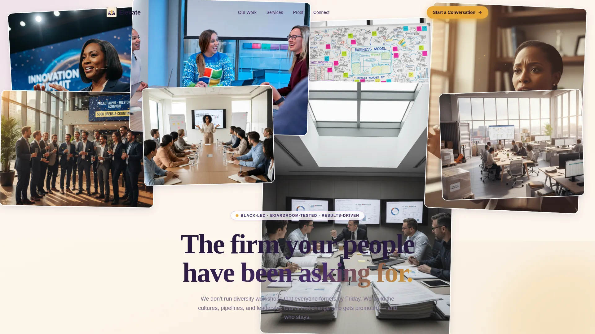
The page opens with a living mosaic of warm-toned, slightly overlapping photos pinned at gentle angles. The header is designed to feel like a mood board of real moments, not a polished stock shoot. A soft lavender-to-cream gradient bleeds upward from the bottom as the headline materializes.
Comparison Journey Scroll
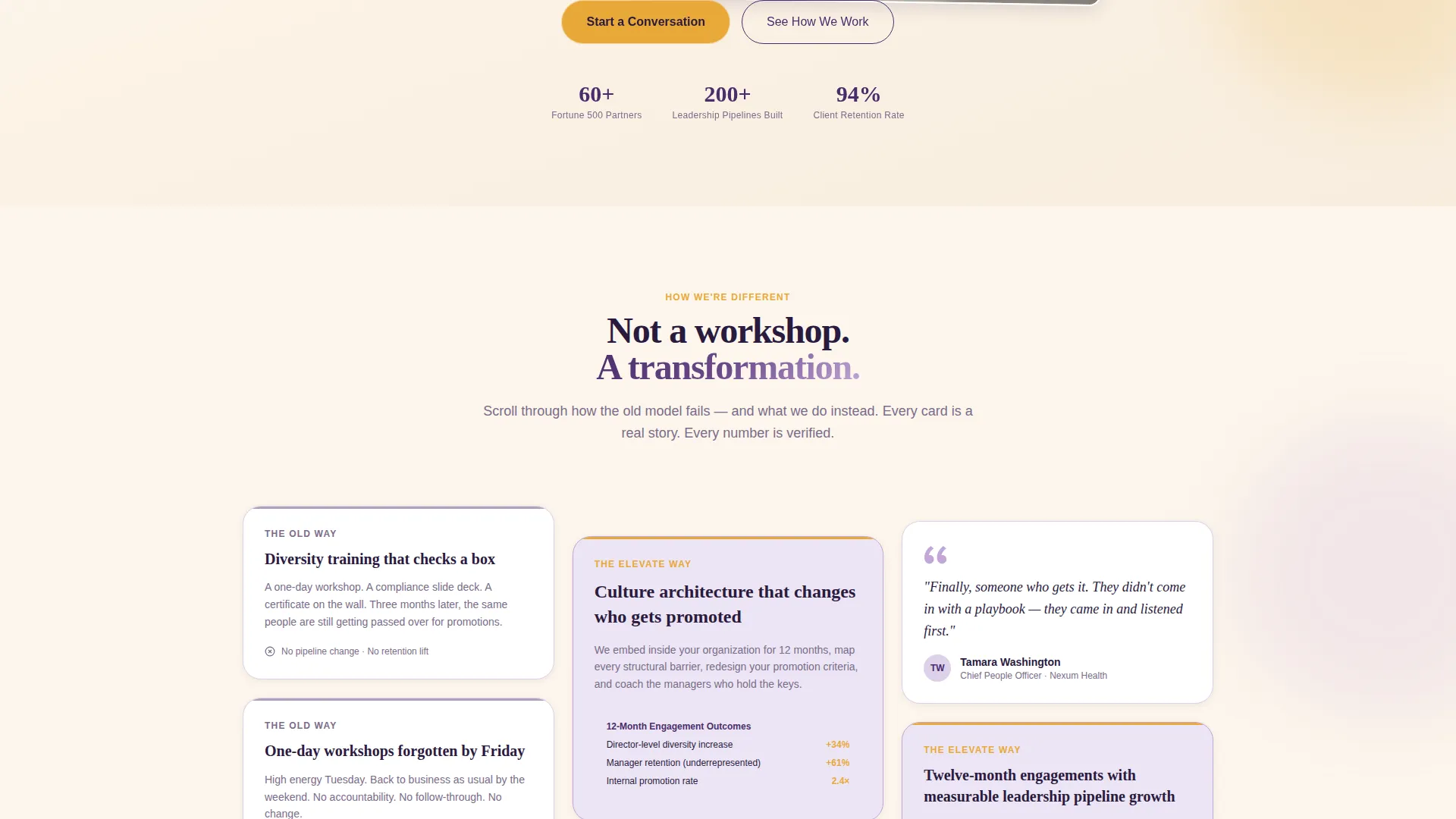
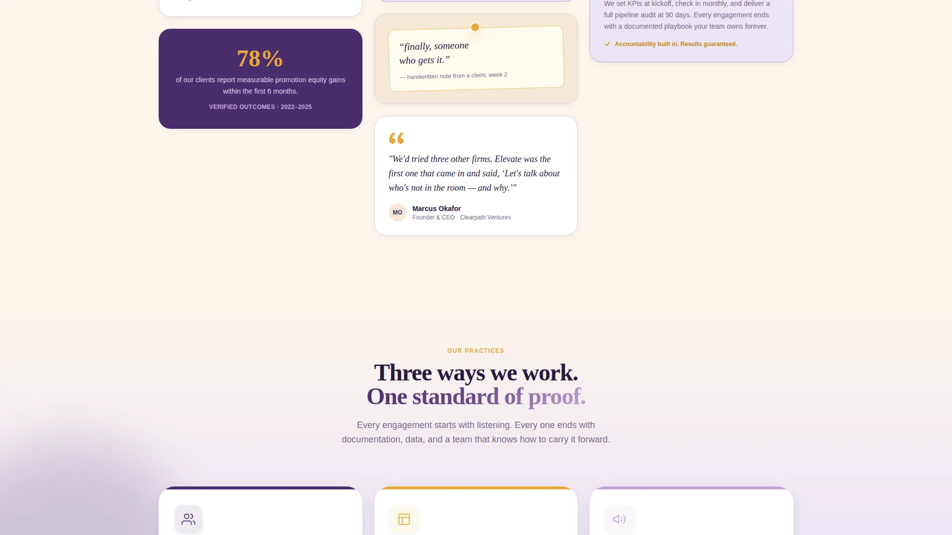
The masonry layout drives the scroll through a deliberate before-and-after contrast. Each row places the old consulting model beside the Elevate approach. Cards mix client testimonials, before-and-after org chart snapshots, anonymized case studies, and pull quotes so visitors alternate between evidence and emotion.
Three Service Practice Cards
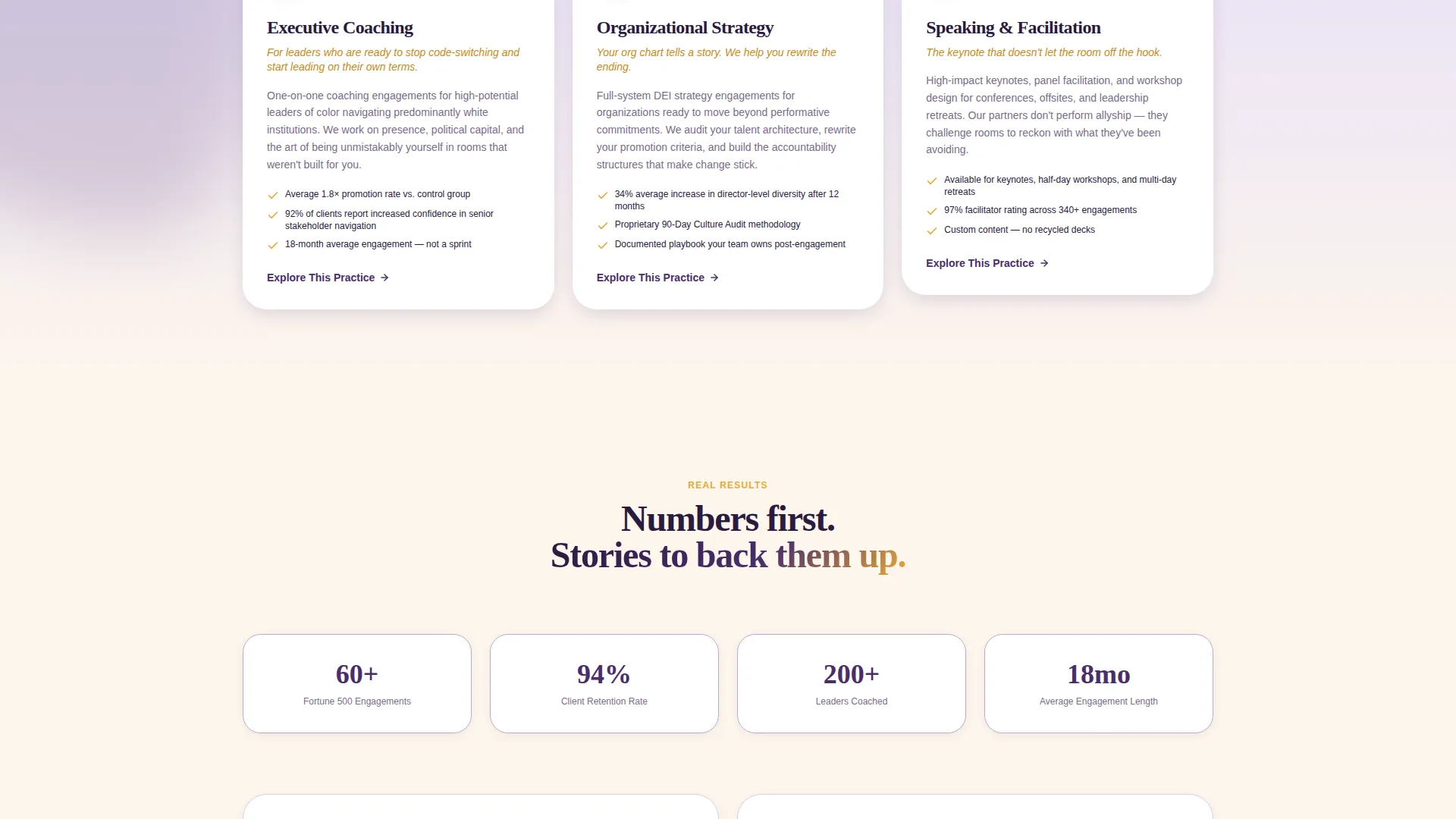
Mid-scroll, three distinct cards introduce Executive Coaching, Organizational Strategy, and Speaking and Facilitation. Each card carries its own "Explore This Practice" button that expands into a dedicated masonry section with case studies and a contextual booking form.
Primary Intake Form
The "Start a Conversation" form asks for company name, team size, and one open field: "What's the change you're trying to make?" The form appears after transformation proof has been established, so it reads as an invitation rather than a sales gate.
Gated Lead Magnet Section
A secondary conversion path offers "The 90-Day Culture Audit Framework" as a free downloadable guide. The gate requires only an email address, giving visitors who are not yet ready to book a meaningful next step.
Masonry Card Grid System
The staggered card heights and mixed content types prevent visual monotony. Testimonials, case study data, pull quotes, and org-chart visuals share the same grid, creating a rhythm that keeps visitors engaged through the full scroll.
Page sections overview
| Section | Purpose |
|---|---|
| UGC Photo Wall | Opens with real moments and the headline "The firm your people have been asking for" |
| Comparison Journey Row 1 | Contrasts checkbox diversity training with culture architecture that changes promotion paths |
| Comparison Journey Row 2 | Contrasts one-day workshops with twelve-month leadership pipeline engagements |
| Testimonial Pull Quotes | Builds emotional trust between evidence cards throughout the masonry grid |
| Executive Coaching Card | Introduces the coaching practice with an expand-and-book interaction |
| Organizational Strategy Card | Introduces the strategy practice with an expand-and-book interaction |
| Speaking and Facilitation Card | Introduces the facilitation practice with an expand-and-book interaction |
| Intake Conversation Form | Captures company name, team size, and the change the visitor is working toward |
| Lead Magnet Gate | Offers the 90-Day Culture Audit Framework in exchange for an email address |
Design & branding system
The Lavender Dream color system is central to the visual identity of this template. Every palette choice reflects the brand position: unhurried, intentional, and unmistakably authoritative without performing luxury.
- Deep amethyst (#4A2D6B) anchors headlines and navigation; soft wisteria (#C3A6D8) washes across card backgrounds; warm cream (#FDF6EC) is the primary canvas color
- Gilded marigold (#E8A838) activates hover states and all call-to-action elements, creating a warm focal point that draws the eye without demanding it
- The Soft Gradient theme carries a late-afternoon quality throughout: gradients bleed gently between sections rather than cutting hard, keeping the page feeling cohesive and considered
Mobile & speed optimization
The masonry grid is designed to reflow cleanly on smaller screens. Staggered card heights and variable image scales adapt to mobile viewports without losing the mood-board quality that defines the layout.
- Card columns reduce gracefully so the Comparison Journey remains readable on phone screens
- The intake form and lead magnet gate are single-column on mobile, keeping friction low at the conversion points
- Warm-toned photo elements are sized to maintain visual weight without overwhelming narrow layouts
How this template helps you convert
The page is structured so trust is earned incrementally, and every conversion ask arrives at the right moment in the visitor's journey.
- The Comparison Journey establishes credibility through real numbers, named testimonials, and before-and-after case study snapshots before any form appears, so the visitor arrives at the intake already convinced.
- Three distinct service cards with individual booking paths allow visitors to self-select their engagement type, reducing the distance between interest and action.
- The gated lead magnet captures email addresses from visitors who are not yet ready to book, creating a secondary conversion path that keeps warm prospects in reach.
Other information about this template
This template is built on the Masonry and Pinterest layout style, making it well suited for practices that have a rich mix of visual and text-based proof content. The Direct Sales landing-page direction means every section earns its place by moving the visitor closer to a decision.
- The template is categorized under Black-Owned Business and is designed specifically to honor and amplify Black-led professional services brands
- The Comparison Journey creative direction is a proven scroll pattern for consulting and coaching pages where reframing the status quo is central to the pitch
- The UGC Photo Wall header concept is intentionally anti-stock: it signals authenticity and cultural fluency from the first pixel the visitor sees
- This template fits practices operating at the intersection of organizational change, leadership development, and equity-centered consulting
Theme
Soft Gradient
Creative direction
Comparison Journey
Color system
Cloud Canvas
Style
Masonry/Pinterest
Direction
Direct Sales
Page Sections
UGC Photo Wall Header
Comparison Journey Scroll Layout
Three Service Practice Cards
Start a Conversation Intake Form
Gated Lead Magnet Section
Lavender Dream Color System
Related questions
Can I edit the comparison cards to match my firm's own service language?
Does the template include all three service practice sections?
How does the lead magnet gate work in this template?
Is this template only suitable for DEI consulting firms?
Can the intake form fields be customized?



