High Net Worth Individual Insurance Pricing & Packages Website Template
The Underwrite template is a bespoke high net worth health insurance comparison landing page built for concierge insurance practices. It opens with a live premium modeling calculator, unfolds into a four-tier coverage comparison table across twelve line items, and closes with anonymized client dossiers and a two-step lead capture form. Every element is designed to earn trust before asking for a single piece of information.
by Rocket studio
Quick summary
Underwrite is a single-page landing page template built for concierge health insurance practices serving high net worth individuals. It pairs a live premium estimator with an authoritative four-tier comparison table, three anonymized case study dossiers, and a progressive two-step form. The layout reads like a private banking document, projecting quiet confidence from the first scroll.
Who this template is for
This template is built for insurance companies and independent brokers who place bespoke health coverage for clients the standard market cannot serve. It speaks directly to practices where the service model resembles private wealth management more than retail insurance sales. The target audience on both sides of the transaction demands precision, discretion, and analytical depth.
- Concierge health insurance brokers and specialized placement firms serving high net worth individuals aged 45 to 70 with complex medical histories or coverage gaps
- Family office advisors and wealth managers who source insurance products for principals managing multi-generational health spend
- Founders post-liquidity event, retired executives whose COBRA coverage has lapsed, and dual-residency clients whose specific needs fall outside standard carrier directories
What problem this template solves
Most insurance landing pages written for the open market overwhelm visitors with generic messaging, cluttered layouts, and forms that ask too much too soon. For high net worth clients, that approach destroys trust immediately. This template solves a specific positioning problem: how does a concierge insurance business demonstrate analytical authority before it asks for anything in return?
- Visitors in a coverage gap need to quickly grasp their placement options without wading through irrelevant insurance products or retail-market noise
- A standard insurance landing page rarely presents the kind of structured comparison that supports informed decisions at the level this audience expects
- Without a strong value proposition communicated through data rather than persuasion, potential clients in this segment disengage before reaching any call to action
What you get with this template
This template delivers a complete, section-led landing page structured around three conversion layers: a live calculator that returns a personalized premium range, a detailed comparison table that supports confident decision making, and a gated lead magnet that captures earlier-funnel visitors. Every section is built to guide visitors toward one of two clear conversion paths without overwhelming visitors or requiring them to self-educate from scratch.
- A live premium modeling calculator above the fold, a four-tier comparison table with twelve line items, three anonymized client case study dossiers formatted as brief dossiers, a secondary PDF lead magnet section, and a two-step progressive disclosure form for the primary call to action
- A footer built on a Stripe Two-Row Compact pattern, completing the page with the same austere, data-forward tone carried throughout every section
- Full visual identity system using Fraunces serif display headers and DM Sans body type, applied consistently across every layout block from the hero section down to the form fields
Feature list
This landing page template includes a set of purpose-built components, each designed to serve a specific role in the conversion process for a high-value insurance business.
Live Premium Modeling Calculator
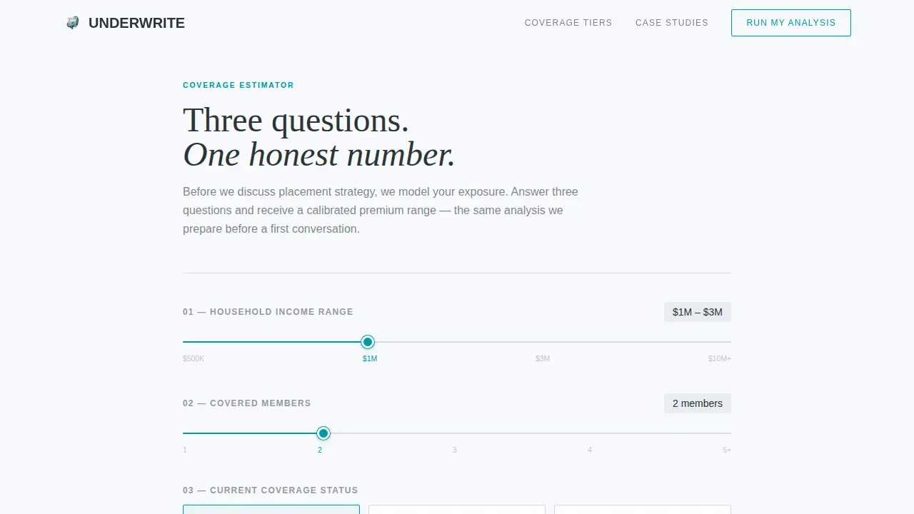
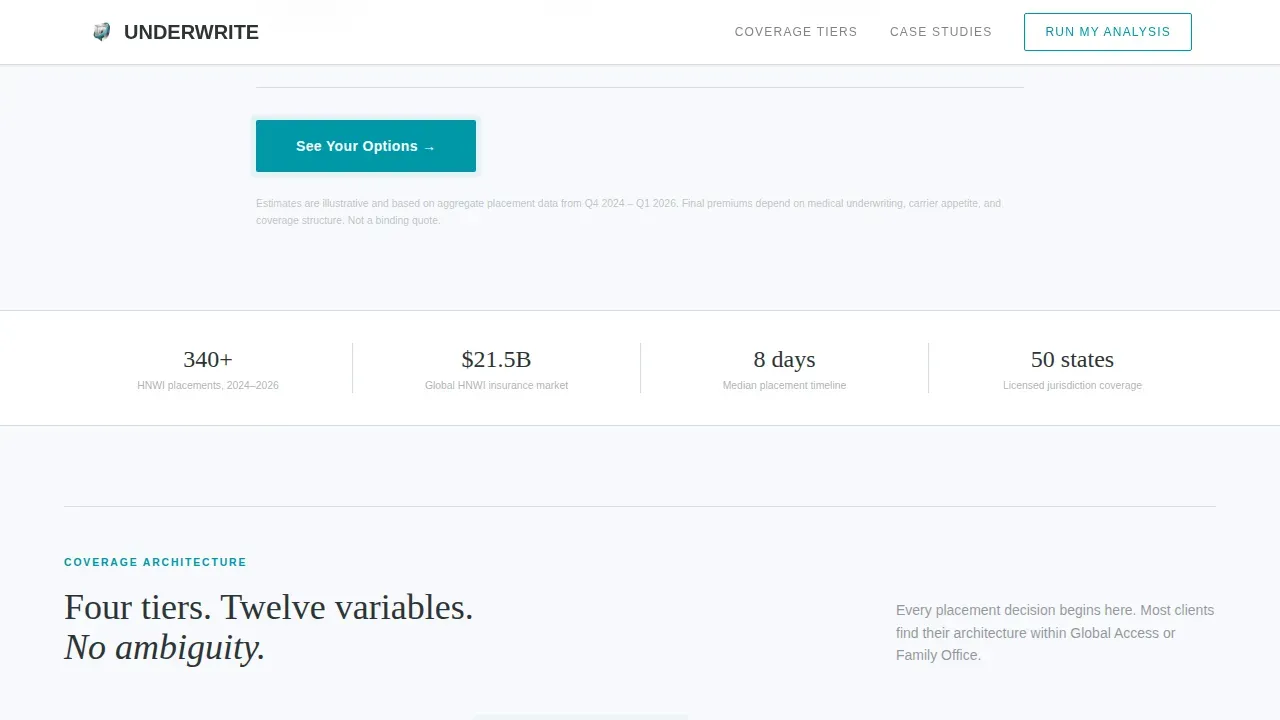
The header section functions as a Calculator/Estimator that asks three quiet questions before the visitor scrolls: estimated household income range via slider, number of covered household members, and current coverage status. The tool returns a personalized annual premium range and a single summary sentence. The teal call to action button pulses gently, drawing attention without visual noise.
Four-Tier Coverage Comparison Table
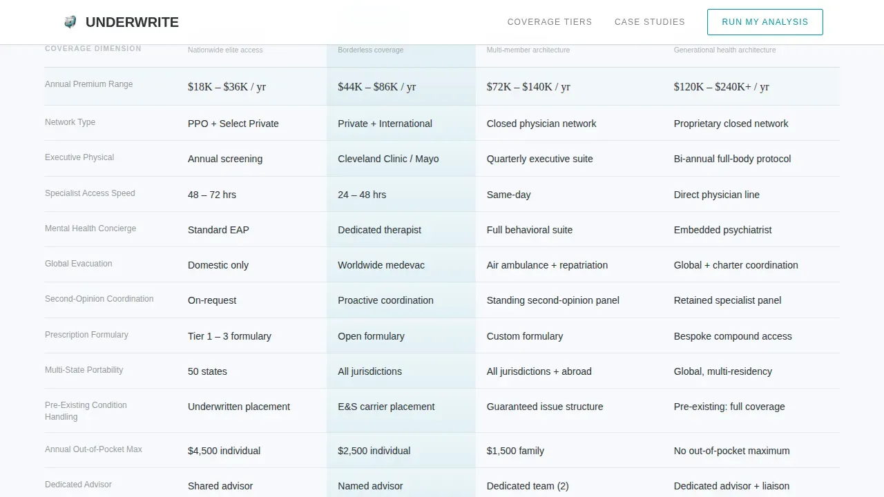
The comparison table is the analytical core of this landing page. It presents four coverage tiers, Domestic Premier, Global Access, Family Office, and Legacy/Multi-Generational, across twelve line items. Those line items include annual premium range, network type, executive physical inclusion, specialist access speed, mental health concierge, global evacuation, second-opinion coordination, prescription formulary flexibility, portability across states, pre-existing condition handling, annual out-of-pocket maximum, and dedicated advisor access. The recommended tier carries a subtle background gradient from white to a faint teal wash, making it visually distinct without being heavy-handed.
Anonymized Client Case Study Dossiers
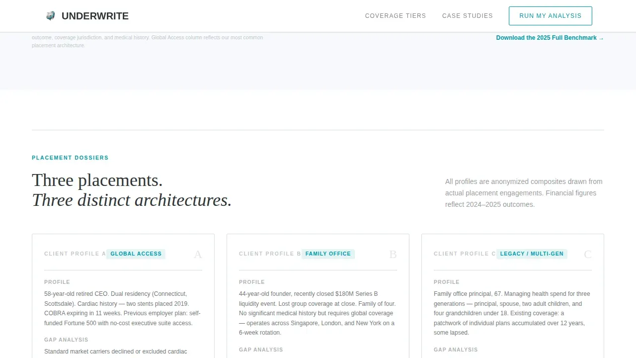
Three case study blocks appear below the comparison table, formatted as brief client dossiers. Each dossier names a profile, for example a 58-year-old retired chief executive with dual residency and cardiac history, then presents a gap analysis, a placement strategy, and the annual difference versus prior coverage. This approach uses social proof grounded in specificity rather than generic testimonials, which is critical for building credibility with a skeptical, analytically oriented audience.
Progressive Two-Step Lead Capture Form
The primary call to action, labeled "Run My Full Analysis," uses progressive form disclosure. Clicking the cta button first reveals only name and email. A second step then asks for current coverage status and preferred contact method, which can be phone, encrypted email, or advisor-to-advisor introduction. Multi-step forms reduce friction by breaking the information-gathering process into smaller, manageable parts, which is one of the most effective practices for improving conversion rate on high-consideration insurance landing pages.
Secondary PDF Lead Magnet Section
A secondary conversion path sits beneath the comparison table. It offers a gated PDF benchmark report as a downloadable asset, capturing potential customers who are not yet ready for a direct engagement. This section keeps the form fields minimal, asking only what is necessary to avoid overwhelming visitors who are still in early-stage decision making.
Industry Report Visual Layout
The page scrolls like a white paper, not a marketing brochure. Section sequencing follows an industry report creative direction: calculator first, then data, then proof, then conversion. This layout structure is a strong example of how insurance landing pages can earn the click by demonstrating analytical depth before making any direct ask.
Page sections overview
| Section | Purpose |
|---|---|
| Premium Modeling Calculator | Estimate annual coverage range above the fold using three slider-driven inputs |
| Coverage Comparison Table | Compare four tiers across twelve line items with a highlighted recommended option |
| Client Case Dossiers | Present three anonymized placement stories with gap analysis and outcome data |
| PDF Lead Magnet | Capture earlier-funnel visitors with a gated benchmark report download |
| Full Analysis Form | Convert ready visitors through a two-step progressive disclosure form |
| Compact Footer | Close the page with a Stripe Two-Row Compact footer in the same austere visual tone |
Design & branding system
The visual identity follows a Cloud Canvas color system applied through the Dashboard Pro theme. The palette is deliberately restrained, communicating authority through absence of noise rather than through decoration. Typography pairs Fraunces, a serif display face, for all headers and section labels, with DM Sans handling all body copy and data presentation.
- Cloud Canvas color roles: cirrus white (#F7F9FC) for all open backgrounds, slate charcoal (#2D3406) for primary text and table headers, muted platinum (#D5DDE0) for table borders and divider lines, and a single decisive teal (#0097A7) used exclusively for interactive elements, toggle states, and the primary cta button
- The hero section contains no cartoon illustrations and no hero image photography. The calculator sits against cirrus white, framed by a thin platinum rule, with clean design discipline maintained across every section
- White space is used structurally throughout the layout, giving the page the same visual register as a private banking document rather than a retail insurance website
Mobile & speed optimization
The template is built desktop-first, reflecting the demographic reality that this target audience most often engages with wealth-adjacent services on desktop at early morning hours. That said, the layout structure and component choices keep the page functional and readable on smaller screens. Mobile-friendly landing pages load fast and look good on any screen, and this template's low animation profile supports that goal.
- The teal cta button and all interactive elements are sized and spaced so buttons on mobile are large enough to click without zooming in, consistent with best practices for mobile insurance landing pages
- The progressive form disclosure pattern means forms on mobile are quick and straightforward to fill out, avoiding the multi-field overload that harms conversion rate on smaller screens
- Static sections use server-rendered components, while the calculator and form use client-side components, which keeps the page structure lean and ensures it loads fast across connection types
How this template helps you convert
Every element on this landing page works toward a single goal: moving a qualified visitor from awareness to a concrete next step, without ever feeling like a hard sell. The page earns trust through specificity, then makes the conversion path easy to follow.
- The calculator delivers immediate, personalized value before any form appears, so visitors arrive at the comparison table already engaged. A good insurance landing page answers key questions upfront, and the estimator does exactly that: it tells potential clients where they likely fit before they scroll.
- The comparison table and case dossiers function as trust signals. Studies show that three of the top five factors that build trust are reputation, reviews, and recommendations. The anonymized dossiers serve a similar function: real outcomes, presented with the specificity that keeps users engaged and supports confident decision making.
- Two distinct conversion paths, the "Run My Full Analysis" form and the downloadable PDF, guide visitors toward whichever action matches their readiness level, improving overall conversion rate without forcing a single high-commitment step on visitors who need more time.
Other information about this template
This template is classified under Finance and Insurance, specifically within the High Net Worth Individual Insurance subcategory and the High Net Worth Individual Health Insurance niche. It is a strong example of what the underwrite bespoke high net worth health insurance comparison landing page template category demands: data density, visual restraint, and conversion architecture that respects the intelligence of the reader.
Insurance landing pages across many categories, including home insurance, travel insurance, auto insurance, and disability insurance, benefit from the same core practices demonstrated here: a catchy headline that communicates the value proposition immediately, a clean design that does not distract, social proof that builds credibility, and a call to action that is impossible to miss. This landing page applies every one of those practices at a premium tier.
Looking at insurance landing page examples across the market, most people recognize that the best-performing pages share a common structure: compelling headline, relevant comparison, and a form that does not ask for more than necessary. This template is a good example of that structure applied to a niche where the cost of a poor first impression is extremely high.
The template can also serve as a reference point for insurance business contexts beyond its primary niche. Practices that offer insurance products across multiple categories, or companies building a dedicated health insurance landing page for a specific plan or program, will find the layout, comparison format, and progressive form model directly transferable.
- This template supports A/B testing of headline variants, cta button copy, and form field order without restructuring the page layout, aligning with best practices for improving conversion rate over time
- Customization options within the template include adjusting coverage tier labels, line item rows in the comparison table, and the number of case study dossiers displayed, making it relevant across a range of concierge insurance contexts
- The template references Medical History Disregarded (MHD) and Full Medical Underwriting (FMU) concepts in its comparison structure, both of which are important underwriting distinctions for visitors evaluating their insurance options after a coverage gap
- Trust signals such as industry awards, client outcome data, and security badges can be added to the page within the existing layout without disrupting the visual hierarchy or the clean design discipline of the Cloud Canvas system
- Concierge insurance practices that want to position their service above commodity insurance products will find this template a great example of how visual restraint and analytical depth work together to convince visitors that the practice understands their situation before they ever make contact
Theme
Dashboard Pro
Creative direction
Industry Report
Color system
Cloud Canvas
Style
Comparison Table
Direction
Freemium/Trial
Page Sections
Live Premium Modeling Calculator
Four-tier Coverage Comparison Table
Anonymized Client Case Study Dossiers
Progressive Two-step Lead Capture Form
Secondary PDF Lead Magnet Section
Industry Report Page Layout
Related questions
What types of insurance practices is this template best suited for?
Can I adapt the comparison table for different coverage tiers or line items?
How does the progressive form help with lead quality?
Does the template support a secondary lead capture path for earlier-funnel visitors?
Can this template's layout apply to other specialized insurance products beyond health coverage?



