Hobby & Passion Supplies Professional Website Template
Ember is a bento grid landing page template built for artisan campfire cooking outfitters. It blends an Ink & Paper color palette with an unboxing-inspired scroll experience, guiding visitors from a dramatic Before/After header slider through individual product reveals to a curated bundle call to action. Every section is designed to earn the click before asking for it.
by Rocket studio
Quick summary
Ember is a single-page bento grid template for campfire cooking supply stores. It opens with a viewport-wide Before/After slider, then unfolds product reveals like items being unpacked from a kraft-paper shipment. The palette stays deliberately restrained: soot black, unbleached linen, and one ember-orange accent. The result is a page that feels hand-crafted, heavy, and worth exploring.
Who this template is for
This template suits specialty retailers who sell high-quality, tactile goods to a passionate outdoor cooking audience. It works especially well when the product story is as important as the product itself.
- Artisan campfire cooking outfitters selling hand-forged grates, cast-iron cookware, or carbon steel tools
- Backyard fire pit retailers and overlanding supply shops with a curated, premium product range
- Off-grid lifestyle brands whose buyers treat cooking over open flame as a deliberate, meaningful practice
What problem this template solves
Most e-commerce landing pages treat products like catalog entries. Ember solves the problem of a flat, forgettable product presentation for goods that deserve to feel special.
- Generic grid layouts fail to communicate craftsmanship or the sensory appeal of fire-cooked food
- Visitors leave before reaching the bundle or kit offer because nothing early in the scroll builds desire
- A single product page cannot carry the weight of a full collection story without the right pacing
What you get with this template
You get a fully structured bento grid landing page designed around an unboxing creative direction. Every section has a defined role in moving the visitor from curiosity to intent.
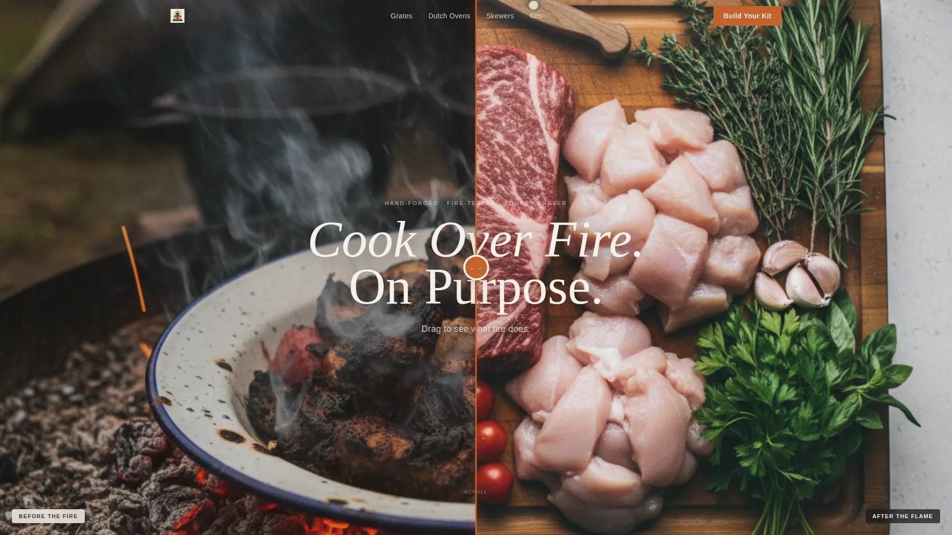
- A Before/After viewport slider header with a draggable ember-orange handle separating raw and fire-finished food photography
- A modular bento grid with alternating product photography cells and linen-white copy cards, escalating from single items to full kits
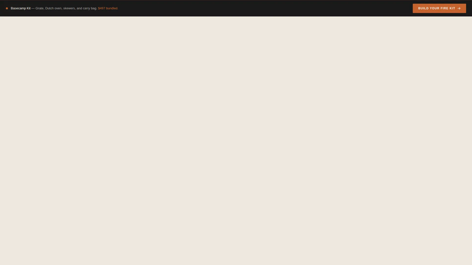
- Persistent bottom bar carrying a secondary "Build Your Fire Kit" call to action linking to a curated bundle page
Feature list
This template packs its persuasive work into visual structure, interaction detail, and intentional copy placement. Each feature below reflects a specific decision made in the brief.
Before/After Viewport Slider
The header splits the screen between a flat-daylight cutting board shot and a fire-finished plated meal on enamelware. Visitors drag a thin ember-orange line to reveal the transformation. The gesture itself communicates the product value before a single word is read.
Bento Grid Unboxing Layout
Product cells are arranged in a modular card grid that mimics the experience of opening a shipment. Each cell reveals one item: a sealed box, tissue paper pulled back, a hand lifting a seasoned grate. The grid escalates in ambition from a skewer set to a full basecamp kitchen kit.
Per-Card Click-Through calls to action
Every bento product card carries a "See What's Inside" call to action. The label sits in graphite on linen at rest and shifts to ember orange on hover. Each card routes independently to a dedicated product page where the purchase happens.
Persistent Bundle Bar
A fixed bottom bar stays visible throughout the scroll. It carries the "Build Your Fire Kit" secondary call to action, leading visitors to a curated bundle page. The bar ensures the highest-value offer is always one click away, regardless of scroll position.
Ink & Paper Color System
The palette uses deep soot black, unbleached linen, warm graphite, and a single low ember-orange accent. Orange is reserved strictly for pricing, calls to action, and hover states. This restraint keeps the page feeling tactile and confident rather than promotional.
Alternating Copy and Photography Cards
The grid alternates between tight product photography and short copy cards on linen-white backgrounds. This rhythm gives the eye room to rest and lets each product moment land with full weight before the next one arrives.
Page sections overview
| Section | Purpose |
|---|---|
| Before/After Slider Header | Dramatizes the fire-cooking transformation as the opening hook |
| Sealed Box Cell | Opens the unboxing sequence with the stamped logo reveal |
| Tissue Reveal Cell | Exposes oiled steel as the first product detail moment |
| Hand Lifting Grate | Communicates craftsmanship and physical weight of the product |
| Single Product Cards | Presents skewer sets and individual items with focused photography |
| Linen Copy Cards | Delivers short product context between photography cells |
| Full Kit Reveal | Escalates the offer to a complete basecamp kitchen collection |
| Persistent Bottom Bar | Keeps the "Build Your Fire Kit" bundle call to action always visible |
Design & branding system
The visual identity follows a Luxe Minimal theme built on an Ink & Paper color system. Every design decision reinforces the feeling of something blackened, weighty, and perfectly made.
- Colors: deep soot black (#1A1A1A), unbleached linen (#F5F0E8), warm graphite (#3D3A38), and low ember orange (#C4622D) used only for pricing, calls to action, and hover states
- Texture and tone: the palette evokes a letterpress menu at a wood-fire restaurant, restrained and tactile rather than loud or promotional
- Layout style: a modular card grid with alternating photography and copy cells, each one paced like a hand-packed shipment being discovered for the first time
Mobile & speed optimization
The bento grid layout is designed to translate cleanly to smaller viewports without losing the unboxing pacing or the visual weight of the product photography.
- Modular card cells stack vertically on mobile, preserving the reveal sequence and escalating ambition from single items to full kits
- The persistent bottom bar remains fixed on mobile, keeping the bundle call to action accessible at every scroll position
- The Before/After slider is built as a full-width viewport element, keeping the opening gesture dramatic even on a phone screen
How this template helps you convert
Ember earns the click before asking for it. The entire page is structured as a progressive desire loop, not a product list.
- The Before/After header slider delivers the core sales pitch in a single gesture, transforming a casual visitor into someone who already understands why fire-cooked food is different and why the right tools matter.
- The unboxing bento grid builds emotional investment one cell at a time, so by the time a visitor reaches the full basecamp kit section, they want the whole collection rather than a single piece.
- The persistent "Build Your Fire Kit" bottom bar captures high-intent visitors who are ready to commit to a bundle without requiring them to scroll back to find it.
Other information about this template
Ember is built for specialty retailers whose customers lead with passion and buy with purpose. A few additional details worth noting before you build with it.
- The template is designed as a click-through landing page, meaning product purchases happen on dedicated product pages rather than inline; the landing page focuses entirely on desire and routing
- The creative direction is described as Neo-Retro Luxe Minimal, combining the tactile warmth of analogue craft materials with a clean, modern grid structure
- The unboxing creative direction makes this template a strong fit for any curated outfitter model where presentation, curation, and perceived craftsmanship are central to the brand story
- The color system and call to action language ("See What's Inside", "Build Your Fire Kit") are designed as a cohesive unit and work best when kept together rather than swapped individually


Theme
Neo-Retro
Creative direction
Curated Collection
Color system
Ink & Paper
Style
Card Grid (Modular)
Direction
Quiz/Assessment
Page Sections
Before/after Viewport Slider Header
Bento Grid Unboxing Layout
Per-card Click-through Ctas
Persistent Bundle Bottom Bar
Ink & Paper Color System
Alternating Photography and Copy Cards
Related questions
Is this template suitable for a store that sells multiple product types?
Does this template handle purchases directly on the page?
What makes the Before/After slider effective as a header?
Can I use this template if my products are not campfire cooking tools?
How does the persistent bottom bar work with the rest of the page?



