Restaurant & Dining Specialist Blog Website Template
The Mezze landing page template captures the warmth of slow-cooked, communal Middle Eastern dining through cinematic photography, sensory scroll copy, and a Neo-Retro editorial design. Built as a single-column click-through page, it guides visitors from a moody cinemagraph hero through intimate dish reveals toward a reservation call to action, making guests hungry before they read a single menu item.
by Rocket studio
Quick summary
The Mezze template is a single-column flow landing page built for a full-service Middle Eastern restaurant centered on shared plates and slow-fire cooking. Its editorial scroll unfolds like a meal, moving from a cinemagraph coffee-pour hero to intimate food close-ups and a golden-hour dining room reveal. Every section is designed to manufacture appetite and earn the click to a reservation platform.
Who this template is for
This template is built for a specific kind of restaurant operator. If your dining room runs on long tables, slow cooking, and the kind of food that turns a Tuesday lunch into a two-hour memory, this page was shaped around you. It suits a neighborhood spot with a strong identity, not a generic chain looking for a quick web presence.
- Middle Eastern restaurant owners who want a landing page that feels as considered as their kitchen, with a visual identity built around shared-plate dining culture.
- First-time website builders who need a no-code solution. No-code website builders allow users to create websites without any coding knowledge, and this template fits that model perfectly.
- Office event planners and date-night seekers who land on the page while browsing from a mobile device and need to feel the atmosphere before they commit to a booking.
What problem this template solves
Most restaurant pages are transactional. They list hours, drop a stock photo of an empty table, and bury the reservation button in a navigation menu. That approach fails a restaurant like Mezze, where the experience is the product. Visitors who are deciding between three dinner options on a Thursday night do not stay on a flat, menu-list page long enough to book.
This template solves the attention problem. It builds desire scroll by scroll, so that by the time visitors reach the reservation call to action, they already feel like they have tasted the food.
- Flat, uninspiring restaurant pages that fail to communicate atmosphere, warmth, or the communal spirit that makes shared-plate dining special.
- High bounce rate pages that lose mobile visitors quickly because the experience does not translate on smaller screens.
- Missed reservation conversions caused by a weak call-to-action flow or a buried booking path that makes it harder to navigate efficiently toward the decision moment.
What you get with this template
You get a fully designed single-page layout that handles the entire storytelling arc from first impression to confirmed table. The template includes every section required to move a cold visitor through curiosity, desire, and commitment. Nothing is filler. Each scroll section earns its place in the sequence.
The layout is ready for you to add your own copy, images, hours, and reservation link. No coding knowledge is required to update the content, and the visual framework is built to display your food photography at its most evocative.
- Five named page sections, each with a clear editorial purpose: hero cinemagraph, flatbread teaser with sticky call to action, editorial food scroll with three alternating dish reveals, golden-hour dining room reveal with full-width call to action, and a closing section with hours, address, and final booking link.
- A complete design system built on the Sunset Mesa color palette and Fraunces vintage serif typography, giving your restaurant page an identity that feels specific, warm, and unmistakably its own.
- Scroll-driven animation architecture using GSAP ScrollTrigger reveals, staggered text entrances, and a CSS steam cinemagraph in the hero, so the page performs like an editorial magazine feature rather than a static web page.
Feature list
This section covers the core capabilities built into the template. Each feature is grounded directly in the prompt and the matched intersection context.
Cinemagraph Hero with Animated Steam
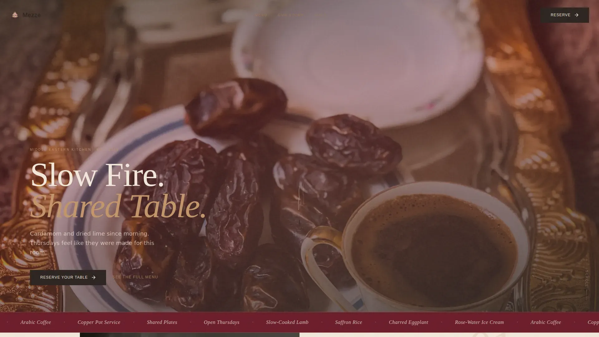
The hero section opens on a wide, moody shot of a copper finjan pouring Arabic coffee, with a CSS animation isolating a single ribbon of steam curling upward while everything else stays frozen. A vintage serif headline, set in aged parchment against the dark scene, fades in after two beats. The hero is designed to stop the scroll immediately and communicate intimacy before a single word is read. High-resolution, warm-toned visuals in the hero section are essential for a mezze restaurant landing page, and this template delivers exactly that.
Editorial Sensory Scroll with GSAP Reveals
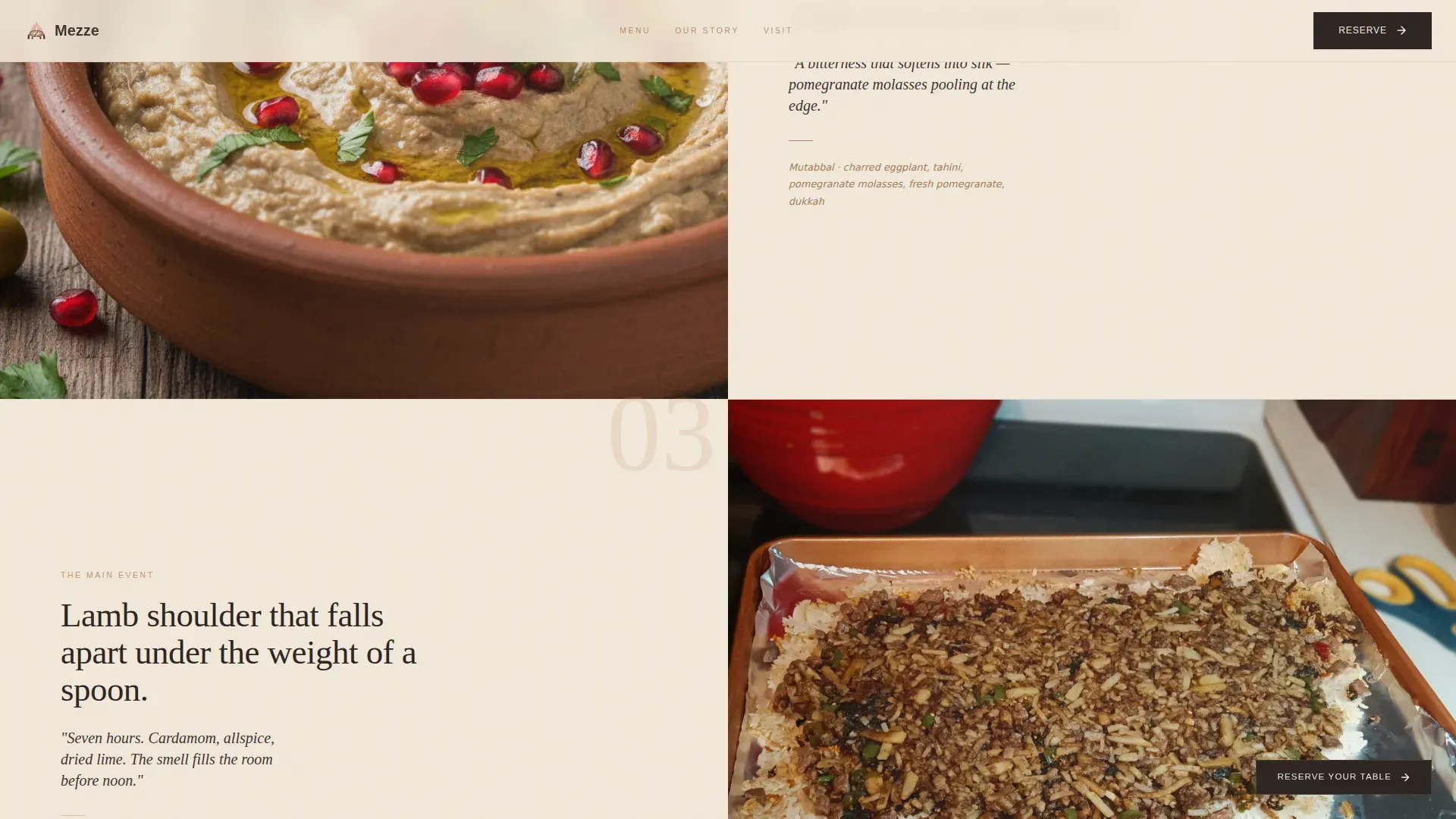
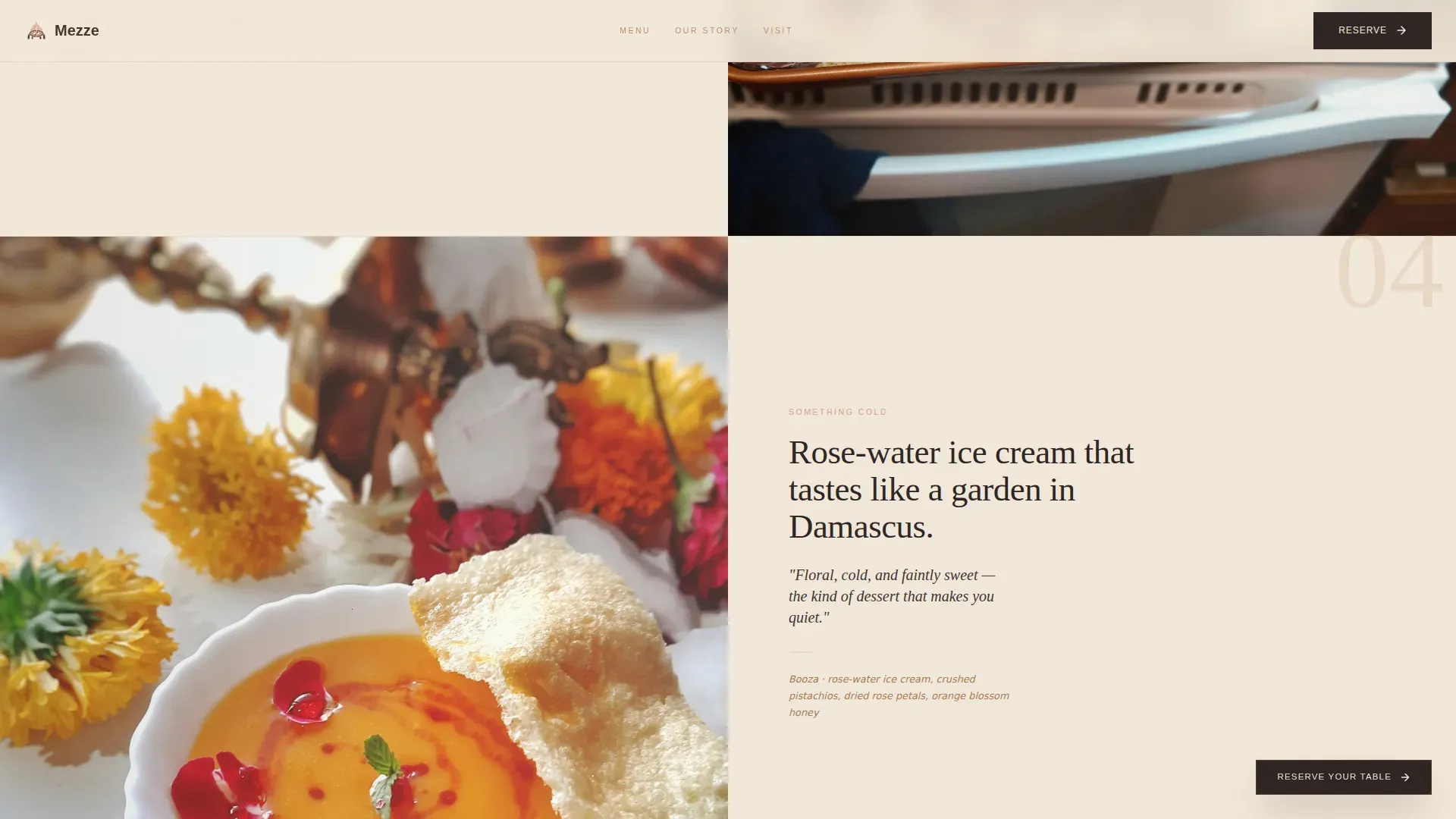
Past the hero, the page unfolds course by course. Each section isolates one dish or ingredient with a tight editorial photograph and a single line of copy that names a smell, a texture, or a sound rather than a generic dish description. Three alternating full-bleed dish sections cover charred eggplant, slow-braised lamb shoulder, and rose-water ice cream. GSAP ScrollTrigger controls every reveal, so content enters with staggered text and parallax image movement. Engaging scrolling effects and smooth animations create a high-end feel that keeps visitors moving through the page at the right pace.
Sticky and Full-Width Call-to-Action System
The primary call to action, "Reserve Your Table," appears three times across the page in three different forms. It shows first as a subtle sticky button in smoked charcoal after the second scroll section. It appears again full-width after the dining room reveal. It anchors the closing section beside hours and address. A secondary text link, "See the Full Menu," sits below each call to action for visitors who need one more look before committing. No form lives on the page itself. The click passes visitors to the reservation platform with context intact, keeping the landing page clean and focused.
Neo-Retro Sunset Mesa Design System
The entire visual identity follows a Neo-Retro editorial direction. The Sunset Mesa color system uses deep pomegranate (#6B1D2A), toasted sesame (#C4956A), desert dusk pink (#D4A08F), aged parchment (#F2E8DA), and smoked charcoal (#2C2421). Typography pairs Fraunces vintage weight serif headlines with DM Sans body text. The result feels like a faded 1970s postcard from Beirut: sun-bleached warmth with enough shadow to feel intimate. High-quality imagery of shared, rustic dishes sits inside this warm, earthy palette to create a coherent and compelling visual world.
Mobile-First Responsive Layout
The template is built mobile-first, recognizing that restaurant discovery happens on phones. Responsive web design ensures that the landing page provides a seamless experience across various devices, from a large desktop display to the phone screen of someone looking for dinner plans at 6 pm on a Friday. Every section, image, and call-to-action button is sized and spaced for thumb-friendly navigation, so visitors can navigate efficiently without pinching or zooming.
Minimal Ultra-Clean Footer
The footer follows Pattern 3: Vercel Horizontal Flow. It is ultra-minimal and contains only the information a visitor needs after reading the full page: address, hours, and navigation to the reservation platform. This keeps the close of the page as considered as the opening, avoiding the cluttered link-dump that undermines many restaurant sites.
Page sections overview
| Section | Purpose |
|---|---|
| Hero Cinemagraph | Opens the page with a moody animated coffee pour, CSS steam animation, and a two-beat serif headline reveal to capture immediate attention |
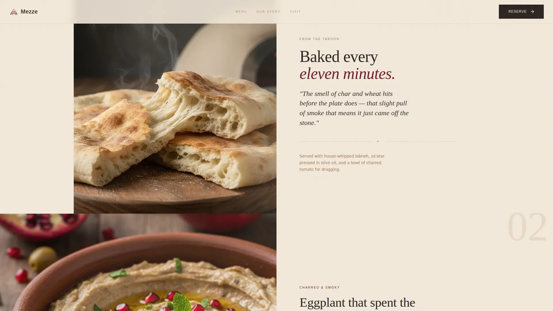
| Flatbread Teaser | Displays a close-up editorial photograph with a single craft-copy line; the sticky call-to-action button appears here for the first time |
| Editorial Food Scroll | Alternates three full-bleed dish sections covering charred eggplant, slow-braised lamb, and rose-water ice cream with sensory single-line copy |
| Dining Room Reveal | Shows a golden-hour wide shot of the dining room with a full-width "Reserve Your Table" call-to-action block beneath |
| Closing Hours Block | Anchors the page with address, operating hours, the final call-to-action button, and the secondary "See the Full Menu" text link |
| Ultra-Minimal Footer | Delivers a clean horizontal flow footer with only essential links, keeping the page exit as intentional as its entry |
Design & branding system
The design language of this template is specific, intentional, and built for a single effect: making the visitor feel they have already stepped inside the restaurant before they have left their phone. The Neo-Retro editorial style draws from the visual vocabulary of 1970s Mediterranean print culture, faded but warm, textured but refined. Every color, typographic weight, and image treatment serves that mood.
- Sunset Mesa color palette: deep pomegranate (#6B1D2A) for rich, anchoring backgrounds; toasted sesame (#C4956A) for warm highlight accents; desert dusk pink (#D4A08F) for softer transition zones; aged parchment (#F2E8DA) as the primary background and headline text color; smoked charcoal (#2C2421) anchoring all body typography.
- Fraunces serif headlines and DM Sans body text: Fraunces carries the vintage weight of the restaurant's identity in every headline, while DM Sans keeps body copy clean, legible, and modern enough to feel current on any device.
- Editorial photography direction: images alternate between tight food close-ups and wide atmospheric dining-room shots, with interior images showing communal tables to depict a cozy and inviting environment. The rhythm creates a visual conversation between the intimate and the expansive, mirroring the experience of a long shared meal.
Mobile & speed optimization
Restaurant discovery happens overwhelmingly on mobile devices, and this template is designed with that reality at the center, not as an afterthought. Responsive web design is essential for restaurants to cater to the increasing number of users accessing websites via mobile devices, and every layout decision here reflects that priority. A responsive design can improve user engagement by making it easier for customers to navigate restaurant websites on mobile devices, and implementing responsive design can lead to higher conversion rates for restaurant websites by facilitating online reservations and orders.
- GPU-accelerated transforms only: all animations, including the GSAP ScrollTrigger reveals, parallax food images, and CSS cinemagraph steam, use GPU-accelerated transforms. This limits rendering cost and helps the page perform smoothly on mid-range mobile devices without dropping frames.
- Native CSS smooth scroll: the single-column scroll flow uses native CSS smooth scroll rather than a heavy JavaScript library, keeping the interaction lightweight and reducing unnecessary overhead on mobile browsers.
- Mobile-first image sizing and spacing: every section scales from a mobile viewport upward. Call-to-action buttons are sized for thumb reach, text columns are set for comfortable reading on small screens, and image crops are optimized for portrait orientation so food photography displays at full editorial impact on a phone screen.
How this template helps you convert
The page is a click-through landing page, meaning its single conversion goal is getting visitors to tap "Reserve Your Table" and reach the booking platform. Every design and copy decision serves that one outcome. The philosophy here matches the slow-food approach of the restaurant itself: earn trust before asking for the commitment.
- Sensory scroll sequence builds desire before the ask: visitors move through the hero, flatbread teaser, and three dish reveals before they see the first full-width call-to-action block. By that point, they have already imagined the meal. The page earns the click by making the visitor taste the food before they have read a single menu item. A high-converting landing page for a shared-dining mezze restaurant should emphasize atmosphere, storytelling, and visual high-quality images of communal dishes, and this template is structured entirely around that principle.
- Three-stage call-to-action placement removes friction: the sticky button appears after the second section for visitors ready to act early. The full-width block converts visitors who needed the dining room reveal. The closing anchor captures those who scrolled all the way through for hours and address before deciding. Integrating a clear reservation path into the landing page structure can improve user engagement and conversion rates measurably, and having the call to action appear at the right moment in the scroll, rather than only at the top or bottom, is a core part of that approach.
- Secondary menu link handles hesitation without losing the visitor: the "See the Full Menu" text link below each call-to-action button gives undecided visitors a clear next step that does not abandon the page flow. Visitors who need one more look before committing get it without breaking the reservation journey.
Other information about this template
This section covers practical and technical context that supports your decision to use this template, as well as additional facts about the template ecosystem it belongs to.
The Mezze slow fire shared table restaurant landing page template is part of a broader library of intersection-matched templates designed by category, niche, theme, and conversion direction. This one sits at the intersection of the Food and Beverage category, the Restaurant and Dining subcategory, and the Ethnic Restaurant niche, with a specific focus on Middle Eastern shared-plate culture.
No-code website builders allow users to create websites without any coding knowledge, and this template is fully compatible with that workflow. No-code website builders provide customizable templates that can be easily managed by users without developer support. No-code platforms enable users to showcase menus effectively through stylish design options, and no-code platforms can integrate third-party tools for enhanced functionality, such as reservation systems, so you can connect your preferred booking partner directly through the call-to-action link without touching a line of code. No-code website builders are designed to be user-friendly, allowing non-technical users to create websites, and this template requires no coding skills for updates. No-code platforms often include features for online reservations and booking systems, which aligns directly with the click-through architecture of this page.
The template was designed with the slow-food dining philosophy at its core. The philosophy section explains the commitment to traditional preparation methods and the kind of cooking that cannot be rushed. The landing page conveys that commitment through copy that names smells and textures, through imagery of copper pots and torn flatbread, and through a visual rhythm that mirrors the pace of a long, satisfying meal.
Restaurant landing page templates often feature elegant and responsive designs that adapt seamlessly to all devices. Many restaurant landing page templates include online reservation and booking systems that can be easily integrated with third-party tools. Stylish menu pages are a common feature in restaurant landing page templates, allowing establishments to highlight their dishes with images and descriptions. Gallery and testimonials sections are often included in restaurant landing page templates to display food photography and customer reviews. Restaurant landing page templates are designed to be customizable and easy to manage, often requiring no coding skills for updates.
SEO considerations are built into the structure of the page. A well-structured website with clear navigation helps both users and search engines understand the content better. Fast loading speeds are important for restaurant websites as they enhance user experience and contribute to better search visibility. Using high-quality images and descriptions of menu items can enhance the appeal of a restaurant's website and improve its standing in search results. Mobile optimization is essential for restaurant websites as many users search for dining options on their mobile devices, and this template is mobile-first by design.
From a web performance perspective, the page relies on GPU-accelerated transforms and native CSS smooth scroll to keep things light. Analytics and tracking can be layered on top of the finished page through your platform of choice. When setting up analytics for your restaurant website, it is worth understanding how visitors interact with each scroll section. Tracking the traffic source, measuring the bounce rate, and monitoring which call-to-action placement drives the most clicks are all useful signals. Analytics analytical cookies, when configured through your platform, allow you to collect this data and understand how visitors navigate your page. Key performance indexes like scroll depth, click-through rate on the reservation button, and time on page give you the metrics you need to assess the effectiveness of the page over time.
Cookie and privacy considerations apply to any live restaurant website. Most platforms require you to set up a consent preferences banner so that visitors can accept or reject cookies depending on their preferences. A consent category system typically separates necessary cookies, which handle basic features like providing secure log in and secure log in to admin areas, from optional categories that cover analytics analytical cookies and third party features. Visitors interact with these banners when they first land on the page. The consent preferences setup lets visitors choose what data they share, and platforms that store this choice will remember it for users who have visited previously, so the banner does not appear on every return visit. Collecting feedback on whether users accept or reject consent categories helps you understand what your audience values in terms of privacy. Certain functions on your live website, such as social media platforms sharing buttons or embedded maps, may require additional consent to activate, since those involve other third party features that can collect personally identifiable data. Providing secure log in for any admin account access and being clear about what certain functionalities require in terms of consent is a basic responsibility of any live web service. You can find detailed information about cookie management and consent in your platform's documentation. Your platform may also allow you to display detailed information about each consent category, so visitors can navigate efficiently through the options and make an informed choice without needing to reject all non-essential cookies by default. The importance of transparent consent preferences is recognized across the industry, and the pages you build on this template should reflect that standard.
When you run ad campaigns to drive traffic to this landing page, tracking the traffic source accurately is essential. A well-configured analytics setup lets you measure how each ad campaign contributes to reservation clicks. Social media platforms like Facebook are common sources of paid and organic traffic for restaurant discovery. Facebook, along with other social media platforms, can be a strong channel for sharing the page and driving visitors to it. The number of visitors arriving from each traffic source tells you where to focus your marketing attention. Adjusting your ad campaigns based on traffic source data and bounce rate metrics helps you allocate budget more effectively and deliver a better user experience to the audiences most likely to convert.
Other practical points worth noting:
- The template is set up as a single-column flow, meaning all content lives on one scroll path with no side navigation or sub-pages to manage.
- The footer is ultra-minimal by design, covering only address, hours, and essential links, so visitors are not distracted at the moment of decision.
- The "See the Full Menu" secondary link is a text link, not a button, and is replaced by a new instance below each call-to-action placement, keeping the visual hierarchy clean.
- All animation layers, including the cinemagraph steam, GSAP staggered text, and parallax food images, are built to degrade gracefully on devices that have reduced motion preferences set at the operating system level.
- The template is designed to store the visual identity consistently across all five page sections, so the brand experience does not feel fragmented as visitors scroll.
- You can add your own high-quality images to any of the editorial photo slots. High-quality images of menu items can significantly enhance online menu presentation, and the template's image containers are built to display food photography at editorial scale.
- Customer testimonials can be effectively used to build trust and enhance the online presence of a restaurant. While the template does not include a dedicated testimonials block, atmosphere and specificity serve as the implicit social proof throughout the scroll.
- A well-designed online menu can improve customer engagement and increase reservations, and the secondary "See the Full Menu" link provides visitors with access to that information without cluttering the landing page itself.
- The page content and design are fully yours to customize. You can replace placeholder text, swap images, update hours, and set your reservation link without touching code.
Theme
Neo-Retro
Creative direction
Taste & Aroma
Color system
Sunset Mesa
Style
Single Column Flow
Direction
Click-Through
Page Sections
Cinemagraph Hero with CSS Steam Animation
Sensory Editorial Food Scroll
Three-stage Reservation Call-to-action Flow
Neo-retro Sunset Mesa Visual Identity
Mobile-first Responsive Single-column Layout
Ultra-minimal Footer with Essential Information
Related questions
Does this template include a built-in reservation form?
Can I use this template without any coding experience?
How does the sticky call-to-action button work across the page?
Is this template optimized for mobile devices?
Can I customize the colors and fonts to match my restaurant brand?