Luxe Letterpress Landing Page Template for Stationery
Emboss is a scroll-reveal landing page template built for letterpress and luxury stationery studios. It guides visitors through three tiers of New Year's card collections, from Classic to Atelier, using close-up textures, foil-effect animations, and a sticky upgrade bar. The design uses obsidian black and brushed gold to create an atmosphere of quiet, tangible luxury.
by Rocket studio
Quick summary
Emboss is a single-page landing page template designed for high-end letterpress stationery studios. It walks visitors through a curated collection journey, from entry-level cotton stock cards to bespoke hand-torn Atelier pieces, using scroll-driven reveals and foil-effect micro-animations to build desire at every tier.
Who this template is for
This template is built for studios and individuals who sell premium physical stationery. It speaks directly to sellers who need their page to feel as refined as their product.
- Letterpress studios offering tiered New Year's card collections for corporate and private clients
- Event planners and executive assistants sourcing table cards or bulk orders for formal occasions
- Design-conscious independent stationery brands serving couples or clients who reject digital alternatives
What problem this template solves
Most stationery product pages treat every item the same. They list products in a flat grid without building any sense of value or progression. That approach undersells craftsmanship and leaves high-margin tiers buried.
- Visitors see no visual difference between a basic card and a hand-finished Atelier piece, so they default to the cheapest option
- There is no guided journey that teaches the eye to recognise quality before asking for a purchase decision
- Budget-conscious and premium buyers land on the same page with no clear path tailored to either
What you get with this template
You get a complete scroll-reveal landing page that moves the visitor through three distinct collection tiers in a deliberate, sensory sequence. Every section is designed to feel like a step deeper into craft.
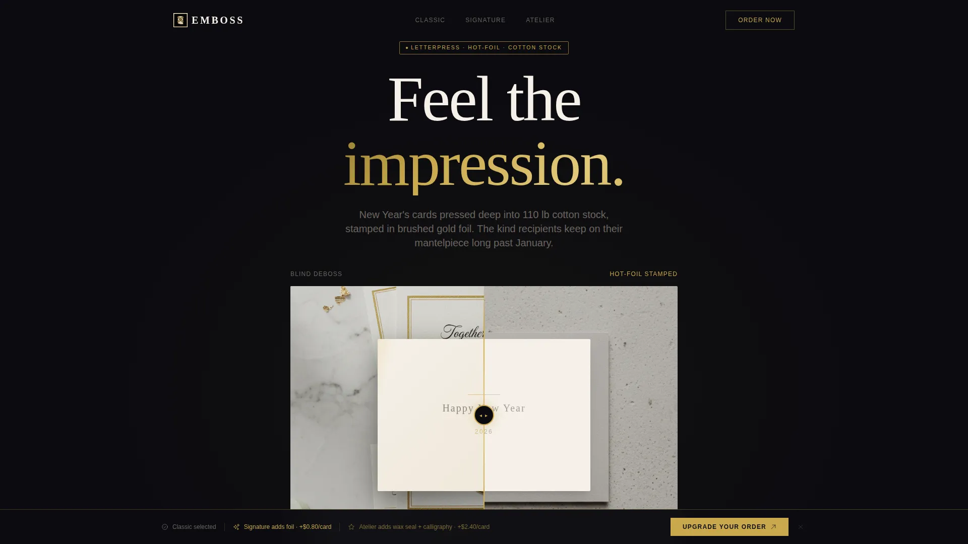
- A Before/After Slider header with a draggable gold foil handle and light-reflection micro-animations on reveal
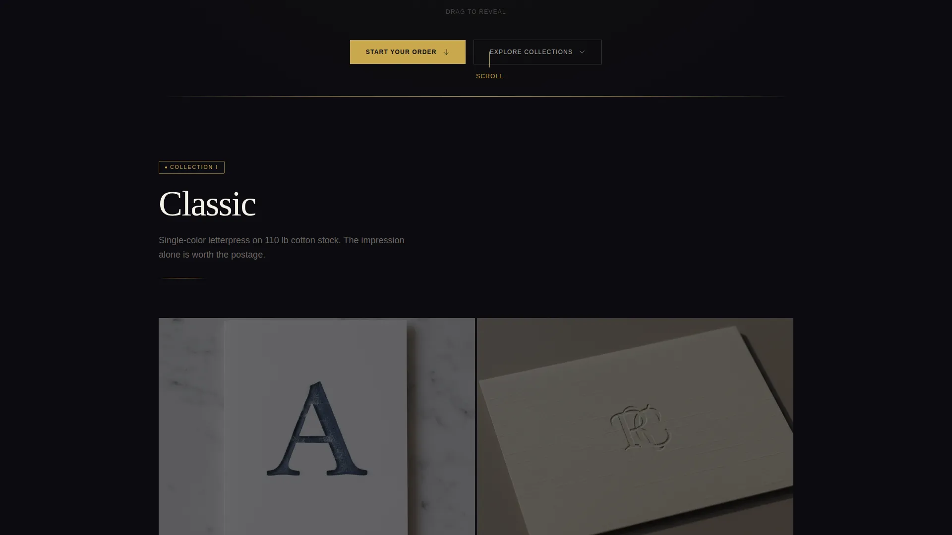
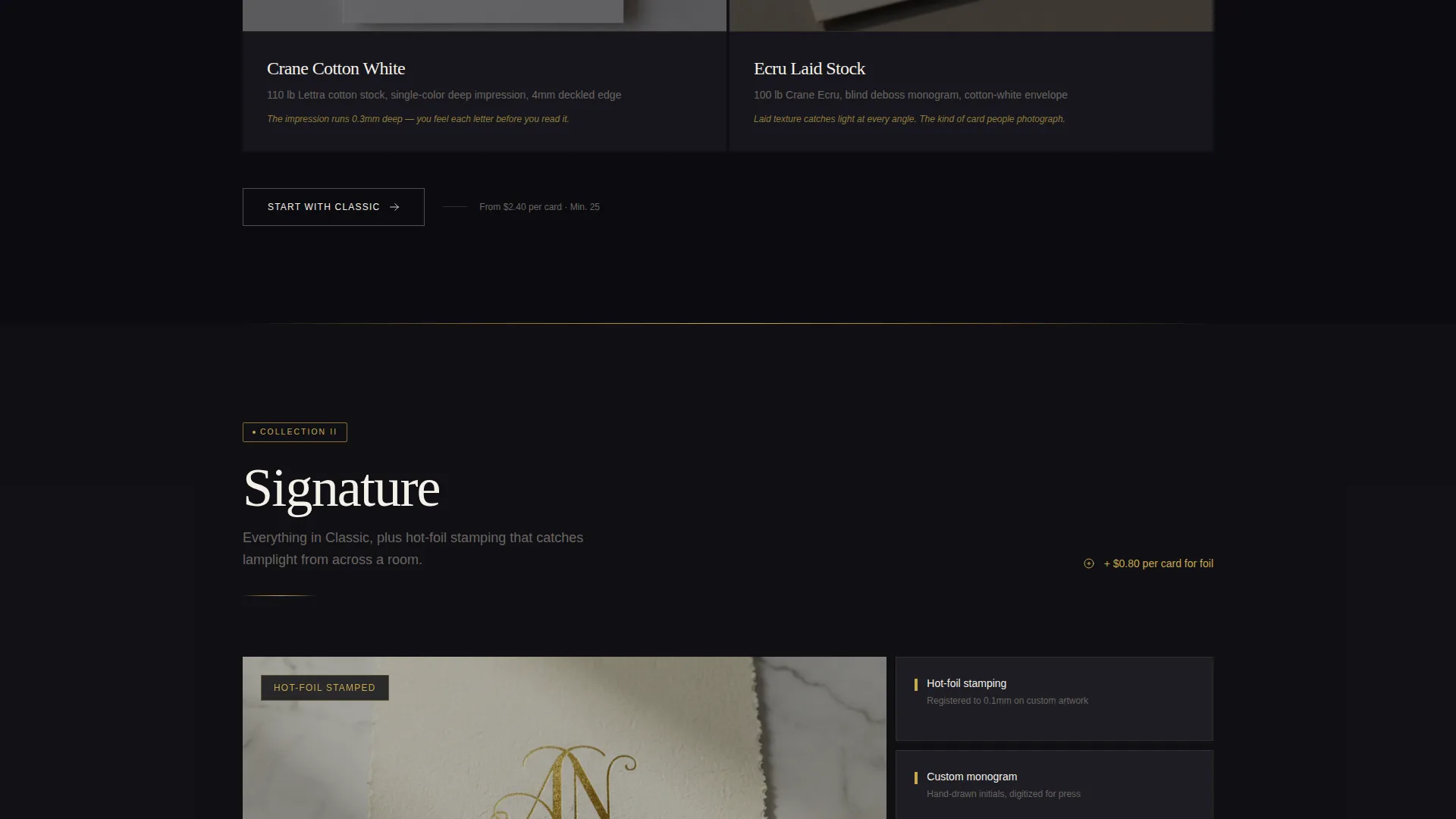
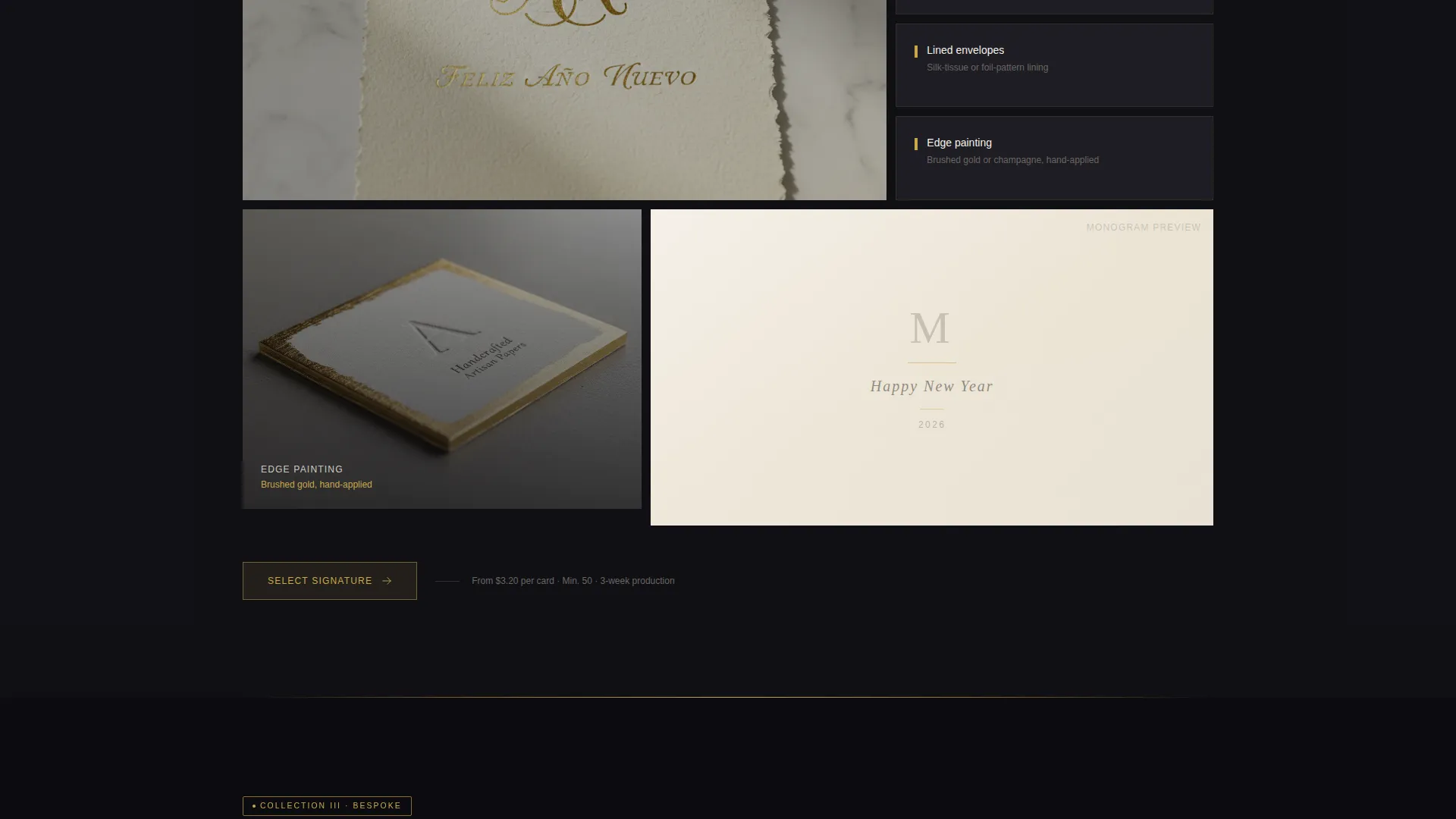
- Three tiered collection sections (Classic, Signature, and Atelier) with progressively richer textures, slower animations, and deeper close-ups
- A sticky comparison bar and upsell mechanic that surfaces after the second collection reveal, with per-card price framing
Feature list
This template delivers a focused set of design and interaction features, each grounded in the brief and built to serve the stationery buying experience.
Before/After Foil Reveal Slider
The header opens with a draggable slider. The left side shows a flat matte card with blind deboss only. Dragging the gold foil handle reveals the same card finished with hot-foil stamping, edge painting, and a lined envelope. Micro-animations simulate light catching the foil as the handle moves.
Three-Tier Curated Collection Flow
The page reveals Classic, Signature, and Atelier collections in sequence as the visitor scrolls. Each tier introduces richer finishes, closer detail shots, and slower animation pacing. The structure makes each upgrade feel like a natural appetite rather than a prompted decision.
Sticky Upgrade Comparison Bar
After the second collection reveal, a sticky bar anchors to the viewport. It shows the visitor what their current selection is missing compared to the next tier. The primary call-to-action reads "Upgrade Your Order" and stays visible without interrupting the scroll.
Quantity-First Order Flow
The order sequence begins with a quantity selector offering 25, 50, 100, and 200-plus card counts. Once quantity is chosen, each tier is presented as a visual flip card. Price differences are framed per card, for example, showing the cost increment for adding foil per unit.
Pulsing Gold Accent on Atelier Tier
The top-tier Atelier section uses subtly pulsing gold accent buttons. This distinguishes the premium tier visually and creates a sense of low-key urgency without relying on countdown timers or aggressive promotional language.
Dual Entry-Point Calls to Action
A secondary call-to-action, labelled "Start with Classic," captures budget-conscious visitors early in the scroll. This prevents drop-off among buyers who are not ready for the premium tier and keeps them in the purchase flow.
Page sections overview
| Section | Purpose |
|---|---|
| Before/After Slider Header | Introduce foil reveal and set the tone of tactile luxury |
| Classic Collection Reveal | Present the entry-level cotton stock letterpress tier |
| Signature Collection Reveal | Introduce foil stamping and custom monogram options |
| Atelier Collection Reveal | Showcase hand-torn edges, wax seals, and calligraphy |
| Sticky Comparison Bar | Surface upgrade prompts after the second collection scroll |
| Quantity and Tier Selector | Guide buyers through count choice and per-card pricing |
Design & branding system
The visual identity follows a Luxe Minimal theme built around an obsidian and gold palette. The result feels like opening a velvet-lined box in low light: restrained, tactile, and expensive without being loud.
- Core palette: true obsidian black (#0B0B0F) as the dominant background, brushed gold (#C9A84C) for foil-effect accents and hover states, warm parchment (#F5F0E8) for card preview surfaces, and deep graphite (#1E1E24) for secondary containers
- The camera framing in the header is deliberately tight: just the card, a marble surface, and a shadow with no hands, no props, and no distractions
- Animation pacing slows progressively from Classic through to Atelier, reinforcing the sense that higher tiers deserve more consideration
Mobile & speed optimization
The template is structured for a clean mobile experience. Scroll-reveal animations and the slider interaction are designed to translate across screen sizes without losing the tactile quality of the desktop view.
- The sticky comparison bar repositions gracefully on smaller screens so it remains readable without blocking collection content
- Flip card tier selectors adapt to touch interaction, making the quantity-and-tier order flow usable on a phone or tablet
- Close-up texture sections use proportional layouts that preserve detail at narrower viewport widths
How this template helps you convert
The page is built around a deliberate upsell architecture that guides the visitor toward higher-value tiers before asking for a decision.
- The Before/After Slider at the top establishes perceived value immediately, showing the physical difference between a basic card and a fully finished product before the visitor has scrolled past the header.
- The curated scroll journey builds appetite tier by tier, so by the time a visitor reaches the Atelier section, the upgrade feels earned rather than pushed.
- The sticky comparison bar and per-card price framing reduce the psychological cost of upgrading by making the difference feel small and specific rather than vague or large.
Other information about this template
This template fits naturally within the broader category of retail and e-commerce landing pages for seasonal and occasion-based stationery businesses. It is especially well suited to the New Year's Eve business niche, where premium gifting and corporate gifting decisions are made weeks in advance.
- The template style follows a card grid (modular) layout philosophy, making each collection tier visually self-contained and easy to scan
- The creative direction is Curated Collection, which means the scroll is structured as a journey of increasing refinement rather than a flat product catalogue
- The landing page direction is Direct Sales, meaning every design decision, from the sticky bar to the pulsing Atelier button, serves a purchase outcome
- This template is a strong fit for studios selling New Year's greeting cards, luxury corporate stationery, black-tie event table cards, and bespoke wedding or celebration stationery
Theme
Luxe Minimal
Creative direction
Curated Collection
Color system
Lavender Dream
Style
Card Grid (Modular)
Direction
Direct Sales
Page Sections
Before/after Foil Reveal Slider
Three-tier Curated Collection Scroll
Sticky Upgrade Comparison Bar
Quantity-first Order Flow with Flip Cards
Dual Call-to-action Entry Points
Pulsing Gold Accent on Top Tier
Related questions
Can I use this template for collections other than New Year's cards?
How does the Before/After Slider work in the header?
What does the sticky comparison bar show?
Is the quantity selector part of the built-in order flow?
Who is this landing page template designed for?



