Local Emergency Dentist Appointment Booking Website Template
This split-screen landing page template is built for emergency dental clinics that need to convert panicked patients into booked appointments. An interactive triage calculator leads the experience, asking three plain-language questions and returning a live urgency result. Every section is designed to calm anxiety, build trust fast, and guide patients toward booking before they second-guess themselves.
by Rocket studio
Quick summary
This is a single-page landing page template for emergency dental appointment booking. It opens with a 50/50 split-screen triage calculator that gives patients an instant urgency read. The scroll-through experience walks them step by step through the clinic visit, then closes with a focused booking form. It is built for mobile-first patients in real pain who need clarity, not a sales pitch.
Who this template is for
This template is made for dental clinics that handle urgent cases outside regular office hours. It fits practices that want to replace a generic contact page with a tool that actively earns the patient's trust before asking for their information.
- Emergency dental clinics and after-hours dental practices
- Dental offices adding an urgent-care or same-day appointment service
- Healthcare web designers building appointment funnels for dental clients
What problem this template solves
Patients in a dental emergency are stressed, often on a phone, and looking for one clear answer: "Can someone help me right now?" A standard clinic homepage does not give them that. It buries the phone number, shows a slideshow of smiling models, and asks them to navigate a menu while their jaw throbs.
- Patients leave pages that feel generic and call around instead of booking
- No urgency signal means no reason to act now over tomorrow
- Unclear processes raise doubt, which kills conversions in high-anxiety situations
What you get with this template
You get a complete, single-page emergency dental landing page with every section pre-structured. The layout is ready to receive your clinic's real data, contact details, and brand colors.
- A 50/50 split-screen hero with an interactive triage calculator and a live result panel
- An alternating split-screen process walkthrough with first-person patient experience copy
- A social proof bento section, a four-field booking form, a sticky coral call-to-action button, and a FAQ accordion
Feature list
A paragraph introducing the features section: every component in this template was chosen because it serves a patient in distress. There is no decorative padding. Each feature either reduces friction, builds confidence, or accelerates a decision.
Interactive Triage Calculator
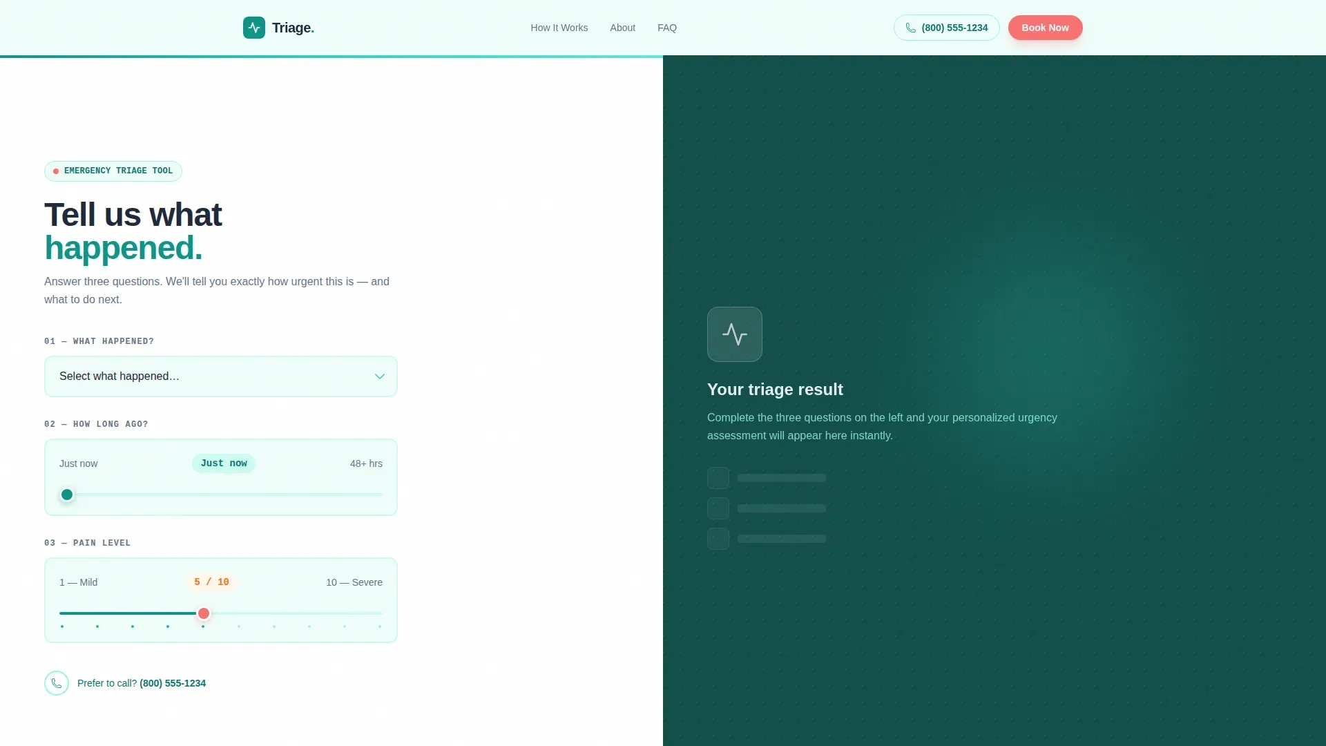
The hero section is a 50/50 split screen. The left side presents three plain-language inputs: a dropdown for the type of emergency, a sliding scale for how long ago it happened, and an interactive pain slider rated 1 to 10. The right panel updates in real time with an estimated urgency level, a recommended treatment window, and a ballpark cost range shown in calm teal with clear iconography.
Live Urgency Result Panel
As patients interact with the calculator, the right side of the split screen updates without a page reload. The result displays urgency tier, suggested action window, and a cost estimate. This panel is the page's core trust mechanism. It shows competence before a single word of marketing copy appears.
Step-by-Step Visit Process
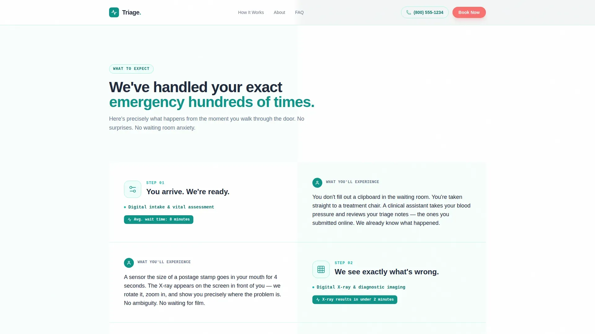
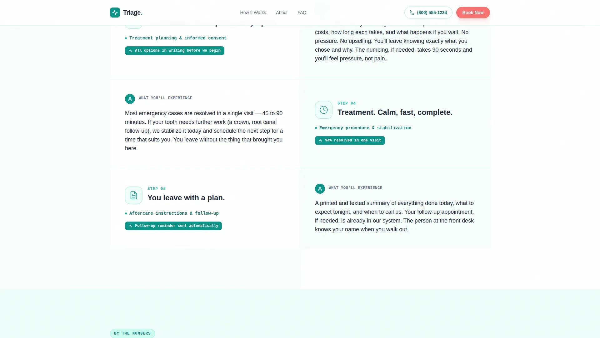
Below the calculator, the template alternates between left and right split panels. Each left panel names a step in the emergency visit: digital X-ray, diagnosis, treatment options, aftercare. Each right panel delivers first-person copy describing exactly what the patient will experience. Clinical line-drawing illustrations replace stock photography throughout this section.
Sticky Booking Call-to-Action
A "Book Emergency Slot Now" button in urgent coral stays pinned to the bottom of the viewport after the patient has interacted with the triage estimator. It does not appear immediately. It earns its position by waiting until the patient has received their urgency result, making the click feel logical rather than pressured.
Four-Field Booking Form
The form captures four pieces of information: name, phone number, estimated urgency level (pre-filled from the calculator output), and preferred time window. Time window options are "next 2 hours," "today," and "tomorrow morning." The secondary path offers a tap-to-call button for mobile visitors who prefer to speak directly with the clinic.
Trust and Stats Bento Section
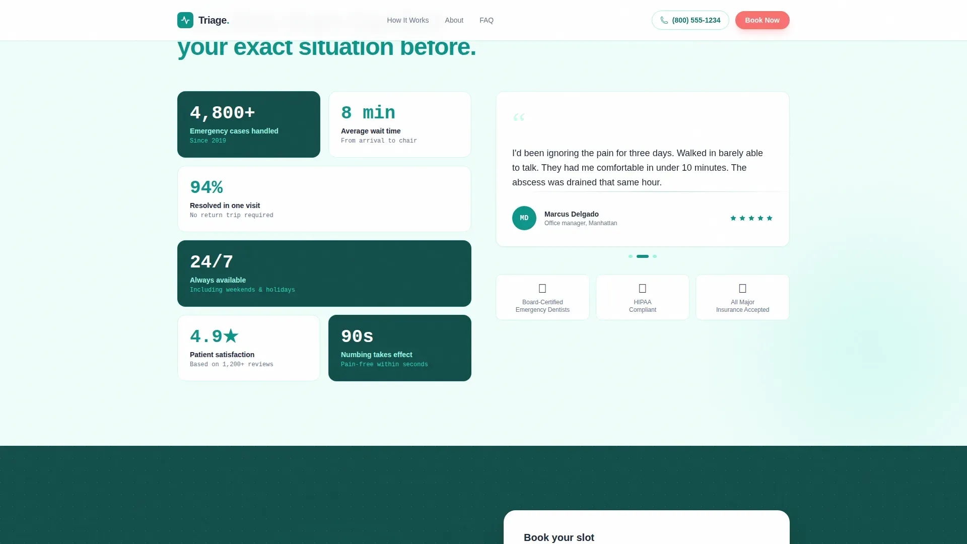
A bento-grid social proof section displays case volume statistics, average patient wait time, satisfaction percentage, and specific outcome metrics. Numbers use JetBrains Mono for a clinical data readout feel. This section sits between the process walkthrough and the booking form, reinforcing confidence at the moment of decision.
Page sections overview
| Section | Purpose |
|---|---|
| Hero Triage Calculator | Captures emergency details and delivers a live urgency and cost estimate |
| Emergency Visit Process | Walks patients through each clinic step using first-person reassurance copy |
| Trust and Stats Bento | Displays case volume, wait time, satisfaction rate, and outcome metrics |
| Booking Form | Collects name, phone, urgency level, and preferred appointment window |
| FAQ Accordion | Addresses cost, insurance, after-hours availability, and pain management concerns |
| Footer | Single-row linear layout with clinic contact details and essential links |
Design & branding system
The visual identity follows a clinical modernism style that balances sterile authority with enough warmth to ease anxiety. The palette is purposeful: every color has a job, and none of them overlap.
- Teal (#0D9488) is the primary action color for interactive elements, result panels, and section headings; deep charcoal (#1E293B) carries all authoritative body text; calming mist (#F0FDFA) covers section backgrounds
- Urgent coral (#F87171) appears exclusively on emergency-tier calls to action and time-sensitive badges, never as a decorative color
- Typography pairs DM Sans for all body copy and user interface elements with JetBrains Mono for numerical data, clinical readouts, and cost estimates
Mobile & speed optimization
This template treats mobile as the primary device. Patients booking a dental emergency are almost always on a phone, often one-handed, sometimes in real discomfort. The layout decisions reflect that reality.
- The 50/50 split-screen stacks vertically on small screens so the calculator and result panel each take full width and remain easy to tap
- The sticky coral call-to-action button and the tap-to-call secondary path are sized and positioned for one-handed use without zooming
- Scroll reveal animations, slider interactions, and real-time panel updates use a medium-high animation budget appropriate for modern mobile browsers
How this template helps you convert
The conversion strategy in this template is built around earning trust before asking for a commitment. The triage calculator is not a gimmick. It is the reason a stressed patient stays on the page instead of dialing a competitor.
- The calculator gives the patient something valuable first: their own urgency result, a treatment time estimate, and a cost range. By the time they see the booking button, they already feel served, not sold to.
- The step-by-step visit process eliminates the fear of the unknown. Patients who know exactly what will happen inside the clinic are far more likely to book than patients who are guessing.
- The four-field form with a pre-filled urgency level reduces perceived effort. Fewer decisions at the booking stage means fewer drop-offs at the final step.
Other information about this template
This template is categorized under Health and Medical, specifically in the Emergency Dentist Website subcategory. It is scoped for the United States market, using United States dollar currency and 12-hour time format throughout the booking form and result panels.
- The template style is Split Screen (50/50), and the header concept is a Calculator and Estimator combination, which is unusual for healthcare landing pages and gives this design a clear competitive distinction
- The creative direction follows a Transparent Process approach: every section educates the patient about what comes next rather than simply pushing them toward a form
- The color system is named Teal Catalyst, and the theme is Educational Guide, both of which reinforce the goal of building informed confidence rather than manufactured urgency
- Illustration style throughout the process walkthrough is clinical line drawings, not photographs, which has been chosen deliberately to reduce patient anxiety while maintaining clinical authority
Theme
Educational Guide
Creative direction
Transparent Process
Color system
Teal Catalyst
Style
Split Screen (50/50)
Direction
Lead Generation
Page Sections
Interactive Triage Calculator
Live Urgency Result Panel
Step-by-step Visit Walkthrough
Sticky Emergency Booking Button
Streamlined Four-field Booking Form
Social Proof Bento Section
Related questions
Does the booking form connect to a scheduling or calendar system?
Can the sticky coral call-to-action button be disabled or repositioned?
Is this template suitable for a pediatric dental emergency clinic?
What happens to the triage result when a patient starts filling out the booking form?



