Complete Emergency Dentist Appointment Booking Website Template
A single-page emergency dentist landing page built for patients in pain. The zigzag Expert Panel layout walks visitors through five real dental emergencies, answers their immediate questions, and guides them to book a same-day appointment. Clean Cloud Canvas colors and a calming line art header create trust fast, especially on mobile at 2 a.m.
by Rocket studio
Quick summary
This is a single-page emergency dentist patient education hub. It uses a zigzag alternating layout to address five specific dental emergencies, then moves visitors toward a streamlined booking form. The design is warm and clinical without being intimidating, and the entire experience is built around a mobile-first patient who needs help right now.
Who this template is for
This landing page is built for emergency dental practices that need to convert panicked patients into same-day appointments. It serves providers who take late-night calls, see walk-ins, and want their website to feel like a knowledgeable, steady presence rather than a generic brochure.
- Emergency dental practices offering same-day or after-hours care
- Dental offices serving adults with acute pain and parents of children with dental injuries
- Practices that want to educate patients first and earn the booking second
What problem this template solves
Most dental websites are built for routine care. They list services alphabetically, bury the phone number, and assume the visitor has time to browse. An emergency patient does not. They are on a phone at midnight, jaw throbbing, searching for someone who can actually help them right now.
- Visitors in pain cannot quickly find what to do next on a standard dental site
- Practices lose bookings because their site does not address the specific emergency the patient is experiencing
- Generic contact forms create friction at exactly the moment when speed and reassurance matter most
What you get with this template
You get a fully structured landing page designed specifically for emergency dental patient education and same-day booking. Every section is mapped to a real patient need, from the first headline to the final form field.
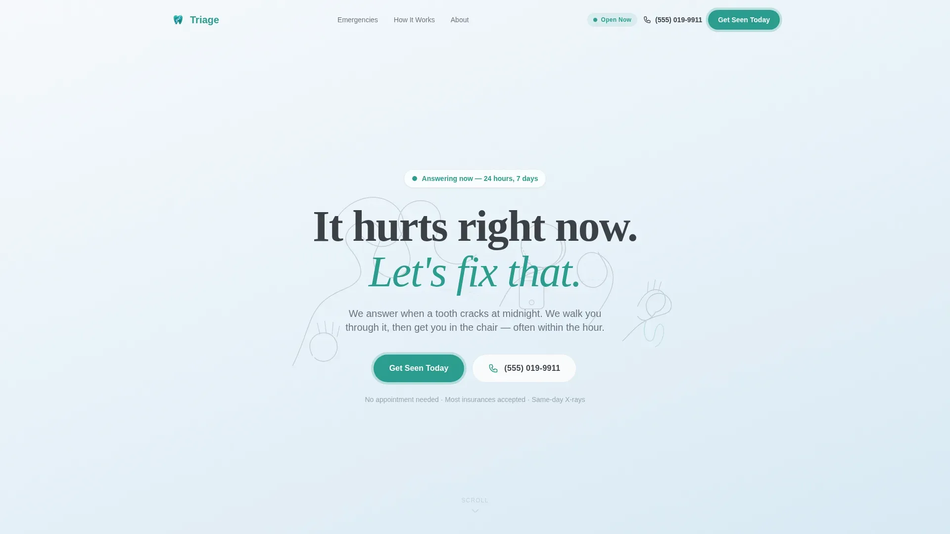
- A hero section with a full-width line art illustration, a calm reassuring headline, a pulsing teal call-to-action button, and a prominently displayed phone number
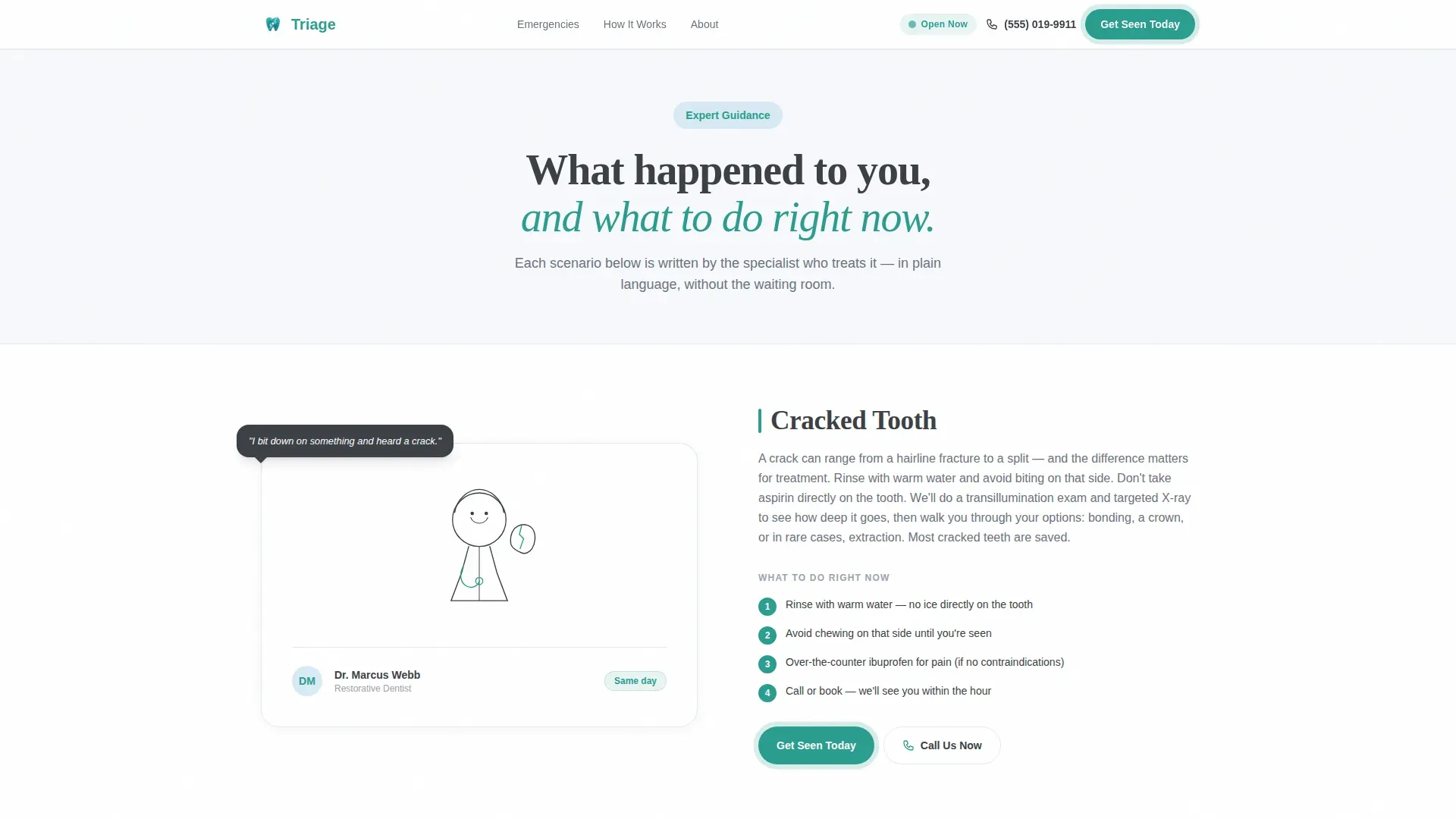
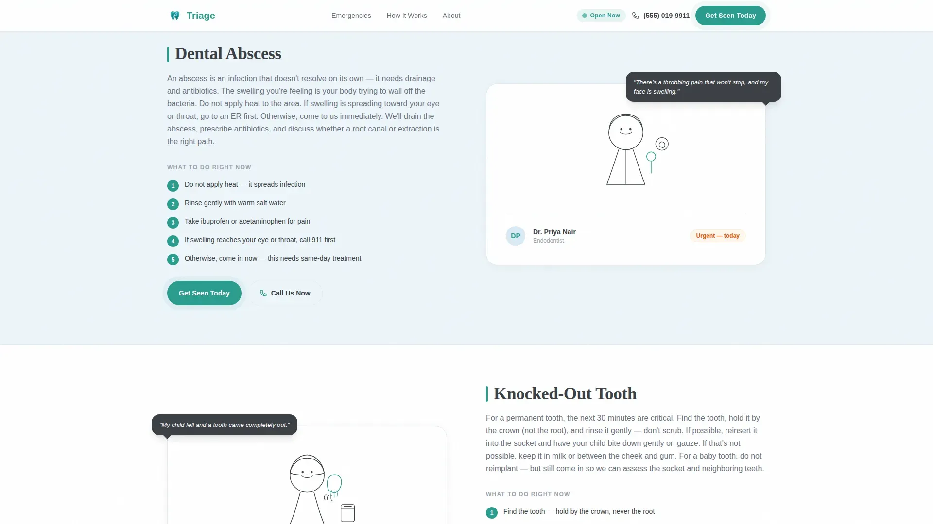
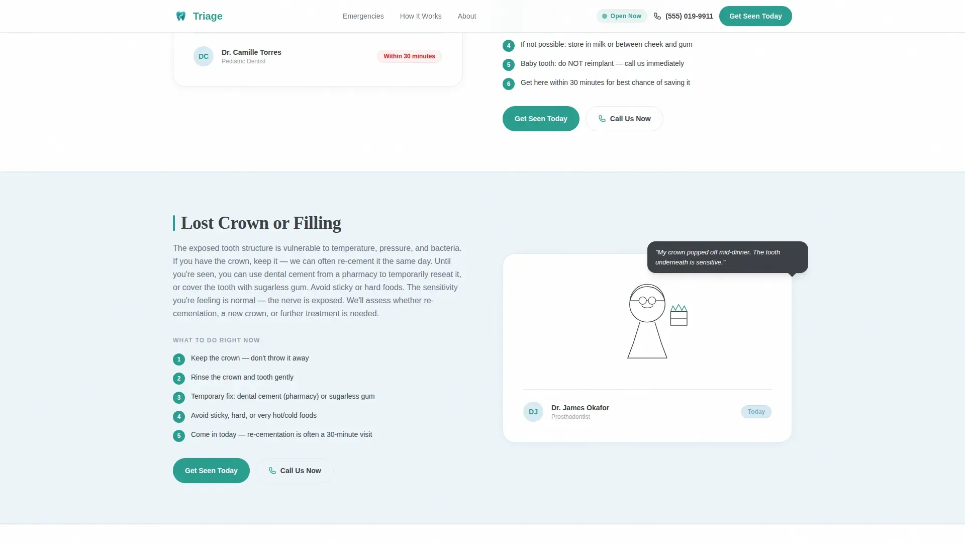
- Five zigzag expert panels covering cracked tooth, abscess, knocked-out tooth, lost filling, and broken braces wire scenarios
- A three-step same-day care process section, a trust statistics section, a streamlined three-field inline booking form, and a linear single-row footer
Feature list
This landing page brings together several purpose-built components that work together to reassure, educate, and convert a patient in distress.
Zigzag Emergency Scenario Panels
Five alternating panels each address one specific dental emergency. Each panel opens with the patient's own words, then responds with clear step-by-step guidance from the dentist's perspective. The alternating layout creates a natural conversational rhythm that builds trust as the visitor scrolls.
SVG Line Art Header Illustration
A continuous single-stroke line art illustration spans the full header width. It traces a human journey from a hand clutching a jaw, to a phone being picked up, to a dentist's gloved hand examining a tooth. The style is minimal and disarming, chosen deliberately to avoid the clinical anxiety that dental photography can trigger.
Persistent Mobile Footer Booking Bar
A fixed footer bar stays visible on mobile screens as the visitor scrolls. It keeps the primary "Get Seen Today" call-to-action and the "Call Us Now" secondary path within thumb reach at all times, removing the need to scroll back to act.
Streamlined Three-Field Booking Form
The inline booking form uses three fields only: a symptom selector dropdown matching the five scenarios covered on the page, a preferred time selector with options for now, within two hours, today, or tomorrow, and a phone number field. Keeping the form short removes friction at the highest-anxiety point in the patient journey.
Scroll-Reveal and SVG Draw Animations
Sections animate into view as the visitor scrolls using IntersectionObserver-based scroll reveals. The header illustration uses an SVG line draw animation. The primary call-to-action button pulses gently. These animations are intentionally moderate so they reassure rather than distract.
Trust Statistics Section
A dedicated section surfaces social proof through response time stats, patient volume numbers, and 24/7 availability indicators. These figures answer the patient's underlying question: "Can I actually trust this practice to show up for me right now?"
Page sections overview
| Section | Purpose |
|---|---|
| Hero with Line Art | Establish immediate reassurance and surface the phone number and primary call-to-action |
| Cracked Tooth Panel | Educate and guide patients experiencing a cracked or fractured tooth |
| Abscess Scenario Panel | Address abscess symptoms with step-by-step dentist guidance |
| Knocked-Out Tooth Panel | Walk parents and patients through tooth avulsion first steps |
| Lost Filling Panel | Explain what to do when a filling or crown is lost or dislodged |
| Broken Braces Wire | Guide patients dealing with a broken orthodontic wire emergency |
| How It Works | Show the three-step same-day care process clearly and simply |
| Trust Stats Section | Display availability, response time, and patient volume as credibility signals |
| Booking Form | Collect symptom, preferred time, and phone number with minimal friction |
| Single-Row Footer | Provide essential practice links in a clean linear layout |
Design & branding system
The visual identity follows an Educational Guide theme using the Cloud Canvas color system. The palette is built to feel clean, warm, and trustworthy without triggering the sterile anxiety that many dental offices carry. Typography pairs DM Sans for body text with Fraunces for headlines, combining readable clarity with warm authority.
- Soft clinical white (#F7F9FC) as the dominant base, sky blue (#A8C6DF) washing behind educational panels, warm graphite (#3B3F45) anchoring all body copy
- Confident teal (#2A9D8F) reserved exclusively for every actionable element including buttons, calls-to-action, and interactive highlights
- Minimal line art illustration style throughout, avoiding clinical photography and stock-photo smiles in favor of human, disarming single-stroke drawings
Mobile & speed optimization
The entire landing page is designed mobile-first. Patients searching for an emergency dentist are almost always on their phones, often at night, often in pain. Every layout decision prioritizes legibility, tap-target size, and the ability to act without scrolling unnecessarily.
- Graphite body text is sized and weighted to stay readable on a phone screen at 2 a.m. under stress
- The persistent mobile footer bar keeps both the primary and secondary call-to-action within thumb reach at all times
- Scroll reveal animations use IntersectionObserver for lightweight triggering without heavy animation libraries
How this template helps you convert
This landing page earns the booking by answering the patient's most urgent question before asking for anything in return. The conversion path is built deliberately around the emotional state of someone in acute dental pain.
- The hero section leads with empathy and a clear headline, surfacing the phone number and "Get Seen Today" button before the visitor reads a single word of body copy, so the most ready-to-act patients can convert immediately.
- Each expert panel educates the visitor about their specific emergency first, then ends with the same teal call-to-action button, so the patient feels informed and trusted before they are asked to book.
- The three-field booking form removes every unnecessary barrier at the final step, while the side-by-side "Call Us Now" secondary path ensures that patients too distressed to type can still reach the practice in seconds.
Other information about this template
This template is designed for a United States dental practice context. Phone number fields are formatted for the standard USA format. The page is localized for English-speaking patients and uses phrasing tuned to the emotional register of someone in a genuine dental crisis.
- The footer follows Pattern 1: a linear single-row layout keeping the page clean and focused through to the last pixel
- The booking modal symptom selector dropdown is pre-loaded with the exact five emergency scenarios covered in the expert panels, creating a cohesive and reassuring experience from education to action
- The template uses DM Sans for body copy and Fraunces for display headlines, a pairing that communicates warm authority without feeling overly formal or clinical
Theme
Educational Guide
Creative direction
Expert Panel
Color system
Cloud Canvas
Style
Zigzag/Alternating
Direction
Booking/Scheduling
Page Sections
Zigzag Expert Panel Layout
SVG Line Art Header
Persistent Mobile Footer Bar
Three-field Streamlined Booking Form
Scroll-reveal and Pulse Animations
Trust Statistics Section
Related questions
Can I customize the five emergency scenarios to match my practice's most common cases?
Does this template include the booking form logic and symptom dropdown?
Is this landing page suitable for a practice that also offers routine dental care?
How does the persistent mobile footer bar work?
Can I update the trust statistics with my practice's real numbers?



