Insurance Agency Cost Calculator Website Template
Underwrite is an insurance agency maintenance landing page that keeps visitors productive during downtime. A live-rendered dashboard mockup, an interactive coverage calculator, a policy comparison matrix, and a risk assessment quiz scroll into view progressively. The page drives app downloads by proving its tools work before making any ask, turning a temporary outage into a high-value detour.
by Rocket studio
Quick summary
Underwrite is a single-page insurance agency maintenance landing page built on a scroll-reveal structure. Visitors arrive during downtime and immediately find working tools: a coverage calculator, a policy comparison matrix, and a risk assessment quiz. The Data Command theme wraps everything in a dark, deliberate visual identity that communicates reliability rather than apology.
Who this template is for
This template is designed for insurance agencies that need their digital presence to keep delivering value even when core systems are temporarily offline. It suits teams that want downtime to feel like a controlled procedure rather than a failure.
- Insurance agencies running scheduled system upgrades or maintenance windows
- Digital marketing teams managing paid traffic that cannot simply be paused during downtime
- Agency operators who want existing policyholders and new leads to stay engaged rather than leave
What problem this template solves
A standard maintenance page wastes every visitor who arrives during downtime. For an insurance agency, that means policyholders checking claim status, small business owners mid-quote, and new leads from live ad campaigns all hit a dead end and leave. This template replaces that dead end with a set of working tools.
- Visitors lose trust when a maintenance screen offers nothing useful
- Active ad spend continues sending traffic with no page to convert it
- Policyholders who cannot check their status at off-hours may call support or churn
What you get with this template
You get a fully structured, single-page maintenance landing page that progressively reveals interactive tools as the visitor scrolls. Every section is built to carry its weight, from the header that signals system health to the pinned app-download banner that closes the loop.
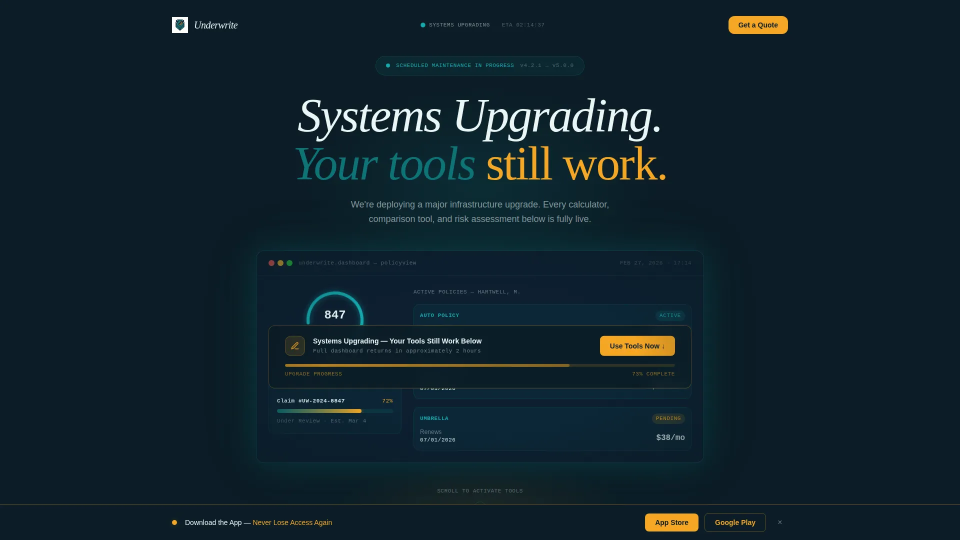
- A header dashboard mockup with a coverage score dial, three policy cards, and a claims tracker
- A scroll-reveal sequence covering the coverage calculator, policy comparison matrix, and risk assessment quiz
- Two app-download call-to-action placements with direct links to the App Store and Google Play
Feature list
This template includes a focused set of built-in components, each designed to serve a specific visitor need during the maintenance window.
Live-Rendered Dashboard Header
The header opens with a detailed insurance dashboard mockup. It displays a coverage score dial at 847, three policy cards for auto, home, and umbrella coverage with renewal dates, and a claims tracker showing a status bar at 72% processed. A frosted-glass maintenance banner overlays the center. A pulsing amber progress bar beneath the banner signals forward motion rather than failure.
Interactive Coverage Calculator
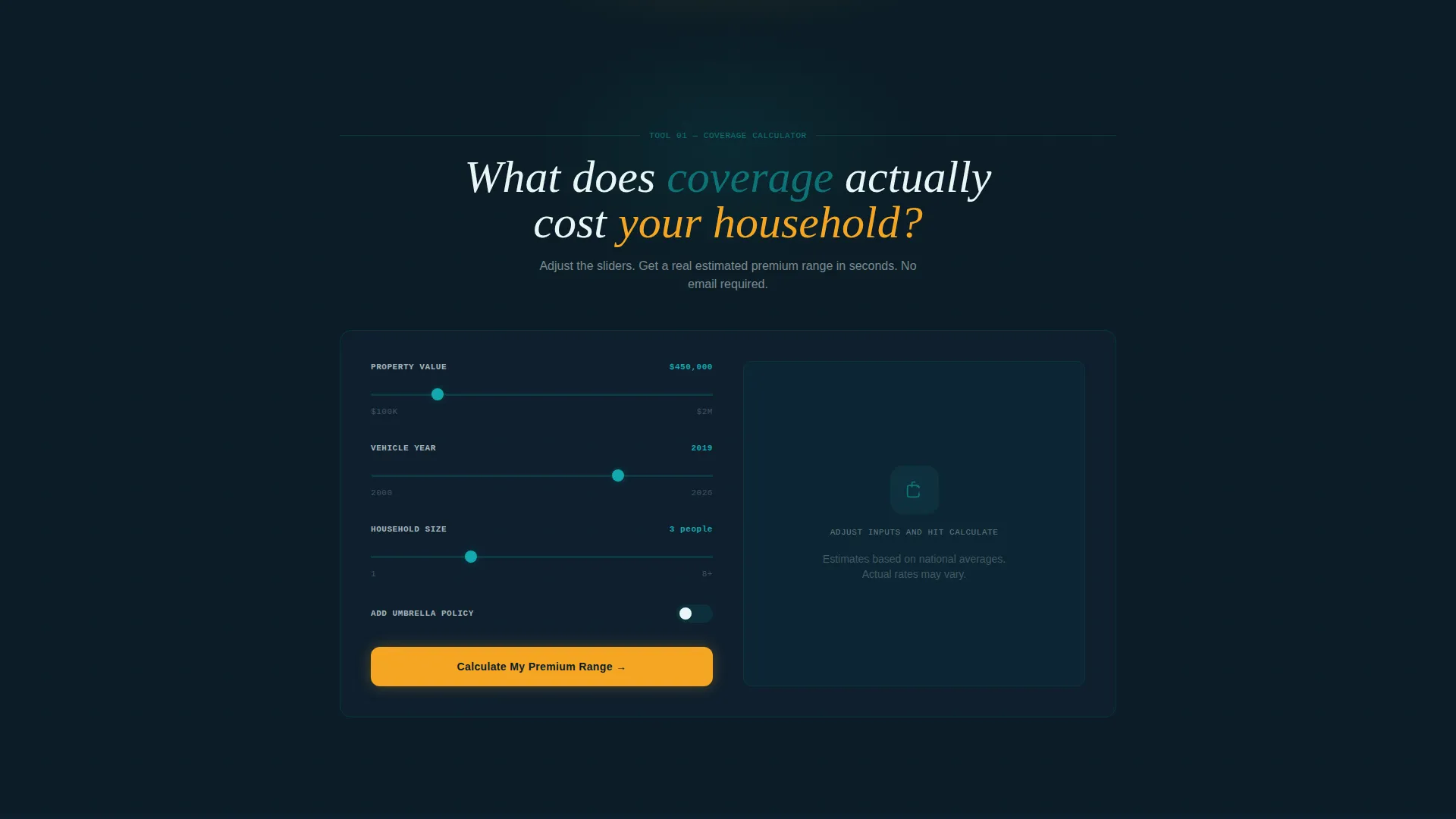
The first tool to appear in the scroll sequence is a fully interactive coverage calculator. Visitors input property value, vehicle year, and household size to receive an instant estimated premium range. It works independently of any backend system, giving the visitor a concrete result before anything else is asked of them.
Progressive Policy Comparison Matrix
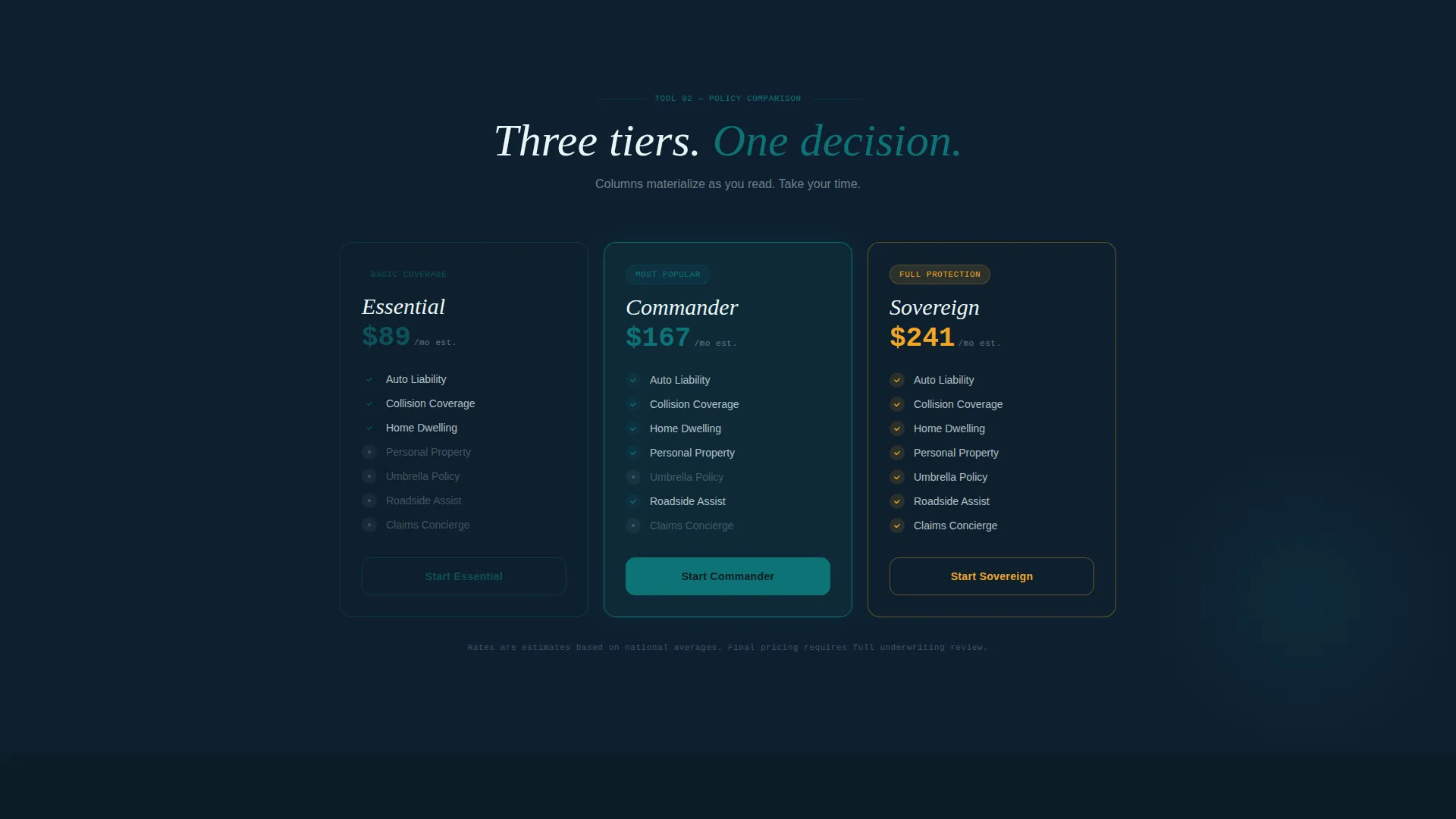
The policy comparison matrix materializes column by column as the visitor scrolls. This progressive reveal mirrors the feeling of instruments powering on, keeping the visitor engaged while presenting structured coverage comparisons in a readable format.
Risk Assessment Quiz
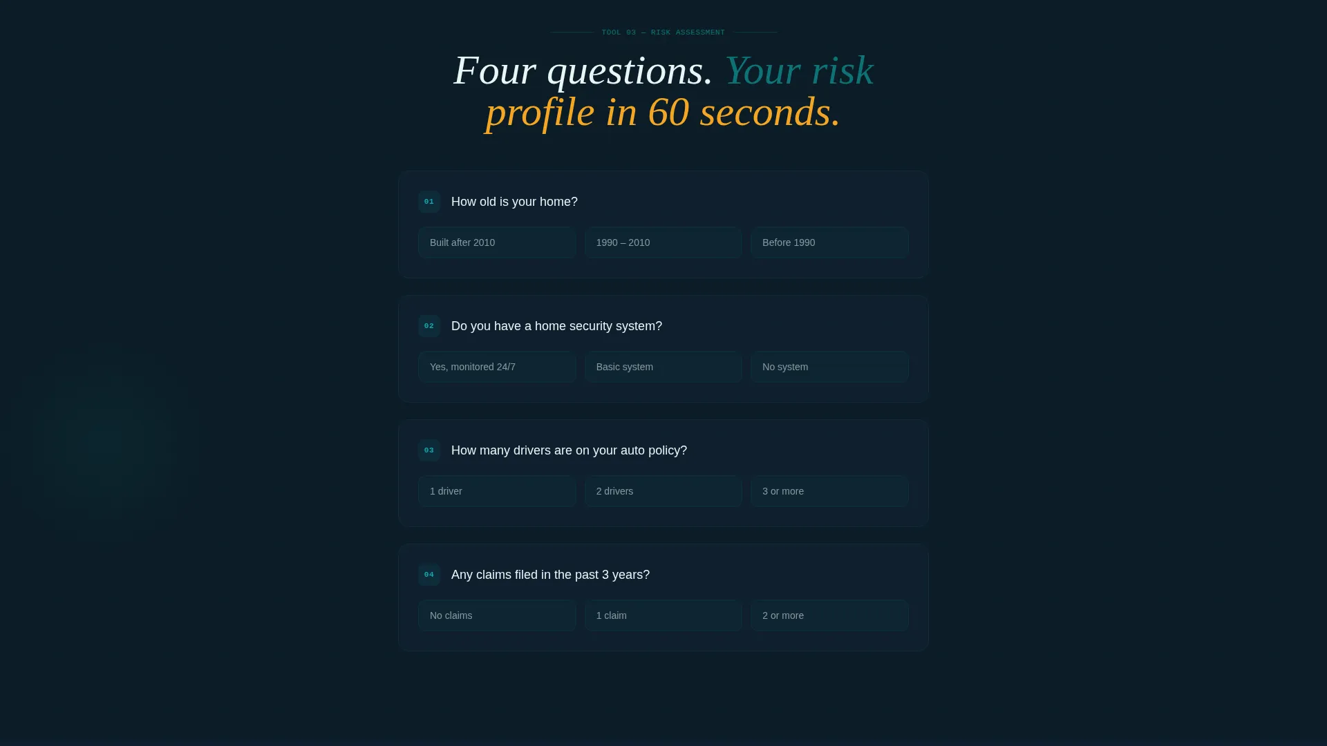
The risk assessment quiz builds question by question as the visitor scrolls further down the page. Each new question appears from the dark background, reinforcing the progressive empowerment narrative and keeping the visitor moving through the page with a sense of growing capability.
Dual App Download calls to action
The primary call to action, "Get Your Dashboard on Mobile," appears immediately after the calculator delivers results. A phone mockup animates beside it, showing the same dashboard from the header now displayed in-pocket. A slim secondary banner pins to the bottom of the viewport after 40% scroll depth, reading "Download the App, Never Lose Access Again," with direct links to both app store platforms.
Scroll Reveal Animation System
Every major section emerges from the midnight command background using scroll-triggered reveal animations. The effect reinforces the cockpit metaphor: instruments power on one by one as the visitor progresses, making the page feel alive and purposeful rather than static.
Page sections overview
| Section | Purpose |
|---|---|
| Dashboard header mockup | Signals system health and sets the control-room tone |
| Maintenance status banner | Communicates upgrade context without apologizing for downtime |
| Amber progress indicator | Gives downtime a sense of forward motion |
| Coverage calculator tool | Delivers immediate, interactive value on arrival |
| Primary app download call to action | Converts calculator users at peak engagement |
| Policy comparison matrix | Presents structured coverage options column by column |
| Risk assessment quiz | Builds question-by-question engagement as visitor scrolls |
| Pinned app download banner | Persistent secondary call to action after 40% scroll depth |
Design & branding system
The visual identity follows a Data Command theme built on the Teal Catalyst color system. The palette is deliberately dark and purposeful, borrowing from the aesthetic of submarine control rooms and operational dashboards where every lit element carries meaning.
- Deep operational teal (#0D7377) anchors headers and interactive elements; midnight command (#0B1D26) floods the background
- Signal white (#EAF6F6) handles typography, cutting cleanly against the dark field
- Catalyst amber (#F5A623) pulses on call-to-action elements and progress indicators, creating clear focal points
Mobile & speed optimization
The template is designed with mobile-first visitors in mind. The app-download call to action is the primary conversion goal, and the layout supports that goal by presenting tools that translate directly to an in-pocket experience.
- The phone mockup animation beside the primary call to action mirrors the header dashboard, connecting the desktop experience to the mobile destination
- The pinned app-download banner remains accessible after 40% scroll depth, keeping the mobile conversion path visible throughout the session
- The scroll-reveal sequence is structured to work in a linear, single-column flow suitable for smaller screens
How this template helps you convert
The conversion strategy in this template is built on earned trust. The page delivers working tools before making any request, so the call to action lands after the visitor has already received something useful.
- The coverage calculator produces a concrete result early in the scroll sequence, creating an emotional anchor that makes the app-download ask feel like a natural continuation rather than an interruption.
- The pinned secondary banner activates only after meaningful scroll depth, ensuring the persistent call to action appears for visitors who have already engaged with the tools rather than new arrivals.
Other information about this template
This template sits within the Technology category and targets the insurance agency maintenance page niche. It is built as a scroll-reveal, single-page layout that can be deployed quickly during any planned maintenance window.
- The template style is Scroll Reveal (Progressive), meaning each section animates into view on scroll rather than loading all at once
- The creative direction follows a Calculator/Tool First approach, prioritizing immediate visitor utility before any conversion ask
- The header concept is a Dashboard Preview, a design pattern suited to insurance platforms where data familiarity builds trust fast
- The landing-page direction is App Download, making the mobile app the single primary conversion goal throughout the page
Theme
Data Command
Creative direction
Calculator/Tool First
Color system
Teal Catalyst
Style
Scroll Reveal (Progressive)
Direction
App Download
Page Sections
Live-rendered Dashboard Header Mockup
Interactive Coverage Calculator
Progressive Policy Comparison Matrix
Question-by-question Risk Assessment Quiz
Dual App Download Call to Action Placements
Scroll Reveal Animation System
Related questions
Who is this template designed for?
Can visitors actually use the coverage calculator during maintenance?
How do the two app-download call-to-action placements work?
What does the scroll-reveal animation system do for the page?
Is this template suitable for both new leads and existing policyholders?



