Specialist Dental Clinic Professional Website Template
Canal is a zigzag landing page template built for endodontist practices. It walks anxious patients through root canal treatment step by step, using an Educational Guide design with a Forest Trust color palette. The layout earns trust before asking for anything, then converts with a guide download and consultation request form.
by Rocket studio
Quick summary
Canal is a single-page landing page template designed for endodontic dental clinic practices. It uses a five-step educational scroll to turn fearful tooth-pain sufferers into confident, informed patients. Every section deepens understanding of root canal treatment while quietly dissolving dread. By the time the call to action appears, visitors are ready to act.
Who this template is for
This landing page is built for endodontists who want their website to do the patient education work before the first phone call. It fits clinics that compete on expertise and precision, not on price or volume.
- Endodontist practices targeting anxious adults searching for tooth pain answers late at night
- Specialists receiving referrals from general dentists who need to reassure and convert those patients
- Dental clinic owners who want landing pages that build trust through content before asking for contact details
What problem this template solves
Most dental landing pages ask for a booking before they have earned it. Patients searching for root canal information are scared and skeptical. They need to understand what is happening inside their teeth before they can feel confident calling a stranger.
- Visitors arrive with fear and leave with answers, which makes them far more likely to book
- The page removes the need for a receptionist to explain the procedure from scratch on every call
- It replaces the generic dental clinic website that gives no reason to choose this practice over another
What you get with this template
You get a complete, ready-to-customize landing page with five educational zigzag sections, two conversion paths, and a fully realized Forest Trust visual identity. Every section is purposeful and every design decision supports calm, informed dental care decision-making.
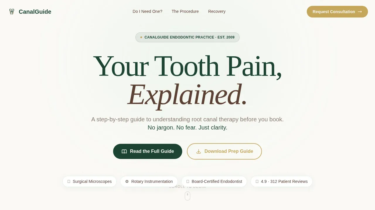
- A hero section with a giant centered headline on linen white, designed to feel like a first full breath after days of tooth pain
- Five numbered zigzag content steps covering symptoms, tooth anatomy, the procedure, specialist credentials, and recovery
- Two distinct call-to-action flows: a mid-page guide download form and a footer consultation request with phone and preferred-time capture
Feature list
This landing page template includes purpose-built features drawn from the source brief. Each one serves a specific role in converting anxious visitors into booked patients.
Five-Step Educational Zigzag Layout
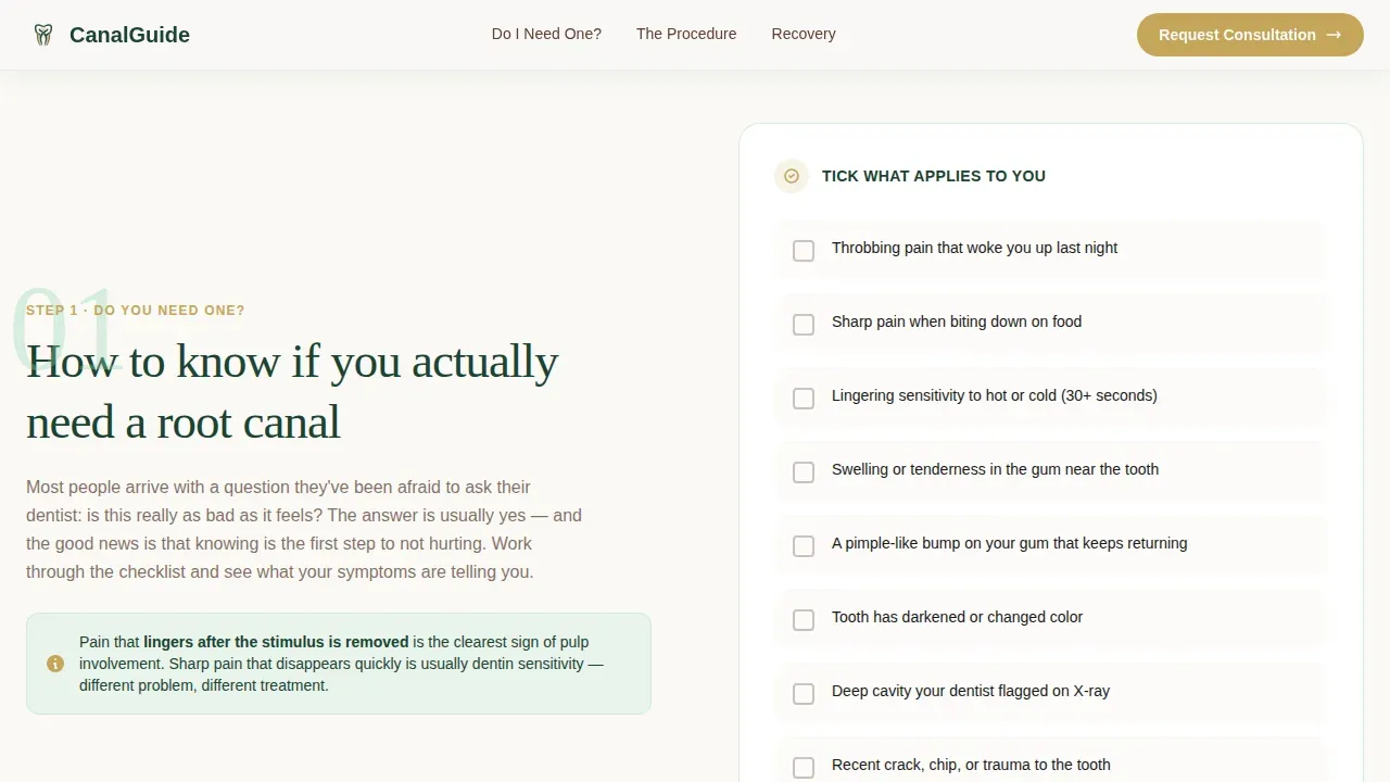
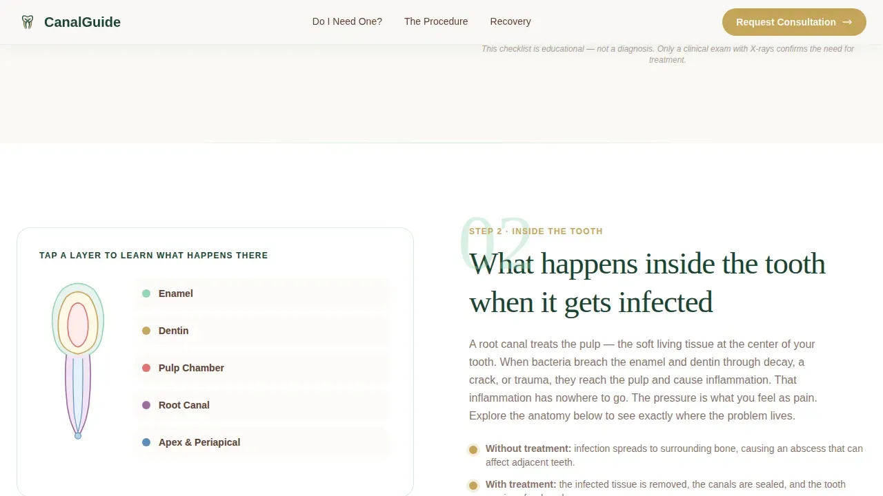
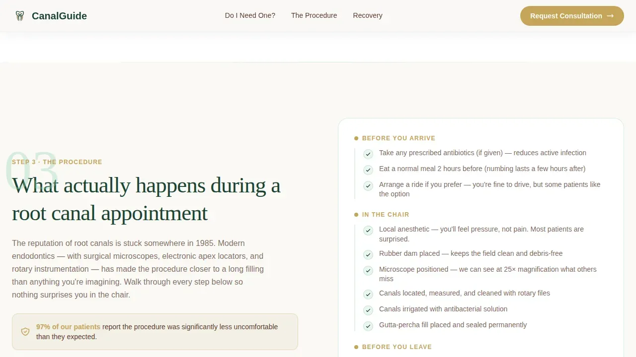
The page is structured as a numbered guide. Each step alternates text and visual content in a classic zigzag orientation. Step one presents a symptom checklist. Step two shows a layered cross-section of tooth anatomy. Step three covers the procedure in plain language. Step four highlights specialist credentials and precision technology. Step five walks through recovery so patients know exactly what to expect.
Interactive Symptom Checklist
Step one includes a live, interactive checklist that visitors mentally and physically tick through. Each item corresponds to a real symptom that may indicate the need for root canal treatment. This design choice helps the user self-identify their situation, which raises engagement and makes the rest of the page feel personally relevant. Checklist tick animations add smooth, satisfying feedback on interaction.
Dual Conversion Path Design
The primary call to action, a guide download form in muted gold, appears after step three when trust is at its peak. It asks only for a first name and email address. The secondary path lives in the footer: a single phone field with a preferred-time toggle. This two-path design lets visitors choose the commitment level they are ready for, which improves overall results.
Forest Trust Color System and Editorial Typography
The design uses deep evergreen, warm bark brown, soft fern, and clean linen white as its core palette. Muted gold accents appear on checkmarks, icons, and interactive elements. Fraunces serif headings carry editorial authority while DM Sans body text keeps reading smooth and accessible. The result is a visual identity that feels grounded, unhurried, and competent.
Staggered Scroll Animation System
Sections enter the viewport with staggered scroll reveals. Alternating section entrances follow the zigzag orientation of the layout. The checklist uses tick animations on interaction. This medium level of animation adds life to the page without distracting from the educational content that drives dental care decision-making.
Mobile-First Responsive Structure
The template is built with mobile-first priorities because many patients search for tooth pain relief on their phones at night. The layout reflows cleanly on small screens. Interactive elements including the checklist, download modal, and phone capture field are all sized and spaced for thumb-friendly use on any device.
Page sections overview
| Section | Purpose |
|---|---|
| Hero headline | Sets calm authority with giant centered type on linen white |
| Step 1 Symptoms | Interactive checklist helps visitors identify their need for root canal treatment |
| Step 2 Tooth Anatomy | Cross-section diagram explains what is happening inside the tooth |
| Step 3 Procedure Detail | Plain-language walkthrough of what root canal treatment actually involves |
| Guide Download call to action | Mid-page muted gold form captures first name and email at peak trust |
| Step 4 Specialist Credentials | Highlights precision technology and endodontist qualifications |
| Step 5 Recovery Timeline | Checklist-format recovery guide answers the last remaining patient fears |
| Footer Consultation call to action | Single-field phone capture with preferred-time toggle for ready patients |
Design & branding system
The visual identity follows an Educational Guide theme within the Forest Trust color system. The palette communicates that someone competent has been tending this place for a long time, which is exactly the feeling that turns a nervous searcher into a confident patient.
- Colors: deep evergreen (#1B4332) for primary text and headings, warm bark brown (#5C4033) for secondary elements, soft fern (#95D5B2) for accents, clean linen white (#FAF9F6) for backgrounds, and muted gold (#C5A55A) for checkmarks, icons, and interactive elements
- Typography: Fraunces serif for headings to deliver editorial authority, DM Sans for body text to keep reading easy and natural
- Layout: alternating zigzag sections with generous linen white breathing room and muted gold accent moments that reward the eye without creating distraction
Mobile & speed optimization
Patients searching for tooth pain relief do not wait until morning. Many will find this landing page on a phone at 2 a.m. The template is built to serve that user first.
- Mobile-first layout that reflows all zigzag sections cleanly on small screens
- Interactive elements sized for thumb use: the checklist, guide download modal, and footer phone capture all work without pinch-zooming
- Server Components handle static content while Client Components manage the interactive checklist and forms, keeping the page responsive on any device
How this template helps you convert
This landing page is built on a single principle: earn the click by giving everything away first. By the time a visitor reaches the call to action, they already feel they owe this dental clinic their attention.
- The five-step scroll answers every question a patient arrives with, replacing fear with informed calm and making the decision to book feel obvious rather than pressured
- The mid-page guide download captures high-intent leads at the moment trust peaks, asking only for a first name and email so the barrier to access is as low as possible
- The footer consultation path with phone capture and preferred-time toggle catches patients who are ready to book immediately, giving them a direct and smooth route to the next step
Other information about this template
This template is a strong starting point for any endodontic dental clinic that wants its landing pages to do real educational work. The design principles here reflect what successful dental landing pages share: intuitive layout, high-quality pictures, clear calls to action, and trust signals that help visitors feel confident before they commit. Content accompanied by images is 80% more likely to be read by visitors, and videos can boost conversion rates by 86% when incorporated into landing pages, so the template leaves clear visual slots for pictures and video embeds throughout each step. The average conversion rate for health-related landing pages including dental services sits around 7.4%, and a well-structured educational landing page is one of the most reliable ways to reach or exceed that benchmark.
- The template supports clear display of verified patient testimonials, before-and-after pictures, and practitioner credential callouts, all of which are proven trust signals for dental care landing pages
- A 'Call Now' button and an interactive map plugin can be added to the footer to help visitors locate the dental clinic and take immediate action, which encourages same-day contact from urgent cases
- Platforms like Landingi offer many pre-designed templates for dental landing pages, and royalty-free root canal treatment pictures are available on Envato to source images that match the Forest Trust visual identity
- Always Smile DC shows how clear navigation helps visitors find what they want quickly; Endodontics Northwest demonstrates how detailed procedure pages reassure patients seeking specialized dental care; and Smileboston proves that clear contact information and location details directly drive consultation bookings
- Using technology callouts such as Dental Operating Microscopes and 3D Cone Beam Imaging in Step 4 gives the dental clinic landing page the clinical credibility that protects the brand against comparison with general-practice competitors
- The page is designed as a standalone, distraction-free experience with a minimal menu to keep patient orientation clear and the scroll journey uninterrupted from hero to footer
Theme
Educational Guide
Creative direction
Checklist & Audit
Color system
Forest Trust
Style
Zigzag/Alternating
Direction
Content/Resource
Page Sections
Five-step Educational Zigzag Layout
Interactive Symptom Checklist
Dual Conversion Path Design
Forest Trust Color System and Editorial Typography
Staggered Scroll Animation System
Mobile-first Responsive Structure
Related questions
Who is the Canal template best suited for?
Can I customize the color palette and typography?
What conversion paths does the template include?
Does the template include the interactive symptom checklist?
How does the template address patient anxiety about root canal treatment?



