Estate & Succession Planning Booking Website Template
The Endow charitable trust comparison landing page template is built for high-net-worth advisory practices that structure charitable remainder trusts, donor-advised funds, and private foundations. It uses animated data counters, interactive comparison tables, and a scroll-driven Problem-to-Solution arc to move qualified visitors toward a consultation booking. The design follows a Plum Executive color system with quiet, ledger-room authority.
by Rocket studio
Quick summary
The Endow template is a single-page, click-through landing page designed for charitable trust advisory practices. It leads visitors through an animated hero, a cost-of-inaction data visualization, and three layered comparison tables covering charitable remainder trusts, donor-advised funds, and private foundation structures. Every section is built to earn a consultation booking from high-net-worth families and estate professionals.
Who this template is for
This landing page serves practices and professionals who work at the intersection of charitable planning and significant personal wealth. It is not aimed at small donors or general fundraising. The template speaks directly to decision-makers who manage large, concentrated asset positions and need a clear vehicle comparison before committing to a planning cycle.
- Business owners holding $5 million or more in concentrated stock who are approaching a liquidity event and need to understand how trust structures protect purchasing power and reduce taxes
- Estate attorneys and co-counsel professionals seeking a polished, data-led page that communicates the difference between a charitable remainder trust, a donor-advised fund, and a private foundation to prospective clients
- Family office directors who need to rebalance portfolios around philanthropic mandates and want a landing page that can speak to sophisticated readers who already manage complex investments across multiple asset classes
What problem this template solves
Without a well-structured landing page, charitable trust advisors struggle to communicate a genuinely complex value proposition in a format that holds attention long enough to generate a consultation. Generic pre-designed templates built for broad non-profit organizations miss the mark entirely. They are built for donation landing flows that serve small donors, not for practices working with families whose decisions involve six- or seven-figure tax consequences.
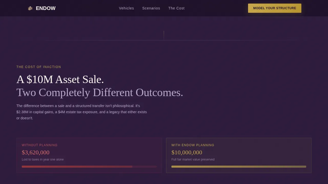
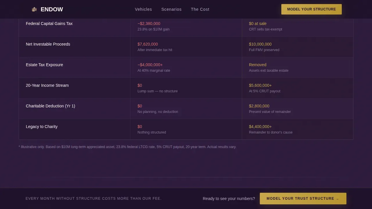
- The template replaces static brochure pages with an interactive, scroll-driven comparison experience that shows the exact cost of inaction using a side-by-side $10 million asset scenario. Visitors see the capital gains tax erosion, estate tax bleed, and missed charitable impact before they scroll past the first two sections. The data makes the case. The advisor does not have to.
- Most pre-designed templates for charitable advisors either look like fundraising pages aimed at broad public charities or like institutional investor fact sheets. This template occupies a specific middle ground: the visual authority of a private family office paired with the persuasive clarity of a well-built donation landing page. It keeps potential supporters engaged without diluting the premium positioning.
- The persistent call-to-action anchor bar and the diagnostic booking flow remove form friction from the main landing page itself. The comparison tables do the persuasion work across six structured dimensions, so by the time a visitor clicks "Model Your Trust Structure," they have already self-qualified.
What you get with this template
This template provides a complete, production-ready landing page designed around the Data Command theme and Plum Executive color system. Everything included works together as a single, coherent persuasion system rather than a collection of disconnected sections. The template is structured so that advisors can deploy a compelling, information-dense page without writing code from scratch or assembling individual components.
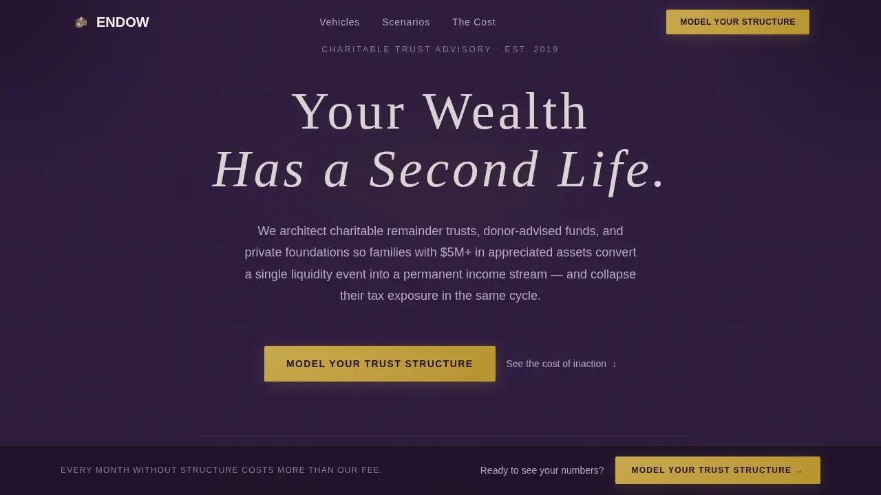
- An animated hero section with a dark full-bleed aubergine canvas, wide-tracked serif headline, and three burnished-gold animated counters that tick upward to display cumulative tax savings structured, charitable capital deployed, and income streams activated
- A scroll-driven Problem-to-Solution arc featuring a side-by-side $10 million asset comparison (without trust planning versus with it), followed by three layered comparison tables covering charitable remainder trust, donor-advised fund, and private foundation structures across six dimensions including tax deduction timing, income payout flexibility, control retention, and administrative burden
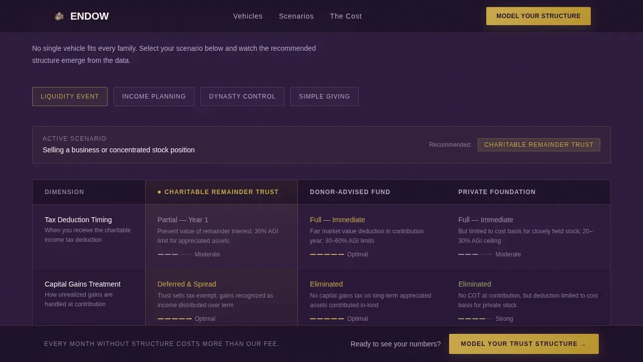
- A scenario selector component that shifts the highlighted "winner" column dynamically based on the visitor's profile, a persistent "Model Your Trust Structure" call-to-action anchor bar that reappears after the second comparison table, and a click-through diagnostic page where visitors enter estimated asset value, asset type, planning timeline, and existing charitable commitments
Feature list
This landing page template includes the following purpose-built features, each grounded in the prompt's design and functional specification.
Animated Gold Counter Hero
The hero section opens on a deep aubergine full-bleed canvas with no photography and no stock imagery. A thin-weight serif headline in wide tracking anchors the visual. Below it, three counters animate upward in burnished gold, displaying cumulative tax savings structured, charitable capital deployed, and income streams activated. The numbers function as the primary visual proof point, pulsing with quiet authority rather than relying on decorative imagery. This keeps the landing page focused on data-driven trust-building from the very first scroll position.
Interactive Charitable Vehicle Comparison Tables
The core of the landing page is a three-vehicle comparison table set covering charitable remainder trust (CRT), donor-advised fund (DAF), and private foundation structures. Each table row compares the vehicles across six defined dimensions: tax deduction timing, income payout flexibility, control retention over distributions, investment fund options, impact on estate taxes, and administrative burden. Rows highlight on hover. This interactivity keeps visitors engaged, lowers the bounce rate, and positions the advisor as the necessary interpreter of a genuinely complex landscape.
Dynamic Scenario Selector
A scenario selector component sits above or within the comparison table section. Visitors choose their profile from asset type options including public stock, real estate, business interest, and mixed portfolios, along with their planning timeline and existing charitable commitments. Based on those inputs, the "winner" column in the comparison table shifts dynamically. This makes clear that no single vehicle, whether a private foundation, a donor-advised fund, or a community foundation hybrid, fits every family, which reinforces the case for a qualified advisor rather than a self-serve answer.
Persistent call to action Anchor Bar
A burnished-gold "Model Your Trust Structure" call-to-action button appears first below the hero counters and then locks into a persistent bottom anchor bar after the visitor scrolls past the second comparison table. This approach keeps the primary conversion action visible without interrupting the comparison flow. The anchor bar does not appear until the visitor has passed enough information-dense content to be genuinely ready to take action.
Click-Through Diagnostic Booking Flow
Rather than placing a lead-capture form on the main landing page, the template routes qualified visitors to an intermediate diagnostic page. That page includes a short, structured intake covering estimated asset value range, asset type, planning timeline, and existing charitable commitments. This approach removes form friction from the main landing page entirely, meaning the comparison tables and cost-of-inaction visualization handle all of the persuasion work before a single field is filled in.
Cost-of-Inaction Data Visualization
The Problem arc opens with a stark side-by-side data visualization. It shows what happens to a $10 million asset sale without trust planning on one side, including capital gains tax erosion, estate tax reduction, and charitable impact left unrealized, versus the outcome with professional trust planning on the other. This visualization sets the financial stakes early and anchors the rest of the comparison content in real-dollar consequence rather than abstract planning concepts.
Page sections overview
| Section | Purpose |
|---|---|
| Hero Counter Canvas | Opens on an animated aubergine header with three burnished-gold ticking counters showing tax savings, charitable capital deployed, and active income streams |
| Cost of Inaction | Side-by-side $10M asset comparison showing capital gains tax erosion and estate tax impact without trust planning versus the structured outcome with it |
| CRT versus DAF Table | First comparison table layer covering charitable remainder trust and donor-advised fund across six planning dimensions with hover-highlighted rows |
| Private Foundation Table | Second comparison table layer adding private foundation as a third vehicle column with dynamic winner-column highlighting per scenario |
| Scenario Selector | Visitor-input component that shifts the highlighted winner column across all comparison tables based on asset type, timeline, and charitable commitments |
| call to action Anchor Bar | Persistent burnished-gold "Model Your Trust Structure" bar that locks to the bottom viewport after the visitor passes the second comparison table |
| Diagnostic Booking Page | Click-through intermediate page with a short intake form covering asset value, type, timeline, and existing charitable commitments |
| Footer | Linear single-row footer pattern with minimal navigation and essential practice information |
Design & branding system
The visual identity follows a Data Command theme expressed through the Plum Executive color system. Every design decision reinforces quiet authority. The palette is intentionally restrained: darkness is not somber but expensive, and every accent of burnished gold is functional rather than decorative. The result is a landing page that feels like opening a leather-bound ledger in a mahogany-paneled room, where every column balances and every element earns its place.
- Color palette: deep aubergine (#2D1B3D) as the primary background, muted silver-lavender (#B8A9C9) for secondary text and table borders, warm ivory (#FAF6F0) for card surfaces and data cells, and burnished gold (#C9A84C) reserved exclusively for interactive elements and key figures such as the counter values, the call to action button, and the scenario selector highlight state
- Typography: Fraunces serif in thin weight with wide tracking for all headlines, creating a glowing, backlit quality against the dark canvas; DM Sans for all body copy, table data, and label text, keeping data cells crisp and readable at both desktop and smaller viewport widths
- No photography, no stock imagery, and no decorative illustration anywhere on the landing page; the numbers, tables, and typographic hierarchy are the entire visual system
Mobile & speed optimization
The template is built desktop-first, which reflects how financial advisors, estate attorneys, and family office directors actually review complex comparison tables. Wide viewports are necessary for the three-column vehicle comparison tables to render without horizontal scrolling or column collapse. However, the layout is also designed to remain functional and readable at smaller sizes.
- Server Components power all static sections of the landing page, including the hero canvas, cost-of-inaction visualization, and footer, keeping the initial page load fast and reducing unnecessary JavaScript on first render
- Client Components handle the animated counters, hover-highlight table rows, dynamic scenario selector, and persistent call to action anchor bar, isolating interactivity to the elements that require it and avoiding layout-blocking scripts across the rest of the landing page
- The diagnostic booking page that visitors reach after clicking the call to action is a separate, lightweight page with a short intake form, meaning the main landing page carries no form-rendering overhead and can load cleanly on any connection
How this template helps you convert
This landing page is designed to earn a consultation booking, not just attract traffic. Every section is sequenced to move a qualified visitor from awareness of the tax problem through structured comparison of the three charitable vehicles and into a self-qualified click to the diagnostic booking page. The conversion logic is built into the content architecture, not bolted on as a pop-up or interruption.
- The animated counters in the hero establish social proof through cumulative data rather than testimonials. Visitors see the scale of tax savings structured and charitable capital deployed before reading a single word of explanatory copy. This primes them to treat the advisor as an established authority rather than an untested service.
- The layered comparison tables and dynamic scenario selector demonstrate, through interaction rather than assertion, that the difference between a charitable remainder trust, a donor-advised fund, and a private foundation is not a simple answer. Each time a visitor adjusts their scenario and watches the winner column shift, they feel the weight of needing an expert to navigate the decision. That feeling is what makes "Model Your Trust Structure" feel rational rather than salesy.
Other information about this template
This section covers additional context about the template's scope, structural decisions, and practical details that potential buyers may want to confirm before purchasing.
- The template is classified as a single landing page with a click-through architecture. The main page contains no navigation menu and focuses on a single conversion action, which is consistent with the best practice that a dedicated landing page template should eliminate distractions and direct all attention toward one defined outcome. A lower bounce rate is a natural byproduct of this focused structure.
- The comparison table design accommodates multiple asset classes across the vehicle rows, including public equity securities, real estate, business interests, and mixed portfolios. Rows covering short sales, private equity positions, and other complex asset types can be referenced in the scenario selector without requiring custom development.
- Landing page templates for endowed charitable trusts differ in purpose depending on whether the goal is immediate funding or long-term legacy giving. This template is firmly in the legacy-oriented category, emphasizing legal transparency, planning consequence, and mission continuity rather than a quick donation landing appeal. It is not designed for community foundations seeking to engage small donors or to collect unrestricted funds from the general public.
- Investment fund options across the three charitable vehicles vary significantly in flexibility. A donor-advised fund account through a major provider typically offers access to pooled investment funds, including equity, fixed income, and, in some cases, hedge funds and alternative asset classes. A private foundation can maintain its own investment policy statement, allocate across a broader range of investment funds, and manage its own grant-making independently. The template's comparison tables are structured to make these distinctions visible and scannable.
- Effective endowment management requires a formal investment policy statement that covers asset allocation targets, acceptable ranges for rebalancing, risk tolerance parameters, and a planning horizon typically greater than ten years. The Uniform Prudent Management of Institutional Funds Act (UPMIFA) sets the legal standard for how charitable organizations must manage and allocate endowment assets. The template's content framework can support advisors in communicating these governance considerations to prospective clients.
- Public charities represent the largest share of active 501(c)(3) organizations, making up 72 percent of them. Private foundations are a distinct category of 501(c)(3) organizations that usually grant money to charitable causes rather than carrying out direct charitable activity. Both structures must apply to the Internal Revenue Service (IRS) for determination status before they can legally solicit charitable donations. The template's comparison tables surface these structural differences clearly.
- A donor-advised fund allows donors to take a tax deduction now and grant money to charity at a later date. DAF providers, including Vanguard Charitable among others, typically offer tiered fee structures based on account value. Some providers allow advisor-managed accounts that offer broader investment flexibility across asset classes. The template's comparison section can highlight these distinctions so visitors understand which vehicle best matches their income needs, tax deduction timing preferences, and charitable goals.
- The template's key elements include a typographic hero with no imagery, an animated counter system, two or more comparison table layers, a scenario selector, a persistent call to action anchor bar, and a click-through diagnostic flow. Pre-designed templates in this category rarely include all of these components together. This template assembles them into a single, coherent landing page that can provide information clearly to a highly qualified audience.
- Detailed information about a family's asset allocation, risk tolerance, and planning timeline is collected in the diagnostic booking page rather than on the main landing page itself. This protects the persuasion purity of the main page and ensures that visitors who click through are already self-qualified, making the advisor's intake conversation more efficient.
- The footer follows Pattern 1, a linear single-row layout with minimal links. This keeps the bottom of the landing page clean and consistent with the overall design principle that every element should earn its place. Connecting the landing page to Google Analytics or another tracking platform for measuring conversion events is straightforward given the page's single-call to action architecture.
- The template's design does not include photography, illustration, or stock imagery anywhere on the landing page. This is a deliberate product decision consistent with the Data Command theme. The numbers, tables, and typography carry the full visual weight, which also means the page loads without large image assets competing for bandwidth.
- Organizations that want to present the template to potential supporters in a non-profit fundraising context, or adapt it for community foundations pursuing planned giving programs, should review whether the landing page's tone and table structure align with their specific audience. The template is optimized for high-net-worth advisory services, not for broad-based charitable causes campaigns.
Theme
Data Command
Creative direction
Problem→Solution Arc
Color system
Plum Executive
Style
Comparison Table
Direction
Click-Through
Page Sections
Animated Gold Counter Hero Section
Layered Charitable Vehicle Comparison Tables
Dynamic Winner-column Scenario Selector
Persistent Call to Action Anchor Bar
Cost-of-inaction Data Visualization
Click-through Diagnostic Booking Flow
Related questions
What charitable vehicles does the comparison table cover?
Is this template suitable for non-profit organizations needing a general donation landing page?
How does the dynamic scenario selector work?
Does the main landing page include a lead-capture form?
What design system and typography does this template use?



